用CSS画一个三角形
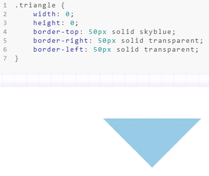
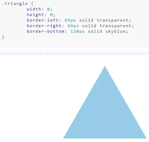
一、border
二、llinear-gradient

.triangle {
        width: 160px;
      height: 200px;
      outline: 2px solid skyblue;
      background-repeat: no-repeat;
        background-image: linear-gradient(32deg, orangered 50%, rgba(255, 255, 255, 0) 50%), linear-gradient(148deg, orangered 50%, rgba(255, 255, 255, 0) 50%);
        background-size: 100% 50%;
        background-position: top left, bottom left;
}
三、clip-path

.triangle{
        margin: 100px;
        width: 160px;
      height: 200px;
      background-color: skyblue;
        clip-path: polygon(0 0, 0% 100%, 100% 50%);
}

 浙公网安备 33010602011771号