matplotlib绘图的基本操作
更简明易懂看Matplotlib Python 画图教程 (莫烦Python)_演讲•公开课_科技_bilibili_哔哩哔哩 https://www.bilibili.com/video/av16378354/#page=1
plt.plot(x,y , fmt) :绘制坐标图
plt.boxplot(data, notch, position): 绘制箱形图
plt.bar(left, height, width, bottom) : 绘制条形图
plt.barh(width, bottom, left, height) : 绘制横向条形图
plt.polar(theta, r) : 绘制极坐标图
plt.pie(data, explode) : 绘制饼图
plt.scatter(x, y) :绘制散点图
plt.hist(x, bings, normed) : 绘制直方图
绘制图表的一些基本操作:
tips:如果你向plot()指令提供了一维的数组或列表,那么matplotlib将默认它是一系列的y值,并自动为你生成x的值,默认的x向量从0开始并且具有和y同样的长度。
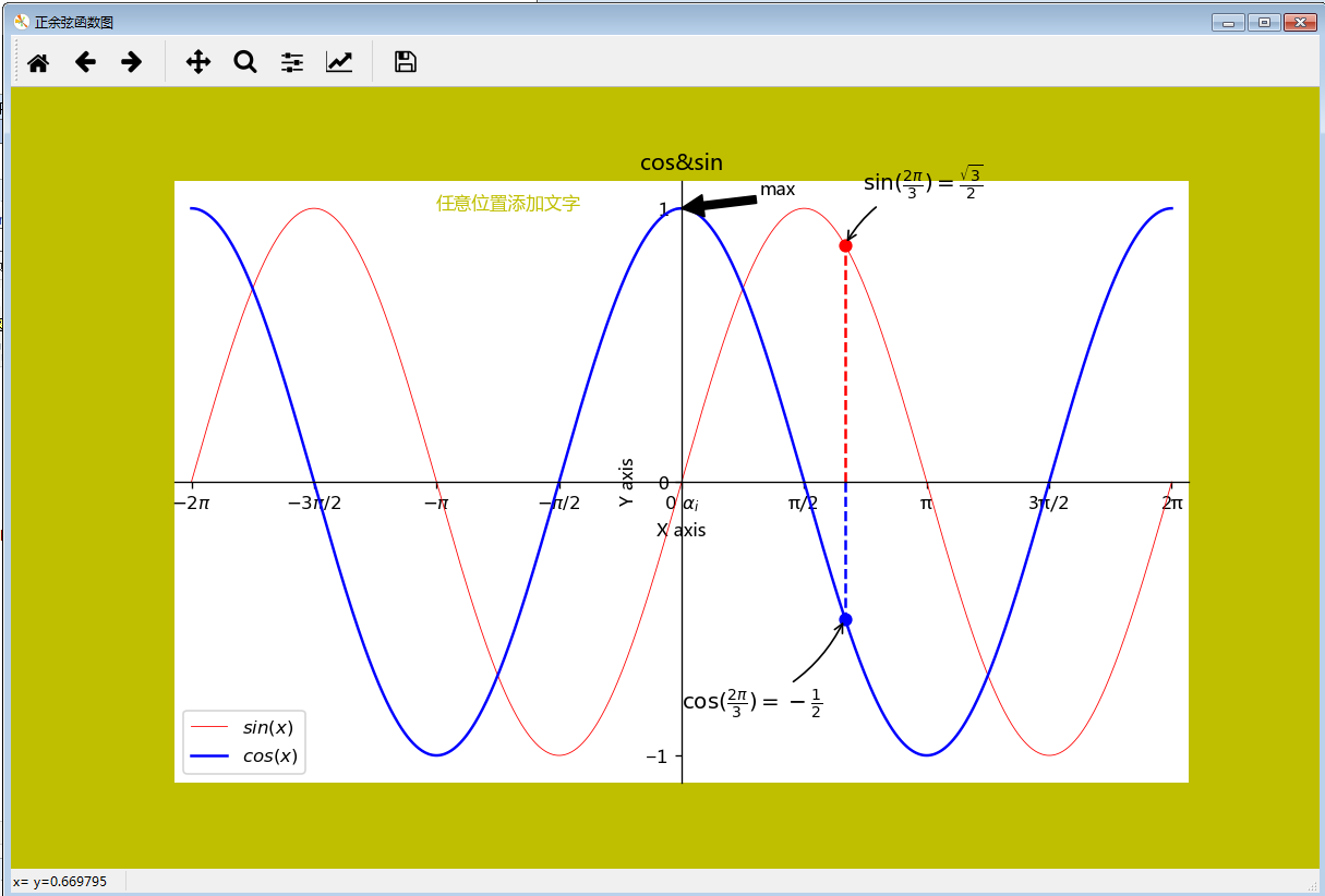
"""matplotlib绘图的基本操作"""


import matplotlib.pyplot as plt
import numpy as np

# 绘制普通图像
x = np.linspace(-2*np.pi, 2*np.pi, 1000)
y1 = np.sin(x)
y2 = np.cos(x)
y3 = np.cos(2*x)

# 创建figure对象,生成画板  # 参数依次是图名,大小,dpi,背景色,边缘色
plt.figure(num='正余弦函数图', figsize=(10, 6), dpi=120, facecolor='y', edgecolor='g')
    # 在绘制时设置lable, 逗号是必须的
l1 = plt.plot(x, y1, color='red', linestyle='-', linewidth=0.5, label='$sin(x)$')
l2 = plt.plot(x, y2, 'b', label='$cos(x)$')
    # plt.plot(x, y1, 'r--', x, y2, 'b-.', x, y3, 'g') 叠加图 在一个图画出多条不同格式的线
    # 设置坐标轴的取值范围
plt.axis((-6.5, 6.5, -1.1, 1.1))
    # plt.xlim((-6.5, 6.5))
    # plt.ylim((-1.1, 1.1))


# 设置坐标轴的lable
plt.xlabel('X axis')
plt.ylabel('Y axis')
# 设置x坐标轴刻度, 原来为0.25, 修改后为0.5 # plt.xticks(np.linspace(-2*np.pi, 2*np.pi, 9))
# 第一个参数是位置,第二个参数是标签lable,$使字体倾斜,\ 输出空格,\alpha_i输出数学符号α1也可直接alpha
plt.xticks((-2*np.pi, -3*np.pi/2, -np.pi, -np.pi/2, 0, np.pi/2, np.pi, 3*np.pi/2, 2*np.pi),
           ('$-2π$', '$-3π/2$', '$-π$', '$-π/2$', r'$0\ \alpha_i$', 'π/2', 'π', '3π/2', '2π'))
plt.yticks((-1, 0, 1))

# 设置、显示legend
plt.legend(loc='best')  # loc参数设置图例显示的位置


# 设置图表的标题
plt.title('cos&sin')
plt.text(-np.pi, 1, '任意位置添加文字',fontdict={'size': 10, 'color': 'y'})  # text在图中任意位置添加文字,前两个参数是左下角的位置坐标
plt.annotate('max', xy=(0, 1), xytext=(1, 1.05), arrowprops=dict(facecolor='k', shrink=1))  # 注释的地方xy(x,y)和插入文本的地方xytext(x1,y1)


# 移动坐标轴,spines为脊梁,即4个边框
ax = plt.gca()  # gca stands for 'get current axis'
ax.spines['right'].set_color('none')  # 设置右‘脊梁’为无色
ax.spines['top'].set_color('none')  # 设置上‘脊梁’为无色
ax.xaxis.set_ticks_position('bottom')  # 底部‘脊梁’设置为X轴
ax.spines['bottom'].set_position(('data', 0))  # 底部‘脊梁’移动位置,y的data
ax.yaxis.set_ticks_position('left')  # 左部‘脊梁’设置为Y轴
ax.spines['left'].set_position(('data', 0))  # 左部‘脊梁’移动位置,x的data


# 给特殊点做注释,在2π/3的位置给两条函数曲线加一个注释
plt.plot([2*np.pi/3, 2*np.pi/3], [0, np.sin(2*np.pi/3)], 'r--')  # xy是基于xycoords的data
plt.annotate(r'$\sin(\frac{2\pi}{3})=\frac{\sqrt{3}}{2}$', xy=(2*np.pi/3, np.sin(2*np.pi/3)), xycoords='data',
             xytext=(+10, +30), textcoords='offset points', fontsize=12, arrowprops=dict(arrowstyle="->",
             connectionstyle="arc3,rad=.2"))  # +10,+30表示基于xy加10,加30,textcoords='offset points'代表基于xy
plt.scatter([2*np.pi/3], [np.sin(2*np.pi/3)], 40, 'r')  # 绘制点x,y,大小,颜色
plt.plot([2*np.pi/3, 2*np.pi/3], [0, np.cos(2*np.pi/3)], 'b--')
plt.annotate(r'$\cos(\frac{2\pi}{3})=-\frac{1}{2}$', xy=(2*np.pi/3, np.cos(2*np.pi/3)), xycoords='data',
             xytext=(-90, -50), textcoords='offset points', fontsize=12, arrowprops=dict(arrowstyle="->",
             connectionstyle="arc3,rad=.2"))  # arrowprops设置指示线的格式,connectionstyle设置线的角度,弧度
plt.scatter([2*np.pi/3], [np.cos(2*np.pi/3)], 40, 'b')
plt.show()
以下参考自 Python--matplotlib绘图可视化知识点整理 - michael翔的IT私房菜 - SegmentFault https://segmentfault.com/a/1190000005104723
| 线条风格linestyle | 描述 | |||
|---|---|---|---|---|
| '-' | 实线 | ':' | 虚线 | |
| '--' | 破折线 | 'None', ' ', '' | 什么都不画 | |
| '-.' | 点划线 | |||
| 线条标记maker | 描述 | |||
|---|---|---|---|---|
| 'o' | 圆圈 | '.' | 点 | |
| 'D' | 菱形 | 's' | 正方形 | |
| 'h' | 六边形1 | '*' | 星号 | |
| 'H' | 六边形2 | 'd' | 小菱形 | |
| '_' | 水平线 | 'v' | 一角朝下的三角形 | |
| '8' | 八边形 | '<' | 一角朝左的三角形 | |
| 'p' | 五边形 | '>' | 一角朝右的三角形 | |
| ',' | 像素 | '^' | 一角朝上的三角形 | |
| '+' | 加号 | '\’ | 竖线 | |
| 'None','',' ' | 无 | 'x' | X | |
颜色
可以通过调用matplotlib.pyplot.colors()得到matplotlib支持的所有颜色。
| 别名 | 颜色 | 别名 | 颜色 | |
|---|---|---|---|---|
| b | 蓝色 | g | 绿色 | |
| r | 红色 | y | 黄色 | |
| c | 青色 | k | 黑色 | |
| m | 洋红色 | w | 白色 | |
如果这两种颜色不够用,还可以通过两种其他方式来定义颜色值:
-
使用HTML十六进制字符串
color='eeefff'使用合法的HTML颜色名字('red','chartreuse'等)。 -
也可以传入一个归一化到[0,1]的RGB元祖。
color=(0.3,0.3,0.4)
很多方法可以介绍颜色参数,如title()。
plt.tilte('Title in a custom color',color='#123456')
背景色
通过向如matplotlib.pyplot.axes()或者matplotlib.pyplot.subplot()这样的方法提供一个axisbg参数,可以指定坐标这的背景色。
subplot(111,axisbg=(0.1843,0.3098,0.3098)
标题title matplotlib命令与格式:标题(title),标注(annotate),文字说明(text) - CSDN博客 http://blog.csdn.net/helunqu2017/article/details/78659490
- boxstyle方框外形
- facecolor(简写fc)背景颜色
- edgecolor(简写ec)边框线条颜色
- edgewidth边框线条大小
(2)title例子
面向对象api例子:
import matplotlib.pyplot as plt
x=[1,2,3,4,5]
y=[3,6,7,9,2]
fig,ax=plt.subplots(1,1)
ax.plot(x,y,label='trend')
ax.set_title('title test',fontsize=12,color='r')
plt.show()</span>
plt.annotate()文本注释
在数据可视化的过程中,图片中的文字经常被用来注释图中的一些特征。使用annotate()方法可以很方便地添加此类注释。在使用annotate时,要考虑两个点的坐标:被注释的地方xy(x, y)和插入文本的地方xytext(x, y), 见以上程序。
(1)annotate语法说明 :annotate(s='str' ,xy=(x,y) ,xytext=(l1,l2) ,..)
s 为注释文本内容
xy 为被注释的坐标点
xytext 为注释文字的坐标位置
xycoords 参数如下:
- figure points points from the lower left of the figure 点在图左下方
- figure pixels pixels from the lower left of the figure 图左下角的像素
- figure fraction fraction of figure from lower left 左下角数字部分
- axes points points from lower left corner of axes 从左下角点的坐标
- axes pixels pixels from lower left corner of axes 从左下角的像素坐标
- axes fraction fraction of axes from lower left 左下角部分
- data use the coordinate system of the object being annotated(default) 使用的坐标系统被注释的对象(默认)
- polar(theta,r) if not native ‘data’ coordinates t
extcoords 设置注释文字偏移量
arrowprops #箭头参数,参数类型为字典dict
- width the width of the arrow in points 点箭头的宽度
- headwidth the width of the base of the arrow head in points 在点的箭头底座的宽度
- headlength the length of the arrow head in points 点箭头的长度
- shrink fraction of total length to ‘shrink’ from both ends 总长度为分数“缩水”从两端
- facecolor 箭头颜色
bbox给标题增加外框 ,常用参数如下:
- boxstyle方框外形
- facecolor(简写fc)背景颜色
- edgecolor(简写ec)边框线条颜色
- edgewidth边框线条大小
bbox=dict(boxstyle='round,pad=0.5', fc='yellow', ec='k',lw=1 ,alpha=0.5) #fc为facecolor,ec为edgecolor,lw为lineweight
(2)案例
- import matplotlib.pyplot as plt
- import numpy as np
- x = np.arange(0, 6)
- y = x * x
- plt.plot(x, y, marker='o')
- for xy in zip(x, y):
- plt.annotate("(%s,%s)" % xy, xy=xy, xytext=(-20, 10), textcoords='offset points')
- plt.show()
- <span style="font-size:14px;">plt.annotate('local max', xy=(2, 1), xytext=(3, 1.5),arrowprops=dict(facecolor='black', shrink=0.05))</span>
移动坐标系(Spines)
Spines 是连接轴刻度标记的线,是轴的边界,而且标明了数据区域的边界,可以被放置在任意位置。我们想要spines 置于中间。因为有四个spine(上下左右),我们将要通过设置颜色(无)丢弃上面和右侧的部分, 进而移动下面和左边的线到坐标0(数据空间)。 代码见上
text设置文字说明
(1)text语法说明
text(x,y,string,fontsize=15,verticalalignment="top",horizontalalignment="right")
x,y:表示坐标值上的值
string:表示说明文字
fontsize:表示字体大小
verticalalignment:垂直对齐方式 ,参数:[ ‘center’ | ‘top’ | ‘bottom’ | ‘baseline’ ]
horizontalalignment:水平对齐方式 ,参数:[ ‘center’ | ‘right’ | ‘left’ ]
xycoords选择指定的坐标轴系统:
- figure points points from the lower left of the figure 点在图左下方
- figure pixels pixels from the lower left of the figure 图左下角的像素
- figure fraction fraction of figure from lower left 左下角数字部分
- axes points points from lower left corner of axes 从左下角点的坐标
- axes pixels pixels from lower left corner of axes 从左下角的像素坐标
- axes fraction fraction of axes from lower left 左下角部分
- data use the coordinate system of the object being annotated(default) 使用的坐标系统被注释的对象(默认)
- polar(theta,r) if not native ‘data’ coordinates t
arrowprops #箭头参数,参数类型为字典dict
- width the width of the arrow in points 点箭头的宽度
- headwidth the width of the base of the arrow head in points 在点的箭头底座的宽度
- headlength the length of the arrow head in points 点箭头的长度
- shrink fraction of total length to ‘shrink’ from both ends 总长度为分数“缩水”从两端
- facecolor 箭头颜色
bbox给标题增加外框 ,常用参数如下:
- boxstyle方框外形
- facecolor(简写fc)背景颜色
- edgecolor(简写ec)边框线条颜色
- edgewidth边框线条大小
bbox=dict(boxstyle='round,pad=0.5', fc='yellow', ec='k',lw=1 ,alpha=0.5) #fc为facecolor,ec为edgecolor,lw为lineweight
(2)案例
- import matplotlib.pyplot as plt
- fig = plt.figure()
- plt.axis([0, 10, 0, 10])
- t = "This is a really long string that I'd rather have wrapped so that it"\
- " doesn't go outside of the figure, but if it's long enough it will go"\
- " off the top or bottom!"
- plt.text(4, 1, t, ha='left', rotation=15, wrap=True)
- plt.text(6, 5, t, ha='left', rotation=15, wrap=True)
- plt.text(5, 5, t, ha='right', rotation=-15, wrap=True)
- plt.text(5, 10, t, fontsize=18, style='oblique', ha='center',va='top',wrap=True)
- plt.text(3, 4, t, family='serif', style='italic', ha='right', wrap=True)
- plt.text(-1, 0, t, ha='left', rotation=-15, wrap=True)
- plt.show()
- import matplotlib.pyplot as plt
- plt.text(0.6, 0.5, "test", size=50, rotation=30.,ha="center", va="center",bbox=dict(boxstyle="round",ec=(1., 0.5, 0.5),fc=(1., 0.8, 0.8),))
- plt.text(0.5, 0.4, "test", size=50, rotation=-30.,ha="right", va="top",bbox=dict(boxstyle="square",ec=(1., 0.5, 0.5),fc=(1., 0.8, 0.8),))
- plt.draw()
- plt.show()
数学公式:
- plt.title(r'$\alpha_i > \beta_i$', fontsize=20)
- plt.text(1, -0.6, r'$\sum_{i=0}^\infty x_i$', fontsize=20)
- plt.text(0.6, 0.6, r'$\mathcal{A}\mathrm{sin}(2 \omega t)$',fontsize=20)

 浙公网安备 33010602011771号