H5 竖屏显示
1、在H5开发中,我们开发一个商城,是竖屏开发的,可能有某些用户手机设置自动旋转,
这个时候横屏状况下我们的商城 就容易产生样式错乱且格外的不好看,所以我们要在用户手机为横屏的状况下给与用户提醒,让用户在正常竖屏的情况下使用软件,上代码index.html:
<body>
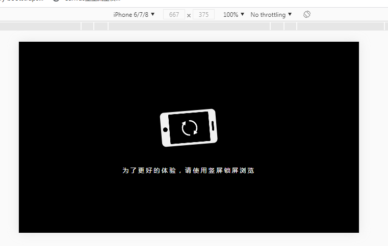
<!-- 提醒用户竖屏 -->
<div id="mark">
<div class="mark-box">
<i class="icon-phone"></i>
<p class="message">为了更好的体验,请使用竖屏方式浏览</p>
</div>
</div>
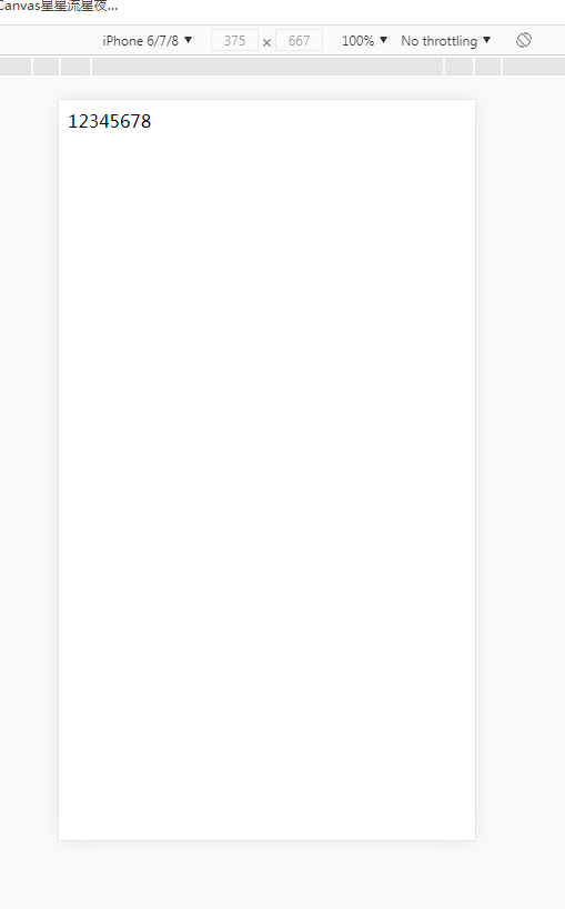
<div id="content">
12345678
</div>
</body>
2、接下来是css代码:
<style type="text/css">

        /* 提醒用户竖屏 */
        #mark {
            position: fixed;
            width: 100vw;
            height: 100vh;
            background: #000000;
            display: none;
        }

        #mark .mark-box {
            position: absolute;
            top: 50%;
            left: 50%;
            transform: translate(-50%,-50%);

        }

        #mark .icon-phone {
           display: block;
            margin: 0 auto;
            width: 67px;
            height: 109px;
            background: url(./img/shuping.png) no-repeat center center/cover;
            animation: ani-phone 1s ease-in-out infinite alternate;
        }

        /* 提醒用户竖屏的动画 */
        @keyframes ani-phone {
            /* from {transform: rotate(0)} */
            to {
                transform: rotate(90deg)
            }
        }

        #mark .message {
            color: #FFF;
            margin-top: 20px;
            letter-spacing: 0.5vw;
        }


        /* 当用户横屏的状态下 注意:这里的媒体查询需要放在#mark的样式下面,这样才能进行覆盖上面的样式 */
        @media only screen and (orientation:landscape) {
            #mark {
                display: block;
            }
        }

    </style>
3、同样我们在浏览器先试一遍,效果图如下: 横屏状态下提示用户改为竖屏,竖屏状态下正常显示内容

 浙公网安备 33010602011771号