2019.11.1 多媒体查询
一、多媒体查询
html:
<!DOCTYPE html>
<html>
    <head>
        <meta charset="utf-8">
        <title>duomeiti</title>
        <style type="text/css">
            body{
                margin: 0 auto;
            }
            #best{
                text-align: center;
                box-sizing: border-box;
                width: 100%;
                height: 500px;
                background-color: #0769ad;
            }
            /* 大框架结束 */
            #one{
                box-sizing: border-box;
                display: flex;
                justify-content: flex-end;
                width: 100%;
                height: 45px;
                background: linear-gradient(180deg,#333333,#323232,#333333);
            }
            .o1{
                box-sizing: border-box;
                width: 110px;
                height: 45px;
                text-align: center;
                line-height: 45px;
                color: white;
                border: 1px solid  #636363;
            }
            .o1:hover{
                cursor: pointer;
            }
            /* 导航栏结束 */
            #two{
                box-sizing: border-box;
                display: flex;
                width: 100%;
                height: 150px;
                border-top: 1px solid #7acef4;
                justify-content: space-between;
            }
            #t1{
                padding-left: 35px;
                width: 20%;
                height: 150px;
                line-height: 206px;
            }
            #t1:hover img{
                cursor: pointer;
            }
            #t1 img{
                width: 210px;
                height: 60px;
            }
            #t2{
                display: flex;
                justify-content: flex-end;
                align-items: center;
                height: 100%;
                width: 80%;
                line-height: 245px;
                padding-right: 67px;
            }
            #t2:hover img{
                cursor: pointer;
            }
            #t2 img{
                width: 420px;
                height: 100px;
            }
            /* 间隔结束 */
            #three{
                border-radius: 8px;
                height: 50px;
                margin-left: 5%;
                width: 90%;
                background-color: #636363;
                display: flex;
                justify-content: center;
                justify-content: space-between;
            }
            #zuoce{
                height: 50px;
                width: 33%;
                display: flex;
            }
            #youce{
                box-sizing: border-box;
                padding-right: 22px;
                height: 50px;
                width: 67%;
                display: flex;
                justify-content: flex-end;
                align-items: center;
            }
            .d1{
                width: 80px;
                height: 50px;
                box-sizing: border-box;
                text-align: center;
                line-height: 50px;
                color: white;
                font-weight: bold;
            }
            .d1:hover{
                cursor: pointer;
            }
            #youce input{
                width: 45%;
                height: 16px;
                border-radius: 16px;
            }
            /* 内导航结束 */
            #four{
                margin-left: 5%;
                display: flex;
                width: 90%;
                height: 200px;
                background-color: #333;
            }
            .f1{
                box-sizing: border-box;
                width: 20%;
                height: 200px;
                display: flex;
                justify-content: space-around;
                align-items: center;
            }
            .f1 img{
                width: 150px;
                height: 150px;
            }
            #f2{
                box-sizing: border-box;
                width: 40%;
                height: 200px;
                display: flex;
                align-items: center;
                justify-content: center;
            }
            #f2 img{
                width: 300px;
                height: 150px;
            }
            /* 四个板块结束 */
        </style>
        <link rel="stylesheet" type="text/css" href="2019.10.30.zy.css"/>
        <link rel="stylesheet" type="text/css" href="2019.10.30.zy.css"/>
    </head>
    <body>
        <div id="best"><!-- 大框架 -->
            <div id="one"><!-- 导航栏 -->
                <div class="o1">
                    首页
                </div>
                <div class="o1">
                    番剧
                </div>
                <div class="o1">
                    电影
                </div>
                <div class="o1">
                    音乐
                </div>
                <div class="o1">
                    登录
                </div>
            </div>
            <div id="two"><!-- 间隔 -->
                <div id="t1">
                    <img src="../image/logo-jquery.png" >
                </div>
                <div id="t2">
                    <img src="../image/傻逼图片.png" >
                </div>
            </div>
            <div id="three"><!-- 内导航 -->
                <div id="zuoce">
                    <div class="d1">
                        首页
                    </div>
                    <div class="d1">
                        番剧
                    </div>
                    <div class="d1">
                        电影
                    </div>
                    <div class="d1">
                        音乐
                    </div>
                    <div class="d1">
                        登录
                    </div>
                </div>
                <div id="youce">
                    <input type="text" name="" id="" value=""/>
                </div>
            </div>
            <div id="four"><!-- 四个板块 -->
                <div class="f1">
                    <img src="../image/头像3.jpg" >
                </div>
                <div class="f1">
                    <img src="../image/头像3.jpg" >
                </div>
                <div class="f1">
                    <img src="../image/头像3.jpg" >
                </div>
                <div id="f2">
                    <img src="../image/111.png" >
                </div>
            </div>
        </div>
    </body>
</html>
css:
@media screen and (max-width:800px){
                #one{
                    justify-content: flex-start;
                }
                #two{
                    box-sizing: border-box;
                    display: flex;
                    width: 100%;
                    height: 260px;
                    border-top: 1px solid #7acef4;
                    flex-wrap: wrap;
                    justify-content: center;
                    align-items: center;
                }
                #t1{
                    display: flex;
                    justify-content: center;
                    width: 100%;
                    height: 25px;
                }
                #t2{
                    justify-content: center;
                    display: flex;
                    align-items: center;
                    height: 44px;
                    width: 100%;
                }
                #three{
                    border-radius: 8px;
                    height: 140px;
                    margin-left: 5%;
                    width: 90%;
                    background-color: #636363;
                    display: flex;
                    flex-wrap: wrap;
                    justify-content: center;
                    align-items: center;
                }
                #zuoce{
                    height: 60px;
                    width: 100%;
                    display: flex;
                    justify-content: center;
                }
                #youce{
                    border-top: 1px solid white;
                    box-sizing: border-box;
                    height: 80px;
                    width: 100%;
                    display: flex;
                    justify-content: center;
                    align-items: center;
                    padding-right: 0px;
                }
                .d1{
                    width: 20%;
                    height: 50px;
                    box-sizing: border-box;
                    text-align: center;
                    line-height: 50px;
                    color: white;
                    font-weight: bold;
                }
                #youce input{
                    width: 80%;
                    height: 16px;
                    border-radius: 16px;
                }
}
@media screen and (max-width:900px){
                #four{
                    margin-left: 5%;
                    width: 90%;
                    height: 800px;
                    display: flex;
                    flex-wrap: wrap;
                    background-color: #333;
                }
                #best{
                    text-align: center;
                    box-sizing: border-box;
                    width: 100%;
                    height: 1300px;
                    background-color: #0769ad;
                }
                .f1{
                    box-sizing: border-box;
                    width: 100%;
                    height: 200px;
                    display: flex;
                    align-items: center;
                    justify-content: center;
                    order: 2;
                }
                #f2{
                    box-sizing: border-box;
                    width: 100%;
                    height: 200px;
                    display: flex;
                    align-items: center;
                    justify-content: center;
                    order: 1;
                }
                .f1 img{
                    width: 180px;
                    height: 180px;
                }
                #f2 img{
                    width: 400px;
                    height: 180px;
                }
}
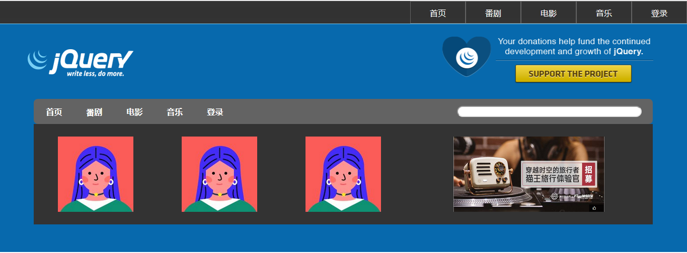
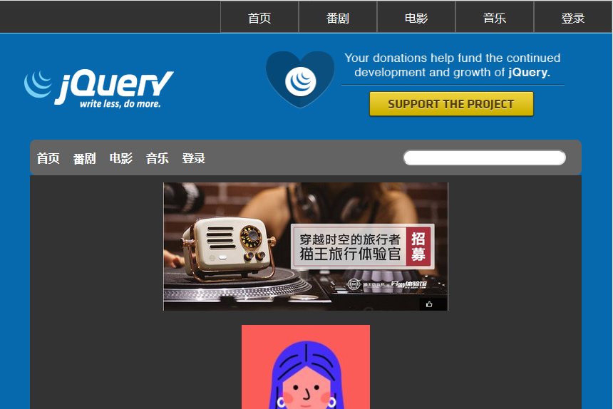
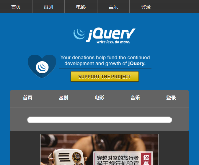
效果图:
二、代码
@media screen and (max-width:800px){ } 多媒体查询最大宽度800px
@media screen and (min-width:800px){ } 多媒体查询最小宽度800px

 浙公网安备 33010602011771号