
一、问题场景
html文件:
<!DOCTYPE html>
<html>

<head>
    <meta charset="utf-8">
    <title>blog</title>
    <link href="" rel="stylesheet">
    <link rel="stylesheet" href="css/reset.css">
    <link rel="stylesheet" href="css/main.css">
</head>

<body>
    <!--页头开始-->

    <head>
        <nav>
            <div class="logo"><a href="#">XX</a></div>
            <ul>
                <li><a href="#" class="active">首页</a></li>
                <li><a href="#">链接2</a></li>
                <li><a href="#">链接3</a></li>
                <li><a href="#">链接4</a></li>
            </ul>
        </nav>
        <div id="banner">
            <div class="inner">
                <h1>XX的网站</h1>
                <p class="sub-heading">Lorem ipsum dolor sit amet, consectetur adipisicing elit. </p>
                <button>了解我</button>
                <div class="more">
                    更多
                </div>
            </div>
        </div>
    </head>
    <!--页头结束-->
    <!--内容开始-->
    <div class="content">
        <section class="green-section">
            <div class="wrapper">
                <div>
                    <h2>一个标题</h2>
                    <div class="hr"></div>
                    <p class="sub-heading">Lorem ipsum dolor sit amet, consectetur adipisicing elit.</p>
                </div>
                <div class="icon-group">
                    <span class="icon">item1</span>
                    <span class="icon">item2</span>
                    <span class="icon">item3</span>
                </div>
            </div>
        </section>
        <section class="gray-section">
            <div class="article-preview">
                <div class="img-section">
                    <img src="img/pic01.jpg" alt="">
                </div>
                <div class="text-section">
                    <h2>又一个标题</h2>
                    <p>Lorem ipsum dolor sit amet, consectetur adipisicing elit.</p>
                </div>
            </div>
        </section>
        <section class="purple-section"></section>
    </div>
    <!--内容结束-->
    <!--页尾结束-->
    <footer></footer>
    <!--页头结束-->
</body>

</html>
css文件
@charset "UTF-8";


nav {
    background-color: #ccc;
    height: 50px;
}

#banner {
    background-color: #777;
    height: 700px;
}

nav ul {
    list-style: none;
    margin: 0;
    float: right;
}

nav ul li,
nav .logo {
    display: inline-block;
    line-height: 50px;
    margin-right: 20px;
}

nav ul li a {
    line-height: 50px;
    text-decoration: none;
    display: inline-block;
    height: inherit;
    color: #fff;
}

nav .logo {
    float: left;
    margin-left: 10px;
    line-height: 50px;
}

#banner .inner {
    max-width: 300px;
    text-align: center;
    margin: 0 auto;
    position: relative;
    top: 160px;
}

#banner .inner h1 {
    margin: 0;
}

button {
    border: none;
    background: #333;
    color: #eee;
    padding: 10px;
}

#banner button {
    padding: 14px 40px;
}

#banner .inner .more {
    margin-top: 200px;
}

.sub-heading {
    line-height: 30px;
    margin: 30px;
}

.logo {
    font-size: 20px;
    font-weight: bold;
    letter-spacing: 1px;
}

.logo a {
    color: #fff;
}
.active{
    border-bottom: 4px solid #fff;
}
h1{
    padding: 12px;
    border-top: 2px solid #fff;
    border-bottom: 2px solid #fff;
}

h2{
    margin: 0px;
    font-size: 30px;
}
.hr{
    height: 2px;
    width: 100%;
    margin:20px auto;
}

.sub-heading {
    font-size: 18px;
}

#main-btn{
    padding: 14px 28px;
    font-size: 20px;
    letter-spacing: 4px;
    border-radius: 6px;
    background: #18a;
}
.green-section{
    text-align: center;
    background: #089DB0;
    color: #fff;
    padding: 100px 0;
}
.green-section .hr{
    background: #078494;
    width: 60%;
}
.green-section .icon-group .icon{
    display: inline-block;
    width: 80px;
    height: 80px;
    border: 1px solid #0D6F7C;
    transform: rotate(45deg);
    margin:20px;
}

.icon-group{
    margin-top: 60px;
}
.wrapper{
    max-width: 1080px;
    margin: 0 auto;

}
.gray-section{
    background:#252F34 ;
    color: #fff;
}
.gray-section .img-section{
    width: 45%;
}
.img-section img{
    width: 100%;
}
.gray-section .text-section{
    width: 55%;
}
.article-preview >div{
    float: left;
}
.article-preview:after{
    content: '';
    display: block;
    clear: both;
}
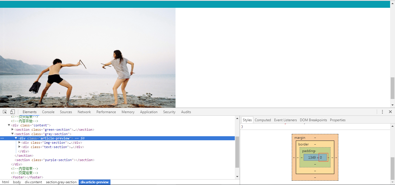
删除了.article-preview:after效果,可以看到.article-preview的高度为0
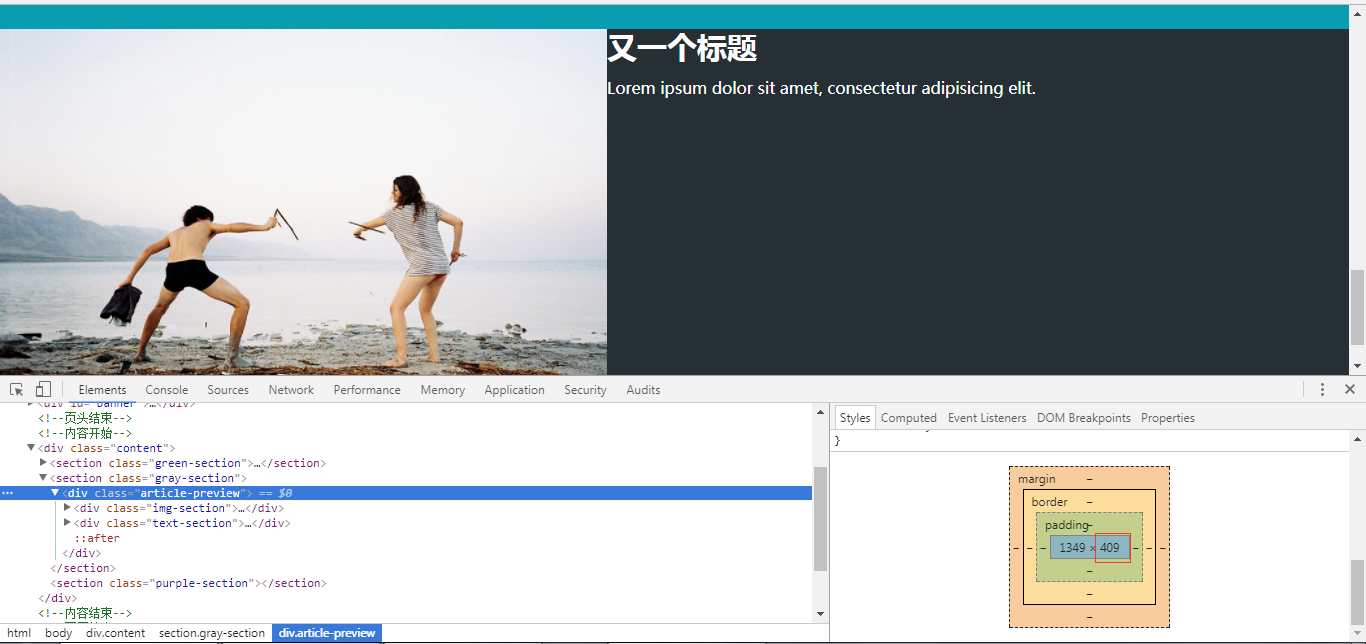
加上.article-preview:after的效果,可以看到.article-preview的高度为409
二、问题分析
如果所有子元素都浮动,则父级盒子中的所有内容均脱离标准文档流,此时的父级盒子里面相当于没有内容,因为都飘离文档流了,也就是说父级盒子的高度为零,则呈现网页本身(body)的白色,设置了clear:both清除浮动之后,相当于此时的子元素拥有浮动属性可以并排显示,但并没有脱离标准文档流,即填充了整个父盒子。
除了clear:both清除浮动解决浮动塌陷这种情况外,还可以给父盒子设置一个合理的高度,也可以解决浮动塌陷,不会出现如上背景变为白色的情况。
三、实际应用总结
由于这种场景应用非常多,一般我们会在css中定义一个类的样式
如下
.clearfix:after{
    content: '';
    display: block;
    clear: both;
}
需要使用时只需要加上类即可
<div class="card-group clearfix"></div>

 浙公网安备 33010602011771号