WPF-自定义实现步骤条控件
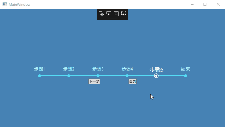
步骤条实现的效果:
步骤条控件是在listbox的基础上实现的。
一、
xaml代码:
  <Window.Resources>
        <convert1:StepListBarWidthConverter x:Key="StepListStepWidthConverter" />
        <ControlTemplate x:Key="NormalItemTemplate" TargetType="ListBoxItem">
            <Grid>
                <Grid.RowDefinitions>
                    <RowDefinition />
                    <RowDefinition Height="20" />
                </Grid.RowDefinitions>
                <ContentPresenter HorizontalAlignment="Center" Content="{TemplateBinding Content}" />
                <Grid Grid.Row="1" Margin="2">
                    <Ellipse
                        Width="10"
                        Height="10"
                        HorizontalAlignment="Center"
                        VerticalAlignment="Center"
                        Fill="#55DCF5" />
                </Grid>
            </Grid>
        </ControlTemplate>
        <Style x:Key="StepListBoxStyle" TargetType="ListBox">
            <Setter Property="Template">
                <Setter.Value>
                    <ControlTemplate TargetType="ListBox">
                        <Grid>
                            <Rectangle
                                Width="510"
                                Height="4"
                                Margin="0,0,0,8"
                                HorizontalAlignment="Center"
                                VerticalAlignment="Bottom"
                                Fill="#55DCF5" />
                            <ItemsPresenter />
                        </Grid>
                    </ControlTemplate>
                </Setter.Value>
            </Setter>
        </Style>

        <ControlTemplate x:Key="SelectedTemplate" TargetType="ListBoxItem">
            <Grid>
                <Grid.RowDefinitions>
                    <RowDefinition />
                    <RowDefinition Height="20" />
                </Grid.RowDefinitions>
                <ContentPresenter HorizontalAlignment="Center" Content="{TemplateBinding Content}" />
                <Grid Grid.Row="1" Margin="2">
                    <Ellipse
                        Width="8"
                        Height="8"
                        VerticalAlignment="Center"
                        Panel.ZIndex="3">
                        <Ellipse.Fill>
                            <SolidColorBrush Color="#FFFFFF" />
                        </Ellipse.Fill>
                    </Ellipse>
                    <Ellipse
                        Width="12"
                        Height="12"
                        VerticalAlignment="Center"
                        Panel.ZIndex="2">
                        <Ellipse.Fill>
                            <SolidColorBrush Color="#225BA7" />
                        </Ellipse.Fill>
                    </Ellipse>
                    <Ellipse
                        Width="16"
                        Height="16"
                        VerticalAlignment="Center"
                        Panel.ZIndex="1">
                        <Ellipse.Fill>
                            <SolidColorBrush Color="#FFFFFF" />
                        </Ellipse.Fill>
                    </Ellipse>
                </Grid>
            </Grid>
        </ControlTemplate>
        <Style x:Key="ListBoxItemStyle" TargetType="ListBoxItem">
            <Setter Property="Width" Value="{Binding RelativeSource={RelativeSource AncestorType=ListBox}, Converter={StaticResource StepListStepWidthConverter}}" />
            <Setter Property="FontSize" Value="16" />
            <Setter Property="FontFamily" Value="SimHei" />
            <Setter Property="Foreground" Value="#ACF1FE" />
            <Setter Property="Template" Value="{StaticResource NormalItemTemplate}" />
            <Style.Triggers>
                <Trigger Property="IsSelected" Value="True">
                    <Trigger.Setters>
                        <Setter Property="Template" Value="{StaticResource SelectedTemplate}" />
                        <Setter Property="FontSize" Value="20" />
                        <Setter Property="Foreground" Value="White" />
                        <Setter Property="FontFamily" Value="SimHei" />
                    </Trigger.Setters>
                </Trigger>
            </Style.Triggers>
        </Style>

    </Window.Resources>
    <StackPanel Background="SteelBlue">
        <ListBox
            Margin="0 200 0 0"
            x:Name="NavList"
            HorizontalAlignment="Center"
            BorderThickness="0"
            Foreground="#225BA7"
            IsEnabled="False"
            ItemContainerStyle="{StaticResource ListBoxItemStyle}"
            SelectedIndex="4"
            Style="{StaticResource StepListBoxStyle}">
            <ListBox.ItemsPanel>
                <ItemsPanelTemplate>
                    <StackPanel IsItemsHost="False" Orientation="Horizontal" />
                </ItemsPanelTemplate>
            </ListBox.ItemsPanel>
            <ListBoxItem>1</ListBoxItem>
            <ListBoxItem>2</ListBoxItem>
            <ListBoxItem>3</ListBoxItem>
            <ListBoxItem>4</ListBoxItem>
            <ListBoxItem>5</ListBoxItem>
            <ListBoxItem>6</ListBoxItem>

        </ListBox>
        <StackPanel HorizontalAlignment="Center" Orientation="Horizontal">
            <Button Click="Button_Click">下一步</Button>
            <Button Margin="100,0,0,0" Click="Button_Click_1">首页</Button>
        </StackPanel>
    </StackPanel>
各个样式模板介绍:StepListBoxStyle,整个步骤条控件的样式,矩形长条模板。
NormalItemTemplate,未被选中时单个步骤样式。
SelectedTemplate,被选中时单个步骤样式。
ListBoxItemStyle,通过样式和触发器使用模板。
二、需要固定步骤条总长度,根据项数设置步骤条步长,所以需要写个转换器,设置每项长度。
转换器代码:
    class StepListBarWidthConverter : IValueConverter
    {
        public object Convert(object value, Type targetType, object parameter, CultureInfo culture)
        {
            ListBox listBox = value as ListBox;
            if (listBox==null)
            {
                return Binding.DoNothing;
            }
            if (listBox.Items.Count == 0)
            {
                return 0;
            }
            return 510 / (listBox.Items.Count - 1);
        }

        public object ConvertBack(object value, Type targetType, object parameter, CultureInfo culture)
        {
            return Binding.DoNothing;
        }
    }
使用的时候对Listbox的ItemSource和SelectedIndex进行绑定即可。

 浙公网安备 33010602011771号