
::before和::after伪元素的用法
一、介绍
css3为了区分伪类和伪元素,伪元素采用双冒号写法。
常见伪类——:hover,:link,:active,:target,:not(),:focus。
常见伪元素——::first-letter,::first-line,::before,::after,::selection。
::before和::after下特有的content,用于在css渲染中向元素逻辑上的头部或尾部添加内容。
这些添加不会出现在DOM中,不会改变文档内容,不可复制,仅仅是在css渲染层加入。
所以不要用:before或:after展示有实际意义的内容,尽量使用它们显示修饰性内容,例如图标。
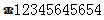
举例:网站有些联系电话,希望在它们前加一个icon☎,就可以使用:before伪元素,如下:

<!DOCTYPE html>
<meta charset="utf-8" />
<style type="text/css">
    .phoneNumber::before {
    content:'\260E';
    font-size: 15px;
}
</style>
<p class="phoneNumber">12345645654</p>
Note:这些特殊字符的html,js和css的写法是不同的,具体可查看html特殊字符的html,js,css写法汇总。
二、content属性
::before和::after必须配合content属性来使用,content用来定义插入的内容,content必须有值,至少是空。默认情况下,伪类元素的display是默认值inline,可以通过设置display:block来改变其显示。
content可取以下值。
1、string
使用引号包一段字符串,将会向元素内容中添加字符串。如:a:after{content:""}
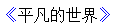
举例:
<!DOCTYPE html>
<meta charset="utf-8" />
<style type="text/css">
p::before{
    content: "《";
    color: blue;
}
p::after{
    content: "》";
    color: blue;
}
</style>
<p>平凡的世界</p>
2、attr()
通过attr()调用当前元素的属性,比如将图片alt提示文字或者链接的href地址显示出来。
<style type="text/css">
a::after{
    content: "(" attr(href) ")";
}
</style>
<a href="http://www.cnblogs.com/starof">starof</a>

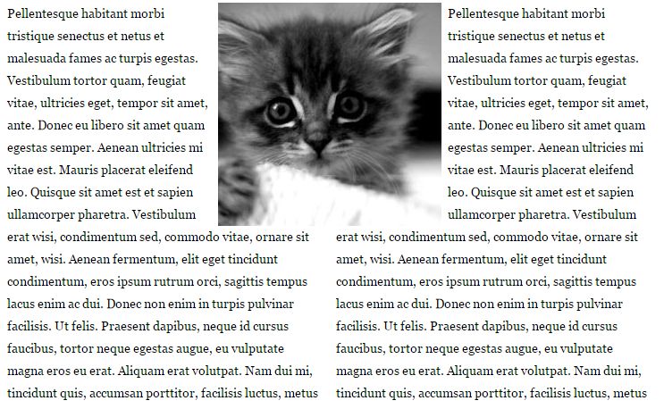
3、url()/uri()
用于引用媒体文件。
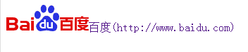
举例:“百度”前面给出一张图片,后面给出href属性。
<style>
a::before{
    content: url("https://www.baidu.com/img/baidu_jgylogo3.gif");
}
a::after{
    content:"("attr(href)")";
}
a{
    text-decoration: none;
}
</style>
---------------------------
<body>
<a href="http://www.baidu.com">百度</a>
</body>
效果:
4、counter()
调用计数器,可以不使用列表元素实现序号功能。
配合counter-increment和counter-reset属性使用:
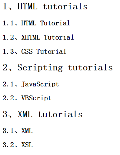
h2:before { counter-increment: chapter; content: "Chapter " counter(chapter) ". " }
代码:
<style>
body{
    counter-reset: section;
}
h1{
    counter-reset: subsection;
}
h1:before{
    counter-increment:section;
    content:counter(section) "、";
}
h2:before{
    counter-increment:subsection;
    content: counter(section) "." counter(subsection) "、";
}
</style>
------------------------------------------------
<body>
<h1>HTML tutorials</h1>
<h2>HTML Tutorial</h2>
<h2>XHTML Tutorial</h2>
<h2>CSS Tutorial</h2>

<h1>Scripting tutorials</h1>
<h2>JavaScript</h2>
<h2>VBScript</h2>

<h1>XML tutorials</h1>
<h2>XML</h2>
<h2>XSL</h2>

</body>
效果:
了解更多可参考:https://developer.mozilla.org/en-US/docs/Web/Guide/CSS/Counters
三、使用
1、清除浮动
清除浮动方法有多种,现在最常用的就是下面这种方法,仅需要以下样式即可在元素尾部自动清除浮动
.cf:before,
.cf:after {
    content: " ";
    display: table;
}
.cf:after {
    clear: both;
}
.cf {
    *zoom: 1;
}
2、模拟float:center的效果
float没有center这个取值,但是可以通过伪类来模拟实现。
这个效果实现很有意思,左右通过::before float各自留出一半图片的位置,再把图片绝对定位上去。
核心css如下:
#page-wrap { width: 60%; margin: 40px auto; position: relative; }
#logo { position: absolute; top: 0; left: 50%; margin-left: -125px; }
#l, #r { width: 49%; }
#l { float: left; }
#r { float: right; }
#l:before, #r:before { content: ""; width: 125px; height: 250px; }
#l:before { float: right; }
#r:before { float: left; }
完整代码如下:
 View Code
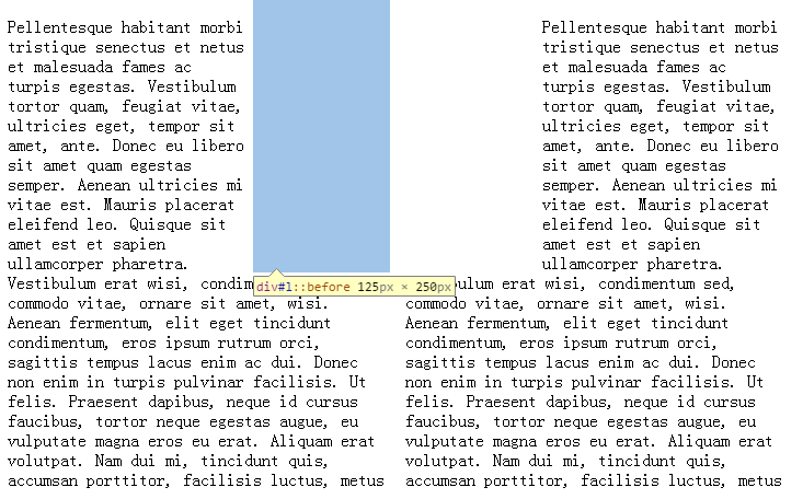
出自:https://css-tricks.com/float-center/
3、做出各种图形效果
举例:一个六角星
<style>
#star-six {
  width: 0;
  height: 0;
  border-left: 50px solid transparent;
  border-right: 50px solid transparent;
  border-bottom: 100px solid red;
  position: relative;
}
#star-six::after {
  width: 0;
  height: 0;
  border-left: 50px solid transparent;
  border-right: 50px solid transparent;
  border-top: 100px solid red;
  position: absolute;
  content: "";
  top: 30px;
  left: -50px;
}
</style>
<body>
<div id="star-six"></div>
</body>
#star-six的div是一个正三角行,#star-six::after是一个倒三角形,通过绝对定位,调整其位置即可实现六角星的效果。
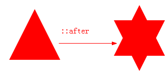
点我查看更多。
4、不使用图片创建小图标
举例:比如一个电话
很巧妙的应用一个div左border加圆角当机身,::before和::after配合圆角当听筒。
<style type="text/css">
    #phone{width:50px;height:50px;border-left:6px solid #EEB422;border-radius:20%;transform:rotate(-30deg);-webkit-transform:rotate(-30deg);margin:20px;margin-right:0px;position:relative;display: inline-block;top: -5px;}
    #phone:before{width:15px;height:15px;background:#EEB422;border-radius: 20%;content: "";position: absolute;left:-2px;top: 1px;}
    #phone:after{width:15px;height:15px;background:#EEB422;border-radius: 20%;content: "";position: absolute;left:-3px;top: 34px;}
</style>
<div id="wraper">
    <div id="phone"></div>
</div>

更多图标:
View Code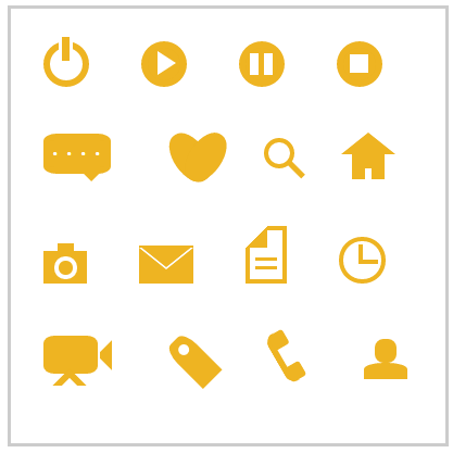
这个效果来自:http://www.w3cfuns.com/blog-5444604-5402127.html
有大神用伪元素创建了84种小图标,具体可查看http://nicolasgallagher.com/pure-css-gui-icons/
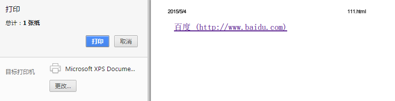
5、显示打印网页的URL
<style>
@media print {
  a[href]:after {
    content: " (" attr(href) ") ";
  }
}
</style><body>
<a href="http://www.baidu.com">百度</a>
</body>
6、给blockquote添加引号
经常用到给blockquote 引用段添加巨大的引号作为背景,可以用 ::before 来代替 background 。好处是即可以给背景留下空间,还可以直接使用文字而非图片:
<meta charset="utf-8"/>
<style type="text/css">
    blockquote::before {
    content: open-quote;
    color: #ddd;
    z-index: -1;
    font-size:80px;
}
</style>
<blockquote>引用一个段落,双引号用::before伪元素实现</blockquote>

7、超链接特效
举例:配合 CSS定位实现一个鼠标移上去,超链接出现方括号的效果
<meta charset="utf-8" />
<style type="text/css">
body{
    background-color: #425a6c;
}
    a {
    position: relative;
    display: inline-block;
    outline: none;
    color: #fff;
    text-decoration: none;
    font-size: 32px;
    padding: 5px 20px;
}
a:hover::before, a:hover::after { position: absolute; }
a:hover::before { content: "\5B"; left: -10px; }
a:hover::after { content: "\5D"; right:  -10px; }
</style>
<a>鼠标移上去出现方括号</a>
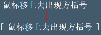
更多创意链接特效可参考: Creative Link Effects 。
8、::before和::after实现多背景图片
举例:一个标签应用5张背景图
View Code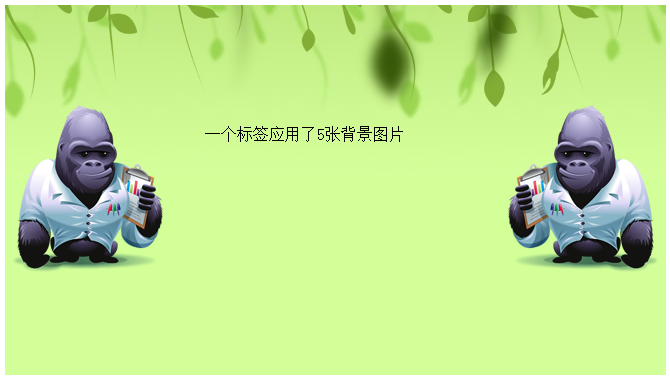
原效果来自:Multiple Backgrounds and Borders with CSS 2.1
这个效果看的真的是脑洞大开,虽然多背景图用css3的background-image很容易就能实现。但是这篇文章是10年写的,已经过去5年了,想想也正是他们这样的尝试和努力才加速了css3标准的制定,让今天的开发更easy。今天的我们又能为5年后的开发人员做些什么贡献呢?


 浙公网安备 33010602011771号