

CSS – 冷知识 (新手)
<img> extra 4px at the bottom
参考:
Extra 4px at the bottom of html <img>
The mysterious 4px gap in between images
效果

红色部分多出来的 4px. 原因是 img 是 inline element, 它可以和 text 并排.

注意紫色图片的位置, 这个叫 vertical-align, 默认是 baseline, 和字对齐, 所以它会有一个 4px, 因为字就是这样.
所以要解决这个 4px 的问题. 可以 set vertical-align: bottom 或者直接把 img 换成 display:block (比如 Tailwind CSS 的 base 就是这样干的) 关键是懂原理, 之后用什么 solution 就看情况而已, 不担心了.
提醒: canvas, svg 也是有同样问题哦.
另一个关于 inline spacing 的相关问题: Space below inline elements inside a block element (以后才研究)
更新 06-06-2022
上面说到用 display: block 也可以解决这个问题, 但有些场景会翻车

HTML
<div class="wrapper">
  <a href="#">
    <img src="./images/logo.png" />
  </a>
</div>
CSS Style
.wrapper {
  background-color: red;
  a {
    width: 224px;
    display: inline-block;
    background-color: blue;
    img {
      display: block;
      background-color: pink;
      max-width: 100%;
    }
  }
}
img 虽然是 block, 但是 parent anchor 是 inline-block, 这样也是不行的哦. anchor 也必须是 block (注: 而且 inline element 里面最好不要有 block element, 风水不对)
所以我觉得吧, vertical-align: bottom 的方案比较理想.
textarea 也有相同问题

红色是 textare, 蓝色是多出来的 4px, input 倒是没有这个问题哦.
CSS Selector 是不区分大小写的 (case-insensitive)
[myTargetElement] {
  background-color: red;
}

[mytargetelement] {
  background-color: red;
}
上面这 2 给 attribute selector 是完全等价的。
当 absolute / fixed 遇上 width / height auto
参考
stackoverflow – width:auto and fixed position
有时候当我们修改 div 的 position 之后会发现它变小了.
div block element width: auto 相等于 100% 对标 parent. 但是经过 position absolute 以后变成了 hug content.
在 MDN 有一段就是声明这个的.

如果希望保留原本的效果可以设置 left:0; right:0. 或者不要使用 width: auto 改成 100%.
Position absolute 导致 parent overflow
通常是影响到 body scroll. 这里只是举例子, 所以用普通 div 模拟.
<div class="container">
  <h1>Hello World</h1>
  <div class="box"></div>
</div>
CSS style
.container {
  border: 1px solid red;
  position: relative;
  height: 300px;
  width: 300px;
  overflow-x: auto;
}

.box {
  width: 150px;
  height: 150px;
  background-color: pink;
  position: absolute;
  right: -20%;
}
效果

只有 right 和 bottom negative 才会,top 和 left 是不会出现 scrollbar 的哦。
why?
参考: stackoverflow – Why does position absolute make page to overflow?


很深, 目前无法理解. 总之就是会影响到就是了. 解决方法就是 overflow: hidden or clip,注: translateX,Y 也是会哦.
Transition 对 height: auto / fit-content 无效
<div class="box">
  <p>
    Lorem ipsum dolor sit amet consectetur adipisicing elit. Officia
    quibusdam cumque repellat non molestiae fuga ab tempore nulla soluta
    quasi ea fugit ratione quae totam iste veritatis, qui dicta dolorem
  </p>
</div>
CSS style
.box {
  width: 100px;
  height: 20px;
  background-color: pink;
  overflow: hidden;
  &:hover {
    height: 200px;
  }
  transition: height 1s ease;
}
效果

但是一旦把 height 换成 auto 或者 fit-content 这类自动计算的, transition 就 not working 了.
&:hover {
  height: auto;
}
效果

怎样破? stackoverflow – How can I transition height: 0; to height: auto; using CSS?
其实没有特别好的破法, 用 max-height 虽然高赞, 但是体验不完美. 我目前没有遇到这种情况, 或者说都可以闪掉, 所以先不管呗. 大不了用 JS 啦. 不然 JS animation 来干嘛的?
JS 破解之法: CSS & JS Effect – FAQ Accordion & Slide Down
height: 0 无视 padding, border, content
参考: stackoverflow – Why doesn’t height:0 hide my padded <div>, even with box-sizing:border-box?
我们直觉会认为当 height: 0 的时候, 应该什么也没有了. 但其实 height 0 是管不了 padding, border 的 (无论 content-box 还是 border-box)
p {
  width: 0;
  height: 0;
  background-color: red;
  padding: 1rem;
  border: 1rem solid red;
}
效果

它也阻止不了内容
<p class="container">123</p>
最终依然会看见.
内容的问题可以通过 overflow: hidden 来解决. 但是 padding 和 border 却不行. 只能在外面 wrap 多一层来做 overflow hidden.
<details> display: flex 无效
<details>
  <summary>summary</summary>
  <p>details text.</p>
</details>
效果

完全被无视了. 其实不只是 details tag 还有一些 tag, 比如 button, fieldset 都是 override 不到的. 原理不清楚, 以后多了才研究.
参考:
stackoverflow – details element seems to ignore display flex or grid?
stackoverflow – Flex / Grid layouts not working on button or fieldset elements
当 position: absolute 遇上 grid container
<div class="container">
  <div class="box"></div>
</div>
CSS Style
.container {
  width: 100px;
  height: 100px;
  background-color: pink;
  padding: 1rem;

  display: block;
  position: relative;
  .box {
    position: absolute;
    top: 0;

    width: 30px;
    height: 30px;
    background-color: blue;
  }
}
效果

因为只 set 了 top 0 所以 element left 保持原有的位置, 也就是 padding-left 16px. 没有什么问题.
当把 container 从 display block 换成 grid 之后

left 自动变成了 0, 其实 top 也会自动变成 0 如果没有设置的话. 只有 grid 会这样, flex 和 block 效果是一样的, 会保留原本的位置.
原理不知道, 以后有 mood 才去研究呗.
font-size: 0 clear anchor spacing between
<div class="container">
  <a class="link" href="#"><img width="36px" src="./images/social-media/facebook.png" /></a>
  <a class="link" href="#"><img width="36px" src="./images/social-media/twitter.png" /></a>
  <a class="link" href="#"><img width="36px" src="./images/social-media/youtube.png" /></a>
  <a class="link" href="#"><img width="36px" src="./images/social-media/linkedin.png" /></a>
  <a class="link" href="#"><img width="36px" src="./images/social-media/instagram.png" /></a>
</div>
一排 anchor with img icon, 每一个 anchor 左右会自带 spacing.
通过 display: flex 可以去除掉空间.

另一种方法是通过 font-size: 0 (我学 Email Client Tempplate 时学到的)
原理
我还没有找到, 只知道如果给 anchor 和 img font-size:0 是没有效果的. 一定要给它的 parent container. 奇怪耶...
当 overflow-x: visible 遇上 overflow-y: not visible
参考: Stack Overflow – CSS overflow-x: visible; and overflow-y: hidden; causing scrollbar issue
其中一边 visible 另一边就必须也是 visible, 如果另一边是 auto, scroll 这些, 那么 visible 就没了, 它会被另一边影响到.
inset 0 == width height 100% 小心使用
我在 CSS & JS Effect – Image Overlay 提过 inset: 0 相等于
top: 0;
left: 0;
width: 100%;
height: 100%;
有一次我想让它偏移左边 10% 于是我这样写
inset: 0;
left: -10%;
我潜意识认为它是这样的
top: 0;
left: 0;
width: 100%;
height: 100%;
left: -10%
但其实是这样的
top: 0;
left: -10%;
bottom: 0;
right: 0;
可想而知, 最终效果不是我要的. 所以呢, 有时候还是要用顺风水的 way 去做事情. 不然一时没有反应过来就踩坑了.
当 child height: 100% 遇上 parent 没有准确 height
参考: Stack Overflow – Child inside parent with min-height: 100% not inheriting height
当 child element height (或者 min, max-height) 使用 percentage (e.g. 100%) 时,它的 parent (一定要 parent 哦,ancestors 不算) 一定要有准确的 height。
准确的 height 就是说有定义高度,定义 min, max-height 不算准确,要 height 才准确。
如果 height 是 px, vh 这类直接 ok,如果 height 是 percentage 那就继续往上看 parent,这个 parent 同样的规则,一定要有准确 height。
注:假如 parent 是 display: inline 那就继续往上看。
举例
HTML
<div class="parent">
  <p class="child">Lorem ipsum dolor sit amet, consectetur adipisicing elit. Eaque, aspernatur.</p>
</div>
CSS
.parent {
  width: 200px;
  height: 200px;
  child {
    background-color: pink;
    height: 100%;
  }
}
效果

改成 min-height: 200px

蓝色是 parent
解决方案
解决方案有好多, 可以参考上面的链接, 其中一个就是用 flex + stretch
height 100% 指的是...?
续上一 part,height 100% 指的是 parent 精准定义的 full height。
<div class="container" style="height: 500px;">
  <div class="header"  style="height: 300px;"></div>
  <div class="body"    style="max-height: 100%; overflow: auto;">
    <div class="content"   style="height: 400px;"></div>
  </div>
</div>
container 500px,header 200px,body max 100%,body 内容 400px。
请问 body 会出现 scrollbar 吗?
如果我们误以为 max-height 100% 等于 500 - 200 = 300px 的话,那就会出现 scrollbar。
但不是这样,max-height 100% 等于 container 的 500px,所以 body 内容要到 501px 才会出现 scrollbar。
那如果我们想设置 max-height 等于 container - header 的话,可以在 container 加上 display grid,利用 grid 去限制高度,不要使用 max-height。
0 !== 0px
当值是 0 的时候, 我们经常会省略掉 unit, 不管是 % 还是 px. 0 就是没有
但是在一些情况下, unit 是必须的. 比如 calc formula 中

calc(50% + 0) 会直接 syntax error
必须写 calc(50% + 0px) 才正确. 一定要有 unit (px or percent 或其它都可以, 就是一定要有就对了)
Transform, Opacity, Clip-path 也会让元素飘起来
我们知道想让元素飘起来可以用 position relative
但其实还有几个属性是会让元素票的.
1. transform – 这个比较好理解, 因为 translate scale 都可以产生重叠
2. opacity – 我觉得这个很不好理解...
3. Clip-path – 这个也不太好理解....
参考:
Stack Overflow – What has bigger priority: opacity or z-index in browsers?
例子

蓝色 box 有 negative margin, 而它依照顺序它在粉色下面, 所以它覆盖了粉色. 不过, 一旦粉色漂浮起来蓝色就盖不到了.
而 opacity, transform, clip-path, position relation 都可以达到这个效果.
当 margin collapse 遇上 flex
.box1,
.box2 {
  width: 100px;
  aspect-ratio: 1 / 1;
  margin-block: 2rem; // 关键
}

.box1 {
  background-color: pink;
}
.box2 {
  background-color: lightblue;
}
效果

由于 margin collapse, 所以 red 和 blue 的 margin 重叠了, 只保留最大的.
但是 flex 了以后, 它就不 collapse 了哦
.container {
  display: flex; // 关键
  flex-direction: column;

  .box1,
  .box2 {
    margin-block: 2rem;
  }
}
效果

中间明显大了很多. 其原理应该是像这篇说的.

margin collapse 在 display inline-block 是无效的

display inline-block 不会有 margin collapse,上下 element 的 margin 都会有效,空间会大。
只有 display block 才会 margin collapse,上下 element 的 margin 会重叠,空间会小。
nth-child negative 玩法
参考: CSS-Tricks – How nth-child Works
如果想选择所有 child, 除了最后 2 个, 我的第一个想法是
:nth-child(n - 2) {}
假设有 5 个 child, 它涵盖的范围
0 - 1 = -1
1 - 1 = 0
2 - 1 = 1
3 - 1 = 2
4 - 1 = 3
最终应该匹配到 1,2,3. 但经过测试这个是 ok 的
正确的 selector 是
:not(:nth-last-child(-n + 2)) {
  background-color: red;
}
Color Hex !== HSL
#1a73e8 convert to HSL 是 214°, 82%, 51%
但 214°, 82%, 51% convert to Hex 是 #1c74e9
所以 Hex !== HSL, 不过 Hex 倒是和 RGB 是完全等价的, 可以互换来用.
建议: 虽然用 HSL 比较容易做颜色管理, 但如果是想 copy 品牌颜色的话, 还是保留原本的 Hex 或者 RGB 比较妥当.
Overflow hidden not working inside flex with wrapper
<div class="flex-box">
  <div class="p-wrapper">
    <p>Lorem ipsum dolor sit amet consectetur, adipisicing elit. Molestias ex recusandae laborum in enim sed ratione quibusdam saepe maxime rem quod voluptates neque tenetur magnam quas, dolorum aspernatur ipsum ullam.</p>
  </div>
</div>
.flex-box {
  display: flex;
  max-width: 360px;
  border: 4px solid red;

  .p-wrapper {
    p {
      white-space: nowrap;
      overflow: hidden;
      text-overflow: ellipsis;
    }
  }
}
效果

ellipsis 没有效果,原因是 overflow hidden 失效了,文字超出了框但是没有 hide 起来。
假如 flex-box div 使用 display: block 就可以,display: flex 不行。
因为 flex 改变了 p-wrapper 的 width,导致它没有了限制。解决方法是给 p-wrapper 添加 width:100% (flex-basis: 100% 不行哦),或者 max-width: 100% 或者 min-width: 0 或者 overflow: hidden。
具体原因我懒惰去查...以后才研究呗,我觉得类似 当 child height: 100% 遇上 parent min-height 的问题。当 CSS 遇到一些计算计算的东西时,它就有可能变得不太聪明。
参考:
Stack Overflow – text-overflow ellipsis not working in nested flexbox
YouTube – What to do if CSS text-overflow: ellipsis is not working in a Flex container
overflow hidden behind padding
顺带提一嘴,overflow: hidden 是在 padding 前面的,padding 是无法遮挡内容的,解决方法就是 wrap 多一层。
参考 : Stack Overflow – overflow: hidden behind padding
当 Flex Shrink 遇到 Wrapper
flex shrink 会压缩 width
HTML
<div class="flex-box">
  <h1>Hello</h1>
  <p>Lorem ipsum dolor sit</p>
</div>
CSS
.flex-box {
  border: 1px solid black;
  display: flex;
  gap: 12px;
  align-items: center;

  h1 {
    width: 150px;
    background-color: pink;
  }
  p {
    background-color: lightblue;
  }
}
效果

左边有一个 150px, 目前整个 box 宽度是足够的, 所以没有任何 shrink 现象, 让我们添加右边的字

当右边的字多了以后, 左边被 shrink 了. 它会 shrink 到 min-content
用 dev tools 可以看到它 shrink 的讲解

我们把 h1 用 div wrap 起来

效果

h1 的 150px 没有被 shrink 了.
为什么?因为现在 min-content 就是 h1,而 h1 的 width 是 150px。
flex-shrink 对 img 无效?
HTML
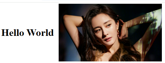
<div class="container">
  <h1>Hello World</h1>
  <img src="../images/yangmi1.jpg" alt="yang mi">
</div>
CSS Styles
.container {
  width: 512px;
  display: flex;
  gap: 16px;
  align-items: center;
  overflow: auto;

  h1 {
    flex-shrink: 0;
  }

  img {
    display: block;
    width: 100%;
    height: auto;
  }
}
效果
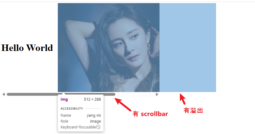
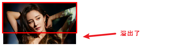
为什么不会 flex-shrink?
flex-shrink 的极限是 min-width 或者 min-content,而图片就有这个问题。
我们可以添加 min-width : 0 来破
img {
  display: block;
  width: 100%;
  height: auto;
  min-width: 0;
}
效果
这样就能 shrink 到了。
相同的情况也发生在 grid
<div style="display: grid; width: 250px; height: 100px; outline: 4px solid red;">
  <img src="./images/yangmi1.jpg" style="width:100%; height:100%; object-fit:cover">
</div>
效果
解决方法是添加 min-height: 0

效果

visibility hidden 有继承效果
如果 parent 是 hidden,拿 child computedStyle.visibility 也会是 hidden (如果 child 没有另外指定的话)。
但是 parent opacity 0,child 依然会是 1 哦,这点和 visibility 不同。
display none 也是,不会有继承效果,只有 visibility hidden 有而已。
:empty 会被 empty string 影响哦
这个不算 :empty,虽然没有 element 但有 node。
下面这个才是 :empty
要注意咯,小心掉坑。
当 scroll-margin-top 遇上 overflow: hidden
平常我们会使用 scroll-margin-top 让 anchor + URL hash scroll to element 时上头留一点 spacing,这样会比较美观。
但假如 element to scroll 刚巧设有 overflow hidden,那 sroll-margin-top 就会失效。
原因我不清楚,但破解之法是把 hidden 换成 clip。
当然这不是万能药,clip 和 hidden 是有区别的,clip 不能 scroll 只能隐藏,而且需要 IOS 16 才能支持。
如果真的避不开,那可能需要使用 scrollTo 替代 scrollIntoView 来实现了。
当 flex align-items 遇上 container-type
HTML
<div class="container">
  <div class="card">
    <h1>Title</h1>
    <p>Lorem ipsum dolor sit amet consectetur adipisicing elit. Earum, quidem.</p>
  </div>
  <button>click me</button>
</div>
Styles
* {
  margin: 0;
  padding: 0;
  box-sizing: border-box;
}

.container {
  max-width: 430px;
  margin-top: 64px;
  margin-left: 64px;

  display: flex;
  flex-direction: column;
  /* align-items: center; */
}
.container .card {
  /* container-type: inline-size; */
  padding: 16px;
}
.container .card h1 {
  font-size: 24px;
}
.container .card p {
  line-height: 1.5;
}
关键在被注释的那两行。
如果 align-items 和 container-type 同时出现,那 layout 会跑掉。
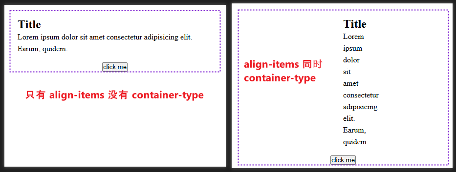
原因不清楚,也懒得去研究,破解之法是给 container-type element 加上 width 100% 就 ok 了。
escape CSS selector (class starts with number)
通常 class name 很少会 starts with number,但像 Tailwind CSS 就是例外。
<h1 class="2xl:text-left md:text-left">Hello World</h1>
2xl starts with number
class name 中间还夹杂了 symbol :分号
如果我们直接写 CSS selector,它是 select 不到的哦。
.2xl:text-left {
  background-color: red;
}

.md:text-left {
  color: white;
}
上面这样是错误的语法。
用 DOM API 甚至会直接报错
console.log(document.querySelector('.2xl:text-left'));

那样怎么破呢?
首先对 HTML 来说,class name starts with number 和使用 symbol 分号是允许的。
所以问题是出在 CSS selector 身上。
.\32xl\:text-left {
  background-color: red;
}
我们需要在 number 前面加上 \3,还有在 symbol : 分号前面加上 \
另外,\32 之后可以加多一个 space
.\32 xl\:text-left {
  background-color: red;
}
这样会更好。
for Scss 的话,必要时使用 double blackslash
$breakpoints: (
  '\\32xl': 1920px,
);

@each $key, $value in $breakpoints {
  .#{$key}\:text-left {
    background-color: red;
    color: white;
  }
}
像这样,它 compile 的结果是
.\32 xl\:text-left {
  background-color: red;
  color: white;
}
当 display: inline 遇上 position: absolute
我们知道 inline 是无视 width, height 的,但当它是 position: ablsolute 时就有 width, height 了。

 浙公网安备 33010602011771号