微信小程序之公共组件写法
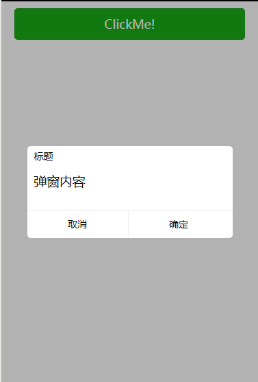
我们要实现如下图功能
小程序一个公共的弹出组件,首先我们创建一个pop文件

然后在生成的pop.json文件中将component定义为true
{
  "component": true
}
为pop.wxml添加内容
<!--pages/common/pop/pop.wxml-->
<view class='wx_dialog' hidden="{{!isShow}}">
  <view class='wx-mask'></view>
  <view class='wx-dialog-content'>
    <view class='wx-dialog-title'>{{ title }}</view>
    <view class='wx-dialog-contents'>{{ content }}</view>
    <view class='wx-dialog-footer'>
      <view class='wx-dialog-btn' catchtap='_cancelEvent'>{{ cancelText }}</view>
      <view class='wx-dialog-btn' catchtap='_confirmEvent'>{{ confirmText }}</view>
    </view>
  </view>
</view>
pop.wxss
/* pages/common/pop/pop.wxss */
.wx_dialog {
  position: fixed;
  left: 0;
  right: 0;
  top: 0;
  bottom: 0;
}
.wx-mask {
  position: absolute;
  left: 0;
  right: 0;
  top: 0;
  bottom: 0;
  background: rgba(0, 0, 0, .3);
  z-index: 99;
}
.wx-dialog-content {
  position: absolute;
  background: #fff;
  left: 50%;
  top: 50%;
  transform: translate(-50%, -50%);
  width: 80%;
  /* height: 200px; */
  padding-bottom: 60px;
  z-index: 100;
  border-radius: 5px;
}
.wx-dialog-contents {
  padding: 10px;
}
.wx-dialog-title {
  padding: 5px 10px;
  font-size: 14px;
}
.wx-dialog-footer {
  position: absolute;
  left: 0;
  right: 0;
  bottom: 0;
  font-size: 14px;
  height: 40px;
  line-height: 40px;
  border-top: 1px solid #eee;
}
.wx-dialog-btn {
  display: inline-block;
  width: 49%;
  cursor: pointer;
  text-align: center;
}
.wx-dialog-btn:first-child {
  border-right: 1px solid #eee;
}
pop.js
// pages/common/pop/pop.js
Component({
  options: {
    multipleSlots: true // 在组件定义时的选项中启用多slot支持
  },
  /**
   * 组件的属性列表
   * 用于组件自定义设置
  */
  properties: {
    // 弹窗标题
    title: { // 属性名
      type: String, // 类型(必填),目前接受的类型包括:String, Number, Boolean, Object, Array, null(表示任意类型)
      value: '标题' // 属性初始值(可选),如果未指定则会根据类型选择一个
    },
    // 弹窗内容
    content: { type: String, value: '弹窗内容' },
    // 弹窗取消按钮文字
    cancelText: { type: String, value: '取消' },
    // 弹窗确认按钮文字
    confirmText: { type: String, value: '确定' }
  },
  /**
   * 私有数据,组件的初始数据
   * 可用于模版渲染
   */
  data: { // 弹窗显示控制
    isShow: false
  },
  /**
   * 组件的方法列表
   * 更新属性和数据的方法与更新页面数据的方法类似
  */
  methods: {
    /**
    * 公有方法
    */
    //隐藏弹框
    hideDialog() {
      this.setData({
        isShow: !this.data.isShow
      })
    },
    //展示弹框
    showDialog() {
      this.setData({
        isShow: !this.data.isShow
      })
    },
    /**
     * 内部私有方法建议以下划线开头
     * triggerEvent 用于触发事件
    */
    _cancelEvent() { //触发取消回调
      this.triggerEvent("cancelEvent")
    },
    _confirmEvent() { //触发成功回调
      this.triggerEvent("confirmEvent");
    }
  }
})
在父级页面的.js文件中添加
  /**
   * 生命周期函数--监听页面初次渲染完成
   */
  onReady: function () {
    this.dialog = this.selectComponent("#dialog");
  },
  showDialog() {
    this.dialog.showDialog();
  },
  //取消事件
  _cancelEvent() {
    console.log('你点击了取消');
    this.dialog.hideDialog();
  },
  //确认事件
  _confirmEvent() {
    console.log('你点击了确定');
    this.dialog.hideDialog();
  },
父级页面的.json文件中添加
{
  "usingComponents": {"pop": "../common/pop/pop"}
}
在父级页面的.wxml文件中添加
<view class="pop">
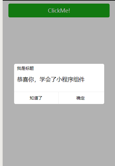
<pop id='dialog' title='我是标题' content='恭喜你,学会了小程序组件' cancelText='知道了' confirm='谢谢你' bind:cancelEvent="_cancelEvent" bind:confirmEvent="_confirmEvent">
</pop>
</view>
然后就大功告成了
如果想注册到全局,则需要在app.json页面添加挂载:
{
  "usingComponents": {"pop": "../common/pop/pop"}
}
每一次的记录,都是向前迈进的一步

 浙公网安备 33010602011771号