CSS
1、 CSS
如何学习
- 什么是CSS
- CSS怎么用(快速入门)
- CSS选择器(重点)
- 美化网页(文字,阴影,超链接,列表)
- 盒子模型
- 浮动
- 定位
- 网页动画(特效)
学习网站:
源码之家(门户网站)
飞冰
vue-element-admin
1.1、 什么是CSS
Cascading Style Sheet 层叠级联样式表
CSS: 表现(美化网页)
字体,颜色,边距,高度,宽度,背景图片,网页定位,网页浮动
1.2、 发展史
CSS 1.0
CSS 2.0 DIV(块)+CSS,HTML与CSS结构分离的思想,网页简单,SEO
CSS 2.1 浮动,定位
CSS 3.0 圆角,阴影,动画…浏览器兼容性~
1.3、 快速入门
style
建议使用规范
CSS的优势
- 内容的表现分离
- 网页结构表现统一,可以实现复用
- 样式十分丰富可以自由选择
- 建议使用独立于html的css文件
- 利于seo,容易被搜索引擎收录
1.4、 CSS的几种导入方式
<!DOCTYPE html>
<html lang="en">
<head>
    <meta charset="UTF-8">
    <title>Title</title>
    <!--内部样式-->
    <style>
        h1{
            color: red;
        }
    </style>
    <!--外部样式-->
    <link rel="stylesheet" href="css/style.css">
</head>
<body>
<!--优先级:就近原则,谁离h1近用谁-->
<!--行内样式:在标签元素中,编写一个style属性,编写样式即可-->
<h1 style="color: red">我是标题</h1>
</body>
</html>
h1{
    color: red;
}
拓展: 外部样式两种写法
-
链接式
html
<!--外部样式--><link rel="stylesheet" href="css/style.css"> -
导入式
@import是CSS2.1特有的!
<!--导入式--><style> @import url("css/style.css");</style>
2、 选择器
作用: 选择页面上的某一个或者某一类元素
2.1、 基本选择器
-
标签选择器: 选择一类标签 标签{}
<!DOCTYPE html> <html lang="en"> <head> <meta charset="UTF-8"> <title>Title</title> </head> <body> <style> /*标签选择器会选择页面上所有的对应标签*/ h1{ color: #c134b5; background: black; }</style><style> p{ background: aquamarine; color: red; font-size: 80px; } </style> <h1>标题1</h1> <h1>标题2</h1> <p>你好吗</p> </body> </html> -
类选择器 class: 选择所有class属性一致的标签,跨标签.类名{}
<!DOCTYPE html>
<html lang="en">
<head>
    <meta charset="UTF-8">
    <title>Title</title>

    <style>
        /*类选择器的格式,.class的名称{}
    好处,可以多个标签归类,是同一个class,可以复用
    */
        .red{
            color: red;
        }
        .green{
            color: green;
        }
    </style>
</head>
<body>
<h1 class="red">你好吗</h1>
<h1 class="green">嗨嗨嗨</h1>
<h1 class="green">你是谁</h1>
<p class="green">仔细听</p>
</body>
</html>
- ID选择器: 全局唯一! #id名{}
<!DOCTYPE html>
<html lang="en">
<head>
    <meta charset="UTF-8">
    <title>title</title>
    <style>
        /*id选择器:id必须保证全局唯一!
            #id名称{}
            不遵循就近原则,固定的
            优先级:id选择器>class选择器>标签选择器
        */
        #kazesan{
            color: blue;
        }
        .style1{
            color: #c134b5;
        }
        h1{
            color: green;
        }

    </style>
</head>
<body>
<h1 class="style1" id="kazesan">标题1</h1>
<h1 class="style1">标题2</h1>
<h1 class="style1">标题3</h1>
<h1>标题4</h1>
<h1>标题5</h1>
</body>
</html>
2.2、 层次选择器
-
后代选择器: 在某个元素的后面
/*后代选择器*/body p{ background: #c134b5;} -
子选择器 一代
/*子选择器*/body>p{ background: #c134b5;} -
相邻,兄弟选择器(对下不对上)
/*兄弟选择器: 只有一个,向下*/.active +p{ background: #c134b5;} -
通用选择器
/*通用兄弟选择器, 当前选中元素的向下所有的兄弟元素*/.active~p{ background: #c134b5;}<!DOCTYPE html> <html lang="en"> <head> <meta charset="UTF-8"> <title>Title</title> <style> /* p{ background: blue; }*/ /*后代选择器*/ /* body p{ background: green; }*/ /*子选择器*/ /* body>p{ background: blueviolet; }*/ /*相邻兄弟选择器:只有一个相邻(向下)*/ /*.active + p{ background: cornflowerblue; }*/ /*通用兄弟选择器,当前选中元素的向下的所有兄弟元素*/ .active~p{ background: darkorchid; } </style> </head> <body> <p class="active">p1</p> <p>p2</p> <p>p3</p> <ul> <li> <p>p4</p> </li> <li> <p>p5</p> </li> <li> <p>p6</p> </li> </ul> </body> </html>
2.3、 结构伪类选择器
伪类:条件
/*ul的第一个子元素*/
ul li:first-child{
    background: red;
}
/*ul的最后一个子元素*/
ul li:last-child{
    background: blue;
}
/*选中p1:定位到父元素,选择当前的第一个元素
选择当前p元素的父级元素,选中父级元素的第一个,按顺序选*/
p:nth-child(2){
    background: yellow;
}
/*选中父元素下第二个p元素,按类型选*/
p:nth-of-type(1){
    background: violet;
}
a:hover{
    background: purple;
}
2.4、属性选择器(常用)
id+class 结合~
<!DOCTYPE html>
<html lang="en">
<head>
    <meta charset="UTF-8">
    <title>Title</title>
    <style>
        .demo a{
            float: left;
            display: block;
            height: 50px;
            width: 50px;
            border-radius: 10px;
            background: #24ff33;
            text-align: center;
            color: gray;
            text-decoration: none; /*去下划线*/
            margin-right: 5px;
            font: bold 20px/50px Arial;
        }
        /* 属性名, 属性名 = 属性值(正则)
        = 绝对等于
        *= 包含这个元素
        ^= 以这个开头
        $ 以这个结尾
        */
        /*存在id属性的元素    a[]{}*/
        /*a[id]{
            background: yellow;
        }*/
        /*a[id=first]{
            background: yellow;
        }*/
        /*class 中有links的元素*/
        /*a[class*="links"]{
            background: yellow;
        }*/
        /*选中href中以http开头的元素*/
        /*a[href^=http]{
            background: yellow;
        }*/
        a[href$=jpg]{
            background: red;
        }
    </style>
</head>
<body>
<p class="demo">
    <a href="http://www.baidu.com" class="links item first" id="first">1</a>
    <a href="http://www.baidu.com" class="links item active" target="_blank" title="test">2</a>
    <a href="images/123.html" class="links item">3</a>
    <a href="images/123.png" class="links item">4</a>
    <a href="images/123.jpg" class="links item">5</a>
    <a href="abc" class="links item">6</a>
    <a href="/a.pdf" class="links item">7</a>
    <a href="/abc.pdf" class="links item">8</a>
    <a href="abc.doc" class="links item">9</a>
    <a href="abcd.doc" class="links item last">10</a>
</p>
</body>
</html>
3、美化网页元素
3.1、为什么要美化网页
- 有效的传递页面信息
- 美化网页,页面漂亮,才能吸引用户
- 凸显页面的主题
- 提高用户的体验
span标签: 重点要突出的字,使用span标签套起来
<!DOCTYPE html>
<html lang="en">
<head>
  <meta charset="UTF-8">
  <title>Title</title>
  <style>
    #title1{
      font-size: 50px;
    }
  </style>
</head>
<body>
欢迎学习<span id="title1">python</span>
</body>
</html>
3.2、字体样式
<!DOCTYPE html>
<html lang="en">
<head>
    <meta charset="UTF-8">
    <title>Title</title>
    <!--
        font-family: 字体
        font-size: 字体大小
        font-weight: 字体粗细
        color: 字体颜色
    -->
    <style>
        body{
            font-family: 楷体;
        }
        h1{
            font-size: 50px;
        }
        .p1{
            font-weight: bold;
        }
    </style>
</head>
<body>
<h1>斗破苍穹</h1>
<p class="p1">
    这里是属于斗气的世界,没有花俏艳丽的魔法,有的,仅仅是繁衍到巅峰的斗气!
</p>
<p>
    新书等级制度:斗者,斗师,大斗师,斗灵,斗王,斗皇,斗宗,斗尊,斗圣,斗帝。
</p>
<p>
    This is a world of fighting spirit. There is no fancy magic. Some are just fighting spirit that has multiplied to the peak!
</p>
</body>
</html>
3.3、文本样式
- 颜色 colr rgb rgba
- 文本对齐的方式 text-align = center
- 首行缩进 text-indent
- 行高 line-height
- 装饰 text-decoration
- 文本图片水平对齐: vertical-align
<!DOCTYPE html>
<html lang="en">
<head>
    <meta charset="UTF-8">
    <title>Title</title>
    <!--
    颜色:
        单词 0-F
        RGBA A 0-1
    text-align: center; 排版,居中
    text-indent: 2em;  段落首行缩进2个字符
    行高,和快的高度一致,就可以上下居中
    -->
    <style>
        h1{
            color: rgba(0,255,255,0.5);
            text-align: center;
        }
        .p1{
            text-indent: 2em;
        }
        .p3{
            background: red;
            height: 300px;
            line-height: 300px;
        }
        /*下划线*/
        .l1{
            text-decoration: underline;
        }
        /*中划线*/
        .l2{
            text-decoration: line-through;
        }
        /*上划线*/
        .l3{
            text-decoration: overline;
        }
        /*超链接去下划线*/
        a{
            text-decoration: none;
        }
        /*水平对其~ 参照物, a,b*/
        img,span{
            vertical-align: middle;
        }
    </style>
</head>
<body>
<a href="">123</a>
<p class="l1">1231231</p>
<p class="l2">1231231</p>
<p class="l3">1231231</p>
<h1>斗破苍穹</h1>
<p class="p1">
    这里是属于斗气的世界,没有花俏艳丽的魔法,有的,仅仅是繁衍到巅峰的斗气!
</p>
<p>
    新书等级制度:斗者,斗师,大斗师,斗灵,斗王,斗皇,斗宗,斗尊,斗圣,斗帝。
</p>
<p class="p3">
    This is a world of fighting spirit. There is no fancy magic. Some are just fighting spirit that has multiplied to the peak!
</p>
<p>
    <img src="images/test.png" alt="" weight="100" height="100">
    <span>abcd</span>
</p>
</body>
</html>
3.4、 阴影
/*阴影的颜色,水平偏移,垂直偏移,阴影半径*/
#price{
text-shadow: deepskyblue 10px 10px 2px;
}
3.5、 超链接伪类
/*默认的颜色*/
  a{
      text-decoration:none;
      color: red;
  }
  /*鼠标悬浮的状态,只需记住这个*/
  a:hover{
      color: orange;
      font-size: 50px;
  }
  /*鼠标按住未释放的状态*/
  a:active{
      color: green;
  }
3.6、列表
/*ul li*/
/*circle 空心圆
  decimal 数字
  square 正方形*/
/*ul li*/
ul {
    background: grey;
}
ul li{
    height: 30px; /*行高*/
    list-style: none; /*去掉圆点*/
    text-indent: 1em;
}
3.7、背景
背景颜色
背景图片
div{
    width: 1000px;
    height: 700px;
    border: 1px solid red;
    background-image: url("images/1.jfif");
    /*默认是全部平铺的*/
}
.div1{
    background-repeat: repeat-x;
}
.div2{
    background-repeat: repeat-y;
}
.div3{
    background-repeat: no-repeat;
}
3.8、渐变
body{
    /*background-color: #4158D0;*/
    background-image: linear-gradient(43deg, #4158D0 0%, #C850C0 46%, #FFCC70 100%);
}
4、盒子模型
margin:外边距
padding:内边距
border:边框
4.1、边框
- 边框的粗细
- 边框的样式
- 边框的颜色
/*body总有一个默认的外边距需要设置为0*/
h1,ul,li,a,body{
    margin: 0px;
}
#box{
    width: 300px;
    border: 1px solid red;
}
h2{
    font-size: 16px;
    background-color: #24ff33;
    line-height: 30px;
    margin: 0;
    color: white;
}
form{
    background: #24ff33;
}
div:nth-of-type(1) input{
    border: 1px solid black;
}
div:nth-of-type(2) input{
    border: 1px dashed blue;
}
div:nth-of-type(3) input{
    border: 1px dashed gold;
}
4.3、内外边距
<!DOCTYPE html>
<html lang="en">
<head>
  <meta charset="UTF-8">
  <title>Title</title>
  <!--外边距的妙用:居中对齐-->
  <style>
    /*body总有一个默认的外边距需要设置为0*/
    /*h1,ul,li,a,body{*/
    /*    margin: 0px;*/
    /*}*/
    #box{
      width: 300px;
      border: 1px solid red;
      margin: 0 auto;
    }
    /*
        顺时针旋转
        margin:0 1px 2px 3px
    */
    h2{
      font-size: 16px;
      background-color: #24ff33;
      line-height: 30px;
      margin: 0;
      color: white;
    }
    form{
      background: #24ff33;
    }
    div:nth-of-type(1) input{
      border: 1px solid black;
    }
    div:nth-of-type(2) input{
      border: 1px dashed blue;
    }
    div:nth-of-type(3) input{
      border: 1px dashed gold;
    }
    div:nth-of-type(1){
      padding: 10px 2px;
    }
  </style>
</head>
<body>
<div id="box">
  <h2>会员登录</h2>
  <form action="#">
    <div>
      <span>用户名:</span>
      <input type="text">
    </div>
    <div>
      <span>密码:</span>
      <input type="text">
    </div>
    <div>
      <span>邮箱:</span>
      <input type="text">
    </div>
  </form>
</div>
</body>
</html>
盒子的计算方式:元素到底多大?
margin+border+padding+内容宽度
4.4、圆角边框
4个角
<!--
左上 右上 右下 左下 顺时针
-->
<!--
圆圈: 圆角 = 半径
-->
    div{
        width: 100px;
        height: 100px;
        border: 10px solid red;
        border-radius: 50px 20px;
    }
4.5 盒子阴影
<!DOCTYPE html>
<html lang="en">
<head>
    <meta charset="UTF-8">
    <title>Title</title>
    <style>
        img{
            display: block;
            margin: 0 auto;
            border-radius: 300px;
            box-shadow: 10px 10px 100px yellow;
        }
    </style>
</head>
<body>
    <div>
        <img src="images/test.png" alt="">
    </div>

</body>
</html>
5、浮动
5.1、 标准文档流
块级元素:独占一行
h1-h6 p div 列表
行内元素(内联):不独占一行
span a img strong ...
行内元素可以被包含在块级元素,反之则不行
<!--
block 块元素
inline 行内元素
inline-block 是块元素,但是可以内联,在一行!
none
-->
<style>
    div{
        width: 100px;
        height: 100px;
        border: 1px solid red;
        display: none;
    }
    span{
        width: 100px;
        height: 100px;
        border: 1px solid red;
        display: inline-block;
    }
</style>
5.3、float
1、左右浮动
.layer{
    float: right;
}
5.4、父级边框塌陷问题
clear
clear: right; 右侧不允许有浮动元素
clear: left;  左侧不允许有浮动元素
clear: both;  两侧不允许有浮动元素
clear: none;  不允许有浮动元素
解决方案:
1、增加父级元素的高度
#father{
    border: 1px #000 solid;
    height: 800px;
}
2、增加一个空的div标签,清除浮动
<div class="clear"></div>
.clear{
    clear: both;
    margin: 0;
    padding: 0;
}
3、overflow
在父级元素中增加一个overflow:hidden;
4、父类添加一个伪类:after
#father:after{
    content: '';
    display: block;
    clear: both;
}
小结:
1、浮动元素后面增加div
简单,代码中尽量避免空div
2、设置父元素的高度
简单,元素假设有了固定的高度,就会被限制
3、overflow
简单,下拉的一些场景避免使用
4、父类添加伪类:after(推荐)
写法稍微复杂一点,但是没有副作用,推荐使用!
5.5、对比
-
display
方向不能控制
-
float
浮动起来的话会脱离标准文档流,所以要解决父级边框塌陷的问题
6、定位
6.1相对定位
<!DOCTYPE html>
<html lang="en">
<head>
    <meta charset="UTF-8">
    <title>Title</title>
    <!--相对定位
    相对于自己原来的位置进行偏移~-->
    <style>
        body{
            padding: 20px;
        }
        div{
            margin: 10px;
            padding: 5px;
            font-size: 12px;
            line-height: 25px;
        }
        #father{
            border: 1px solid red;
        }
        #first{
            background: #c134b5;
            border: 1px dashed #c134b5;
            position: relative;/*相对定位:上下左右*/
            top: -20px;
            left: 20px;
        }
        #second{
            background: green;
            border: 1px dashed #24ff33;
        }
        #third{
            background: cornflowerblue;
            border: 1px dashed #1abcf8;
            position: relative;
            bottom: -20px;
            right: 20px;
        }
    </style>
</head>
<body>
<div id="father">
  <div id="first">第一个盒子</div>
  <div id="second">第二个盒子</div>
  <div id="third">第三个盒子</div>
</div>
</body>
</html>
相对定位:position: relative
相对于原来的位置,进行指定的偏移,相对定位的话,它仍然在标准文档流中,原来的位置会被保留
top: -20px;
left: 20px;
bottom: -20px;
right: 20px;
练习
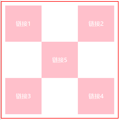
<!DOCTYPE html>
<html lang="en">
<head>
    <meta charset="UTF-8">
    <title>Title</title>
    <style>
        #box{
            width: 300px;
            height: 300px;
            padding: 10px;
            border: 2px solid red;
        }
        a{
            width: 100px;
            height: 100px;
            text-decoration: none;
            background: pink;
            line-height: 100px;
            text-align: center;
            color: white;
            display: block;
        }
        a:hover{
            background: cornflowerblue;
        }
        .a2{
            position: relative;
            left: 200px;
            top: -100px;
        }
        .a4{
            position: relative;
            left: 200px;
            bottom: 100px;
        }
        .a5{
            position: relative;
            left: 100px;
            bottom: 300px;
        }
    </style>
</head>
<body>
<div id="box">
    <a class="a1" href="#">链接1</a>
    <a class="a2" href="#">链接2</a>
    <a class="a3" href="#">链接3</a>
    <a class="a4" href="#">链接4</a>
    <a class="a5" href="#">链接5</a>
</div>
</body>
</html>
6.2、绝对定位
定位:基于xxx定位,上下左右
1、没有父级元素定位的前提下,相对于游览器定位
2、假设父级元素存在定位,我们通常会相对于父级元素进行偏移
3、在父级元素范围内移动
相对于父级或者游览器的位置,进行指定的偏移,绝对定位后,它不在标准文档流中,原来的位置不会被保留
<!DOCTYPE html>
<html lang="en">
<head>
    <meta charset="UTF-8">
    <title>Title</title>
    <!--相对定位
    相对于自己原来的位置进行偏移~-->
    <style>
        body{
            padding: 20px;
        }
        div{
            margin: 10px;
            padding: 5px;
            font-size: 12px;
            line-height: 25px;
        }
        #father{
            border: 1px solid red;
            padding: 0;
            position: relative;
        }
        #first{
            background: #c134b5;
            border: 1px dashed #c134b5;
            position: relative;/*相对定位:上下左右*/
            top: -20px;
            left: 20px;
        }
        #second{
            background: green;
            border: 1px dashed #24ff33;
            position: absolute;
            left: 100px;
        }
        #third{
            background: cornflowerblue;
            border: 1px dashed #1abcf8;
            position: relative;
            bottom: -20px;
            right: 20px;
        }
    </style>
</head>
<body>
<div id="father">
  <div id="first">第一个盒子</div>
  <div id="second">第二个盒子</div>
  <div id="third">第三个盒子</div>
</div>
</body>
</html>
6.3、固定定位fixed
<!DOCTYPE html>
<html lang="en">
<head>
    <meta charset="UTF-8">
    <title>Title</title>
    <style>
        body{
            height: 1000px;
        }
        div:nth-of-type(1){/*绝对定位:相对于浏览器*/
            width: 100px;
            height: 100px;
            background: red;
            position: absolute;
            right: 0;
            bottom: 0;
        }
        div:nth-of-type(2){/*fixed:固定定位*/
            width: 50px;
            height: 50px;
            background: green;
            position: fixed;
            right: 0;
            bottom: 0;
        }
    </style>
</head>
<body>
<div>div1</div>
<div>div2</div>
</body>
</html>
6.4、z-index
图层~
z-index: 默认是0,最高无限~999
<!DOCTYPE html>
<html lang="en">
<head>
    <meta charset="UTF-8">
    <title>Title</title>
    <link rel="stylesheet" href="css/style.css">
</head>
<body>
<div id="content">
  <ul>
    <li><img src="images/bg.jfif" alt=""></li>
      <li class="tipText">微软必应壁纸</li>
      <li class="tipBg"></li>
      <li>时间:2022.7.19</li>
      <li>地点:荧惑之星</li>
  </ul>
</div>
</body>
</html>
opacity: 0.5;/背景透明度/
#content{
    width: 600px;
    padding: 0px;
    margin: 0px;
    overflow: hidden;
    font-size: 12px;
    line-height: 25px;
    border: 1px solid red;
}
ul,li{
    padding: 0px;
    margin: 0px;
    list-style: none;
}
/*父级元素相对定位*/
#content ul{
    position: relative;
}
.tipText, .tipBg{
    position: absolute;
    width: 600px;
    height: 25px;
    top: 250px;
}
.tipText{
    color: white;
    z-index: 999;
}
.tipBg{
    background: black;
    opacity: 0.5;/*背景透明度*/
    filter: Alpha(opacity=50);
}
7、动画
去菜鸟教程
菜鸟教程 - 学的不仅是技术,更是梦想! (runoob.com)
canvas

 浙公网安备 33010602011771号