JS判断移动设备最佳方法 并实现跳转至手机版网页

方法一:纯JS判断
使用这方法既简单,又实用,不需要引入jQuery库,把以下代码加入到<head>里即可。
<script type=”text/javascript”>
if( /Android|webOS|iPhone|iPad|iPod|BlackBerry|IEMobile|Opera Mini/i.test(navigator.userAgent) ) {
window.location = “mobile.html”; //可以换成http地址
}
</script>
方法二:使用 Device.Js 库
device.js 是一个用于检查设备用的插件,使用它你可以很方便的判断设备的操作系统,以及设备是纵向还是横向。
首先,我们下载Device.js
下载地址:https://github.com/matthewhudson/device.js
STEP 1: 引入 JS 文件
<script src=”device.min.js”></script>
STEP 2: 加入判断代码
<script type=”text/javascript”>
if(device.mobile()){
window.location = “shouji.html”;  //可以换成http地址
}
</script>
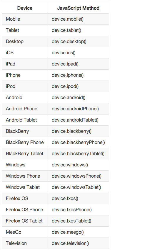
Device.js 方法有很多,若你想实现对某个设备的判断,要以根据以下代码来替换 device.mobile()
以上两种方法判断手机端都是很实用的,由其是电脑版网页和手机版网页分别用不同的网站域名时,使用该方法可以免去用户记2个域名烦恼!

 浙公网安备 33010602011771号