<!doctype html>
<html>
<head>
<meta charset="utf-8" />
<title>H5标准页面</title>
<link href="css/css实现树形图 - 副本 (2).css" rel="stylesheet" type="text/css" />
</head>
<body>
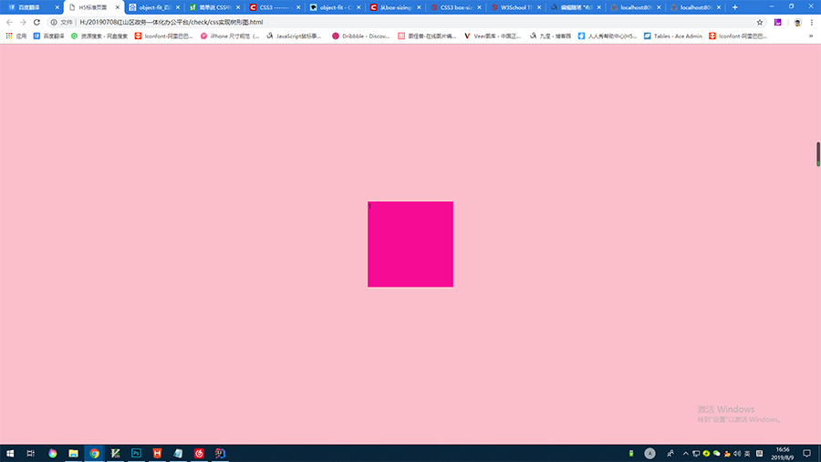
<section>
<article>
<div>1</div>
</article>
</section>
</body>
</html
section{
    position:absolute;
    height:100%;
    width:100%;
    background-color:pink;
    display:-webkit-flex;
    display:flex;
    justify-content:center;
    align-items:center;
}

article{
    height:200px;
    width:200px;
    background-color:deeppink;
    margin:10px;
}
![]()
<!doctype html>
<html>
<head>
<meta charset="utf-8" />
<title>H5标准页面</title>
<link href="css/css实现树形图 - 副本 (2).css" rel="stylesheet" type="text/css" />
</head>
<body>
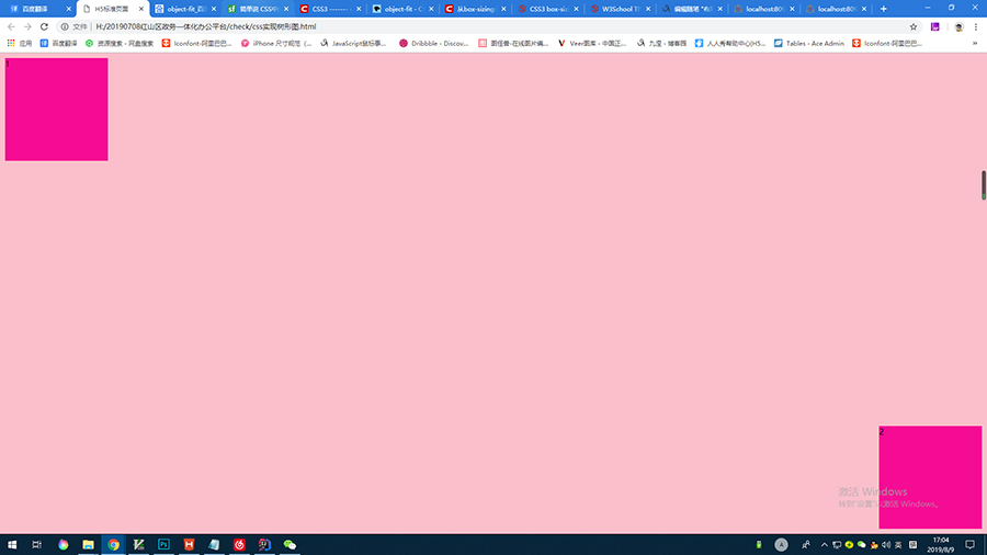
<section>
<article>
<div>1</div>
</article>
<article>
<div>2</div>
</article>
</section>
</body>
</html>
section{
    position:absolute;
    height:100%;
    width:100%;
    background-color:pink;
    display:-webkit-flex;
    display:flex;
    justify-content:space-between;
}

article{
    height:200px;
    width:200px;
    background-color:deeppink;
    margin:10px;
}

article:nth-child(2){
    align-self:flex-end;
}
![]()
<!doctype html>
<html>
<head>
<meta charset="utf-8" />
<title>H5标准页面</title>
<link href="css/css实现树形图 - 副本 (2).css" rel="stylesheet" type="text/css" />
</head>
<body>
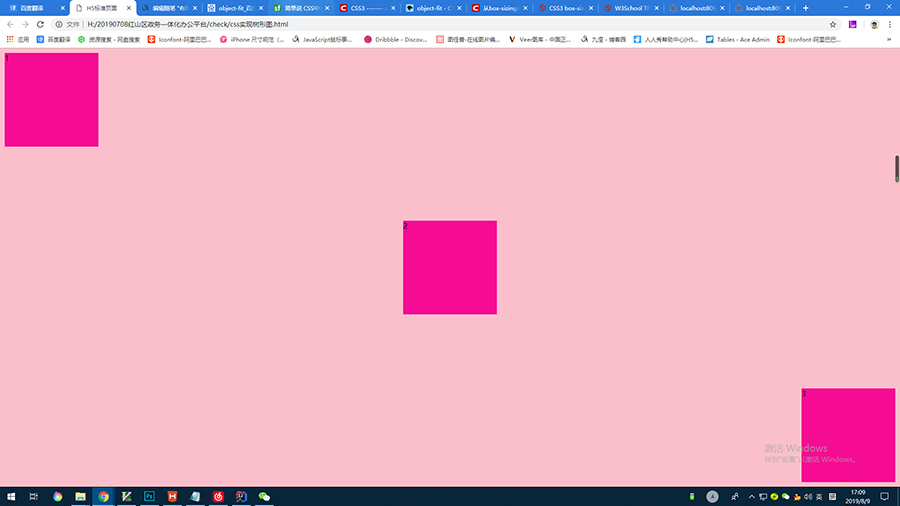
<section>
<article>
<div>1</div>
</article>
<article>
<div>2</div>
</article>
<article>
<div>3</div>
</article>
</section>
</body>
</html
section{
    position:absolute;
    height:100%;
    width:100%;
    background-color:pink;
    display:-webkit-flex;
    display:flex;
    justify-content:space-between;
}

article{
    height:200px;
    width:200px;
    background-color:deeppink;
    margin:10px;
}

article:nth-child(2){
    align-self:center;
}

article:nth-child(3){
    align-self:flex-end;
}
![]()
<!doctype html>
<html>
<head>
<meta charset="utf-8" />
<title>H5标准页面</title>
<link href="css/css实现树形图 - 副本 (2).css" rel="stylesheet" type="text/css" />
</head>
<body>
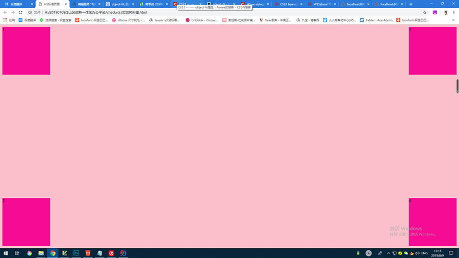
<section>
<div class="customWrap">
<article>
<div>1</div>
</article>
<article>
<div>2</div>
</article>
</div>
<div class="customWrap">
<article>
<div>3</div>
</article>
<article>
<div>4</div>
</article>
</div>
</section>
</body>
</html>
section{
    position:absolute;
    height:100%;
    width:100%;
    background-color:pink;
    display:-webkit-flex;
    display:flex;
    justify-content:space-between;
}

.customWrap{
    display:-webkit-flex;
    display:flex;
    flex-direction:column;
    justify-content:space-between;
}

article{
    height:200px;
    width:200px;
    background-color:deeppink;
    margin:10px;
}
![]()
<!doctype html>
<html>
<head>
    <meta charset="utf-8" />
    <title>H5标准页面</title>
    <link href="css/css实现树形图 - 副本 (2).css" rel="stylesheet" type="text/css" />
</head>

<body>
    <section>

        <div class="customWrap">
            <article>
                <div>1</div>
            </article>
            <article>
                <div>2</div>
            </article>
        </div>

        <div class="customWrap">
            <article>
                <div>5</div>
            </article>
        </div>

        <div class="customWrap">
            <article>
                <div>3</div>
            </article>
            <article>
                <div>4</div>
            </article>
        </div>
    </section>
</body>

</html>
section{
    position:absolute;
    height:100%;
    width:100%;
    background-color:pink;
    display:-webkit-flex;
    display:flex;
    justify-content:space-between;
}

.customWrap{
    display:-webkit-flex;
    display:flex;
    flex-direction:column;
    justify-content:space-between;
}
.customWrap:nth-child(2){
    justify-content:center;
}

article{
    height:200px;
    width:200px;
    background-color:deeppink;
    margin:10px;
}
![]()


 浙公网安备 33010602011771号