【python】2D/3D散点图
需求
根据数据画2D和3D图
部分数据如下:
10 40 1.598
10 40 1.743
10 42 1.838
10 40 1.899
10 43 1.584
10 49 0.52
10 45 2.604
10 49 0.63
10 44 3.755
10 45 1.149
10 42 0.478
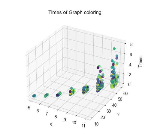
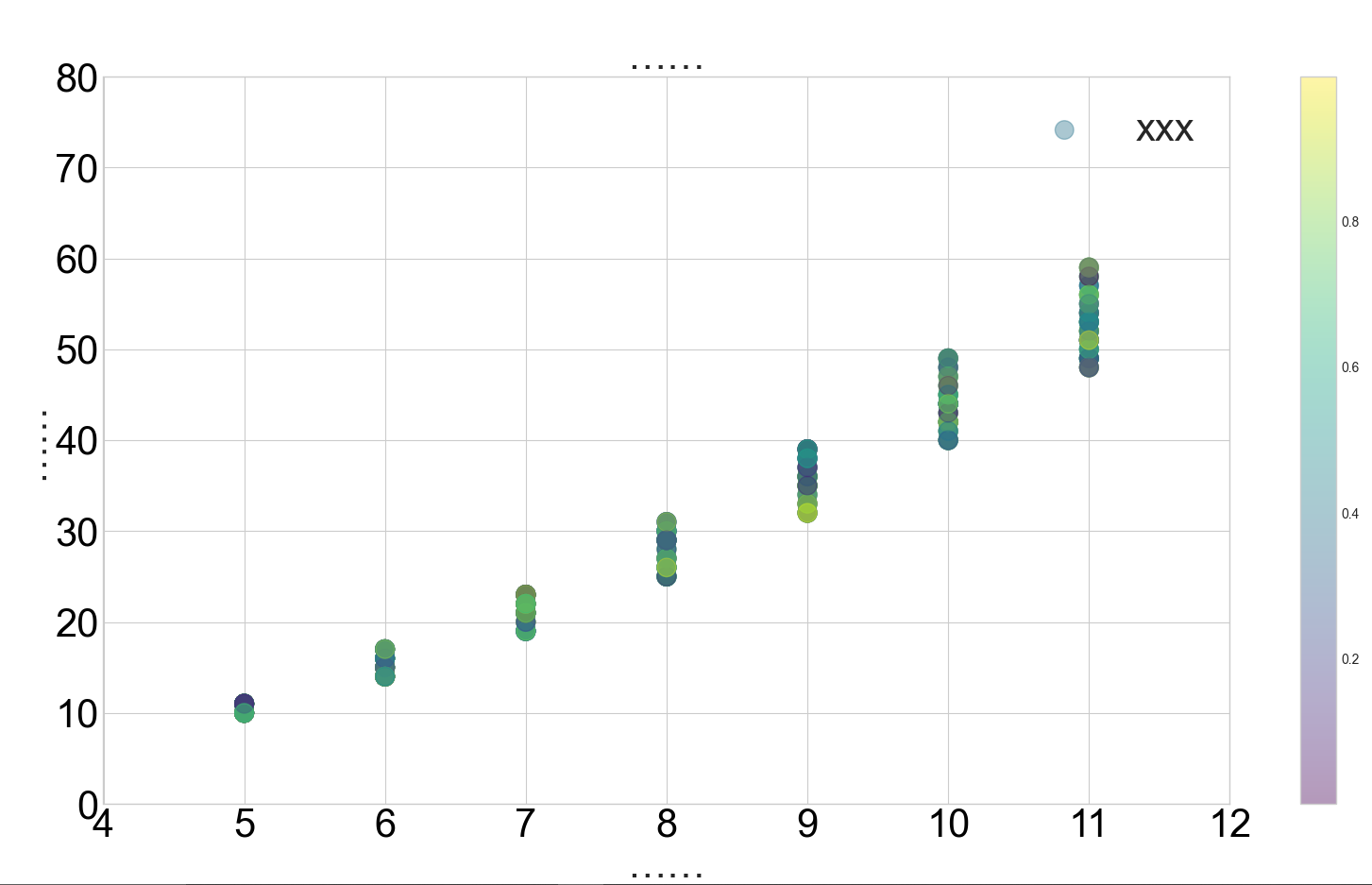
效果
代码
3D图代码
import matplotlib.pyplot as plt
import random


def draw(x, y, z, result_path):
    plt.style.use('seaborn-whitegrid')
    colors = [random.random() for i in range(len(x))]
    ax = plt.subplot(projection='3d')
    ax.set_title('Times of Graph coloring')  # 设置本图名称
    ax.scatter(x, y, z, s=30, c=colors, cmap='viridis')

    ax.set_xlabel('e')  # 设置x坐标轴
    ax.set_ylabel('v')  # 设置y坐标轴
    ax.set_zlabel('Times')  # 设置z坐标轴

    plt.tick_params(pad=1)  # 刻度距离坐标轴的距离调整
    plt.savefig(result_path, bbox_inches='tight', dpi=1000)
    plt.show()


if __name__ == "__main__":
    path = r"time.txt"
    result_path = r"a.png"
    data = open(path).readlines()
    x, y, z = [], [], []
    for i in data:
        a, b, c = i.split(' ')
        x.append(int(a))
        y.append(int(b))
        z.append(float(c))
    draw(x, y, z, result_path)
2D图代码
#!/usr/bin/env python
# -*- coding: utf-8 -*-
# @Time    : 2022/8/22 23:42
# @Author  : Fw_022
import matplotlib.pyplot as plt
import random


def scatter(x, y, result_path):
    colors = [random.random() for i in range(len(x))]
    plt.figure(figsize=(20, 10))
    plt.style.use('seaborn-whitegrid')

    plt.scatter(x, y, s=200, c=colors, alpha=0.4, label='xxx', cmap='viridis')
    """
        viridis:    从蓝色到黄色渐变的颜色映射。
        plasma:     从紫色到黄色渐变的颜色映射。
        inferno:    从黑色到黄色渐变的颜色映射。
        magma:      从黑色到紫色渐变的颜色映射。
        cividis:    从蓝色到黄色渐变的颜色映射,适合于色盲人士。
    """
    plt.legend(fontsize=30)

    plt.xlabel("……", fontsize=30)
    plt.ylabel('……', fontsize=30)
    plt.title("……", fontsize=30)

    plt.xlim(xmin=4, xmax=12)  # 设置X轴最小刻度和最大刻度
    plt.ylim(ymin=0, ymax=80)  # 设置Y轴最小刻度和最大刻度

    plt.xticks(fontsize=30, color='#000000')  # 设置X轴字体的尺寸和颜色
    plt.yticks(fontsize=30, color='#000000')  # 设置Y轴字体的尺寸和颜色

    # plt.xticks([])  # 如果想不显示x轴刻度值,则取消注释
    # plt.yticks([])  # 如果想不显示x轴刻度值,则取消注释

    plt.colorbar()  # 显示颜色对比条
    plt.savefig(result_path, bbox_inches='tight', dpi=1000)
    # plt.show()


if __name__ == "__main__":
    path = r"time.txt"
    result_path = r"a.png"
    data = open(path).readlines()
    x, y, z = [], [], []
    for i in data:
        a, b, c = i.split(' ')
        x.append(int(a))
        y.append(int(b))
        z.append(float(c))
    scatter(x, y, result_path)

 浙公网安备 33010602011771号