

博客园首秀 matplotlib的极简单操作
matplotlib画廊
要查看使用matplotlib可制作的各种图表,请访问http://matplotlib.org/的示例画廊。单击画廊中的图表,就可查看用于生成图表的代码。
基本图表包括的元素
x轴和y轴
水平和垂直的轴线
x轴和y轴刻度
刻度标示坐标轴的分隔,包括最小刻度和最大刻度
x轴和y轴刻度标签
表示特定坐标轴的值
绘图区域
实际绘图的区域
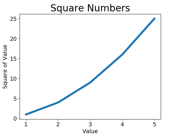
折线图
import matplotlib.pyplot as plt

input_values = [1, 2, 3, 4, 5]
squares = [1, 4, 9, 16, 25]
plt.plot(input_values, squares, linewidth=5)

# 设置图表标题,并给坐标轴加上标签
plt.title("Square Numbers", fontsize=24)
plt.xlabel("Value", fontsize=14)
plt.ylabel("Square of Value", fontsize=14)
# 设置刻度标记的大小
plt.tick_params(axis='both', labelsize=14)
plt.show()
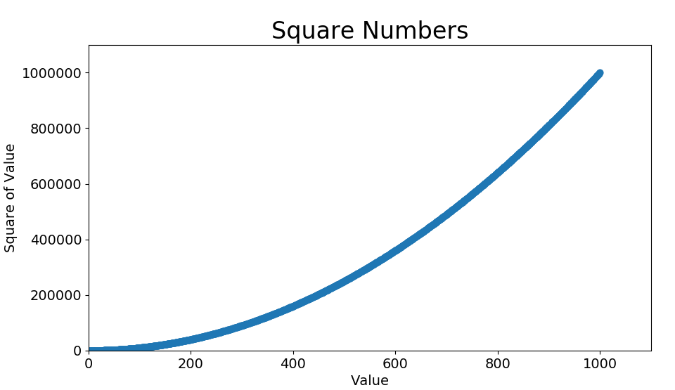
散点图
import matplotlib.pyplot as plt
x_values = list(range(1, 1001))
y_values = [x**2 for x in x_values]
plt.scatter(x_values, y_values, s=40)
#plt.scatter(x_values, y_values, edgecolor='none', s=40)#新增设置边缘颜色
#plt.scatter(x_values, y_values, c='red', edgecolor='none', s=40)#新增设置点的颜色
#plt.scatter(x_values, y_values, c=(0, 0, 0.8), edgecolor='none', s=40)#新增设置点的颜色为RGB颜色模式
# 设置图表标题并给坐标轴加上标签
plt.title("Square Numbers", fontsize=24)
plt.xlabel("Value", fontsize=14)
plt.ylabel("Square of Value", fontsize=14)
# 设置刻度标记的大小
plt.tick_params(axis='both', which='major', labelsize=14)
plt.axis([0, 1100, 0, 1100000])
# 设置每个坐标轴的取值范围
plt.axis([0, 1100, 0, 1100000])

plt.show()
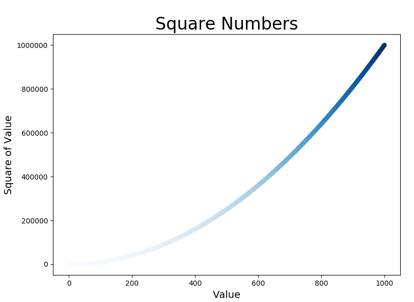
颜色映射colormap
了解更多pyplot的颜色映射,官网传送门https://matplotlib.org/gallery/color/colormap_reference.html#sphx-glr-gallery-color-colormap-reference-py
关于cmap的随机漫步例子,请在下集见
例子
关键语句
plt.scatter(x_values, y_values, c=y_values, cmap=plt.cm.Blues, edgecolor='none', s=40)
参数c设置成一个y值列表,y值较小的点为浅蓝色,y值较大的点为深蓝色
全部代码


import matplotlib.pyplot as plt
x_values = list(range(1001))
y_values = [x**2 for x in x_values]
plt.scatter(x_values, y_values, c=y_values, cmap=plt.cm.Blues,
 edgecolor='none', s=40)

# 设置图表标题并给坐标轴加上标签
plt.title("Square Numbers", fontsize=24)
plt.xlabel("Value", fontsize=14)
plt.ylabel("Square of Value", fontsize=14)

plt.show()
自动保存图标
plt.savefig('figurename.png', bbox_inches='tight')
也可以设置dpi
各种函数的常用参数
plot()
常见线的属性有:color,label,linewidth,linestyle,maker等
plot函数的一般的调用形式:
#单条线:
plot([x], y, [fmt], data=None, **kwargs)
#多条线一起画
plot([x], y, [fmt], [x2], y2, [fmt2], ..., **kwargs)
可选参数[fmt] 是一个字符串来定义图的基本属性如:颜色(color),点型(marker),线型(linestyle),
具体形式 fmt = '[color][marker][line]'
fmt接收的是每个属性(线的颜色、线的形状、点的标记形状)的单个字母缩写,顺序任意,例如:plot(x, y, 'bo-') # 蓝色圆点实线
如果我们不想缩写的话,可以分别写成如: color=’green’, linestyle=’dashed’, marker=’o’,linewidth=1,或color='#900302'
对应使用参数选择参考文章https://blog.csdn.net/sinat_36219858/article/details/79800460
tick_param()
常用参数axis : {‘x’, ‘y’, ‘both’},which : {‘major’, ‘minor’, ‘both’} ,direction : {‘in’, ‘out’, ‘inout’},labelsize等
参考文章 https://blog.csdn.net/helunqu2017/article/details/78736554/
scatter()
def scatter(x, y, s=None, c=None, marker=None, cmap=None, norm=None, vmin=None, vmax=None, alpha=None, linewidths=None, verts=None, edgecolors=None, hold=None, data=None, **kwargs)
alpha:透明度
参考文章https://blog.csdn.net/qq_38486203/article/details/80578260
这篇文章同样简单明了https://blog.csdn.net/anneqiqi/article/details/64125186
xlim()、ylim()、axis()
plt.xlim(num1, num2)
plt.xlim(xmin=num1,xmax=num2)
axis()参数
1、xmin, xmax, ymin, ymax : float, optional
2、option : str
3、emit : bool, optional, default True
参考文章https://blog.csdn.net/The_Time_Runner/article/details/89928057
figure()
matplotlib.pyplot.figure(num=None, figsize=None, dpi=None, facecolor=None, edgecolor=None, frameon=True, FigureClass=<class 'matplotlib.figure.Figure'>, clear=False, **kwargs)
参考文章https://blog.csdn.net/black_shuang/article/details/81299200
2020-03-03

 浙公网安备 33010602011771号