3D导航栏
<!DOCTYPE html>
<html lang="en">

<head>
    <meta charset="UTF-8">
    <meta name="viewport" content="width=device-width, initial-scale=1.0">
    <meta http-equiv="X-UA-Compatible" content="ie=edge">
    <title>Document</title>
    <style>
        * {
            margin: 0;
            padding: 0;
        }

        ul {
            margin: 100px;
        }

        ul li {
            float: left;
            margin: 0 5px;
            width: 120px;
            height: 35px;
            line-height: 35px;
            text-align: center;
            list-style: none;
            /* 一会我们需要给box 旋转 也需要透视 干脆给li加 里面的子盒子都有透视效果 */
            perspective: 500px;
        }

        .box {
            position: relative;
            width: 100%;
            height: 100%;
            transform-style: preserve-3d;
            transition: all .4s;
        }

        .box:hover {
            transform: rotateX(90deg);
        }

        .front,
        .bottom {
            position: absolute;
            left: 0;
            top: 0;
            width: 100%;
            height: 100%;
        }

        .front {
            background-color: pink;
            z-index: 1;
            transform: translateZ(17.5px);
        }

        .bottom {
            background-color: yellowgreen;
            /* 这个x轴一定是负值 */
            /* 我们如果有移动 或者其他样式,必须先写我们的移动 */
            transform: translateY(17.5px) rotateX(-90deg);
        }
    </style>
</head>

<body>
    <ul>
        <li>
            <div class="box">
                <div class="front"> 我是程序员</div>
                <div class="bottom"> 我在这里等你</div>
            </div>
        </li>
        <li>
            <div class="box">
                <div class="front"> 我是程序员</div>
                <div class="bottom"> 我在这里等你</div>
            </div>
        </li>
        <li>
            <div class="box">
                <div class="front"> 我是程序员</div>
                <div class="bottom"> 我在这里等你</div>
            </div>
        </li>
        <li>
            <div class="box">
                <div class="front"> 我是程序员</div>
                <div class="bottom"> 我在这里等你</div>
            </div>
        </li>
        <li>
            <div class="box">
                <div class="front"> 我是程序员</div>
                <div class="bottom"> 我在这里等你</div>
            </div>
        </li>
        <li>
            <div class="box">
                <div class="front"> 我是程序员</div>
                <div class="bottom"> 我在这里等你</div>
            </div>
        </li>
    </ul>
</body>

</html>

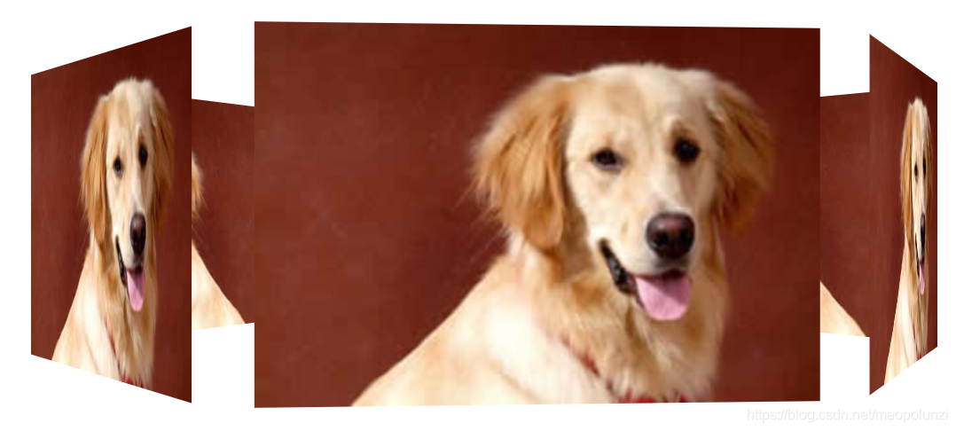
旋转木马
<!DOCTYPE html>
<html lang="en">

<head>
    <meta charset="UTF-8">
    <meta name="viewport" content="width=device-width, initial-scale=1.0">
    <meta http-equiv="X-UA-Compatible" content="ie=edge">
    <title>Document</title>
    <style>
        body {
            perspective: 1000px;
        }

        section {
            position: relative;
            width: 300px;
            height: 200px;
            margin: 150px auto;
            transform-style: preserve-3d;
            /* 添加动画效果 */
            animation: rotate 10s linear infinite;
            background: url(media/pig.jpg) no-repeat;
        }

        section:hover {
            /* 鼠标放入section 停止动画 */
            animation-play-state: paused;
        }

        @keyframes rotate {
            0% {
                transform: rotateY(0);
            }
            100% {
                transform: rotateY(360deg);
            }
        }

        section div {
            position: absolute;
            top: 0;
            left: 0;
            width: 100%;
            height: 100%;
            background: url(media/dog.jpg) no-repeat;
        }

        section div:nth-child(1) {
            transform: rotateY(0) translateZ(300px);
        }

        section div:nth-child(2) {
            /* 先旋转好了再 移动距离 */
            transform: rotateY(60deg) translateZ(300px);
        }

        section div:nth-child(3) {
            /* 先旋转好了再 移动距离 */
            transform: rotateY(120deg) translateZ(300px);
        }

        section div:nth-child(4) {
            /* 先旋转好了再 移动距离 */
            transform: rotateY(180deg) translateZ(300px);
        }

        section div:nth-child(5) {
            /* 先旋转好了再 移动距离 */
            transform: rotateY(240deg) translateZ(300px);
        }

        section div:nth-child(6) {
            /* 先旋转好了再 移动距离 */
            transform: rotateY(300deg) translateZ(300px);
        }
    </style>
</head>

<body>
    <section>
        <div></div>
        <div></div>
        <div></div>
        <div></div>
        <div></div>
        <div></div>
    </section>
</body>

</html>

 浙公网安备 33010602011771号