
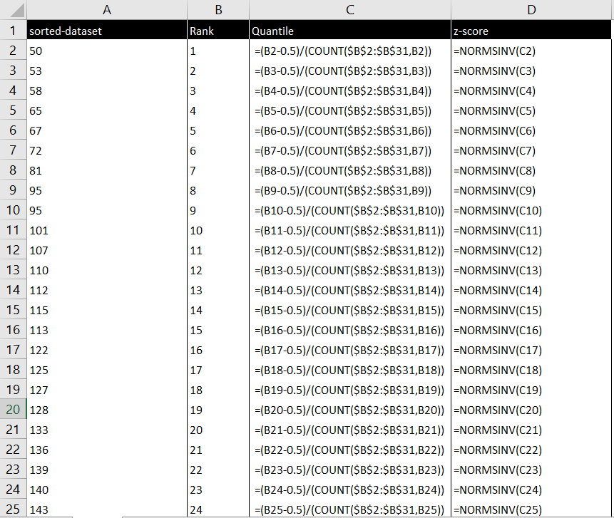
在Excel里绘制Q-Q图
Q-Q图可以用于检验样本是否服从正态分布,在Excel里绘制Q-Q图步骤如下(参考How do you make Q-Q plot in Excel?):
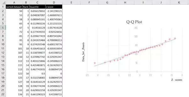
- 排序的数据集 A sorted data set
- 对数据点排序的序数序列 An ordinal sequence to rank the data points
- 对数据点执行分位数计算 Perform the quantile calculation over the data set points
- 查找与数据集的分位数相对应的z分数 Find the z-scores corresponding to the quantiles of the data set
This in an illustration of the above mentioned:
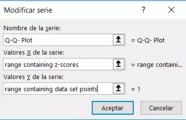
Then, you Insert a scatter plot, using the z-scores as the X axis and the data set points as the Y Axis
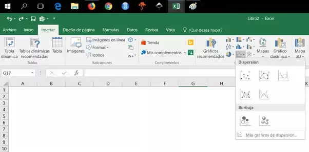
{Please notice: my Excel version is in Spanish, but the context is the same for all other language versions.}
After doing this, you will have a chart that resembles this
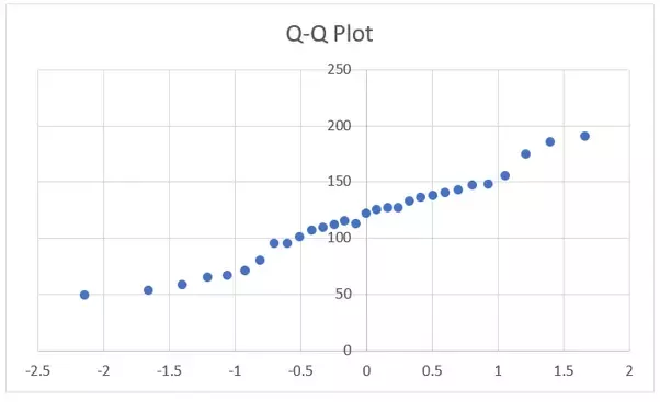
Right-click on the data points and select the add trend line option
Format the plot as desired

 浙公网安备 33010602011771号