
布局方式篇
好不多说 上图
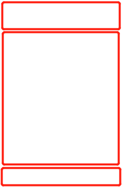
现在很多h5页面都会有这种布局方式
但是实现的方式都各种各样
第一种
利用 定位 布局方式
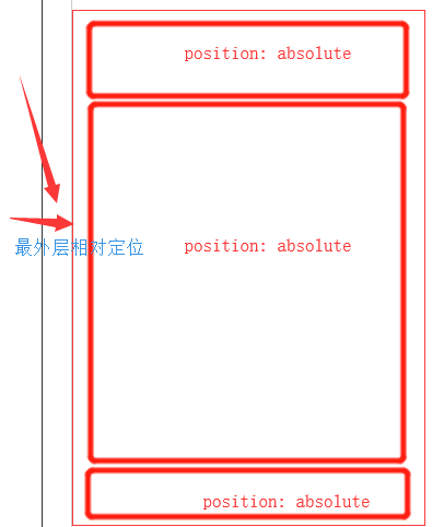
这种布局方式要注意的点就是 要注意父级宽度与高度
一般都会设置 body 和html 的高宽为100%
第二种 比较推荐的方式
<!DOCTYPE html>
<html lang="en">

<head>
    <meta charset="UTF-8">
    <meta name="viewport" content="width=device-width, initial-scale=1.0">
    <meta http-equiv="X-UA-Compatible" content="ie=edge">
    <title>Document</title>
    <style>
        html,
        body {
            padding: 0;
            margin: 0;
            height: 100%;
            width: 100%;
        }

        body {
            display: -webkit-box;
            -webkit-tap-highlight-color: transparent;
            -webkit-box-orient: vertical;

        }

        .top {
            height: 50px;
            width: 100%;
            background-color: #ccc;
        }

        .middle {
            height: 100%;
            width: 100%;
            background-color: #fff;
            position: relative;
            -webkit-box-flex: 1;
            overflow-y: scorll;
        }

        .footer {
            width: 100%;
            height: 80px;
            background-color: #ddd;
        }
    </style>
</head>

<body>
    <div class="top">
        导航
    </div>

    <div class="middle">
        中间可以滚动
    </div>

    <div class="footer">
        底部
    </div>
</body>

</html>
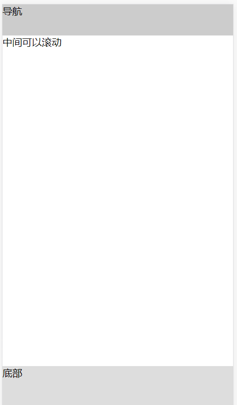
这是效果图
这个方法的好处是 中间的高度是自适应的 底部导航 会一直在底部 上面导航也会一直在上面 中间的高度 会自动撑满 余下的位置

 浙公网安备 33010602011771号