


怎么制作功能强大的位图按钮控件
怎么制作功能强大的位图按钮控件
系统:WindowsXP P
环境:Visual Studio.NET 2003 语言:C# 源码下载
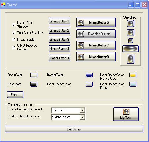
在开始我们的讲解之前先看一下我们位图Button控件的效果(很漂亮吧!)如果你对这个控件感兴趣的话,就跟着我们的脚步学习如何做出这样的一个控件吧!
简介:
创建自定义位图控件的目的是允许在每一种按钮状态下呈现不同的位图,这些状态包括:disabled, normal, mouse over,还有button pressed;除了按钮的图像,让我们的按钮饱含文本,并且根据按钮图片控制文本的对齐方式也很重要。按钮采用XP样式,还包含了我们定制的一些特性。
代码使用:
程序的源码可以分为3大部分:data(数据), rendering(表现), and events(事件)
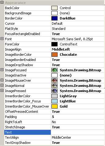
Data:存储状态和设置属性的私有变量,下表中有每一个属性的描述。
Rendering:按钮的呈现是靠几个方法来实现的,OnPaint方法是调用其它绘制方法的一个驱动性质的方法(意思就是靠我们的OnPaint方法,调用自定义的绘制方法),用来呈现我们的Button控件
Events:事件处理操作按钮的状态这些事件有:OnMouseDown, OnMouseUp, OnMouseLeave, OnMouseMove, OnEnabledChanged, OnLostFocus.
Data:
首先让我们研究一下这些属性
|
BITMAP BUTTON PROPERTIES | ||||||||||||||||||||||||||||||||||||||||||||
|
所有的这些属性都被加到属性标签页了,下面是个截图:
Rendering:
按钮控件的呈现工作是OnPaint方法实现的,它轮流调用几个方法呈现Button我们设置的状态。
CreateRegion: 创建按钮的圆角边框paint_Background: 绘制呈现按钮背景paint_Text: 绘制呈现按钮文本和文本阴影paint_Border: 绘制 1像素的按钮边框paint_InnerBorder: 绘制 2像素的按钮内边框paint_FocusBorder: 绘制 1像素的按钮虚线焦点边框
 /// <summary>
 /// This method paints the button in its entirety./// </summary>
 /// <param name="e">paint arguments use to paint the button</param>
 protected override void OnPaint(PaintEventArgs e){ CreateRegion(0); paint_Background(e); paint_Text(e); paint_Image(e); paint_Border(e); paint_InnerBorder(e); paint_FocusBorder(e);}
绘制背景应该是很有趣的:
Painting the background can be of some interest. The approach that was taken allows for a gradient background interpolation between multiple colors (meaning more then 2 colors). First, a blend object needs to be initialized with an array of colors, and the position of interpolation. Next, the gradient brush can be created as usual. The Final step involves linking the blend object to the brush. This is accomplished by setting the InterpolationColors property of a brush.
下面是复合颜色的代码示例:
Color[] ColorArray = new Color[]{
   System.Drawing.Color.White,
   System.Drawing.Color.Yellow,
   System.Drawing.Color.Blue,
   System.Drawing.Color.Green,
   System.Drawing.Color.Red,
   System.Drawing.Color.Black};
float[] PositionArray  = new float[]{0.0f,.15f,.40f,.65f,.80f,1.0f};
//
// create blend variable for the interpolate the colors
//
System.Drawing.Drawing2D.ColorBlend blend
                                = new System.Drawing.Drawing2D.ColorBlend();
blend.Colors    = ColorArray;
blend.Positions = PositionArray;
//
// create vertical gradient brush
//
System.Drawing.Drawing2D.LinearGradientBrush brush
                = new System.Drawing.Drawing2D.LinearGradientBrush(rect,
                      this.BackColor,Blend(this.BackColor,this.BackColor,10),
                      System.Drawing.Drawing2D.LinearGradientMode.Vertical);
brush.InterpolationColors = blend;
//
// fill the rectangle
//
g.FillRectangle(brush, rect);
//
// release resources
//
brush.Dispose();
我使用了System.Drawing.DrawString()方法绘制按钮文本,在何处使用这个方法呢,为了区别paint_Text()方法,我们将代码放置在Helper函数部分(看源代码大家就一目了然是什么意思了)还有一处大家一定会感兴趣,就是文本的阴影效果是如何实现的呢?我们看看接下来的代码:
//// paint text shadow//if(TextDropShadow){ System.Drawing.Brush TransparentBrush0 = new System.Drawing.SolidBrush( System.Drawing.Color.FromArgb(50, System.Drawing.Color.Black ) ) ; System.Drawing.Brush TransparentBrush1 = new System.Drawing.SolidBrush( System.Drawing.Color.FromArgb(20, System.Drawing.Color.Black ) ) ; e.Graphics.DrawString(this.Text,this.Font, TransparentBrush0,pt.X,pt.Y+1); e.Graphics.DrawString(this.Text,this.Font, TransparentBrush0,pt.X+1,pt.Y); e.Graphics.DrawString(this.Text,this.Font, TransparentBrush1,pt.X+1,pt.Y+1); e.Graphics.DrawString(this.Text,this.Font, TransparentBrush1,pt.X,pt.Y+2); e.Graphics.DrawString(this.Text,this.Font, TransparentBrush1,pt.X+2,pt.Y); TransparentBrush0.Dispose(); TransparentBrush1.Dispose(); }
相信不用我多解释,大家就知道实现的原理是什么了吧,好了我们继续。
绘制图像更是一个直接的过程,但是在使用下面的方法的时候,我遇到了一些问题,当他绘制一个有我们资源编辑器产生的为图的时候确实没有什么问题,但是当我们绘制一个由第三方程序产生的24位位图的时候,失败了。它必须使用另一种DrawImage方法,现在我们知道接下来需要怎么修改我们的方法了。
// FAILEDg.DrawImage(image,rect.Left,rect.Top)// WORKAROUNDg.DrawImage(image,rect, 0, 0 ,image.Width,image.Height, GraphicsUnit.Pixel); 绘制边框的代码当然也不难,像前面一样创建一个梯度画刷对象,然后绘制的时候把这个对象当作参数传递进去,看下面的代码,其实很简单。
// .//// create brush and pens//System.Drawing.Drawing2D.LinearGradientBrush brush = new System.Drawing.Drawing2D.LinearGradientBrush(rect, this.BackColor,Blend(this.BackColor,this.BackColor,10), System.Drawing.Drawing2D.LinearGradientMode.Vertical);brush.InterpolationColors = blend;System.Drawing.Pen pen0 = new System.Drawing.Pen(brush,1);//// draw line 0//g.DrawLine(pen0 , point_0,point_1);//.
Events:
数据成员、一些方法都简单的陈述了,接下来看看我们的事件处理机制。按钮的一个大的方面就是事件和捕获与处理。我们走了个大的捷径,那就是重载按钮事件的方法,这些方法通过按钮属性直接修改按钮的状态。一旦状态改变,他们就会让控件无效,然后刷新机制重新绘制我们的Button。下面是事件方法列表和简单说明。
|
Event Methods |
Button state |
|
|
Set BtnState to Pushed and Capturing mouse to true 设置Button状态为按下,并且将捕获鼠标属性设为true |
|
|
Set BtnState to 设置Button状态为普通,并且将捕获鼠标属性设为false |
|
|
Set BtnState to normal if we CapturingMouse = true 设置Button状态为普通,如果捕获鼠标状态属性为true |
|
|
If CapturingMouse = true and mouse coordinates are within button region, set BtnState to Pushed, otherwise set BtnState to 简单的说就是根据十分捕获鼠标设置Button状态 |
|
|
The button either became enabled or disabled. If button became enabled, set BtnState to Button是否可用改变时的方法 |
|
|
Set btnState to 失去焦点,把Button状态属性变为普通的方法 |
下面的代码是一个简单的事件处理。这里值得注意的是Capture属性。
/// <summary>/// Mouse Down Event:/// set BtnState to Pushed and Capturing mouse to true/// </summary>/// <param name="e"></param>protected override void OnMouseDown(MouseEventArgs e){ base.OnMouseDown (e); this.Capture = true; this.CapturingMouse = true; btnState = BtnState.Pushed; this.Invalidate();}
按钮是否获取焦点问题,大家知道如果这个焦点一直被设置在Button上,那其它当实际焦点改变时,我们的事件处理机制就不能按照我们的要求正常工作了。给出原文供大家参考:
The below code block shows an example of the event code. Events generally are composed of little code. One tidbit of information I should cover is the Capture property of the control. By setting this to true, the button does not lose input focus when the pointer is outside the button region. This is important because if the mouse button is held down and the user moves the mouse pointer in and out of the button region, the state of the button needs to change accordingly. If the Capture property is not set, the control will stop capturing input events when the pointer leaves the button region.
由此展开的课题:
这只是程序最原始的一个版本,所有代码都在一个源文件中,以后我们可以扩展这个程序,比如预先定义好好看的样式,从一个XML文档加载我们主题信息,希望大家能好好利用这个程序,也希望这个程序真的能给大家带来帮助。
这里有一些额外的说明:
CodeProject这篇文章的源码是很不错的,值得大家研究研究,代码其实很简单,有这样的思路才是重点,这样的控件我们也完全能开发出来。
大家可以好好研究 HelperMethods,其实这些才是该控件比较精华的代码。
但是我也发现了一个问题,该控件对设计期的支持不够完善,具体说来就是你改变了某一个属性,它并没有立即在设计期反映出来,我研究了一下,发现它的属性设置完成了都没有这句话,前面我翻译的一篇文章已经强调了,要想让你的控件及时反映出属性的变化,做出相应的反映this.Invalidate()这句话是重点,希望大家不能忽视,我已将修改好的源代码打包,还有一个Demo程序,这样就比较完美了。
怎么把这个不错的控件添加到你的ToolBox中,相信不用我再教一次了,定位到这个dll就行了;还有如何定制自己的空间图标等等小的方面,参看我的这篇文章吧:http://www.cnblogs.com/jht/archive/

 浙公网安备 33010602011771号