[MAUI 项目实战] 音乐播放器(三):界面交互
![[MAUI 项目实战] 音乐播放器(三):界面交互](https://img2023.cnblogs.com/blog/644861/202302/644861-20230227171744731-307160920.png) UI设计的本质是对于产品的理解在界面中多种形式的映射,当需求和定位不同时,对相同的功能表达出了不同的界面和交互方式。作为播放器,界面可以是千差万别的。《番茄播放器》的iOS平台上我开发了传统版本,和基于手势播放的版本。它们界面不同,但用的同一个播放内核。作为播放内核项目,在MatoMusic.Core的工作已经结束。本系列博文重点还是在播放器思路的解读,关于MAUI动画交互,我打算有时间另外写博客(这里给自己挖个坑)。 本项目中朴实无华的播放器界面部分,我想仅作为辅佐播放内核的示例,对于页面和控件的Xaml部分不会展开描述。
UI设计的本质是对于产品的理解在界面中多种形式的映射,当需求和定位不同时,对相同的功能表达出了不同的界面和交互方式。作为播放器,界面可以是千差万别的。《番茄播放器》的iOS平台上我开发了传统版本,和基于手势播放的版本。它们界面不同,但用的同一个播放内核。作为播放内核项目,在MatoMusic.Core的工作已经结束。本系列博文重点还是在播放器思路的解读,关于MAUI动画交互,我打算有时间另外写博客(这里给自己挖个坑)。 本项目中朴实无华的播放器界面部分,我想仅作为辅佐播放内核的示例,对于页面和控件的Xaml部分不会展开描述。
UI设计的本质是对于产品的理解在界面中多种形式的映射,当需求和定位不同时,对相同的功能表达出了不同的界面和交互方式。
作为播放器,界面可以是千差万别的。《番茄播放器》的iOS平台上我开发了传统版本,和基于手势播放的版本。
图片来自于App Store宣传图
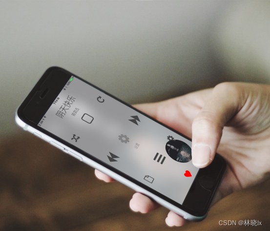
它们界面不同,但用的同一个播放内核。
作为播放内核项目,在MatoMusic.Core的工作已经结束。本系列博文重点还是在播放器思路的解读,关于MAUI动画交互,我打算有时间另外写博客(这里给自己挖个坑)。 本项目中朴实无华的播放器界面部分,我想仅作为辅佐播放内核的示例,对于页面和控件的Xaml部分不会展开描述。
在解决方案管理器中,我们新建MatoMusic项目,作为UI部分。
页面
依赖包
在MatoMusic.csproj中添加对Abp,Abp.AutoMapper,Abp.Castle.Log4Net,CommunityToolkit.Maui的包依赖
<ItemGroup>
  <PackageReference Include="Abp" Version="7.4.0" />
  <PackageReference Include="Abp.AutoMapper" Version="7.4.0" />
  <PackageReference Include="Abp.Castle.Log4Net" Version="7.4.0" />
  <PackageReference Include="CommunityToolkit.Maui" Version="2.0.0" />
</ItemGroup>
CommunityToolkit.Maui.Views.Popup为系统提供弹窗页面支持
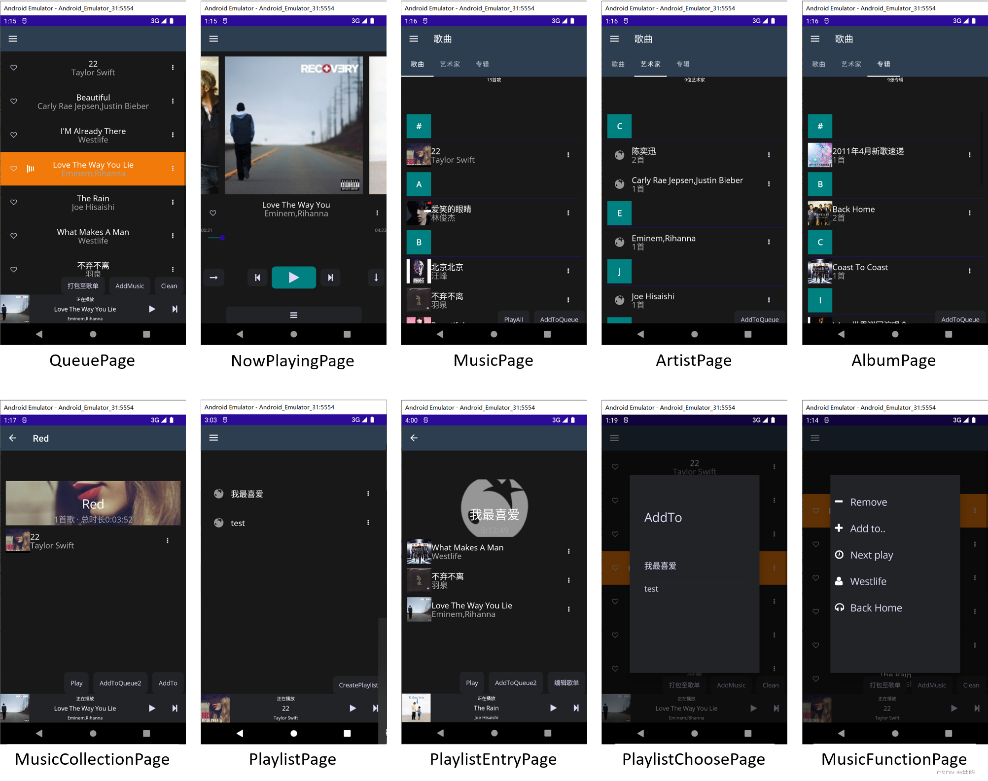
页面设计
已注册的路由页面
- NowPlayingPage - 正在播放页面
- QueuePage - 播放队列页面
- MusicPage - 歌曲页面
- ArtistPage - 艺术家页面
- AlbumPage - 专辑页面
- PlaylistPage - 歌单页面
以及导航或弹窗页面
- MusicCollectionPage - 歌曲集合详情页面
- PlaylistEntryPage - 歌单详情页面
- PlaylistFunctionPage - 歌单功能列表页面
- PlaylistChoosePage - 歌单选择页面
路由页面可以从侧滑菜单栏或功能列表中通过指定的Uri跳转
界面设计风格设计如下:
主页面
.NET MAUI Shell 通过提供大多数应用所需的基本功能来降低应用开发的复杂性,应用视觉对象层次结构导航,详情见官方文档
建立一个Shell页面MainPage.cs作为初始界面:
在页面Load完成后调用IMusicRelatedViewModel.InitAll()方法
public partial class MainPage : Shell, ITransientDependency
{
    private readonly IocManager iocManager;

    public MainPage(IocManager iocManager)
	{
		InitializeComponent();
        this.iocManager = iocManager;
        this.Init();
        Loaded += MainPage_Loaded;
    }

    private async void MainPage_Loaded(object sender, EventArgs e)
    {
        var musicRelatedViewModel = iocManager.Resolve<MusicRelatedService>();
        await musicRelatedViewModel.InitAll();
    }
}
在Xaml中定义各页面的层次结构,隐式注册的路由页面:
<FlyoutItem Route="NowPlayingPage" Title="正在播放" Icon="tab_home.png">
    <ShellContent x:Name="NowPlayingPageShellContent"/>
</FlyoutItem>
<FlyoutItem Route="QueuePage" Title="播放队列" Icon="tab_favorites.png">
    <ShellContent x:Name="QueuePageShellContent"/>
</FlyoutItem>
<FlyoutItem  Route="LibraryMainPage" Title="库" Icon="tab_map.png" >
    <Tab>
        <ShellContent  Title="歌曲" Icon="headphone.png"  x:Name="MusicPageShellContent"/>
        <ShellContent  Title="艺术家" Icon="microphone2.png"  x:Name="ArtistPageShellContent"/>
        <ShellContent  Title="专辑" Icon="cd2.png"  x:Name="AlbumPageShellContent"/>
    </Tab>
</FlyoutItem>
<FlyoutItem  Route="PlaylistPage"  Title="歌单" Icon="tab_map.png">
    <ShellContent x:Name="PlaylistPageShellContent"/>
</FlyoutItem>
后端代码中为各ShellContent指定页面对象
private void Init()
{
    var nowPlayingPage = iocManager.Resolve<NowPlayingPage>();
    var queuePage = iocManager.Resolve<QueuePage>();
    var playlistPage = iocManager.Resolve<PlaylistPage>();
    this.NowPlayingPageShellContent.Content = nowPlayingPage;
    this.QueuePageShellContent.Content = queuePage;
    this.PlaylistPageShellContent.Content = playlistPage;

    var musicPage = iocManager.Resolve<MusicPage>();
    var albumPage = iocManager.Resolve<AlbumPage>();
    var artistPage = iocManager.Resolve<ArtistPage>();

    this.MusicPageShellContent.Content = musicPage;
    this.ArtistPageShellContent.Content = artistPage;
    this.AlbumPageShellContent.Content = albumPage;
}
在App.xaml.cs中配置初始页面
public partial class App : Application
{
    private readonly AbpBootstrapper _abpBootstrapper;

    public App(AbpBootstrapper abpBootstrapper)
    {
        _abpBootstrapper = abpBootstrapper;
        InitializeComponent();
        _abpBootstrapper.Initialize();
        this.MainPage = abpBootstrapper.IocManager.Resolve(typeof(MainPage)) as MainPage;
    }
}
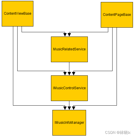
基础可视化元素类
其中ContentPage,ContentView,Popup分别继承于以下三个类别
ContentPageBase
ContentViewBase
PopupBase
他们包含Abp提供的本地化,对象映射,设置等服务,类图如下

ContentPage和ContentViewBase包含曲目管理器IMusicInfoManager和播放控制服务IMusicControlService,类图如下
导航
NavigationService,封装了初始页面的INavigation对象和导航方法
支持:
- 路由方式的导航 - Shell 视觉层次结构中隐式注册的路由。
- 页面导航 - 模式导航页面可以从应用的任何位置推送到堆叠导航。
PushAsync或PushModalAsync可以按文件名的页面导航
public async Task PushAsync(string pageName, object[] args = null)
 {
     var page = GetPageInstance(pageName, args);
     await mainPageNavigation.PushAsync(page);
 }

public async Task PushModalAsync(string pageName, object[] args = null)
{
    var page = GetPageInstance(pageName, args);
    await mainPageNavigation.PushModalAsync(page);
}
GetPageInstance通过反射的方式创建页面对象
传入对象名称,参数和工具栏项目对象,返回页面对象
private Page GetPageInstance(string obj, object[] args, IList<ToolbarItem> barItem = null)
{
    Page result = null;
    var namespacestr = "MatoMusic";
    Type pageType = Type.GetType(namespacestr + "." + obj, false);
    if (pageType != null)
    {
        try
        {
            var ctorInfo = pageType.GetConstructors()
                                  .Select(m => new
                                  {
                                      Method = m,
                                      Params = m.GetParameters(),
                                  }).Where(c => c.Params.Length == args.Length)
                                  .FirstOrDefault();
            if (ctorInfo==null)
            {
                throw new Exception("找不到对应的构造函数");
            }

            var argsDict = new Arguments();

            for (int i = 0; i < ctorInfo.Params.Length; i++)
            {
                var arg = ctorInfo.Params[i];
                argsDict.Add(arg.Name, args[i]);
            }

            var pageObj = iocManager.IocContainer.Resolve(pageType, argsDict) as Page;

            if (barItem != null && barItem.Count > 0)
            {
                foreach (var toolbarItem in barItem)
                {
                    pageObj.ToolbarItems.Add(toolbarItem);
                }
            }
            result = pageObj;
        }
        catch (Exception e)
        {
            Debug.WriteLine(e.Message);
        }
    }
    return result;
}
其中,弹窗的打开和关闭由扩展类CommunityToolkit.Maui.Views.PopupExtensions提供方法
页面资源
NET MAUI 单一项目使资源文件可以存储在统一位置上(一般是Resources文件夹下),为跨平台方案使用。详情见官方文档
将在Fonts添加FontAwesome字体文件,以及Images中添加图标png文件
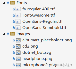
MatoMusic.csproj文件中,对资源范围进行限定,此时的限定范围是Resources\Fonts\*和Resources\Images\*
<ItemGroup>
	<!-- App Icon -->
	<MauiIcon Include="Resources\AppIcon\appicon.svg" ForegroundFile="Resources\AppIcon\appiconfg.svg" Color="#512BD4" />

	<!-- Splash Screen -->
	<MauiSplashScreen Include="Resources\Splash\splash.svg" Color="#512BD4" BaseSize="128,128" />

	<!-- Images -->
	<MauiImage Include="Resources\Images\*" />
	<MauiImage Update="Resources\Images\dotnet_bot.svg" BaseSize="168,208" />

	<!-- Custom Fonts -->
	<MauiFont Include="Resources\Fonts\*" />

	<!-- Raw Assets (also remove the "Resources\Raw" prefix) -->
	<MauiAsset Include="Resources\Raw\**" LogicalName="%(RecursiveDir)%(Filename)%(Extension)" />
</ItemGroup>
样式和主题
在移动端应用配色设计上,不同的应用应该有其独特的设计风格,但因遵循配色原理。
基本配色要求有:应该保持主色统一,使主题鲜明突出;前景、背景色反差强烈使内容更容易阅读;前景、背景有相应辅助色使界面灵动不古板。
因此系统样式应该包含:
- PhoneForegroundBrush - 前景色
- PhoneContrastForegroundBrush - 辅前景色
- PhoneBackgroundBrush - 背景色
- PhoneContrastBackgroundBrush - 辅背景色
- PhoneAccentBrush - 主色(亮色)
- PhoneChromeBrush - 暗色
DarkTheme.xaml暗色主题配置
    <Color x:Key="PhoneBackgroundBrush">#181818</Color>
    <Color x:Key="PhoneForegroundBrush">White</Color>
    <Color x:Key="PhoneContrastBackgroundBrush">#222326</Color>
    <Color x:Key="PhoneContrastForegroundBrush">#DFD8F7</Color>
    <Color x:Key="PhoneAccentBrush">Teal</Color>
    <Color x:Key="PhoneChromeBrush">#A5A5A5</Color>
LightTheme.xaml亮色主题配置
    <Color x:Key="PhoneBackgroundBrush">White</Color>
    <Color x:Key="PhoneForegroundBrush">#181818</Color>
    <Color x:Key="PhoneContrastBackgroundBrush">#DFD8F7</Color>
    <Color x:Key="PhoneContrastForegroundBrush">#828386</Color>
    <Color x:Key="PhoneAccentBrush">Teal</Color>
    <Color x:Key="PhoneChromeBrush">#A5A5A5</Color>
CommonResourceDictionary.xaml中定义通用的控件样式,如Label和Button控件,部分的定义如下
Label全局样式
<Style TargetType="Label">
    <Setter Property="TextColor" Value="{DynamicResource PhoneForegroundBrush}" />
    <Setter Property="FontFamily" Value="OpenSansRegular" />
</Style>
Button全局样式以及特定样式
<Style TargetType="Button">
    <Setter Property="CornerRadius" Value="8"/>
    <Setter Property="TextColor" Value="{DynamicResource PhoneContrastForegroundBrush}" />
    <Setter Property="FontFamily" Value="OpenSansRegular" />
    <Setter Property="BackgroundColor" Value="{DynamicResource PhoneContrastBackgroundBrush}" />
    <Setter Property="Padding" Value="14,10" />
    <Setter Property="Margin" Value="5,0" />

</Style>
<Style TargetType="Button" x:Key="PrimaryButton">
    <Setter Property="CornerRadius" Value="8"/>
    <Setter Property="BackgroundColor" Value="Transparent"/>
    <Setter Property="TextColor" Value="{DynamicResource PhoneContrastForegroundBrush}" />
    <Setter Property="FontFamily" Value="OpenSansRegular" />
    <Setter Property="BackgroundColor" Value="{DynamicResource PhoneAccentBrush}" />
    <Setter Property="Padding" Value="14,10" />
    <Setter Property="Margin" Value="5,0" />
</Style>

<Style TargetType="Button" x:Key="TextButton">
    <Setter Property="BackgroundColor" Value="Transparent"/>
    <Setter Property="TextColor" Value="{DynamicResource PhoneContrastForegroundBrush}" />
    <Setter Property="FontFamily" Value="OpenSansRegular" />
    <Setter Property="BorderWidth" Value="0"/>
    <Setter Property="Padding" Value="14,10" />
    <Setter Property="Margin" Value="5,0" />
</Style>

<Style TargetType="Button" x:Key="PrimaryButtonOutline">
    <Setter Property="CornerRadius" Value="8"/>
    <Setter Property="BackgroundColor" Value="Transparent"/>
    <Setter Property="TextColor" Value="{DynamicResource PhoneContrastForegroundBrush}" />
    <Setter Property="FontFamily" Value="OpenSansRegular" />
    <Setter Property="BorderWidth" Value="1"/>
    <Setter Property="BorderColor" Value="{DynamicResource PhoneAccentBrush}"/>
    <Setter Property="Padding" Value="14,10" />
    <Setter Property="Margin" Value="5,0" />
</Style>
App.xaml中将主题和通用样式囊括到资源字典中
<Application.Resources>
    <ResourceDictionary>
        <ResourceDictionary.MergedDictionaries>
            <style:DarkTheme />
            <!--<style:LightTheme />-->
            <style:CommonResourceDictionary />
        </ResourceDictionary.MergedDictionaries>
    </ResourceDictionary>
</Application.Resources>
字体
配置
在MauiProgram.cs中,CreateMauiApp里将FontAwesome字体加入配置
public static MauiApp CreateMauiApp()
{
	var builder = MauiApp.CreateBuilder();
	builder
		.UseMatoMusic<MatoMusicModule>()
		.UseMauiApp<App>()
		.UseMauiCommunityToolkit()
		.ConfigureFonts(fonts =>
		{
			fonts.AddFont("OpenSans-Regular.ttf", "OpenSansRegular");
			fonts.AddFont("FontAwesome.ttf", "FontAwesome");
		});
	return builder.Build();
}
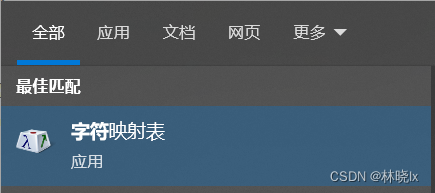
在Xaml中使用:在带有文字属性的标签中,如<Button>或<Label>,设置FontFamily属性为FontAwesome,设置Text属性为FontAwesome字符内容,此值可使用“字符映射表”工具查找。
<Button Text="" FontFamily="FontAwesome"></Button>
在本地计算机中安装好FontAwesome字体后,打开“字符映射表”工具,选择字体FontAwesome,点选后可以从下面的输入框中复制内容

本地化
使用Abp提供的本地化方案
在MatoMusic.Core项目的MatoMusicCoreModule.cs中
public class MatoMusicCoreModule : AbpModule
{
	public override void PreInitialize()
	{
		LocalizationConfigurer.Configure(Configuration.Localization);
	}
    ...
}
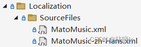
Localization/MatoMusicLocalization.cs中,将提供基于Xml的本地化的语言字典配置,从MatoMusic.Core.Localization.SourceFiles资源中访问字典:
public static void Configure(ILocalizationConfiguration localizationConfiguration)
{
    localizationConfiguration.Sources.Add(
        new DictionaryBasedLocalizationSource(MatoMusicConsts.LocalizationSourceName,
            new XmlEmbeddedFileLocalizationDictionaryProvider(
                typeof(LocalizationConfigurer).GetAssembly(),
                "MatoMusic.Core.Localization.SourceFiles"
            )
        )
    );
}
在这些文件的编译模式应为嵌入的资源
基础可视化元素类中提供L方法,返回本地化字符串
protected virtual string L(string name)
{
    return LocalizationSource.GetString(name);
}
TranslateExtension实现IMarkupExtension,MarkupLanguage的本质,是实例化一个对象。Xaml编译器,会调用标记扩展对象的ProvideValue方法,并将返回值赋值给使用了标记扩展的属性,ProvideValue中调用L方法完成翻译
[ContentProperty("Text")]
public class TranslateExtension : DomainService, IMarkupExtension
{
    public TranslateExtension()
    {
        LocalizationSourceName = MatoMusicConsts.LocalizationSourceName;

    }
    public string Text { get; set; }

    public object ProvideValue(IServiceProvider serviceProvider)
    {
        Console.WriteLine(CultureInfo.CurrentUICulture);
        if (Text == null)
            return "";
        var translation = L(Text);
        return translation;
    }
}
在Xaml中使用:在带有文字属性的标签中,如<Button>或<Label>,Text属性的值将转换为本地化字符串值。
ViewModel
Model-View-ViewModel (MVVM) 设计模式是在称为视图的 Xaml 用户界面和基础数据(称为模型)之间的一个软件层,称之为视图模型,即ViewModel,
界面视图和ViewModel通过Xaml中定义的数据绑定进行连接。 在视图类的构造函数中,我们以注入的方式将ViewModel导入视图,并赋值给BindingContext属性,例如在NowPlayingPage.cs中:
public NowPlayingPage(NowPlayingPageViewModel nowPlayingPageViewModel)
{
	InitializeComponent();
	this.BindingContext = nowPlayingPageViewModel;
	...
}
音乐相关服务类
前一章介绍了播放核心的两个类曲目管理器IMusicInfoManager和播放控制服务IMusicControlService,界面交互对象中对这两个类进行了应用。
MusicRelatedService是播放控制服务的一层封装,它基于ViewModelBase。
抽象的来说,音乐相关服MusicRelatedService包含一系列可绑定的属性,自动维护属性值,并在设置属性值时调用放控制服务完成业务变更操作。数据作为界面交互的支撑。
主要属性:
- NextMusic - 下一首曲目
- PreviewMusic - 上一首曲目
NextMusic和PreviewMusic用于绑定首页的上一曲、下一曲专辑封面。
- CurrentMusic - 当前曲目:正在播放的曲目,所有的音乐相关操作的对象都是当前曲目CurrentMusic。
CurrentMusic可在界面提供双向绑定支持,当其值变更时,代表切换播放歌曲。
- 调用IMmusicControlService.InitPlayer,设置播放器曲目
- 更新当前曲目的长度
- 更新上一首、下一首曲目
- 更新BreakPointMusicIndex值,并用SettingManager持久化当前曲目的角标编号
代码实现如下:
if (e.PropertyName == nameof(CurrentMusic))
{
    if (!Canplay || IsInited == false)
    {
        return;

    }
    await musicControlService.InitPlayer(CurrentMusic);
    DoUpdate();
    InitPreviewAndNextMusic();
    Duration = GetPlatformSpecificTime(musicControlService.Duration());
    SettingManager.ChangeSettingForApplication(CommonSettingNames.BreakPointMusicIndex, Musics.IndexOf(CurrentMusic).ToString());

}
-
Musics - 当前播放队列:可供播放的有序曲目集合,是自然播放、上一曲、下一曲、随机播放的范围。
-
Canplay - 表明当前曲目是否可供播放
实现如下:
public bool Canplay => this.CurrentMusic != null;
- CanplayAll - 指示是否可以播放全部曲目,当当前播放队列为空时,界面将显示向导
实现如下:
public bool CanplayAll => Musics.Count > 0;
- IsPlaying 表明是否正在播放
它的值变更由IMusicControlService.OnPlayStatusChanged事件触发,以实现自动维护属性值:
musicControlService.OnPlayStatusChanged+=MusicControlService_OnPlayStatusChanged;
private void MusicControlService_OnPlayStatusChanged(object sender, bool e)
{
    this.IsPlaying = e;
}
- Duration - 指示当前曲目时长
- CurrentTime - 指示当前曲目播放进度
这两个属性由一个自动定时器,每隔一段时间自动触发DoUpdate方法,以实现自动维护属性值:
public bool DoUpdate()
{
    this.CurrentTime = GetPlatformSpecificTime(musicControlService.CurrentTime());
    this.Duration = GetPlatformSpecificTime(musicControlService.Duration());

    return true;
}
- IsShuffle - 指示随机播放模式,是否为随机播放
- IsRepeatOne - 指示单曲循环模式,是否为单曲循环
这两个属性由SettingManager持久化其值。
- IsInited - 指示是否完成初始化服务
主要方法:
- InitCurrentMusic - 初始化当前曲目CurrentMusic
根据当前曲目的角标编号BreakPointMusicIndex值,从曲目库中获取当前曲目对象,并赋值给CurrentMusic。
- InitAll - 初始化服务,用于系统启动后的一次性调用
调用IMusicControlService.RebuildMusicInfos从播放列队中读取音频列表,完成后触发OnBuildMusicInfosFinished事件,触发InitCurrentMusic。
音乐相关ViewModel类
MusicRelatedViewModel是一个抽象类,基于ViewModelBase,包含MusicRelatedService,以及曲目管理器IMusicInfoManager和播放控制服务IMusicControlService对象,其子类可直接用于界面UI元素的绑定。
MusicRelatedViewModel的子类中,MusicRelatedService对象不需要在构造函数中注入,它将在访问器中初始化。
public MusicRelatedService MusicRelatedService
{
    get
    {
        if (_musicRelatedService==null)
        {
            _musicRelatedService = IocManager.Instance.Resolve<MusicRelatedService>();
            _musicRelatedService.PropertyChanged += this.Delegate_PropertyChanged;
        }
        return _musicRelatedService;
    }

}
并且在MusicRelatedViewModel的子类中,实现了对MusicRelatedService对象属性变更的事件冒泡:
private void Delegate_PropertyChanged(object sender, PropertyChangedEventArgs e)
{
    this.RaisePropertyChanged(e.PropertyName);
}
主要属性:
-
NextMusic - 下一首曲目
-
PreviewMusic - 上一首曲目
-
CurrentMusic - 当前曲目:正在播放的曲目,所有的音乐相关操作的对象都是当前曲目CurrentMusic。
-
Musics - 当前播放队列:可供播放的有序曲目集合,是自然播放、上一曲、下一曲、随机播放的范围。
-
Canplay - 表明当前曲目是否可供播放
-
CanplayAll - 指示是否可以播放全部曲目,当当前播放队列为空时,界面将显示向导
-
IsPlaying 表明是否正在播放
-
Duration - 指示当前曲目时长
-
CurrentTime - 指示当前曲目播放进度
-
IsShuffle - 指示随机播放模式,是否为随机播放
-
IsRepeatOne - 指示单曲循环模式,是否为单曲循环
-
PlayCommand - 播放/暂停命令
-
PreCommand - 上一曲命令
-
NextCommand - 下一曲命令
-
ShuffleCommand - 切换随机模式命令
-
RepeatOneCommand - 切换单曲循环命令
-
FavouriteCommand - 设置/取消设置“我最喜爱”
数据绑定
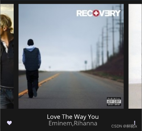
在NowPlayingPage中,对当前播放的曲目,以及上一首、下一首的曲目信息进行显示。
对于当前曲目的长度和进度,进行显示和控制,对播放的曲目进行控制等内容:
<Grid Grid.Column="1">
    <Image HorizontalOptions="Fill"
           x:Name="PreAlbumArt"
           HeightRequest="{Binding Source={x:Reference Name=RefBox}, Path=Height}"
           WidthRequest="{Binding Source={x:Reference Name=RefBox}, Path=Width}"
           VerticalOptions="Fill"
           TranslationX="-320"
           Source="{Binding PreviewMusic.AlbumArt,Converter={StaticResource AlbumArtConverter}}">
    </Image>

    <Image
        HeightRequest="{Binding Source={x:Reference Name=RefBox}, Path=Height}"
        WidthRequest="{Binding Source={x:Reference Name=RefBox}, Path=Width}"
        HorizontalOptions="Fill"
        VerticalOptions="Fill"
        Source="{Binding CurrentMusic.AlbumArt,Converter={StaticResource AlbumArtConverter}}">
        <Image.GestureRecognizers>
            <TapGestureRecognizer Command="{Binding SwitchPannelCommand}"></TapGestureRecognizer>
        </Image.GestureRecognizers>
    </Image>

    <Image
         x:Name="NextAlbumArt"
         HeightRequest="{Binding Source={x:Reference Name=RefBox}, Path=Height}"
         WidthRequest="{Binding Source={x:Reference Name=RefBox}, Path=Width}"
         HorizontalOptions="Fill"
         VerticalOptions="Fill"
         TranslationX="320"
         Source="{Binding NextMusic.AlbumArt,Converter={StaticResource AlbumArtConverter}}">
    </Image>
</Grid>
对曲目名称,艺术家的绑定:
 <StackLayout Grid.Column="1" HorizontalOptions="Center">
     <Label Text="{Binding CurrentMusic.Title}"
                    HorizontalOptions="FillAndExpand"
                    HorizontalTextAlignment="Center"
                    FontSize="{StaticResource BodyFontSize}"
                    TextColor="White" />
     <Label Margin="0,-5,0,0"
                    Text="{Binding CurrentMusic.Artist}"
                LineBreakMode="TailTruncation"
                    HorizontalOptions="FillAndExpand"
                    HorizontalTextAlignment="Center"
                    FontSize="{StaticResource BodyFontSize}"
                    TextColor="{DynamicResource PhoneChromeBrush}" />
 </StackLayout>
界面效果如下:
小窗播放控件MusicMiniView也对曲目信息进行了相似的绑定

进度控制区域代码:
<!--进度控制区域-->
<Grid Grid.Row="2"
              x:Name="ProgressControlLayout"
              BindingContext="{Binding}">

    <StackLayout Margin="0,0,0,0" Orientation="Horizontal">
        <Label Text="{Binding CurrentTime,Converter={StaticResource SecondsToTimeSpanConverter}}"
                       TextColor="{DynamicResource PhoneChromeBrush}"
                       FontSize="{StaticResource TinyFontSize}"
                       HorizontalOptions="StartAndExpand" />
        <Label  Text="{Binding Duration,Converter={StaticResource SecondsToTimeSpanConverter}}"
                        TextColor="{DynamicResource PhoneChromeBrush}"
                        FontSize="{StaticResource TinyFontSize}"
                        HorizontalOptions="End" />
    </StackLayout>
    <Slider
        Maximum="{Binding Duration,Converter={StaticResource SliderMaxValueConverter}}"
        Minimum="0.0"
        MinimumTrackColor="{DynamicResource PhoneAccentBrush}"
        IsEnabled="{Binding Canplay}"
        ValueChanged="OnValueChanged"
        Value="{Binding CurrentTime,Mode=TwoWay} ">
    </Slider>
</Grid>
播放控制区域代码:
<!--播放控制按钮-->
<Grid
Grid.Row="3"
BindingContext="{Binding}"
x:Name="PlayControlLayout">
<Grid.ColumnDefinitions>
<ColumnDefinition Width="1*"></ColumnDefinition>
<ColumnDefinition Width="Auto"></ColumnDefinition>
<ColumnDefinition Width="1*"></ColumnDefinition>
</Grid.ColumnDefinitions>
<Button VerticalOptions="Center"
HorizontalOptions="StartAndExpand"
Grid.Column="0"
Command="{Binding ShuffleCommand}"
FontFamily="FontAwesome"
FontSize="{StaticResource BodyFontSize}"
Text="{Binding IsShuffle,Converter={StaticResource Bool2StringConverter},ConverterParameter=|}"/>
<Grid Grid.Column="1" HorizontalOptions="Center" WidthRequest="216">
<Grid.ColumnDefinitions>
<ColumnDefinition Width="1*"></ColumnDefinition>
<ColumnDefinition Width="2*"></ColumnDefinition>
<ColumnDefinition Width="1*"></ColumnDefinition>
</Grid.ColumnDefinitions>
<Button
VerticalOptions="Center"
Grid.Column="0"
Command="{Binding PreCommand}"
FontFamily="FontAwesome"
FontSize="{StaticResource BodyFontSize}"
Text=""
/>
<Button
VerticalOptions="Center"
Grid.Column="1"
Command="{Binding PlayCommand}"
Style="{StaticResource PrimaryButton}"
FontFamily="FontAwesome"
FontSize="{StaticResource StandOutBodyFontSize}"
Text="{Binding IsPlaying,Converter={StaticResource Bool2StringConverter},ConverterParameter=|} "/>
<Button
VerticalOptions="Center"
Grid.Column="2"
Command="{Binding NextCommand}"
FontFamily="FontAwesome"
FontSize="{StaticResource BodyFontSize}"
Text=""/>
</Grid>
<Button VerticalOptions="Center"
HorizontalOptions="EndAndExpand"
Grid.Column="2"
Command="{Binding RepeatOneCommand}"
FontFamily="FontAwesome"
FontSize="{StaticResource BodyFontSize}"
Text="{Binding IsRepeatOne,Converter={StaticResource Bool2StringConverter},ConverterParameter=|}" />
</Grid>
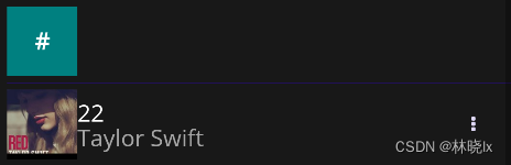
列表分组显示
下列三个页面使用ListView控件呈现曲目,专辑,艺术家的可滚动垂直列表
- MusicPage - 歌曲页面
- ArtistPage - 艺术家页面
- AlbumPage - 专辑页面
通过将 设置 ListView.GroupHeaderTemplateDataTemplate来自定义每个组标头的外观
在MusicGroupHeaderView.xaml中,定义分组标头的外观,由一个标题和亮色方形背景组成
<ContentView xmlns="http://schemas.microsoft.com/dotnet/2021/maui"
             xmlns:x="http://schemas.microsoft.com/winfx/2009/xaml"
             x:Class="MatoMusic.MusicGroupHeaderView">
    <Grid>
        <Grid.ColumnDefinitions>
            <ColumnDefinition Width="Auto">
            </ColumnDefinition>
            <ColumnDefinition>
            </ColumnDefinition>
        </Grid.ColumnDefinitions>
        <BoxView Color="{DynamicResource PhoneAccentBrush}"
                     Margin="0,5"
                     WidthRequest="54">
        </BoxView>
        <Label VerticalTextAlignment="Center"
               HorizontalTextAlignment="Center"
               Text="{Binding Title}"
               FontAttributes="Bold"
               TextColor="{DynamicResource PhoneForegroundBrush}"
               FontSize="{StaticResource BodyFontSize}">
        </Label>
    </Grid>

</ContentView>
在页面控件中,IsGroupingEnabled设置为true,并指定GroupHeaderTemplate属性为MusicGroupHeaderView
<ListView
    IsGroupingEnabled="true"
    <ListView.GroupHeaderTemplate>
        <DataTemplate>
            <ViewCell>
                <mato:MusicGroupHeaderView></mato:MusicGroupHeaderView>
            </ViewCell>
        </DataTemplate>
    </ListView.GroupHeaderTemplate>
<ListView.ItemTemplate>
界面效果如下
项目地址
本文来自博客园,作者:林晓lx,转载请注明原文链接:https://www.cnblogs.com/jevonsflash/p/17160540.html

 浙公网安备 33010602011771号