CSS3颜色和渐变
CSS3颜色和渐变
在CSS3中对颜色进行了很多扩展,我们不仅可以使用在css2中的rgb模式,十六进制模式,以及关键字模式,同时还支持RGBA模式,HSL 模式和HSLA模式,以及我们可以使用css3实现渐变色。
RGBA模式
RGBA在RGB的基础上多了控制alpha透明度的参数。以上R、G、B三个参数,正整数值的取值范围为:0 - 255。百分数值的取值范围为:0.0% - 100.0%。超出范围的数值将被截至其最接近的取值极限。并非所有浏览器都支持使用百分数值。A参数代表透明度,取值在0~1之间,不可为负值。
注意:如果想让背景实现全透明,可以使用,background:transparent
background-color:rgba(192,192,192,0.5);
HSL 模式和HSLA模式
HSL色彩模式是工业界的一种颜色标准,是通过对色调(H)、饱和度(S)、亮度(L)三个颜色通道的变化以及它们相互之间的叠加来得到各式各样的颜色的,HSL即是代表色调,饱和度,亮度三个通道的颜色
取值说明:
- Hue(色调),取值范围为:(0-360,) 0(或360)表示红色,120表示绿色,240表示蓝色,当然可取其他数值来确定其它颜色;
- Saturation (饱和度)的值形式为百分比(0%:gray ,100%:full color);
- Lightness (亮度)值形式也为为百分比(0%:black,100%:white);
- Alpha(透明度)的取值(0 -1)
background-color:hsl(120,65%,75%);
background-color:hsla(120,65%,75%,0.3);
渐变
CSS3 渐变(gradients)可以让你在两个或多个指定的颜色之间显示平稳的过渡。 以前,你必须使用图像来实现这些效果,现在通过使用 CSS3 的渐变(gradients)即可实现。此外,渐变效果的元素在放大时看起来效果更好,因为渐变(gradient)是由浏览器生成的。
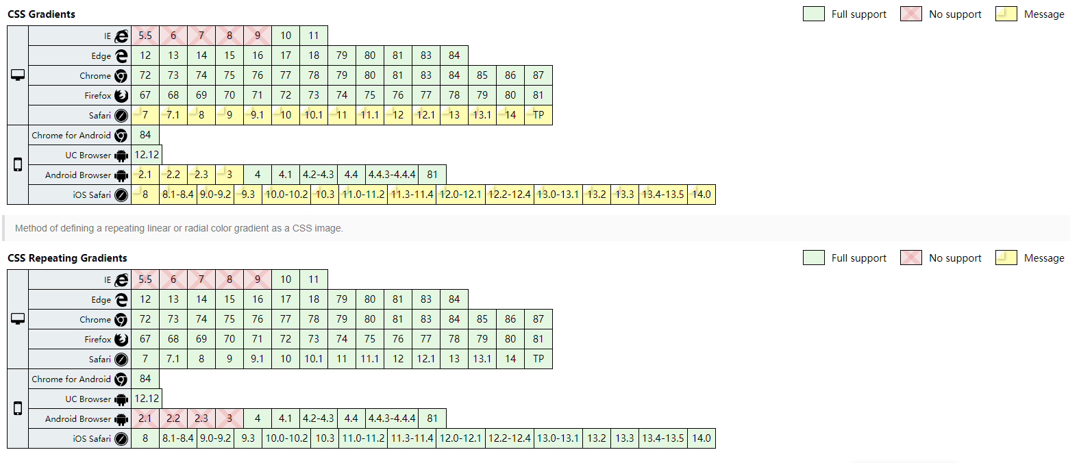
渐变兼容性:
渐变的类型
- 线性渐变(Linear Gradients)- 向下/向上/向左/向右/对角方向
- 径向渐变(Radial Gradients)- 由它们的中心定义
CSS3 线性渐变
语法:
background: linear-gradient(direction, color-stop1, color-stop2, ...);
- linear-gradient:线性渐变 ;
- direction:渐变的方向;
- color-stop1:颜色,颜色截止;
线性渐变实例
-
简单渐变
.box{
    background: -webkit-linear-gradient(red, blue); /* Safari 5.1 - 6.0 */
    background: -o-linear-gradient(red, blue); /* Opera 11.1 - 12.0 */
    background: -moz-linear-gradient(red, blue); /* Firefox 3.6 - 15 */
    background: linear-gradient(red, blue); /* 标准的语法 */
}
-
简单方向渐变
.box {
    background: -webkit-linear-gradient(left top, red , blue); /* Safari 5.1 - 6.0 */
    background: -o-linear-gradient(bottom right, red, blue); /* Opera 11.1 - 12.0 */
    background: -moz-linear-gradient(bottom right, red, blue); /* Firefox 3.6 - 15 */
    background: linear-gradient(to bottom right, red , blue); /* 标准的语法 */
}
-
使用角度
.box {
    background: -webkit-linear-gradient(180deg, red, blue); /* Safari 5.1 - 6.0 */
    background: -o-linear-gradient(180deg, red, blue); /* Opera 11.1 - 12.0 */
    background: -moz-linear-gradient(180deg, red, blue); /* Firefox 3.6 - 15 */
    background: linear-gradient(180deg, red, blue); /* 标准的语法 */
}
-
使用透明度
.box {
    background: -webkit-linear-gradient(left,rgba(255,0,0,0),rgba(255,0,0,1)); /* Safari 5.1 - 6 */
    background: -o-linear-gradient(right,rgba(255,0,0,0),rgba(255,0,0,1)); /* Opera 11.1 - 12*/
    background: -moz-linear-gradient(right,rgba(255,0,0,0),rgba(255,0,0,1)); /* Firefox 3.6 - 15*/
    background: linear-gradient(to right, rgba(255,0,0,0), rgba(255,0,0,1)); /* 标准的语法 */
}
- 重复的渐变
.box {
    /* Safari 5.1 - 6.0 */
    background: -webkit-repeating-linear-gradient(red, yellow 10%, green 20%);
    /* Opera 11.1 - 12.0 */
    background: -o-repeating-linear-gradient(red, yellow 10%, green 20%);
    /* Firefox 3.6 - 15 */
    background: -moz-repeating-linear-gradient(red, yellow 10%, green 20%);
    /* 标准的语法 */
    background: repeating-linear-gradient(red, yellow 10%, green 20%);
}
CSS3 径向渐变
径向渐变由它的中心定义。为了创建一个径向渐变,您也必须至少定义两种颜色结点。颜色结点即您想要呈现平稳过渡的颜色。同时,您也可以指定渐变的中心、形状(原型或椭圆形)、大小。默认情况下,渐变的中心是 center(表示在中心点),渐变的形状是 ellipse(表示椭圆形),渐变的大小是 farthest-corner(表示到最远的角落)。
background: radial-gradient(center, shape size, start-color, ..., last-color);
- radial-gradient:线性渐变 ;
- center:渐变的中心点;
- color-stop1:颜色/颜色截止;
径向渐变实例
-
简单实例
.box {
    background: -webkit-radial-gradient(red, green, blue); /* Safari 5.1 - 6.0 */
    background: -o-radial-gradient(red, green, blue); /* Opera 11.6 - 12.0 */
    background: -moz-radial-gradient(red, green, blue); /* Firefox 3.6 - 15 */
    background: radial-gradient(red, green, blue); /* 标准的语法 */
}
-
不均匀的渐变
.box {
    background: -webkit-radial-gradient(red 5%, green 15%, blue 60%); /* Safari 5.1 - 6.0 */
    background: -o-radial-gradient(red 5%, green 15%, blue 60%); /* Opera 11.6 - 12.0 */
    background: -moz-radial-gradient(red 5%, green 15%, blue 60%); /* Firefox 3.6 - 15 */
    background: radial-gradient(red 5%, green 15%, blue 60%); /* 标准的语法 */
}
-
形状渐变
语法:shape 参数定义了形状。它可以是值 circle 或 ellipse。其中,circle 表示圆形,ellipse 表示椭圆形。默认值是 ellipse
.box{
      background: -webkit-radial-gradient(circle, red, yellow, green); /* Safari 5.1 - 6.0 */
      background: -o-radial-gradient(circle, red, yellow, green); /* Opera 11.6 - 12.0 */
      background: -moz-radial-gradient(circle, red, yellow, green); /* Firefox 3.6 - 15 */
      background: radial-gradient(circle, red, yellow, green); /* 标准的语法 */
}
-
重复的径向渐变
.box {
    /* Safari 5.1 - 6.0 */
    background: -webkit-repeating-radial-gradient(red, yellow 10%, green 15%);
    /* Opera 11.6 - 12.0 */
    background: -o-repeating-radial-gradient(red, yellow 10%, green 15%);
    /* Firefox 3.6 - 15 */
    background: -moz-repeating-radial-gradient(red, yellow 10%, green 15%);
    /* 标准的语法 */
    background: repeating-radial-gradient(red, yellow 10%, green 15%);
}

 浙公网安备 33010602011771号