Visual Studio可视化IDE风格主题参照
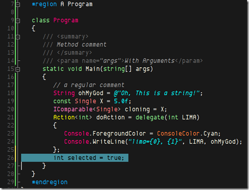
不难看出,经常见到Scott Guthrie所用的的Visual Studio主题就是Oren Ellenbogen's Dark Scheme主题。
Oren Ellenbogen's Dark Scheme
A lot of the darker schemes like Oren's don't use a True Black, but an "off black." His theme is very low contrast and uses muted, relaxing colors.

Mike "Blowmage" Moore's Ruby Blue
This is a low-contrast calm schema, but operators and numbers have a little "pop" to them.
Vibrant Borland by Mawi
This one bring backs good memories of writing Borland C++ with OWL and Turbovision, with a little Norton Commander thrown in for fun.
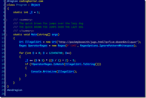
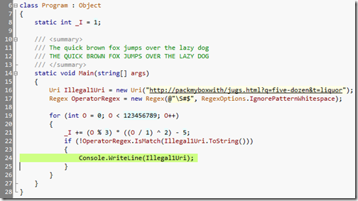
CodingHorror
One of the few light-colored themes, Jeff's also uses a custom font to make 0 and O stand out. Note that the white background is more of a paper-colored off-white.
Dave Reed's Jedi Scheme
Dave's schema uses a complete black, and a neon blue. A little intense, but much higher contrast.
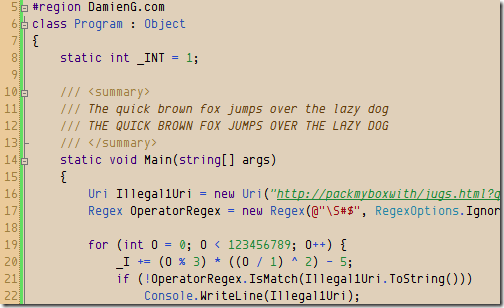
Damien Guard's Humane
This earthy theme includes little details like smart fonts and italics.
Tomas Restrepo's Themes
Tomas has done a huge amount of work in this space. You can get seven of his themes here. He's even got a tool to port color schemes from Visual Studio to SQL Management Studio.
Desert Nights
This theme uses the greatest range of colors outside of the Vibrant Ink them, and approaches, but doesn't reach, a number of primary colors.
Garden of Eden
Green, Kermit-green, sea-green, they are all here in this blue-green theme.
Ragnarok
Initially similar to many dark themes, this one uses complementary colors to provide contrast between identifiers and keywords, string literals and comments.
Nightingale
A more cheerful dark theme that includes italics for string literals and brighter neons for keywords.
Moria Alternate
This uses Deja Vu Sans Mono as it's font and uses a lot more neutrals and grays outside of the keyword space.
Brad Wilson Dark Visual Studio
A muted, low-contrast theme with blues and purples. Even the yellow is relaxed.

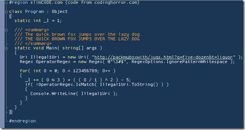
Martin Plante (slimCODE)
Martin likes small text, no ClearType to take advantage of crisp LCD screens. Rather than committing to blue or black he goes for a navy-gray-blue background.
John Lam's Vibrant Ink Port
John's trying for a straight port of Textmate's famous Vibrant Ink. This is a sharp, bright, neo-classic theme. Note his use of Monaco.
Rob Conery - Textmate
This is Rob's take on Vibrant Ink, added Consolas as the font, some bolding, and lowers the contrast a smidge.

 浙公网安备 33010602011771号