


Module Agenda
Legacy(遗产) layouts
Flexbox
Grid
Transforms
Transitions(过渡、转变) and Animations
1、Legacy layouts
(1)positioning
    #id01{
        position:absolute;
        top:25px;
        left:50px;
        z-index:0;
    }
    #id02{
        position:relative;
        top:25px;
        left:50px;
        z-index:1;
    }
position有四个属性值:relative、absolute、fixed、static。仅根据字面意思不是很好理解,以实例解释如下:(参见http://www.cnblogs.com/Zigzag/archive/2009/02/19/position.html)
<!DOCTYPE html PUBLIC "-//W3C//DTD XHTML 1.0 Transitional//EN" "http://www.w3.org/TR/xhtml1/DTD/xhtml1-transitional.dtd">
<html xmlns="http://www.w3.org/1999/xhtml" >
<head>
    <title></title>
    <style>
      /*relative 是相对元素本身的位置进行偏移
        relative的偏移是基于对象的margin的左上侧

        absolute:
        (1)当sub1的父级对象也设置了position属性,且position的属性值为absolute或relative时,
        sub1按照父级对象来定位,这个定位点将忽略padding,从padding的左上角进行定位
        (2)如果sub1不存在一个有着position属性的父对象,那么就以body定位
        sub2的位置到哪里去了呢?由于position设为absolute后,导致sub1溢出正常的文档流,就像它不属于parent一样。
        此时sub2将获得sub1的位置,它的文档流不再基于sub1,直接从parent开始。

        fixed 是特殊的absolute,即fixed总是以body为定位对象

        static 是position的默认值,一般不设置position属性时,会按照正常的文档流进行排列
       */
    #sub1
    {
        position:relative;
        padding:5px;
        top:5px;
        left:5px;
    }
    </style>
</head>
<body>
    <div id="parent">
        <div id="sub1">sub1</div>
        <div id="sub2">sub2</div>
    </div>
</body>
</html>
(2)display
    .vanish{
        display:none;
    }
    .centered{
        display:table-cell;
        min-height:200px;
        min-width:200px;
        text-align:center;
        vertical-align:middle;
        border:1px solid #ff4444;
    }
注意display属性有一个值是table-cell,可以将子元素垂直居中显示,下面以一张图片在div中的居中显示来说明:
a. 用了display:table-cell的效果
<head>
    <meta charset="utf-8" />
    <title></title>
    <style>
        div {
            display:table-cell;
            height:400px;
            width:400px;
            text-align:center;
            vertical-align:middle;
            border:1px solid #ff4444;
        }
    </style>
</head>
<body>
    <div>
        <img src="机柜微环境.png" />
    </div>
</body>
b. 没用display:table-cell的效果
<head>
    <meta charset="utf-8" />
    <title></title>
    <style>
        div {
            /*display:table-cell;*/
            height:400px;
            width:400px;
            text-align:center;
            vertical-align:middle;
            border:1px solid #ff4444;
        }
    </style>
</head>
<body>
    <div>
        <img src="机柜微环境.png" />
    </div>
</body>
效果杠杠滴,大家可以随意感受一下。以前吧,做这种图片的居中显示,要把图片放在<table>的<tr>的<td>中,十分麻烦;自从用了table-cell,腰不酸腿不疼了,大家如果有更好的药可以推荐一下。
(3)float
(4)z-index
2、Flexbox
(1)horizontal or vertical,这个玩意儿可以做成横的,也可以做成竖的
(2)packing : is the alignment of the child items along the excessive(过多的) layout.packing controls the spacing of the child items in the horizental direction. packing控制着子元素在水平方向上的间距
下面是微软JumpStart教程上的例子,此例主要说明-ms-flex-pack属性的用法:
<body>
    <div id="flexbox1">
        <div></div>
        <div></div>
        <div></div>
    </div>
    <style>
        .flexbox #flexbox1 {
            margin-top:20px;
            display:-ms-flexbox;
            width:100%;
            -ms-flex-pack:distribute;/*分配,散布*/
            border:1px solid gray;
        }
        .flexbox #flexbox1 > div{min-width:80px;min-height:80px;}
        .flexbox #flexbox1 > div:nth-child(1){background-color:red;}
        .flexbox #flexbox1 > div:nth-child(2){background-color:green;}
        .flexbox #flexbox1 > div:nth-child(3){background-color:blue;}
    </style>
</body>

由于上例中“-ms-flex-pack:distribute;”,使flexbox的子元素散列分布,三个div左右留有相同宽度的间隔。
(3)alignment
(4)flex
下面的例子主要说明-ms-flex属性的用法,该属性有三个参数:第一个是relative amount(相对大小,是各个div间的相对大小),第二个是recommended size(推荐的大小,其父级元素对此属性做了控制,不需要太多设置)。主要理解第一个参数的用法。
.flexbox #flexxingFlexbox{
    margin-top:20px;
    display:-ms-flexbox;
}
.flexbox #flexxingFlexbox > div {min-width:80px;min-height:80px;}
.flexbox #flexxingFlexbox > div:nth-child(1){background-color:red;-ms-flex:1 0 auto;}
.flexbox #flexxingFlexbox > div:nth-child(2){background-color:green;-ms-flex:2 0 auto;}
.flexbox #flexxingFlexbox > div:nth-child(3){background-color:blue;}

上例中,绿色div的-ms-flex属性的第一个参数值“2”是红色div该参数值“1”的两倍,所以绿色div的长度是红色的两倍。
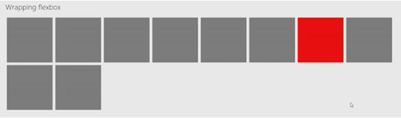
(5)wrapping(包装)
Flexbox items can wrap to the next line instead of causing overflow.下面展示了当-ms-flex-wrap属性值为wrap时的效果
.flexbox #wrappingFlexbox {
    margin-top:20px;
    display:-ms-flexbox;
    -ms-flex-wrap:wrap;
    width:100%;
}
.flexbox #wrappingFlexbox > div {
    min-width:140px;
    min-height:140px;
    background-color:gray;
    margin:5px;
    font-size:60px;
    padding:15px;
}
.flexbox #wrappingFlexbox > div:nth-child(7) {
    background-color:red;
}
you may actually be asking,"is the flexbox what's used to implement tails on the start screen in windows8?"--No!
3、Grid
(1)power of tables but implemented in CSS
(2)absolute rows and columns
(3)fractional(部分的;分数的;分级的) rows and columns
<body>
    <div id="simple">
        <h2>Simple</h2>
        <div class="explanation">This simple 2x2 grid has 4 elements that are each assigned their own "cell".</div>
        <div class="msgrid">
            <div>A</div>
            <div>B</div>
            <div>C</div>
            <div>D</div>
        </div>
    </div>
    <style>
        /* Simple */
        .grid #simple > div.msgrid { display: -ms-grid; -ms-grid-columns: 250px 250px; -ms-grid-rows: 250px 250px; }
        .grid #simple > div.msgrid > div { border: 1px solid gray; }
        .grid #simple > div.msgrid > div:nth-child(2) { -ms-grid-column: 2; -ms-grid-row: 1; }
        .grid #simple > div.msgrid > div:nth-child(3) { -ms-grid-row: 2; }
        .grid #simple > div.msgrid > div:nth-child(4) { -ms-grid-column: 2; -ms-grid-row: 2; }
    </style>
</body>

(4)spanning(生成;跨越;横跨)
/* Rowspans */
.grid #rowspans > div.msgrid {
    display: -ms-grid;
    -ms-grid-columns: 100px 1fr 100px;
    -ms-grid-rows: 100px 1fr 100px;
    width:600px;
    height: 400px;
}

.grid #rowspans > div.msgrid > div:nth-child(1) {
    -ms-grid-column: 1;
    -ms-grid-row: 1;
    -ms-grid-row-span: 2;
    border: solid 2px blue;
}

.grid #rowspans > div.msgrid > div:nth-child(2) {
    -ms-grid-column: 2;
    -ms-grid-row: 2;
    -ms-grid-column-span: 2;
    border: solid 2px green;
}

.grid #rowspans > div.msgrid > div:nth-child(3) {
    -ms-grid-column: 2;
    -ms-grid-row: 3;
    border: solid 2px red;
}

(5)alignment
4、Transforms
rotate (旋转)
skew (歪斜)
scale (比例;缩放)
translate (调动;平移)
#pic:hover{
    transform:scale(2) translate(50px,50px) rotate(10deg);
}
5、Transitions(过渡、转变) and Animations
transition
.someClass{
    transition: all 1s;
}
.someClass:hover{
    border-radius: 50%;
}
animation
.animate-get-angry {
    animation: get-angry 5s forwards;
}

@keyframes get-angry {
    0%   {box-shadow: 0 0 1px 1px #000000;text-shadow: 0 0 #ffffff;border-radius: 0%;}
    60%  {color: #991100; font-size: 22pt; text-shadow: blue;}
    80%  {color: #FF0000; font-size: 24pt; }
    90%  {color: #22DD22; font-size: 16pt; }
    100% {color: #110000; font-size: 40pt; background-color: #000000; font-weight: bold;box-shadow: 0 0 30px 15px #000000;border-color: black; text-shadow: 0 0 10px 2px #22DD22;border-radius: 50%; }
}

 浙公网安备 33010602011771号