【GitHub热门前端50天50项目-打卡活动】--day02
GitHub热门前端练手项目,纯HTML、CSS、JS实现,50天50个项目,每日一个项目,打卡活动,解读项目中的知识点
GitHub项目官网连接
50Projects in 50 Days
项目展示
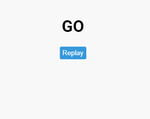
一个简单的倒计时的效果,当点击按钮后,开始倒计时,如图所示
源代码
HTML
<!DOCTYPE html>
<html lang="en">
  <head>
    <meta charset="UTF-8" />
    <meta name="viewport" content="width=device-width, initial-scale=1.0" />
    <link rel="stylesheet" href="style.css" />
    <title>Animated Countdown</title>
  </head>
  <body>
    <div class="counter">
      <div class="nums">
        <span class="in">3</span>
        <span>2</span>
        <span>1</span>
        <span>0</span>
      </div>
      <h4>Get Ready</h4>
    </div>

    <div class="final">
      <h1>GO</h1>
      <button id="replay">
        <span>Replay</span>
      </button>
    </div>
    <script src="script.js"></script>
  </body>
</html>
CSS
@import url('https://fonts.googleapis.com/css2?family=Roboto:wght@400;700&display=swap');

* {
  box-sizing: border-box;
}

body {
  font-family: 'Roboto', sans-serif;
  margin: 0;
  height: 100vh;
  overflow: hidden;
}

h4 {
  font-size: 20px;
  margin: 5px;
  text-transform: uppercase;
}

.counter {
  position: fixed;
  top: 50%;
  left: 50%;
  transform: translate(-50%, -50%);
  text-align: center;
}

.counter.hide {
  transform: translate(-50%, -50%) scale(0);
  animation: hide 0.2s ease-out;
}

@keyframes hide {
  0% {
    transform: translate(-50%, -50%) scale(1);
  }

  100% {
    transform: translate(-50%, -50%) scale(0);
  }
}

.final {
  position: fixed;
  top: 50%;
  left: 50%;
  transform: translate(-50%, -50%) scale(0);
  text-align: center;
}

.final.show {
  transform: translate(-50%, -50%) scale(1);
  animation: show 0.2s ease-out;
}

@keyframes show {
  0% {
    transform: translate(-50%, -50%) scale(0);
  }

  30% {
    transform: translate(-50%, -50%) scale(1.4);
  }

  100% {
    transform: translate(-50%, -50%) scale(1);
  }
}

.nums {
  color: #3498db;
  font-size: 50px;
  position: relative;
  overflow: hidden;
  width: 250px;
  height: 50px;
}

.nums span {
  position: absolute;
  top: 50%;
  left: 50%;
  transform: translate(-50%, -50%) rotate(120deg);
  transform-origin: bottom center;
}

.nums span.in {
  transform: translate(-50%, -50%) rotate(0deg);
  animation: goIn 0.5s ease-in-out;
}

.nums span.out {
  animation: goOut 0.5s ease-in-out;
}

@keyframes goIn {
  0% {
    transform: translate(-50%, -50%) rotate(120deg);
  }

  30% {
    transform: translate(-50%, -50%) rotate(-20deg);
  }

  60% {
    transform: translate(-50%, -50%) rotate(10deg);
  }

  100% {
    transform: translate(-50%, -50%) rotate(0deg);
  }
}

@keyframes goOut {
  0% {
    transform: translate(-50%, -50%) rotate(0deg);
  }

  60% {
    transform: translate(-50%, -50%) rotate(20deg);
  }

  100% {
    transform: translate(-50%, -50%) rotate(-120deg);
  }
}

#replay{
  background-color: #3498db;
  border-radius: 3px;
  border: none;
  color: aliceblue;
  padding: 5px;
  text-align: center;
  display: inline-block;
  cursor: pointer;
  transition: all 0.3s;
}

#replay span{
  cursor: pointer;
  display: inline-block;
  position: relative;
  transition: 0.3s;
}

#replay span:after{
  content: '\00bb';
  position: absolute;
  opacity: 0;
  top: 0;
  right: -20px;
  transition: 0.5s;
}

#replay:hover span{
  padding-right: 25px;
}

#replay:hover span:after{
  opacity: 1;
  right: 0;
}
JS
const nums = document.querySelectorAll('.nums span')
const counter = document.querySelector('.counter')
const finalMessage = document.querySelector('.final')
const replay = document.querySelector('#replay')

runAnimation()

function resetDOM() {
  counter.classList.remove('hide')
  finalMessage.classList.remove('show')

  nums.forEach((num) => {
    num.classList.value = ''
  })

  nums[0].classList.add('in')
}

function runAnimation() {
  nums.forEach((num, idx) => {
    const nextToLast = nums.length - 1

    num.addEventListener('animationend', (e) => {
      if (e.animationName === 'goIn' && idx !== nextToLast) {
        num.classList.remove('in')
        num.classList.add('out')
      } else if (e.animationName === 'goOut' && num.nextElementSibling) {
        num.nextElementSibling.classList.add('in')
      } else {
        counter.classList.add('hide')
        finalMessage.classList.add('show')
      }
    })
  })
}

replay.addEventListener('click', () => {
  resetDOM()
  runAnimation()
})
解读
HTML
    <div class="counter">
      <div class="nums">
        <span class="in">3</span>
        <span>2</span>
        <span>1</span>
        <span>0</span>
      </div>
      <h4>Get Ready</h4>
    </div>
这段代码就是数字转换的结构
    <div class="final">
      <h1>GO</h1>
      <button id="replay">
        <span>Replay</span>
      </button>
    </div>
这段代码是倒计时结束后,显示的结构
HTML没没啥说的
CSS
伪元素
伪元素在选中的元素的某个位置添加一个元素,此元素并不是一个真正的DOM元素,就是一个CSS渲染出来的虚拟的元素,需要搭配content属性来为伪元素添加内容
::after
selector::after{
    content: ''
}
根据MDN的解释,::after用来创建已选中元素的最后一个子元素
::before
跟::after同理,只是在前面罢了
text-transform
在项目的css中看到这样一个属性,之前我没见过
text-transform: uppercase;
text-transform属性控制文本的大小写
none,默认,文本中既可以有大写,也可以有小写capitalize,文本中每个单词开头字母大写uppercase,文本字母大写lowercase文本字母小写
opacity
opacity用来设置元素的透明度,包括元素本身和里面的内容。
不管子元素有没有设置opacity这个属性,只要父元素设置了opacity属性,子元素就会根据父元素的透明度来设置
数值越小,元素越接近于透明
CSS动画
利用CSS实现动画效果,首先要知道动画的本质是什么?
动画的本质就是使元素从一种样式变为另一种样式,第一天项目中的过渡,就是一个简单的动画
如果需要使用动画,首先需要为动画指定一些关键帧,这些关键帧中就包含了元素的样式
@keyframes规则
使用@keyframes来定义一个关键帧样式,元素会在指定的时间内变化到这一帧的样式
定义一个@keyframes样式
@keyframes animateName {
    from {
        ...
    }to {
        ....
    }
}
使用@keyframes来定义一个动画规则,后面跟上动画名字
动画中可以使用from和to来表示元素从一种状态变化到另一种状态
像这样,一个简单的动画就做好了
            from {
                background-color: rgb(236, 223, 223);
            }to {
                background-color: rgb(168, 123, 39);
            }
from(0%)是元素在动画初始时的状态,to(100%)是动画结束时的状态,元素的样式会从from(0%)平滑的变化到to(100%)状态
还可以使用百分比来更加细致地规定动画的关键帧0%、25%、50%、100%
接下来,要使动画生效,就需要为关键帧绑定一个元素,并且规定多长时间内完成这个动画
        #kk {
            height: 200px;
            width: 200px;
            animation-name: animateName;
            animation-duration: 2s;
        }

还可以使用百分比来定义关键帧
        @keyframes animateSecond {
            0% {
                background-color: red;
                height: 100px;
                width: 100px;
            }
            25% {
                background-color: rgb(26, 199, 49);
                height: 150px;
                width: 150px;
            }
            50% {
                background-color: rgb(47, 19, 211);
                height: 200px;
                width: 200px;
            }
            100% {
                background-color: rgb(255, 0, 0);
                height: 100px;
                width: 100px;
            }
        }

延时动画
使用animation-delay属性来规定动画延时几秒触发,要将此属性写在被绑定的元素身上
也可以设置负值,代表动画已经开始了多少秒
div {
  width: 100px;
  height: 100px;
  position: relative;
  background-color: red;
  animation-name: example;
  animation-duration: 4s;
  animation-delay: 2s;
/*    延时2s触发 */
}
运行次数
默认的动画运行次数是一次,可以使用animation-iteration-count属性来指定动画运行的次数
        #kk {
            height: 100;
            width: 100px;
            animation-name: animateSecond;
            animation-duration: 4s;
            animation-delay: 2s;
            /* 动画运行两次 */
            animation-iteration-count: 2;
        }
如果将animation-iteration-count值设置为infinite,就是无限循环的意思
反向或交替运行动画
animation-direction属性指定动画向前播放、向后播放,还是交替播放动画
normal默认值,正常播放,向前播放reverse动画以反方向播放,从100%向0%变化alternate动画先向前播放,然后向后,从0%到100%,再从100%到0%alternate-reverse动画先向后播放,然后向前;从100%到0%,再从0%到100%
来看一波实例
        #trangle {
            height: 100px;
            width: 100px;
            background-color: rgb(129, 223, 120);
            position: relative;
            animation-name: place;
            animation-duration: 3s;
            animation-iteration-count: infinite;
            animation-direction: alternate;
        }
        @keyframes place{
            from{
                left: 0;
                top: 0;
            }
            to{
                left: 200px;
                top: 200px;
            }
        }

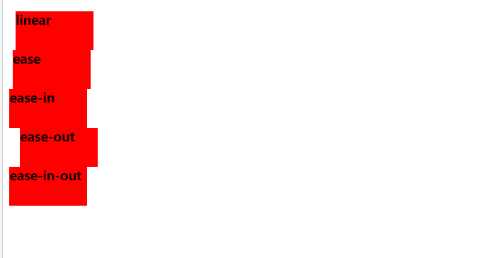
速度曲线
animation-timing-function属性规定动画的速度曲线
ease- 指定从慢速开始,然后加快,然后缓慢结束的动画(默认)linear- 规定从开始到结束的速度相同的动画ease-in- 规定慢速开始的动画ease-out- 规定慢速结束的动画ease-in-out- 指定开始和结束较慢的动画cubic-bezier(*n*,*n*,*n*,*n*)- 运行您在三次贝塞尔函数中定义自己的值
div {
  width: 100px;
  height: 50px;
  background-color: red;
  font-weight: bold;
  position: relative;
  animation: mymove 5s infinite;
}

#div1 {animation-timing-function: linear;}
#div2 {animation-timing-function: ease;}
#div3 {animation-timing-function: ease-in;}
#div4 {animation-timing-function: ease-out;}
#div5 {animation-timing-function: ease-in-out;}

@keyframes mymove {
  from {left: 0px;}
  to {left: 300px;}
}
看
动画填充模式
就是动画未开始之前,或动画结束之后,元素的样式
none- 默认值。动画在执行之前或之后不会对元素应用任何样式。forwards- 元素将保留由最后一个关键帧设置的样式值(依赖 animation-direction 和 animation-iteration-count)。backwards- 元素将获取由第一个关键帧设置的样式值(取决于 animation-direction),并在动画延迟期间保留该值。both- 动画会同时遵循向前和向后的规则,从而在两个方向上扩展动画属性。
动画简写
关于动画的属性这么多,写起来很麻烦,所以就有了简写的方式
animatino: 动画名称 持续时间 速度曲线 拖延时间 执行次数 执行方向
按照这个顺序书写属性
animation: place 2s linear 1s infinite normal;
没有的属性可以缺省
animation: place 2s linear infinite ;
animation还可以绑定多个动画,只需要用英文逗号隔开即可,
animatino: move1 2s ease, move2 1s linear
JS
querySelector
JS DOM中的一个API,通过CSS选择器来选择DOM元素
querySelector()方法返回满足选择器的一个元素
注意: querySelector() 方法仅仅返回匹配指定选择器的第一个元素。如果你需要返回所有的元素,请使用 querySelectorAll() 方法替代。
document.querySelector("#demo");
querySelectorAll()
querySelectorAll() 方法返回文档中匹配指定 CSS 选择器的所有元素,返回 NodeList 对象。
NodeList 对象表示节点的集合。可以通过索引访问,索引值从 0 开始。
提示: 你可以使用 NodeList 对象的 length 属性来获取匹配选择器的元素属性,然后你可以遍历所有元素,从而获取你想要的信息。
var x = document.querySelectorAll("p");
var i;
for (i = 0; i < x.length; i++) {
    x[i].style.backgroundColor = "red";
}

 浙公网安备 33010602011771号