CSS学习笔记(一)-25.定位
一、为什么需要定位?
问题1:某元素可以自由在一个盒子内部移动位置,并压住其他盒子。
问题2:当滚动页面时,会发现有些盒子固定在屏幕中某个位置。
以前的标准流和浮动都无法实现上面2个问题。所以需要引入定位。
1.浮动盒子可以让多个块级盒子一行显示且中间没有缝隙,常用于横向排列盒子。
2.定位可以让盒子自由在某个盒子内部移动位置或则固定在屏幕中摸个位置,且可以压住别的盒子。
二、定位的组成。
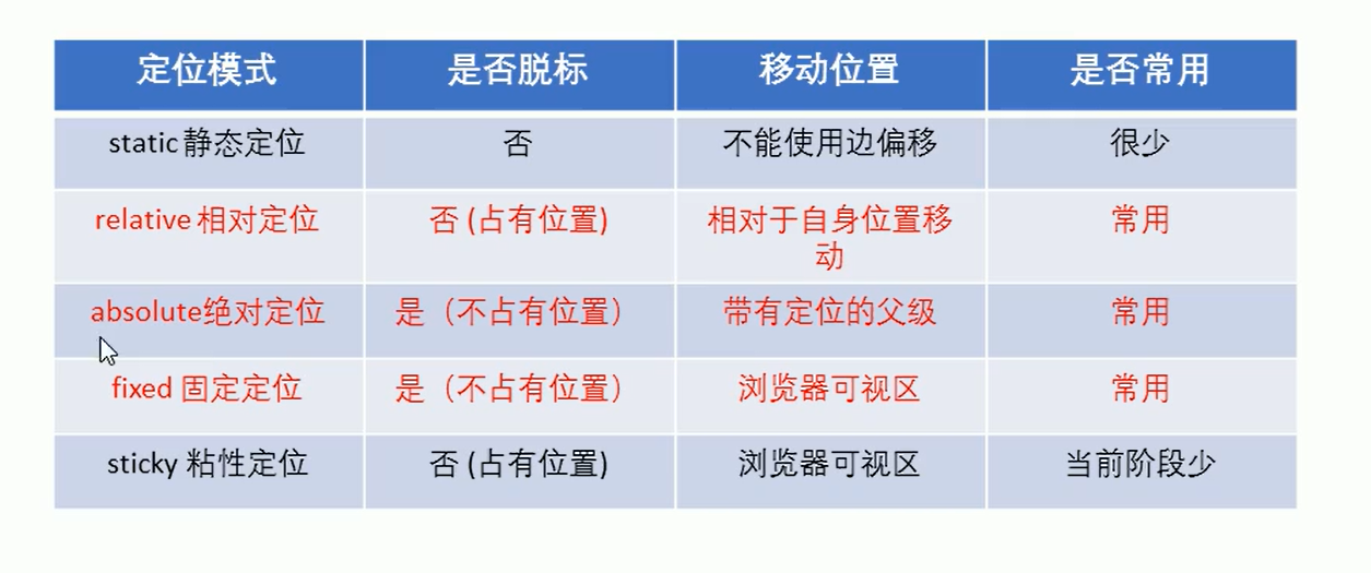
2.1 定位:将盒子定在某个位置,定位就是摆放盒子,按照定位的方式移动盒子。
定位=定位模式+边偏移
定位模式:指定一个元素在文档中的定位方式。
边偏移:决定该元素的最终位置。
定位模式:通过CSS的position属性来设置,分为4种:
static 静态定位
relative 相对定位
absolute 绝对定位
fixed 固定定位
边偏移:定位的盒子移动到最终位置。有top,bottom,left,right四个属性。
三、实例
3.1静态定位 static
是元素默认定位方式,无定位的意思。
静态定位是按照标准流方式摆放位置,它没有边偏移。静态定位布局时很少用到。
语法:选择器{position:static;}
3.2相对定位 relative
相对定位是元素在移动位置时,相对于他原来的位置来说的。
语法:选择器{position:relative;}
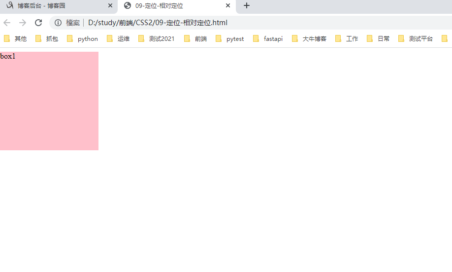
3.2.1普通盒子没有相对定位。


 1 <!--
 2  * @Author: invoker
 3  * @Github: https://github.com/invoker2021
 4  * @Date: 2021-07-29 22:17:12
 5  * @LastEditors: invoker
 6  * @LastEditTime: 2021-07-29 22:19:46
 7  * @Description:
 8  * @FilePath: \CSS2\09-定位-相对定位.html
 9 -->
10
11 <!DOCTYPE html>
12 <html lang="en">
13
14 <head>
15     <meta charset="UTF-8">
16     <meta http-equiv="X-UA-Compatible" content="IE=edge">
17     <meta name="viewport" content="width=device-width, initial-scale=1.0">
18     <title>09-定位-相对定位</title>
19     <style>
20         .box1 {
21             /* position: relative;
22             top: 50px;
23             left: 50px; */
24             height: 200px;
25             width: 200px;
26             background-color: pink;
27         }
28     </style>
29 </head>
30
31 <body>
32     <div class="box1">
33         box1
34     </div>
35 </body>
36 </html>
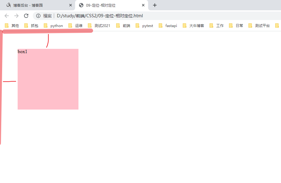
3.2.2 有相对定位时的显示:
 1 <!--
 2  * @Author: invoker
 3  * @Github: https://github.com/invoker2021
 4  * @Date: 2021-07-29 22:17:12
 5  * @LastEditors: invoker
 6  * @LastEditTime: 2021-07-29 22:22:13
 7  * @Description:
 8  * @FilePath: \CSS2\09-定位-相对定位.html
 9 -->
10
11 <!DOCTYPE html>
12 <html lang="en">
13
14 <head>
15     <meta charset="UTF-8">
16     <meta http-equiv="X-UA-Compatible" content="IE=edge">
17     <meta name="viewport" content="width=device-width, initial-scale=1.0">
18     <title>09-定位-相对定位</title>
19     <style>
20         .box1 {
21             position: relative;
22             top: 50px;
23             left: 50px;
24             height: 200px;
25             width: 200px;
26             background-color: pink;
27         }
28     </style>
29 </head>
30
31 <body>
32     <div class="box1">
33         box1
34     </div>
35 </body>
36
37 </html>
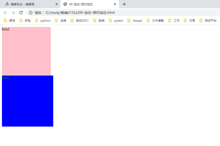
3.2.2.1 原来的位置不会被别的盒子占有
首先看没有定位时的布局
 1 <!--
 2  * @Author: invoker
 3  * @Github: https://github.com/invoker2021
 4  * @Date: 2021-07-29 22:17:12
 5  * @LastEditors: invoker
 6  * @LastEditTime: 2021-07-29 22:26:38
 7  * @Description:
 8  * @FilePath: \CSS2\09-定位-相对定位.html
 9 -->
10
11 <!DOCTYPE html>
12 <html lang="en">
13
14 <head>
15     <meta charset="UTF-8">
16     <meta http-equiv="X-UA-Compatible" content="IE=edge">
17     <meta name="viewport" content="width=device-width, initial-scale=1.0">
18     <title>09-定位-相对定位</title>
19     <style>
20         .box1 {
21             /* position: relative;
22             top: 50px;
23             left: 50px; */
24             height: 200px;
25             width: 200px;
26             background-color: pink;
27         }
28
29         .box2 {
30             height: 210px;
31             width: 210px;
32             background-color: blue;
33             color: green;
34         }
35     </style>
36 </head>
37
38 <body>
39     <div class="box1">
40         box1
41     </div>
42     <div class="box2">
43         box2
44     </div>
45 </body>
46
47 </html>
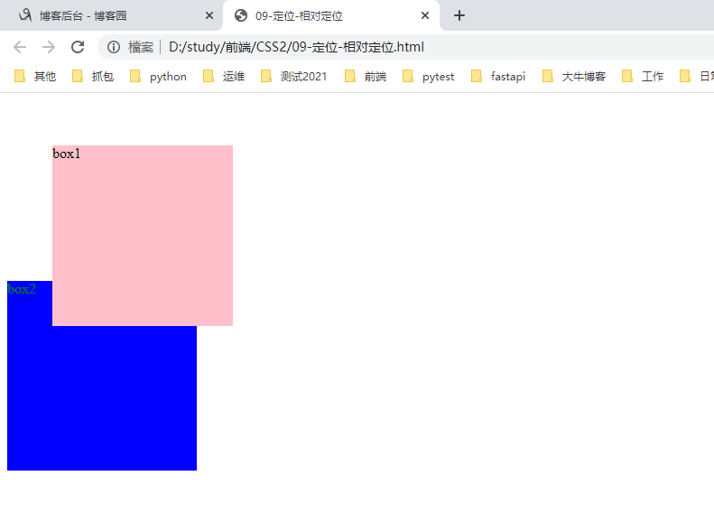
3.2.2.2 使用定位后查看,后面的盒子依然认为box1是标准流展示方式
 1 <!--
 2  * @Author: invoker
 3  * @Github: https://github.com/invoker2021
 4  * @Date: 2021-07-29 22:17:12
 5  * @LastEditors: invoker
 6  * @LastEditTime: 2021-07-29 22:27:38
 7  * @Description:
 8  * @FilePath: \CSS2\09-定位-相对定位.html
 9 -->
10
11 <!DOCTYPE html>
12 <html lang="en">
13
14 <head>
15     <meta charset="UTF-8">
16     <meta http-equiv="X-UA-Compatible" content="IE=edge">
17     <meta name="viewport" content="width=device-width, initial-scale=1.0">
18     <title>09-定位-相对定位</title>
19     <style>
20         .box1 {
21             position: relative;
22             top: 50px;
23             left: 50px;
24             height: 200px;
25             width: 200px;
26             background-color: pink;
27         }
28
29         .box2 {
30             height: 210px;
31             width: 210px;
32             background-color: blue;
33             color: green;
34         }
35     </style>
36 </head>
37
38 <body>
39     <div class="box1">
40         box1
41     </div>
42     <div class="box2">
43         box2
44     </div>
45 </body>
46
47 </html>
相对定位最典型的应用是给绝对定位当爹???
3.3 绝对定位
绝对定位:元素在移动的时候相对于它的祖先元素来说的。
语法:选择器{position:absolute;}
绝对定位的特点:
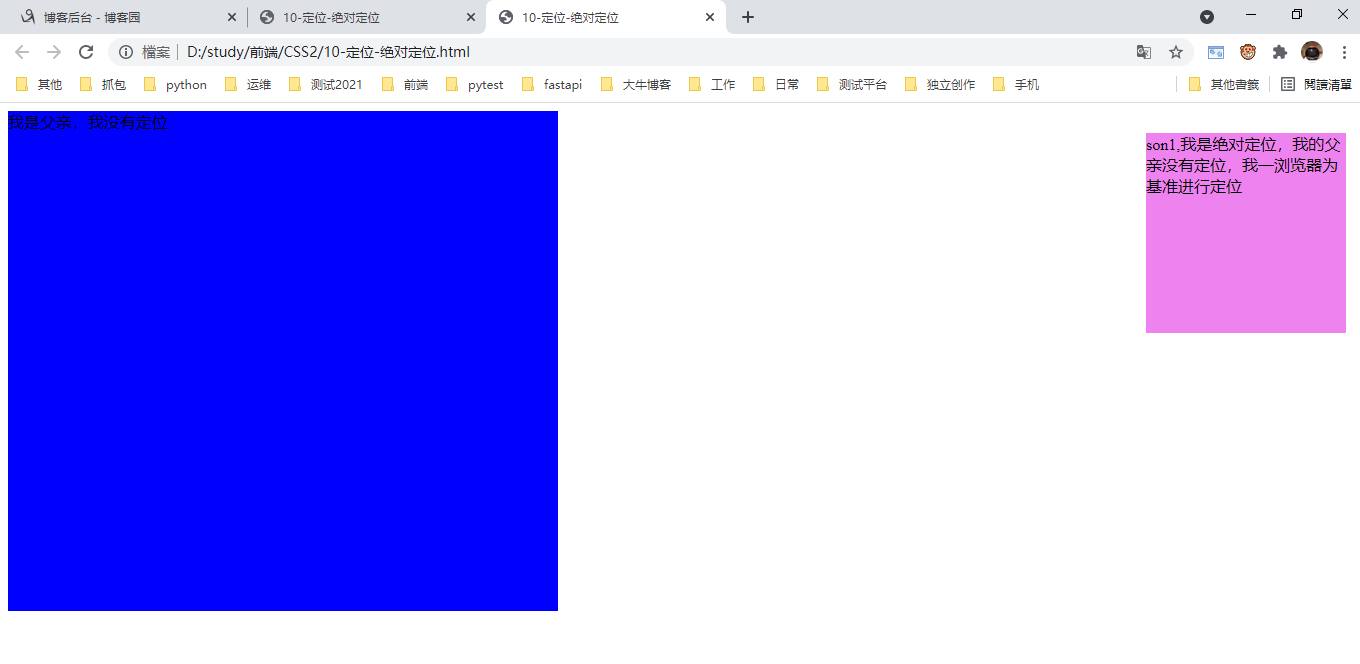
1.如果没有祖先元素,或则祖先元素没有定位,则以浏览器为准进行定位。
以下场景是子元素不听话,跳出父元素的管教。
 1 <!--
 2  * @Author: invoker
 3  * @Github: https://github.com/invoker2021
 4  * @Date: 2021-07-30 12:21:07
 5  * @LastEditors: invoker
 6  * @LastEditTime: 2021-07-30 12:38:43
 7  * @Description:
 8  * @FilePath: \CSS2\10-定位-绝对定位.html
 9 -->
10
11 <!DOCTYPE html>
12 <html lang="en">
13
14 <head>
15     <meta charset="UTF-8">
16     <meta http-equiv="X-UA-Compatible" content="IE=edge">
17     <meta name="viewport" content="width=device-width, initial-scale=1.0">
18     <title>10-定位-绝对定位</title>
19     <style>
20         .father {
21             height: 500px;
22             width: 550px;
23             background-color: blue;
24         }
25
26         .son1 {
27             position: absolute;
28             right: 20px;
29             top: 30px;
30             height: 200px;
31             width: 200px;
32             background-color: violet;
33         }
34     </style>
35 </head>
36
37 <body>
38     <div class="father">
39         我是父亲,我没有定位
40         <div class="son1">
41             son1,我是绝对定位,我的父亲没有定位,我一浏览器为基准进行定位
42         </div>
43     </div>
44 </body>
45
46 </html>
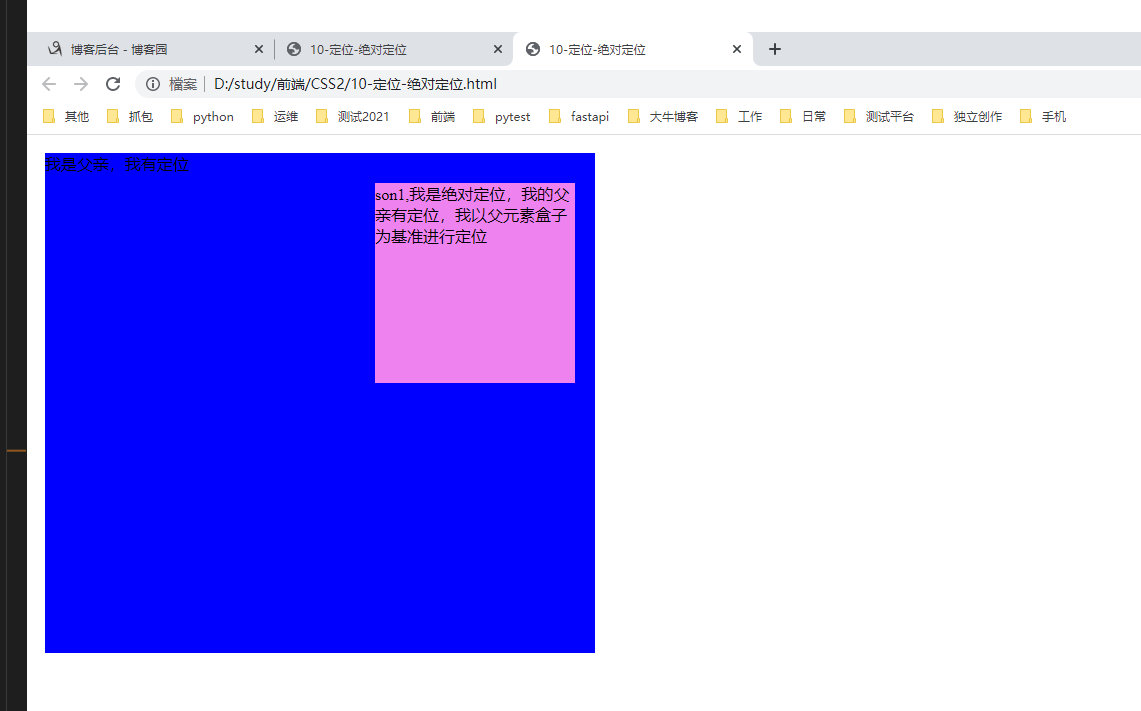
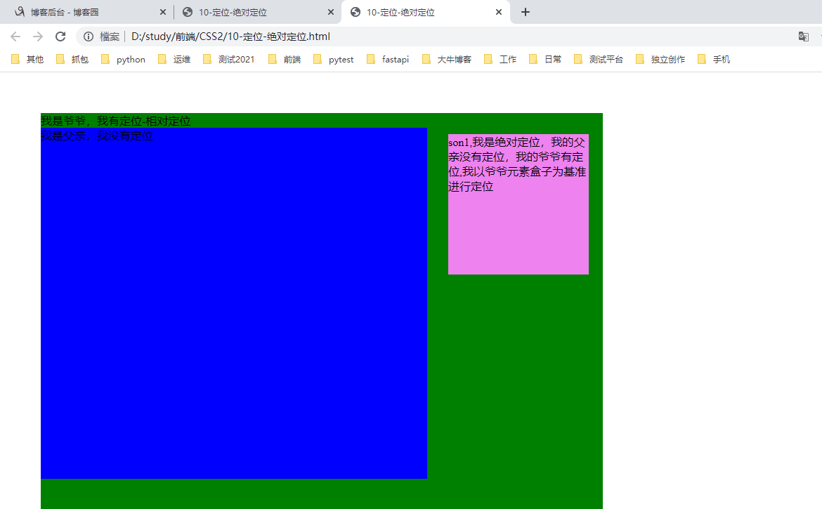
2.如果祖先元素有定位(相对,绝对,固定定位),则以最近一级的有定位祖先元素为参考点移动位置。
父亲有定位
 1 <!--
 2  * @Author: invoker
 3  * @Github: https://github.com/invoker2021
 4  * @Date: 2021-07-30 12:21:07
 5  * @LastEditors: invoker
 6  * @LastEditTime: 2021-07-30 12:44:27
 7  * @Description:
 8  * @FilePath: \CSS2\10-定位-绝对定位.html
 9 -->
10
11 <!DOCTYPE html>
12 <html lang="en">
13
14 <head>
15     <meta charset="UTF-8">
16     <meta http-equiv="X-UA-Compatible" content="IE=edge">
17     <meta name="viewport" content="width=device-width, initial-scale=1.0">
18     <title>10-定位-绝对定位</title>
19     <style>
20         .father {
21             position: relative;
22             top: 10px;
23             left: 10px;
24             height: 500px;
25             width: 550px;
26             background-color: blue;
27         }
28
29         .son1 {
30             position: absolute;
31             right: 20px;
32             top: 30px;
33             height: 200px;
34             width: 200px;
35             background-color: violet;
36         }
37     </style>
38 </head>
39
40 <body>
41     <div class="father">
42         我是父亲,我有定位
43         <div class="son1">
44             son1,我是绝对定位,我的父亲有定位,我以父元素盒子为基准进行定位
45         </div>
46     </div>
47 </body>
48
49 </html>
父亲没有定位,爷爷有定位
 1 <!--
 2  * @Author: invoker
 3  * @Github: https://github.com/invoker2021
 4  * @Date: 2021-07-30 12:21:07
 5  * @LastEditors: invoker
 6  * @LastEditTime: 2021-07-30 12:49:45
 7  * @Description:
 8  * @FilePath: \CSS2\10-定位-绝对定位.html
 9 -->
10
11 <!DOCTYPE html>
12 <html lang="en">
13
14 <head>
15     <meta charset="UTF-8">
16     <meta http-equiv="X-UA-Compatible" content="IE=edge">
17     <meta name="viewport" content="width=device-width, initial-scale=1.0">
18     <title>10-定位-绝对定位</title>
19     <style>
20         .grandfather {
21             position: relative;
22             top: 50px;
23             left: 50px;
24             height: 800px;
25             width: 800px;
26             background-color: green;
27         }
28
29         .father {
30             height: 500px;
31             width: 550px;
32             background-color: blue;
33         }
34
35         .son1 {
36             position: absolute;
37             right: 20px;
38             top: 30px;
39             height: 200px;
40             width: 200px;
41             background-color: violet;
42         }
43     </style>
44 </head>
45
46 <body>
47     <div class="grandfather">
48         我是爷爷,我有定位-相对定位
49         <div class="father">
50             我是父亲,我没有定位
51             <div class="son1">
52                 son1,我是绝对定位,我的父亲没有定位,我的爷爷有定位,我以爷爷元素盒子为基准进行定位
53             </div>
54         </div>
55     </div>
56 </body>
57
58 </html>
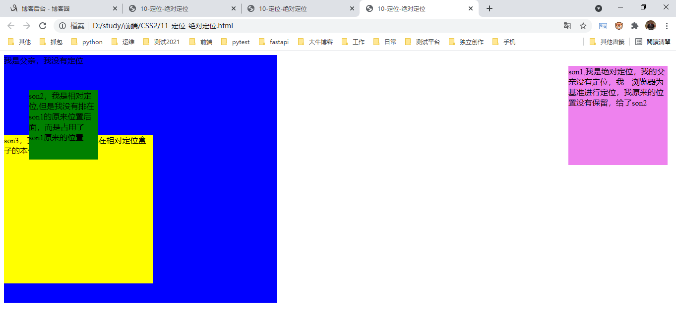
3.绝对定位不再占有原来的位置。(脱离标准流,--脱标)
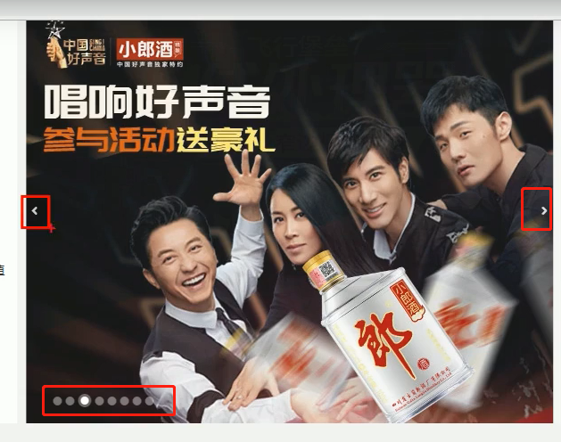
场景:录播图为例,左右箭头是固定的(用绝对定位),而背景图可以占有地板的位置
 1 <!--
 2  * @Author: invoker
 3  * @Github: https://github.com/invoker2021
 4  * @Date: 2021-07-30 12:21:07
 5  * @LastEditors: invoker
 6  * @LastEditTime: 2021-07-30 13:10:07
 7  * @Description:
 8  * @FilePath: \CSS2\11-定位-绝对定位.html
 9 -->
10
11 <!DOCTYPE html>
12 <html lang="en">
13
14 <head>
15     <meta charset="UTF-8">
16     <meta http-equiv="X-UA-Compatible" content="IE=edge">
17     <meta name="viewport" content="width=device-width, initial-scale=1.0">
18     <title>10-定位-绝对定位</title>
19     <style>
20         .father {
21             height: 500px;
22             width: 550px;
23             background-color: blue;
24         }
25
26         .son1 {
27             position: absolute;
28             right: 20px;
29             top: 30px;
30             height: 200px;
31             width: 200px;
32             background-color: violet;
33         }
34
35         .son2 {
36             position: relative;
37             top: 50px;
38             left: 50px;
39             height: 140px;
40             width: 140px;
41             background-color: green;
42         }
43
44         .son3 {
45             height: 300px;
46             width: 300px;
47             background-color: yellow;
48         }
49     </style>
50 </head>
51
52 <body>
53     <div class="father">
54         我是父亲,我没有定位
55         <div class="son1">
56             son1,我是绝对定位,我的父亲没有定位,我一浏览器为基准进行定位,我原来的位置没有保留,给了son2
57         </div>
58         <div class="son2">
59             son2,我是相对定位,但是我没有排在son1的原来位置后面,而是占用了son1原来的位置
60         </div>
61         <div class="son3">
62             son3,我是标准盒子,我排在相对定位盒子的本体位置下方
63         </div>
64     </div>
65 </body>
66
67 </html>
四、定位的问题--子绝父相的由来
问题1:绝对定位和相对定位的使用场景
问题2:为什么说相对定位给绝对定位当爹?
原因:
1.子级绝对定位,不占有原来的位置,可以放在父盒子内部任何地方,不会印象其他兄弟盒子。
2.父级需要添加定位,才能确保子盒子在父盒子内部。
3.父盒子布局时,需要占有位置,因此父级盒子只能是相对定位。
子绝父相用的场景较多。
五、固定定位
5.1 普通固定定位(贴浏览器)
固定定位是元素固定于浏览器可视区的位置。
场景:浏览器滚动时,元素位置不变化。
特点2:
1.以浏览器的可视窗口 为参考点移动元素。
跟父元素没有关系。
不随滚动条滚动而滚动。
2.固定定位不占有原来的位置。
固定定位和绝对定位相似,都是不占有原来的位置。
 1 <!--
 2  * @Author: invoker
 3  * @Github: https://github.com/invoker2021
 4  * @Date: 2021-07-31 15:43:08
 5  * @LastEditors: invoker
 6  * @LastEditTime: 2021-07-31 15:54:46
 7  * @Description:
 8  * @FilePath: \CSS2\12-定位-固定定位.html
 9 -->
10
11 <!DOCTYPE html>
12 <html lang="en">
13
14 <head>
15     <meta charset="UTF-8">
16     <meta http-equiv="X-UA-Compatible" content="IE=edge">
17     <meta name="viewport" content="width=device-width, initial-scale=1.0">
18     <title>12-定位-固定定位</title>
19     <style>
20         .gddw img {
21             position: fixed;
22             top: 100px;
23             right: 100px;
24         }
25     </style>
26 </head>i
27
28 <body>
29     <div class='gddw'>
30         <img src="images/bd.png" alt="">
31     </div>
32     <p>我是一段文字</p>
33     <p>我是一段文字</p>
34     <p>我是一段文字</p>
35     <p>我是一段文字</p>
36     <p>我是一段文字</p>
37     <p>我是一段文字</p>
38     <p>我是一段文字</p>
39     <p>我是一段文字</p>
40     <p>我是一段文字</p>
41     <p>我是一段文字</p>
42     <p>我是一段文字</p>
43     <p>我是一段文字</p>
44     <p>我是一段文字</p>
45     <p>我是一段文字</p>
46     <p>我是一段文字</p>
47     <p>我是一段文字</p>
48     <p>我是一段文字</p>
49     <p>我是一段文字</p>
50     <p>我是一段文字</p>
51     <p>我是一段文字</p>
52     <p>我是一段文字</p>
53     <p>我是一段文字</p>
54     <p>我是一段文字</p>
55     <p>我是一段文字</p>
56     <p>我是一段文字</p>
57     <p>我是一段文字</p>
58     <p>我是一段文字</p>
59     <p>我是一段文字</p>
60     <p>我是一段文字</p>
61     <p>我是一段文字</p>
62     <p>我是一段文字</p>
63 </body>
64
65 </html>
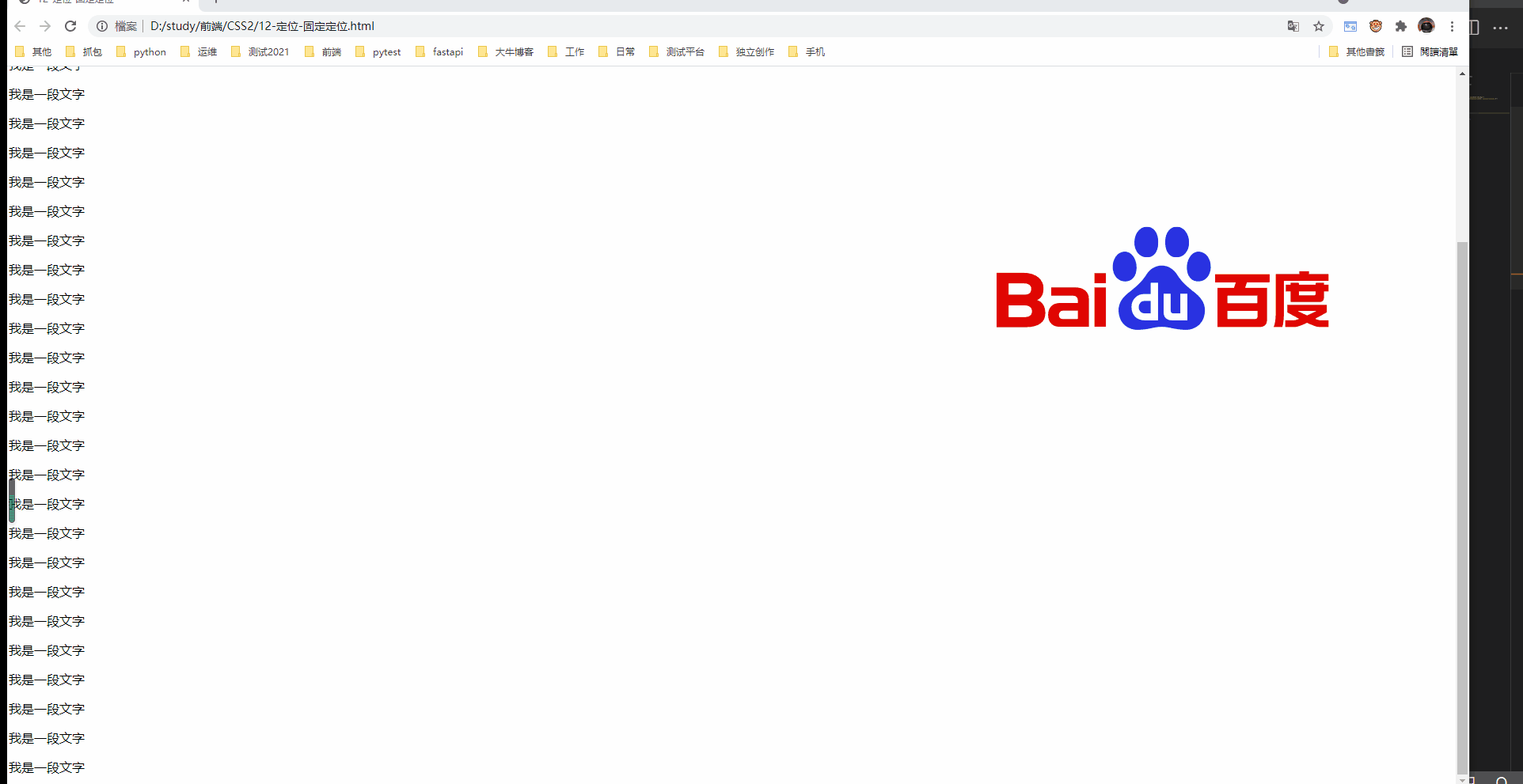
是以上的固定定位是贴着浏览器的边缘,当浏览器变动时,固定定位的图片也跟着移动。
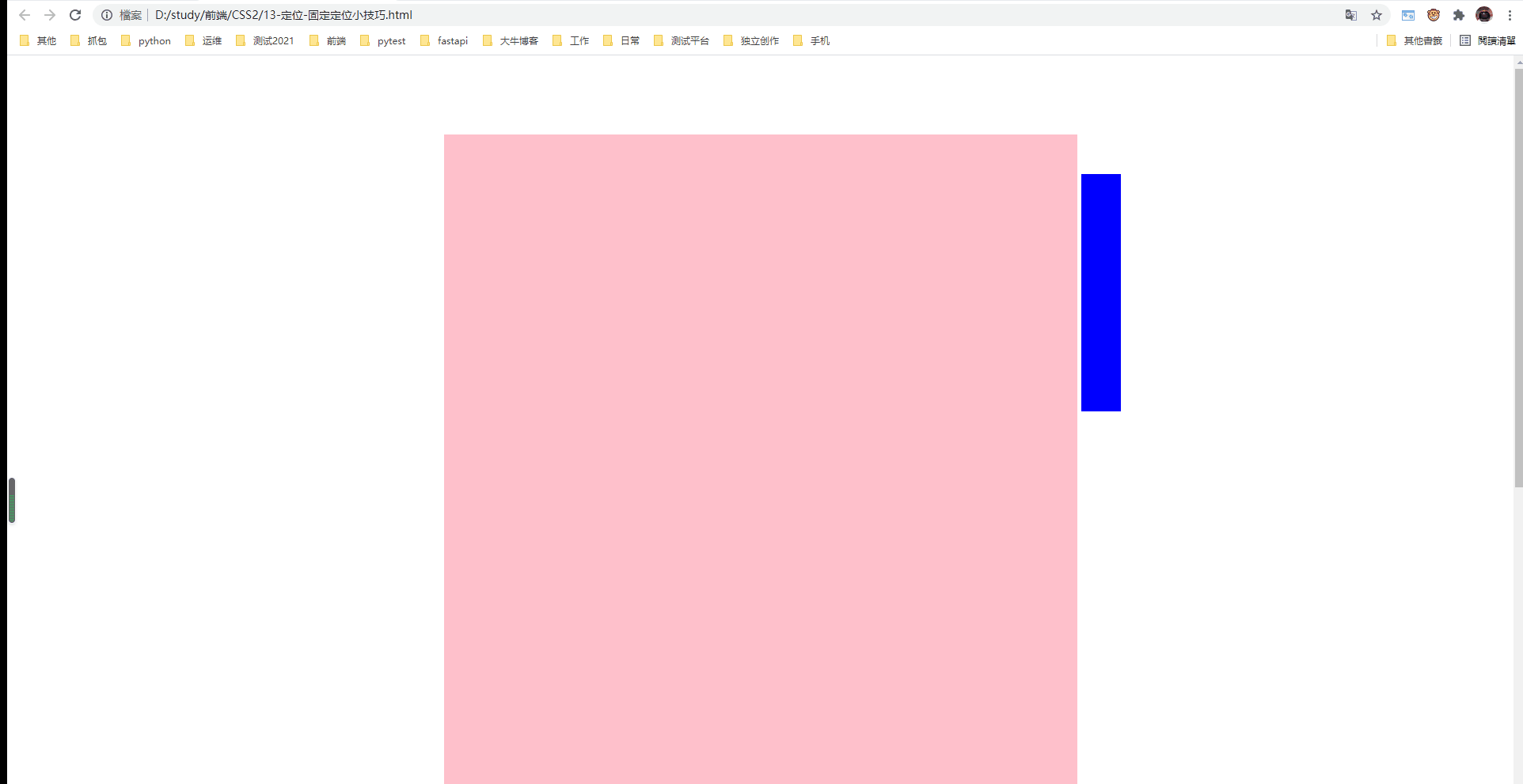
5.2 贴版心的固定定位
有时候需要固定盒子是贴着浏览器的版心右侧对齐固定。
算法:
1.固定定位的盒子left 50%,走到浏览器可视区域一半的位置。
2.让固定定位的盒子margin-left:版心一半的宽度。
 1 <!--
 2  * @Author: invoker
 3  * @Github: https://github.com/invoker2021
 4  * @Date: 2021-07-31 16:05:51
 5  * @LastEditors: invoker
 6  * @LastEditTime: 2021-07-31 16:09:17
 7  * @Description:
 8  * @FilePath: \CSS2\13-定位-固定定位小技巧.html
 9 -->
10 <!DOCTYPE html>
11 <html lang="en">
12
13 <head>
14     <meta charset="UTF-8">
15     <meta http-equiv="X-UA-Compatible" content="IE=edge">
16     <meta name="viewport" content="width=device-width, initial-scale=1.0">
17     <title>13-定位-固定定位小技巧</title>
18     <style>
19         .w {
20             height: 1400px;
21             width: 800px;
22             margin: 100px auto;
23             background-color: pink;
24         }
25
26         .fixed {
27             position: fixed;
28             top: 150px;
29             left: 50%;
30             margin-left: 405px;
31             height: 300px;
32             width: 50px;
33             background-color: blue;
34         }
35     </style>
36 </head>
37
38 <body>
39     <div class="fixed"></div>
40     <div class="w"></div>
41 </body>
42
43 </html>
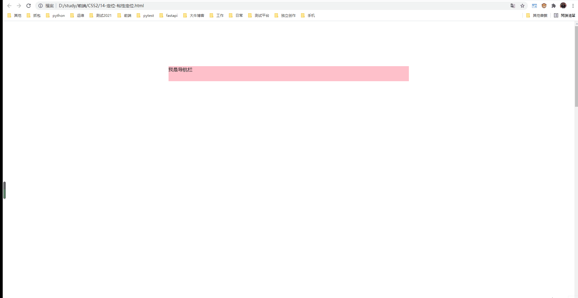
六、粘性定位 sticky
粘性定位是相对定位和固定定位的混合
语法:
{position: sticky; top:10px;}
特点:
1.以浏览器可视窗口为参考点移动元素(固定定位特点)
2.粘性定位占有原来的位置(相对定位的特点)
3.必须使用top,bottom,left,right其中一个才生效
 1 <!--
 2  * @Author: invoker
 3  * @Github: https://github.com/invoker2021
 4  * @Date: 2021-07-31 16:19:39
 5  * @LastEditors: invoker
 6  * @LastEditTime: 2021-07-31 16:21:26
 7  * @Description:
 8  * @FilePath: \CSS2\14-定位-粘性定位.html
 9 -->
10 <!DOCTYPE html>
11 <html lang="en">
12
13 <head>
14     <meta charset="UTF-8">
15     <meta http-equiv="X-UA-Compatible" content="IE=edge">
16     <meta name="viewport" content="width=device-width, initial-scale=1.0">
17     <title>14-定位-粘性定位</title>
18     <style>
19         body {
20             height: 3000px;
21         }
22
23         .nav {
24             position: sticky;
25             top: 10px;
26             height: 50px;
27             width: 800px;
28             margin: 150px auto;
29             background-color: pink;
30         }
31     </style>
32 </head>
33
34 <body>
35
36     <div class="nav">我是导航栏</div>
37
38 </body>
39
40 </html>
总结:
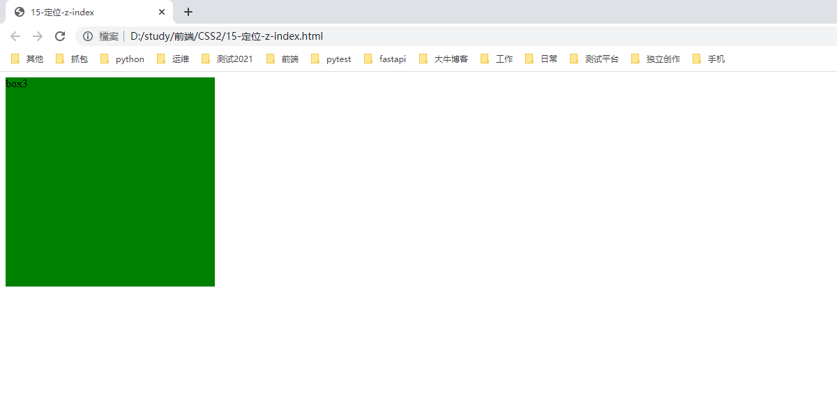
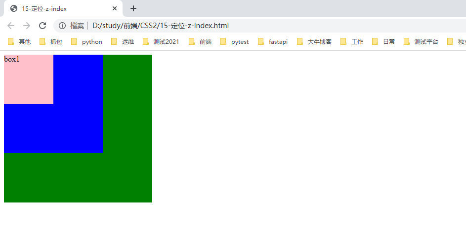
七、定位的叠放次序 z-index
在布局时,会出现盒子重叠。可以使用z-index控制盒子的叠放上下的顺序(z表示z轴)
语法:
选择器 { z-index: 1;}
特性:
1.值可以是正整数,负整数,0,也可是 auto. 数值越大,盒子约靠上层。
2.如果值相同,按照书写顺序,后来者居上。
3.数字后面没有单位。
4.只有定位的盒子才使用z-index属性。
 1 <!--
 2  * @Author: invoker
 3  * @Github: https://github.com/invoker2021
 4  * @Date: 2021-07-31 16:38:42
 5  * @LastEditors: invoker
 6  * @LastEditTime: 2021-07-31 16:42:46
 7  * @Description:
 8  * @FilePath: \CSS2\15-定位-z-index.html
 9 -->
10 <!DOCTYPE html>
11 <html lang="en">
12
13 <head>
14     <meta charset="UTF-8">
15     <meta http-equiv="X-UA-Compatible" content="IE=edge">
16     <meta name="viewport" content="width=device-width, initial-scale=1.0">
17     <title>15-定位-z-index</title>
18     <style>
19         .box1 {
20             position: absolute;
21             /* z-index: 3; */
22             height: 100px;
23             width: 100px;
24             background-color: pink;
25         }
26
27         .box2 {
28             position: absolute;
29             /* z-index: 2; */
30             height: 200px;
31             width: 200px;
32             background-color: blue;
33         }
34
35         .box3 {
36             position: absolute;
37             /* z-index: 1; */
38             height: 300px;
39             width: 300px;
40             background-color: green;
41         }
42     </style>
43 </head>
44
45 <body>
46     <div class="box1">box1</div>
47     <div class="box2">box2</div>
48     <div class="box3">box3</div>
49
50 </body>
51
52 </html>
 1 <!--
 2  * @Author: invoker
 3  * @Github: https://github.com/invoker2021
 4  * @Date: 2021-07-31 16:38:42
 5  * @LastEditors: invoker
 6  * @LastEditTime: 2021-07-31 16:43:36
 7  * @Description:
 8  * @FilePath: \CSS2\15-定位-z-index.html
 9 -->
10 <!DOCTYPE html>
11 <html lang="en">
12
13 <head>
14     <meta charset="UTF-8">
15     <meta http-equiv="X-UA-Compatible" content="IE=edge">
16     <meta name="viewport" content="width=device-width, initial-scale=1.0">
17     <title>15-定位-z-index</title>
18     <style>
19         .box1 {
20             position: absolute;
21             z-index: 3;
22             height: 100px;
23             width: 100px;
24             background-color: pink;
25         }
26
27         .box2 {
28             position: absolute;
29             z-index: 2;
30             height: 200px;
31             width: 200px;
32             background-color: blue;
33         }
34
35         .box3 {
36             position: absolute;
37             z-index: 1;
38             height: 300px;
39             width: 300px;
40             background-color: green;
41         }
42     </style>
43 </head>
44
45 <body>
46     <div class="box1">box1</div>
47     <div class="box2">box2</div>
48     <div class="box3">box3</div>
49
50 </body>
51
52 </html>
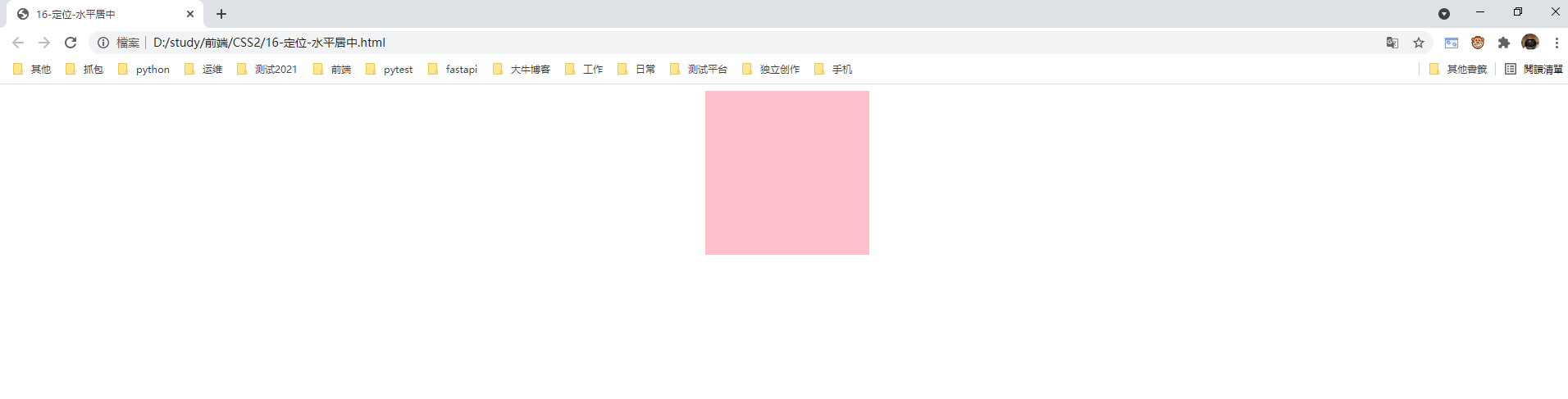
八、定位盒子的居中(水平,垂直)
8.1 非定位盒子,通过margin可以实现水平居中。
 1 <!--
 2  * @Author: invoker
 3  * @Github: https://github.com/invoker2021
 4  * @Date: 2021-07-31 17:05:01
 5  * @LastEditors: invoker
 6  * @LastEditTime: 2021-07-31 17:08:05
 7  * @Description:
 8  * @FilePath: \CSS2\16-定位-水平居中.html
 9 -->
10 <!DOCTYPE html>
11 <html lang="en">
12
13 <head>
14     <meta charset="UTF-8">
15     <meta http-equiv="X-UA-Compatible" content="IE=edge">
16     <meta name="viewport" content="width=device-width, initial-scale=1.0">
17     <title>16-定位-水平居中</title>
18     <style>
19         .box1 {
20             height: 200px;
21             width: 200px;
22             background-color: pink;
23             margin: auto;
24         }
25     </style>
26 </head>
27
28 <body>
29     <div class="box1"></div>
30 </body>
31
32 </html>
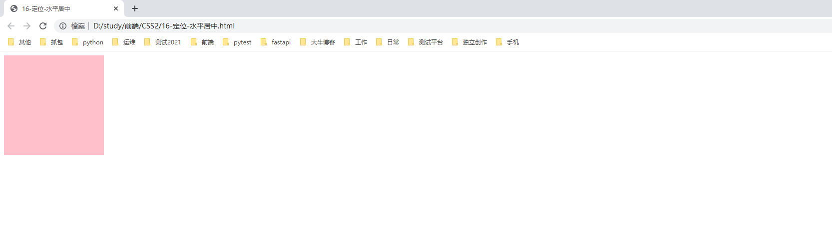
8.2 盒子给了定位,margin:auto则失效。
 1 <!--
 2  * @Author: invoker
 3  * @Github: https://github.com/invoker2021
 4  * @Date: 2021-07-31 17:05:01
 5  * @LastEditors: invoker
 6  * @LastEditTime: 2021-07-31 17:10:40
 7  * @Description:
 8  * @FilePath: \CSS2\16-定位-水平居中.html
 9 -->
10 <!DOCTYPE html>
11 <html lang="en">
12
13 <head>
14     <meta charset="UTF-8">
15     <meta http-equiv="X-UA-Compatible" content="IE=edge">
16     <meta name="viewport" content="width=device-width, initial-scale=1.0">
17     <title>16-定位-水平居中</title>
18     <style>
19         .box1 {
20             position: absolute;
21             height: 200px;
22             width: 200px;
23             background-color: pink;
24             margin: auto;
25         }
26     </style>
27 </head>
28
29 <body>
30     <div class="box1"></div>
31 </body>
32
33 </html>
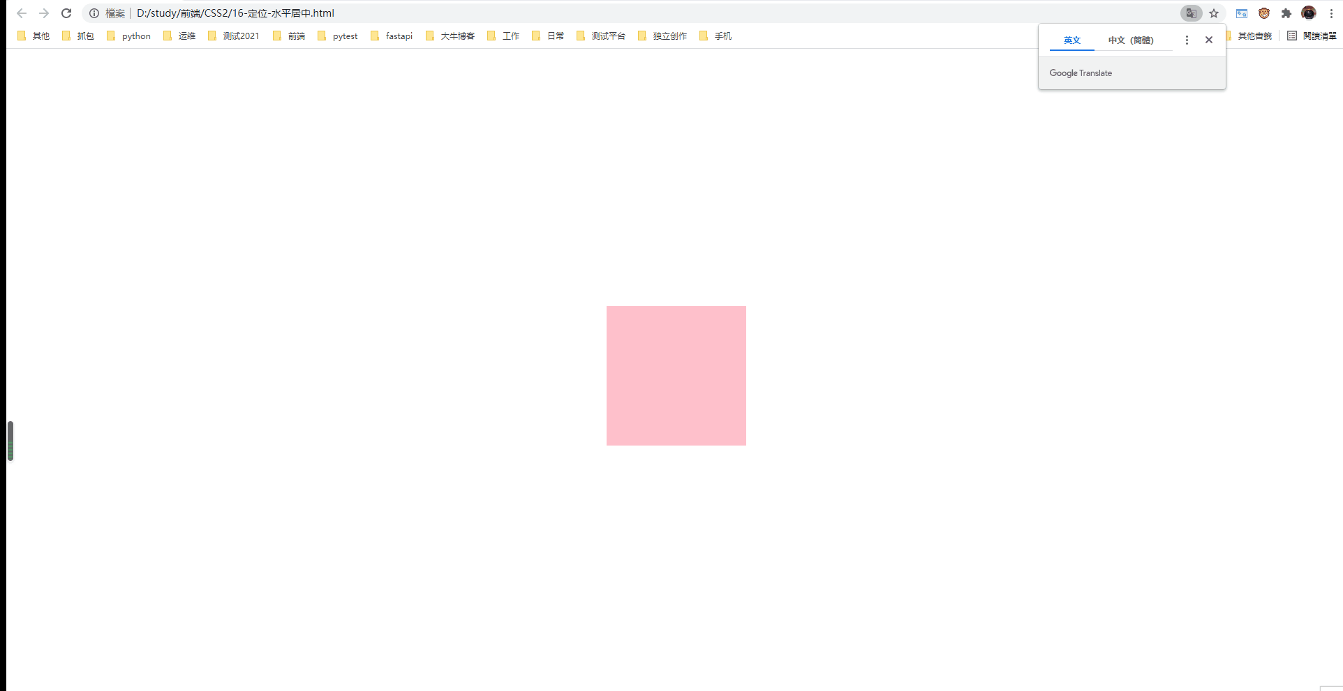
8.3 定位盒子如何实现水平居中,垂直居中,类似于固定盒子实现版心对齐相似的算法。
1.水平偏移50%
2.向左偏移盒子宽度的一半。
3.垂直偏移50%
4.向上偏移盒子的高度的一半。
并且放大缩小浏览器,都始终居中显示。
 1 <!--
 2  * @Author: invoker
 3  * @Github: https://github.com/invoker2021
 4  * @Date: 2021-07-31 17:05:01
 5  * @LastEditors: invoker
 6  * @LastEditTime: 2021-07-31 17:13:49
 7  * @Description:
 8  * @FilePath: \CSS2\16-定位-水平居中.html
 9 -->
10 <!DOCTYPE html>
11 <html lang="en">
12
13 <head>
14     <meta charset="UTF-8">
15     <meta http-equiv="X-UA-Compatible" content="IE=edge">
16     <meta name="viewport" content="width=device-width, initial-scale=1.0">
17     <title>16-定位-水平居中</title>
18     <style>
19         .box1 {
20             position: absolute;
21             left: 50%;
22             top: 50%;
23             margin-left: -100px;
24             margin-top: -100px;
25             height: 200px;
26             width: 200px;
27             background-color: pink;
28             /* margin: auto; */
29         }
30     </style>
31 </head>
32
33 <body>
34     <div class="box1"></div>
35 </body>
36
37 </html>
九、定位的特性;
绝对定位和固定定位也和浮动相似。
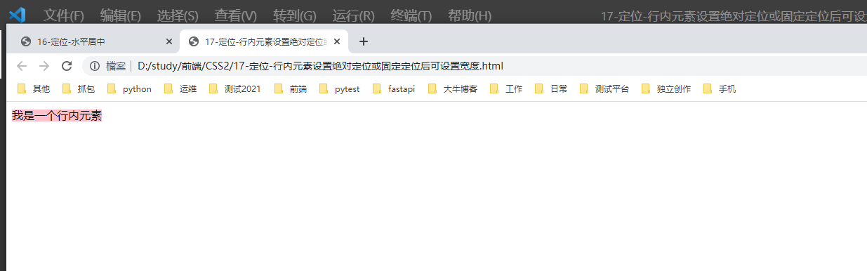
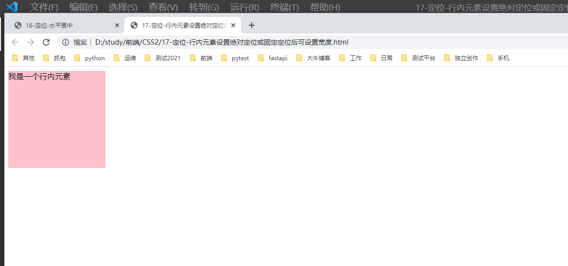
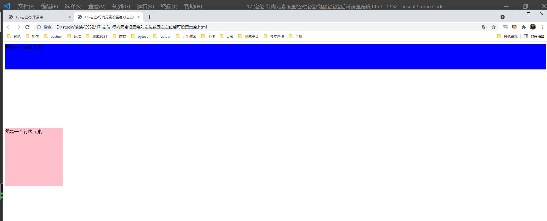
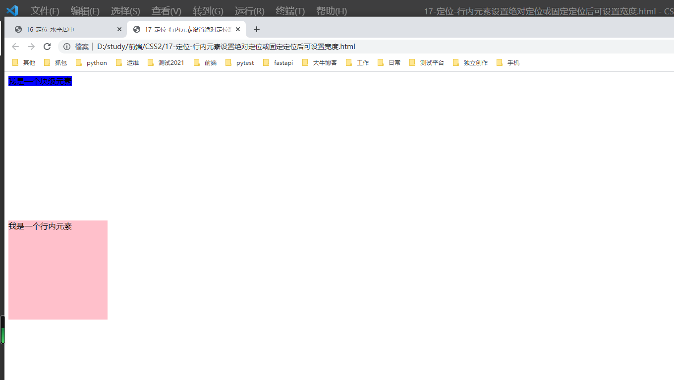
1.行内元素添加绝对或则固定定位后,可以设置宽度和高度。
 1 <!--
 2  * @Author: invoker
 3  * @Github: https://github.com/invoker2021
 4  * @Date: 2021-07-31 17:29:27
 5  * @LastEditors: invoker
 6  * @LastEditTime: 2021-07-31 17:30:49
 7  * @Description:
 8  * @FilePath: \CSS2\17-定位-行内元素设置绝对定位或固定定位后可设置宽度.html
 9 -->
10 <!DOCTYPE html>
11 <html lang="en">
12
13 <head>
14     <meta charset="UTF-8">
15     <meta http-equiv="X-UA-Compatible" content="IE=edge">
16     <meta name="viewport" content="width=device-width, initial-scale=1.0">
17     <title>17-定位-行内元素设置绝对定位或固定定位后可设置宽度</title>
18     <style>
19         span {
20             height: 200px;
21             width: 200px;
22             background-color: pink;
23         }
24     </style>
25 </head>
26
27 <body>
28     <span>我是一个行内元素</span>
29 </body>
30
31 </html>
设置成绝对定位:
 1 <!--
 2  * @Author: invoker
 3  * @Github: https://github.com/invoker2021
 4  * @Date: 2021-07-31 17:29:27
 5  * @LastEditors: invoker
 6  * @LastEditTime: 2021-07-31 17:31:30
 7  * @Description:
 8  * @FilePath: \CSS2\17-定位-行内元素设置绝对定位或固定定位后可设置宽度.html
 9 -->
10 <!DOCTYPE html>
11 <html lang="en">
12
13 <head>
14     <meta charset="UTF-8">
15     <meta http-equiv="X-UA-Compatible" content="IE=edge">
16     <meta name="viewport" content="width=device-width, initial-scale=1.0">
17     <title>17-定位-行内元素设置绝对定位或固定定位后可设置宽度</title>
18     <style>
19         span {
20             position: absolute;
21             height: 200px;
22             width: 200px;
23             background-color: pink;
24         }
25     </style>
26 </head>
27
28 <body>
29     <span>我是一个行内元素</span>
30 </body>
31
32 </html>
2.块级元素添加绝对或则固定定位后,不给宽度和高度,默认大小为内容的大小
 1 <!--
 2  * @Author: invoker
 3  * @Github: https://github.com/invoker2021
 4  * @Date: 2021-07-31 17:29:27
 5  * @LastEditors: invoker
 6  * @LastEditTime: 2021-07-31 17:34:07
 7  * @Description:
 8  * @FilePath: \CSS2\17-定位-行内元素设置绝对定位或固定定位后可设置宽度.html
 9 -->
10 <!DOCTYPE html>
11 <html lang="en">
12
13 <head>
14     <meta charset="UTF-8">
15     <meta http-equiv="X-UA-Compatible" content="IE=edge">
16     <meta name="viewport" content="width=device-width, initial-scale=1.0">
17     <title>17-定位-行内元素设置绝对定位或固定定位后可设置宽度</title>
18     <style>
19         span {
20             position: absolute;
21             top: 300px;
22             height: 200px;
23             width: 200px;
24             background-color: pink;
25         }
26
27         div {
28             height: 88px;
29             background-color: blue;
30         }
31     </style>
32 </head>
33
34 <body>
35     <span>我是一个行内元素</span>
36     <div>我是一个块级元素</div>
37 </body>
38
39 </html>
设置块级元素为绝对定位。
 1 <!--
 2  * @Author: invoker
 3  * @Github: https://github.com/invoker2021
 4  * @Date: 2021-07-31 17:29:27
 5  * @LastEditors: invoker
 6  * @LastEditTime: 2021-07-31 17:35:19
 7  * @Description:
 8  * @FilePath: \CSS2\17-定位-行内元素设置绝对定位或固定定位后可设置宽度.html
 9 -->
10 <!DOCTYPE html>
11 <html lang="en">
12
13 <head>
14     <meta charset="UTF-8">
15     <meta http-equiv="X-UA-Compatible" content="IE=edge">
16     <meta name="viewport" content="width=device-width, initial-scale=1.0">
17     <title>17-定位-行内元素设置绝对定位或固定定位后可设置宽度</title>
18     <style>
19         span {
20             position: absolute;
21             top: 300px;
22             height: 200px;
23             width: 200px;
24             background-color: pink;
25         }
26
27         div {
28             position: absolute;
29             /* height: 88px; */
30             background-color: blue;
31         }
32     </style>
33 </head>
34
35 <body>
36     <span>我是一个行内元素</span>
37     <div>我是一个块级元素</div>
38 </body>
39
40 </html>
十、绝对定位和固定定位会完全压住下面的盒子
10.1 浮动元素会压住后面的标准流的盒子,但是不会压住标准流中文字(浮动当初设计就是为了让文字或图片环绕浮动)
 1 <!--
 2  * @Author: invoker
 3  * @Github: https://github.com/invoker2021
 4  * @Date: 2021-07-31 17:39:45
 5  * @LastEditors: invoker
 6  * @LastEditTime: 2021-07-31 17:41:36
 7  * @Description:
 8  * @FilePath: \CSS2\18-浮动-不会压住原来位子后面盒子中的文字.html
 9 -->
10 <!DOCTYPE html>
11 <html lang="en">
12
13 <head>
14     <meta charset="UTF-8">
15     <meta http-equiv="X-UA-Compatible" content="IE=edge">
16     <meta name="viewport" content="width=device-width, initial-scale=1.0">
17     <title>18-浮动-不会压住原来位子后面盒子中的文字</title>
18     <style>
19         .box1 {
20             float: left;
21             height: 100px;
22             width: 100px;
23             background-color: pink;
24         }
25     </style>
26 </head>
27
28 <body>
29     <div class="box1"></div>
30     <p>1234567890</p>
31 </body>
32
33 </html>
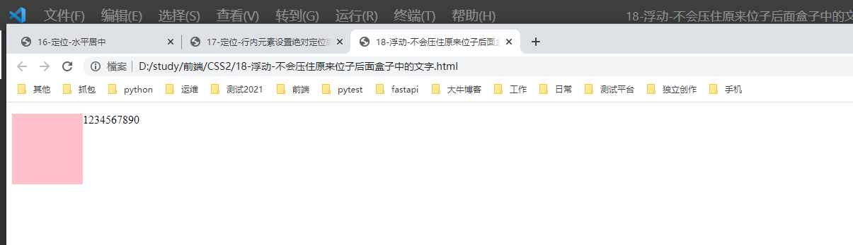
由下图可知,粉色盒子是悬浮在p标签上方的。但是文字或图片却没有被压住
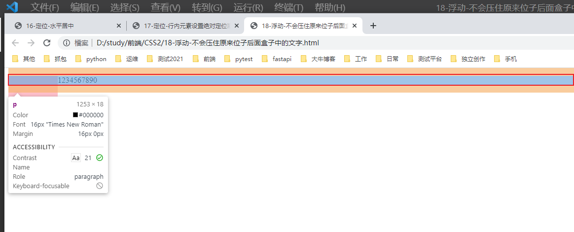
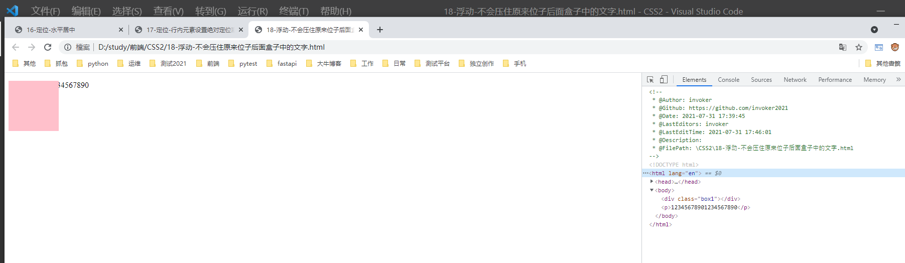
10.2 但是绝对定位和固定定位会压住下面标准流的内容(文字或则图片)
 1 <!--
 2  * @Author: invoker
 3  * @Github: https://github.com/invoker2021
 4  * @Date: 2021-07-31 17:39:45
 5  * @LastEditors: invoker
 6  * @LastEditTime: 2021-07-31 17:46:01
 7  * @Description:
 8  * @FilePath: \CSS2\18-浮动-不会压住原来位子后面盒子中的文字.html
 9 -->
10 <!DOCTYPE html>
11 <html lang="en">
12
13 <head>
14     <meta charset="UTF-8">
15     <meta http-equiv="X-UA-Compatible" content="IE=edge">
16     <meta name="viewport" content="width=device-width, initial-scale=1.0">
17     <title>18-浮动-不会压住原来位子后面盒子中的文字</title>
18     <style>
19         .box1 {
20             /* float: left; */
21             position: absolute;
22             height: 100px;
23             width: 100px;
24             background-color: pink;
25         }
26     </style>
27 </head>
28
29 <body>
30     <div class="box1"></div>
31     <p>12345678901234567890</p>
32 </body>
33
34 </html>
本文来自博客园,作者:kaer_invoker,转载请注明原文链接:https://www.cnblogs.com/invoker2021/p/15071920.html

 浙公网安备 33010602011771号