bootstrap栅格布局和折叠窗的使用
bootstap.js(下载)
bootstrap.min.css(下载)
jquery.min.js(下载)
<link rel="stylesheet" href="../css/bootstrap/css/bootstrap.min.css"/>
<script type="text/javascript" src="../js/jquery.min.js"></script>
<script type="text/javascript" src="../js/bootstrap/js/bootstrap.js"></script>
1、bootstrap栅格(网格)布局
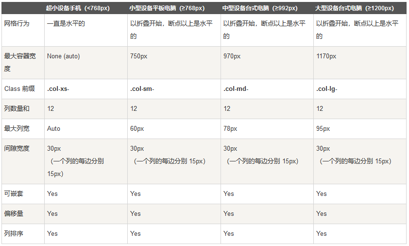
我常用的是col-md-1...col-md-12,可根据需求使用栅格布局+自己写的css相结合达到想要的效果,常用布局,上中下:
<body>
<div class="col-md-12 header">
</div>
<div class="col-md-12 center">
</div>
<div class="col-md-12 footer">
<div class="copy-right"></div>
</div>
</body>
2、折叠窗的使用
样式:
.nav-header {
width: 100%;
height: 25px;
font-size: 18px;
font-family: PingFang-SC-Bold;
font-weight: bold;
color: rgba(51, 51, 51, 1);
line-height: 25px;
text-decoration: none;
float:left;
}
.nav-header:hover{
color:rgba(26,104,206,1);
text-decoration: none;
}
.secondmenu{
list-style-type: none;
margin: 0;
padding: 0;
overflow: hidden;
float:left;
width: 100%;
}
.secondmenu li{
float:left;
width: 100%;
height: 20px;
font-size: 14px;
font-family: PingFangSC-Semibold;
font-weight: 600;
color: rgba(102, 102, 102, 1);
line-height: 20px;
margin-top:20px;
cursor: pointer;
}
.secondmenu li:hover{
color:rgba(26,104,206,1);
}
.ico-right-arrow1 {
float: right;
width: 10px;
height: 20px;
background-image: url(../images/icon.png);
background-position: 80px 0px;
background-size: 200px 22px;
margin-right: 3px;
}
.ico-up-arrow {
float: right;
width: 20px;
height: 20px;
background-image: url(../images/icon.png);
background-position: 140px 0px;
}
html:
<a href="#navMore" class="nav-header" data-toggle="collapse" aria-expanded="true">菜单栏<i class="ico-up-arrow"></i></a>
<ul id="navMore" class="collapse nav nav-list secondmenu in">
<li>菜单栏1<i class="ico-right-arrow1"></i></li>
<li>菜单栏2<i class="ico-right-arrow1"></i></li>
<li>菜单栏3<i class="ico-right-arrow1"></i></li>
<li>菜单栏4<i class="ico-right-arrow1"></i></li>
</ul>
其中aria-expanded="true" 和class中in为默认展开,去掉这两项,默认收缩
箭头是需要加上就加,不需要则不需要js控制,js改变箭头方向:
$(".nav-header").click(function(){
if($(this).hasClass("collapsed")){
$(this).find("i").removeClass("ico-right-arrow").addClass("ico-up-arrow");
}else{
$(this).find("i").removeClass("ico-up-arrow").addClass("ico-right-arrow");
}
});
效果: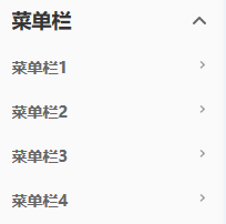


 浙公网安备 33010602011771号