注意:
并不是真正意义的块级元素(display: block),而是具备了块级元素特征的 table 元素(display: table)它独占一行,但宽度为 width: auto,以内部宽度为准,并不会自动拉伸适配父级宽度
2、内联元素
又叫行级元素,顾名思义,只能放在行内,就像一个单词,不会造成前后换行,起辅助作用
2.1、特点
- 和其他元素都在一行上;
- 高,行高及外边距和内边距不可改变;
- 宽度就是它的文字或图片的宽度,不可改变
- 内联元素只能容纳文本或者其他内联元素
2.2、常用标签
表单元素、超级链接、图像![]() 、 ……..
、 ……..
注意:
设置宽度width 无效。
设置高度height 无效,可以通过line-height来设置。
设置margin 只有左右margin有效,上下无效。
设置padding 设置有效。
内联元素和块级元素之间的转换通过样式display来控制
更多参考:
二、DIV
1、Div
div 是 division的缩写,意思是”分隔”。它可以把一个HTML文档中的内容分割开,允许我们通过CSS来定义每一部分的样式,这个标签通常用来作为其他HTML元素的容器,从而组织网页的结构。由于
本身不包含任何默认的样式或表现,它成为了一种非常纯净和通用的方式来分组内容和元素。
2、一列固定宽度
注意是background
 Css样式:
 <style >
 #layout { height: 300px; width: 400px; background: #99FFcc; }
 </style>
 Html页面
 <body>
 <div id="layout">此处显示id "layout" 的内容</div>
 </body>
3、列固定宽度居中
当设置一个盒模型的margin:auto;时,可以让这个盒模型居中
 Css样式:
 <style >
 #layout { height: 300px; width: 400px; background: #99FFcc; margin: auto; }
 </style>
 Html页面
 <body>
 <div id="layout">此处显示id "layout" 的内容</div>
 </body>
4、列自适应宽度
自适应宽度是相对于浏览器而言,盒模型的宽度随着浏览器宽度的改变而改变。这时要用到宽度的百分比,当一个盒模型不设置宽度时,它默认是相对于浏览器显示的
 Css样式:
 <style >
     body { margin: 0px; }//把body 默认的外边距去掉
 #layout { height: 300px; background: #99FFcc; margin: auto; }
 </style>
 Html页面
 <body>
 <div id="layout">此处显示id "layout" 的内容</div>
 </body>
5、多块布局
一般的网站整体可以分为上中下结构,即:头部、中间主体、底部。那么我们可以用三个div 块来划分,分别给它们起名为:头部(header)、主体(maincontent)、底部(footer)
 Css样式:
 <style >
     body { margin:0; padding:0;}
    #header { margin:5px auto; width:500px; height:80px; background:#9F9;}
     #main { margin:5px auto; width:500px; height:400px; background:#9FF;}
     #footer { margin:5px auto; width:500px; height:80px; background:#9f9;}
 </style>
 Html页面
 <div id="header">此处显示id "header" 的内容</div>
 <div id="main">此处显示id "main" 的内容</div>
 <div id="footer">此处显示id "footer" 的内容</div>
三、浮动
1、什么是浮动
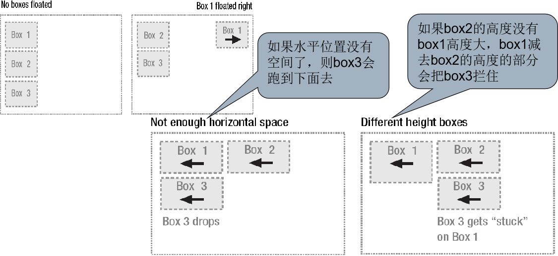
浮动可以改变流布局,可以使多个div水平显示,有左浮动和右浮动
浮动框可以左右移动,直到它的外边缘碰到包含框或另一浮动框的边缘,当元素浮动时,它将不再处于普通文档流中,相当于浮在文档之上,不占据空间,但是会缩短行框,产生文字环绕的效果
浮动元素不占据空间的意思:
以两个div为例, 正常是俩都显示出来,占据2空间,加浮动后,div就会叠加显示在一个位置, 此时要想让两个div正常显示一般使用到margin-left:浮动div的宽度,或者也是使用浮动。如果不设置,div叠加在一个位置时,只是位置叠加,但div中的内容不会被覆盖,如果后面的div没有指定宽度则自动横向填充完整,文字过多则会跑到第一个div下面形成文字环绕效果。如果指定宽度则去掉被覆盖的宽度显示,其它的文字到浮动div下面显示,即产生文字环绕效果。
2、两列固定宽度居中
两列固定宽度居中,需要在两列固定宽度的基础上改进,在学一列固定宽度居中时,我们知道让它居中的方法,所以这里需要在这两个div 之外再加一个父div :
 <!DOCTYPE html>
 <html lang="en">

 <head>
     <meta charset="UTF-8">
     <meta name="viewport" content="width=device-width, initial-scale=1.0">
     <title>Document</title>
 </head>
 <style type="text/css">
     #content { width:470px; margin:0 auto;}
     #side { background: #99FF99; height: 300px; width: 120px; float: left; }
     #main { background: #99FFFF; height: 300px; width: 350px; margin-left: 120px; }
 </style>

 <body>
     <div id="content">
         <div id="side">此处显示id "side" 的内容</div>
         <div id="main">此处显示id "main" 的内容</div>
     </div>

 </body>

 </html>
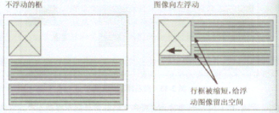
3、word 图片排版效果
当元素浮动过之后,需要指定一个宽度,否则它会尽可能窄。那么把side 的宽度设置为大于图片的宽度,它们中间应该就有空隙了。图片的宽度是192px,设置side 为202px,中间将会有10px 的空隙了
 <!DOCTYPE html>
 <html lang="en">

 <head>
     <meta charset="UTF-8">
     <meta name="viewport" content="width=device-width, initial-scale=1.0">
     <title>Document</title>
 </head>
 <style type="text/css">
     body { font-size:18px; line-height:200%; }
     #box { float:left; width:302px;}
 </style>


 <body>
     <div id="box">
         <img src="image/vue.png" width="292" height="242" />
     </div>
     <div> 标准之提供DIV+CSS…….</div>
 </body>

 </html>
4、三列自适应宽度
三列自适应宽度,一般常用的结构是左列和右列固定,中间列根据浏览器宽度自适应。下面在二列自适应宽度基础上修改一下:
 <!DOCTYPE html>
 <html lang="en">

 <head>
     <meta charset="UTF-8">
     <meta name="viewport" content="width=device-width, initial-scale=1.0">
     <title>Document</title>
 </head>
 <style type="text/css">
     body { margin:0;}
     #box { background: #99FF99; height: 300px; width: 120px; float: left; }
     #box1 { background: #99FF99; height: 300px; width: 120px; float: right; }
     #box2 { background: #99FFFF; height: 300px; margin:0 120px; }
 </style>


 <body>
     <div id="box">此处显示id "side" 的内容</div>
     <div id="box1">此处显示id "side1" 的内容</div>
     <div id="box2">此处显示id "main" 的内容</div>

 </body>

 </html>
5、三列固定宽度居中
三列固定宽度可以在三列自适应基础上添加一个父div,并设置这个div 的宽度即可,如下,添加一个id 为content 的父容器:
 <!DOCTYPE html>
 <html lang="en">

 <head>
     <meta charset="UTF-8">
     <meta name="viewport" content="width=device-width, initial-scale=1.0">
     <title>Document</title>
 </head>
 <style type="text/css">
     body { margin:0;}
     #content { width:470px; margin:0 auto;}
     #box { background: #99FF99; height: 300px; width: 120px; float: left; }
     #box1 { background: #99FF99; height: 300px; width: 120px; float: right; }
     #main { background: #99FFFF; height: 300px; margin:0 120px; }
 </style>

 <body>
     <div id="content">
         <div id="box">此处显示id "side" 的内容</div>
         <div id="box1">此处显示id "side1" 的内容</div>
         <div id="main">此处显示id "main" 的内容</div>
     </div>

 </body>

 </html>
四、清除
1、什么是清除
Clear的作用:当属性设置float(浮动)时,他所在的物理位置已经脱离文档流了,但是大多时候我们希望文档流能识别float(浮动),或者是希望float(浮动)后面的元素不被float(浮动)所影响,这个时候我们就需要用clear来清除。
如果div采用了float之后它所在的物理位置已经脱离文档流了,在该div后面的元素会占据它的水平位置,如果想让后面的元素重新另起一行,不受浮动的影响,那么就需要在后面的元素中加上float:both;就可以换一行了。
如果要为浮动元素留出垂直空间,使其它的元素不在其两侧显示,可以对其周围的元素使用清理属性
clear常用值有:
添加了clear属性的元素,通过自动增加空白边,达到留出垂直空间的效果,如下图,前者为加了clear属性的,后者未加.
2、示例
 <!DOCTYPE html>
 <html lang="en">

 <head>
     <meta charset="UTF-8">
     <meta name="viewport" content="width=device-width, initial-scale=1.0">
     <title>Document</title>
     <style>
         body {
             margin: 0px;
         }

         .top {
             height: 40px;
             background-color: #1aa094 !important;
             color: white;
             text-align: center;
             padding-top: 20px;
             font-size: large;
         }
         .left{
             width: 20%;background-color: #243346;height: 600px;color: white;float: left;
         }
         .main{
             width: 80%;height: 600px;background-color: cornsilk;float: left;
         }
         .foot{height: 50px;background-color: rgb(201, 234, 223);clear: both;}
     </style>
 </head>

 <body>
     <div class="top">欢迎进入人事管理系统</div>
     <div class="left">菜单</div>
     <div class="main"></div>
     <div class="foot"></div>
 </body>

 </html>
五、综合案例
1、效果
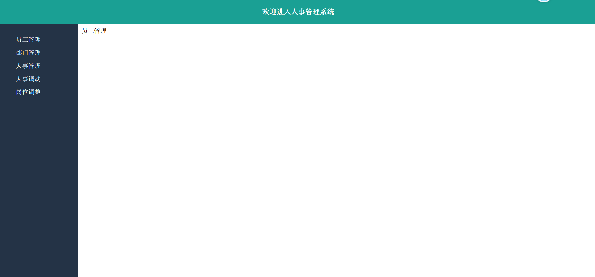
image-20240823180007018
2、代码
 <!DOCTYPE html>
 <html lang="en">

 <head>
     <meta charset="UTF-8">
     <meta name="viewport" content="width=device-width, initial-scale=1.0">
     <title>后台主页</title>
     <style>
         body {
             margin: 0px;
         }

         .container {
             height: 100vh;
             width: 100%;
         }

         .top {
             height: 60px;
             background-color: #1aa094;
             color: white;
             font-size: large;
             font-weight: 900;
             text-align: center;
             line-height: 60px;
         }

         .left {
             width: 200px;
             height: calc(100% - 60px);
             background-color: #243346;
             float: left;
         }

         .main {
             width: calc(100% - 200px);
             height: calc(100% - 60px);
             float: left;
         }

         /* calc() 中-左右注意添加空格*/
         /* .footer{height: 60px;clear: both;background-color: #161212;} */
         ul {
             list-style: none;
             color: white;
         }

         ul li {
             padding-top: 15px;
             font-size: 16px;
         }

         li a {
             color: white;
             text-decoration: none;
         }

         iframe {
             width: 100%;
             height: calc(100% - 60px);
         }
     </style>
 </head>

 <body>
     <div class="container">
         <div class="top">欢迎进入人事管理系统</div>
         <div class="left">
             <ul>
                 <li><a href="employee.html" target="main">员工管理</a></li>
                 <li><a href="">部门管理</a></li>
                 <li>人事管理</li>
                 <li>人事调动</li>
                 <li>岗位调整</li>
             </ul>
         </div>
         <div class="main">
             <iframe src="demo3.html" frameborder="0" name="main"></iframe>
         </div>
         <!-- <div class="footer">footer</div> -->

     </div>
 </body>

 </html>
3、注意事项
3.1、设置容器高度
height: 100vh; /* height:100vh == height:100%; */
参考:https://www.cnblogs.com/art-poet/p/12487834.html
3.2、计算高度
calc()此函数允许在声明 CSS 属性值时执行一些计算
 /* property: calc(expression) */
 width: calc(100% - 80px);
说明
- 需要注意的是,运算符前后都需要保留一个空格,例如:width: calc(100%- 10px);
- 任何长度值都可以使用calc()函数进行计算;
- calc()函数支持”+“,”-“,”*“,”/“运算;
- calc()函数使用标准的数学运算优先级规则;
- 当在background-position中使用calc()时将会导致浏览器崩溃;
- 部分版本在使用calc()时,乘法和除法可能无效;
更多参考:https://www.lanmper.cn/css/t147
3.3、div中的文字垂直水平居中
div中要设置div中的文字垂直居中,只需要设置line-height等于父元素的高度即可
 .main{
     width: 200px;
     height: 200px;
     background-color: azure;
     text-align: center;
     line-height: 200px;
 }
3.4、去掉表格单元格与边框之间的距离
通过样式显示表格样式时,单元格与边框之间会有空隙,可以如下设置:
 /*表格嵌套时去掉边框之间的距离*/
 border-collapse:collapse;
 /*设置垂直居顶*/
 vertical-align: top;
4、带logo版
 <!DOCTYPE html>
 <html lang="en">

 <head>
     <meta charset="UTF-8">
     <meta name="viewport" content="width=device-width, initial-scale=1.0">
     <title>后台主页</title>
     <style>
         body {
             margin: 0px;
         }

         .container {
             height: 100vh;
             width: 100%;
         }

         .top {
             height: 60px;
             background-color: #1aa094;
             color: white;
             font-size: large;
             font-weight: 900;
             text-align: center;
             line-height: 60px;
         }

         .left {
             width: 200px;
             height: 100vh;
             background-color: #243346;
             float: left;
         }

         .left img {
             width: 150px;
             margin: 15px;
         }

         .main {
             width: calc(100% - 200px);
             height: calc(100% - 60px);
             float: left;
         }

         /* calc() 中-左右注意添加空格*/
         /* .footer{height: 60px;clear: both;background-color: #161212;} */
         ul {
             list-style: none;
             color: white;
         }

         ul li {
             padding-top: 15px;
             font-size: 16px;
         }

         li a {
             color: white;
             text-decoration: none;
         }

         .iframe-container {
             width: 100%;
             height: calc(100% - 60px);
         }

         iframe {
             width: 100%;
             height: 100%;
             border: none;
         }
     </style>
 </head>

 <body>
     <div class="container">
         <div class="left">
             <img src="https://www.woniuxy.com/static/images/logo-500px.png" alt="Logo">
             <ul>
                 <li><a href="employee.html" target="main">员工管理</a></li>
                 <li><a href="demo07.html" target="main">部门管理</a></li>
                 <li>人事管理</li>
                 <li>人事调动</li>
                 <li>岗位调整</li>
             </ul>
         </div>
         <div class="main">
             <div class="top">欢迎进入人事管理系统</div>
             <div class="iframe-container">
                 <iframe  name="main"></iframe>
             </div>
         </div>

     </div>
 </body>

 </html>
六、定位(扩展)
position属性用于指定一个元素在文档中的定位方式。top,right,bottom和left属性则决定了该元素的最终位置
- 如果
top和bottom都被指定,top优先。
- 如果指定了
left和right,当direction设置为ltr(水平书写的中文、英语)时left优先,当direction设置为rtl(阿拉伯语、希伯来语、波斯语由右向左书写)时right优先
1、定位模式
| 属性值 |
意义 |
说明 |
| static |
静态定位(默认) |
指定元素使用正常的布局行为,即元素在文档常规流中当前的布局位置。此时 top, right, bottom, left 和 z-index 属性无效。 |
| relative |
相对定位 |
元素先放置在未添加定位时的位置,再在不改变页面布局的前提下调整元素位置 |
| absolute |
绝对定位 |
指定元素相对于最近的非 static 定位祖先元素的偏移,来确定元素位置 |
| fixed |
固定定位 |
元素会被移出正常文档流,并不为元素预留空间,而是通过指定元素相对于屏幕视口(viewport)的位置来指定元素位置 |
2、相对定位
相对于元素在普通文本流中的初始位置,如果一个元素进行相对定位,它将以它所在的位置(即它在普通流中的位置)为初始点,然后,可以通过设置垂直或水平位置,让这个元素“相对于”它的初始点进行移动
示例:
 <!DOCTYPE html>
 <html lang="en">
 <head>
     <meta charset="UTF-8">
     <meta name="viewport" content="width=device-width, initial-scale=1.0">
     <title>Document</title>
     <style>
         *{
             padding: 0px;
             margin: 0px;
         }
         .box1{
             position: relative;
             top: 30px;
             left: 30px;
             margin-top: 50px;
             margin-left: 50px;
             width: 200px;
             height: 100px;
             background-color: red;
         }
         .box2{
             width: 200px;
             height: 200px;
             background-color:blueviolet;
         }
     </style>
 </head>
 <body>
      <div class="box1"></div>
      <div class="box2"></div>
 </body>
 </html>
特性:
- 相对定位的元素相对于其原始位置进行定位。
- 元素的边距和填充会影响相对定位的元素。
- 元素的 z 索引不会影响相对定位的元素
- 这种布局主要使用作为父容器,然后里边可包含绝对定位的元素。
3、绝对定位
可以把某个元素精确的定位在某个地方
- 绝对定位使元素的位置与文档流无关,因此不占据普通流中的空间,普通文档流中其他元素的布局就像绝对定位的元素不存在时一样
- 绝对定位的元素的位置是相对于最近的父元素而言的,因为绝对定位的框与文档流无关,所以它们可以覆盖页面上的其他元素并可以通过z-index 来控制它层级次序。z-index 的值越高,它显示的越在上层
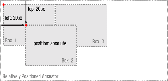
注意:
1、如果外面没有任何容器,那么相对定位的控件默认是相对于浏览器
2、如果有其它父容器,只有父容器使用相对定位,子元素使用绝对定位后,这样子元素的位置不再相对于浏览器左上角,而是相对于父容器左上角
3、如果父容器没有使用定位,而父父容器使用了,则相对于父父容器,依此类推,直到找到浏览器
示例:
 <!DOCTYPE html>
 <html lang="en">
 <head>
     <meta charset="UTF-8">
     <meta name="viewport" content="width=device-width, initial-scale=1.0">
     <title>Document</title>
     <style>
         *{
             margin:0;
             padding: 0;
         }
         .grandparent{
             margin-top: 60px;
             margin-left: 60px;
             width: 300px;
             height: 300px;
             background-color: skyblue;
             overflow: hidden;
         }
         .parent{
             position: relative;
             margin-top: 50px;
             margin-left: 50px;
             width: 200px;
             height: 200px;
             background-color: yellow;
         }
         .child{
             position:absolute;
             top:30px;
             left: 30px;
             width: 100px;
             height: 100px;
             background-color: springgreen;
         }

     </style>
 </head>
 <body>
      <div class="grandparent">
         <div class="parent">
             <div class="child"></div>
         </div>
      </div>
 </body>
 </html>
注:
1、绝对定义以父容器作为参照,如果父容器没有设置定位,那么就是你父亲的父亲作为参照物父相子绝 2、父容器无论是绝对定位还是相对定位都可以
绝对定位实现块容器居中
 <!DOCTYPE html>
 <html lang="en">

 <head>
     <meta charset="UTF-8">
     <meta name="viewport" content="width=device-width, initial-scale=1.0">
     <title>Document</title>
 </head>
 <style>
     .container {
         width: 500px;
         height: 600px;
         background-color: antiquewhite;
         position: absolute;
         top: 50%;
         left: 50%;
         margin-top: -300px;
         margin-left: -250px;
     }
 </style>

 <body>
     <div class="container">
         登录页面
     </div>
 </body>

 </html>
特性:
- 绝对定位的元素相对于其最近的定位父元素进行定位。
- 元素的边距和填充不会影响绝对定位的元素。
- 元素的 z 索引会影响绝对定位的元素
4、固定定位
固定定位,指的是被固定的元素不会随着滚动条的拖动而改变位置
“position:fixed;”是结合top、bottom、left和right这4个属性一起使用的。其中,先使用“position:fixed;”让元素成为固定定位元素,接着使用top、bottom、left和right这4个属性来设置元素相对浏览器的位置
示例:
 <!DOCTYPE html>
 <html lang="utf-8">
 <head>
     <title></title>
     <style>
         *{
             margin: 0px;
             padding: 0px;
         }
         #container {
             height: 1800px;
             border: 1px solid gray;
             line-height: 600px;
             background-color: #B7F1FF;
         }

         #box {
             position: fixed; /*设置元素为固定定位*/
             top: 100px; /*距离浏览器顶部100px*/
             right: 50px; /*距离浏览器左部50px*/
             width: 100px;
             height: 200px;
             border: 1px solid silver;
             background-color: rgb(228, 219, 223);
         }

         li{
             list-style-type: none;
             margin-top: 20px;
             text-align: center;
         }
     </style>
 </head>
 <body>
 <div id="container">无定位的div元素</div>
 <div id="box">
     <ul>
         <li>手机</li>
         <li>个人中心</li>
         <li>售后</li>
         <li>购物车</li>
     </ul>
 </div>
 </body>
 </html>
5、实现登录效果
html
 <!DOCTYPE html>
 <html lang="en">

 <head>
     <meta charset="UTF-8">
     <meta name="viewport" content="width=device-width, initial-scale=1.0">
     <title>Document</title>
     <link rel="stylesheet" href="./css/login.css">
 </head>

 <body>
     <div class="container">
         <div class="login-box">
             <div class="title">用户登录</div>
             <form action="">
                 <div class="login-content">
                     <div class="item"><input type="text" name="" id=""></div>
                     <div class="item"><input type="text" name="" id=""></div>
                     <div class="item">
                         <button class="loginbtn">登录</button>
                     </div>
                 </div>
             </form>
         </div>
     </div>
 </body>

 </html>
样式
 *{
     margin: 0px;
     padding: 0px;
 }
 .container{
     position: relative;
     height: 100vh;
     width: 100vw;
     background-image: url("../img/bg.jpg");
     background-size: 100%;

 }
 .login-box{
     position: absolute;
     width: 410px;
     top:50%;
     left: 50%;
     margin-top: -150px;
     margin-left: -200px;
     opacity: 0.8;/*透明度*/
     background-color: #fff;
 }
 .login-box .title{
     margin-left: 20px;
     font-size: 20px;
     text-align: center;
     margin: 10px 0px;
 }
 .login-content{
     padding: 10px;
     margin: 10px;
 }
 .login-content .item{
     line-height: 30px;
 }
 .item input{
     width: 350px;
     height: 25px;
     padding: 10px;
     margin-bottom: 10px;
 }
 .loginbtn{
     width: 370px;
     height: 45px;
     background-color: skyblue;
     border: none;
 }
3、漂亮版(看看就可以了)
 <!DOCTYPE html>
 <html lang="en">
 <head>
     <meta charset="UTF-8">
     <meta name="viewport" content="width=device-width, initial-scale=1.0">
     <title>Document</title>
 </head>
 <style>
     body {
   background-color: #1e1e1e;
 }

 .container {
   display: flex;
   justify-content: center;
   align-items: center;
   height: 100vh;
 }

 .card {
   background-color: #fff;
   border-radius: 5px;
   box-shadow: 0 5px 10px rgba(0, 0, 0, 0.1);
   width: 400px;
 }

 .card-header {
   background-image: linear-gradient(to right, #e64b3b, #e08243);
   border-radius: 5px 5px 0 0;
   color: #fff;
   padding: 20px;
   text-align: center;
 }

 .card-header h3 {
   margin: 0;
 }

 .card-header span {
   display: block;
   font-size: 14px;
   margin-top: 10px;
 }

 .card-body {
   padding: 20px;
 }

 .input-group {
   display: flex;
   flex-direction: column-reverse;
   margin-bottom: 20px;
   position: relative;
 }

 .input-group input {
   border: none;
   border-bottom: 2px solid #ddd;
   font-size: 16px;
   padding: 10px 0;
 }

 .input-group input:focus {
   outline: none;
 }

 .input-group label {
   color: #999;
   font-size: 16px;
   position: absolute;
   pointer-events: none;
   top: 10px;
   left: 0;
   transition: all 0.2s ease-in-out;
 }

 .input-group input:focus + label,
 .input-group input:valid + label {
   font-size: 12px;
   top: -10px;
   color: #e64b3b;
 }

 button {
   background-image: linear-gradient(to right, #e64b3b, #e08243);
   border: none;
   border-radius: 5px;
   color: #fff;
   cursor: pointer;
   font-size: 16px;
   padding: 10px 20px;
   transition: all 0.2s ease-in-out;
 }

 button:hover {
   transform: translateY(-5px);
 }
 </style>
 <body>
     <div class="container">
         <div class="card">
           <div class="card-header">
             <h3>Login</h3>
             <span>Please enter your login details.</span>
           </div>
           <div class="card-body">
             <form>
               <div class="input-group">
                 <input type="text" name="username" required>
                 <label>Username</label>
               </div>
               <div class="input-group">
                 <input type="password" name="password" required>
                 <label>Password</label>
               </div>
               <button type="submit">Login</button>
             </form>
           </div>
         </div>
       </div>
 </body>
 </html>

 浙公网安备 33010602011771号