纯css3 实现多行显示隐藏和文本垂直居中
用于移动端的效果还不错 自己制作页面:http://www.ysedu.com/zt/wxms.html
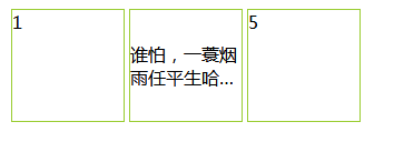
<!DOCTYPE html>
<html lang="en">
<head>
    <meta charset="UTF-8">
    <title>Document</title>
</head>
<body>
    <style>
        .clear {
    clear: both;
}
.fl {
    float: left;
}
.fr {
    float: right;
}
.test-div .test-sc{
    margin: 2px;
    width: 100px;
    height: 100px;
    border: 1px solid yellowgreen;
}
.test-sc2{
    align-items:center;
    display: flex;
    display: -webkit-flex;
    justify-content:center;
}
.text-p{
    width: 100%;
    word-break: break-all;
    text-overflow: ellipsis;
    display: -webkit-box;
    -webkit-box-orient: vertical;
    -webkit-line-clamp: 2;
    overflow: hidden;
}

    </style>
<div class="clear test-div">
          <section class="fl test-sc">1</section>
          <section class="fl test-sc test-sc2">
            <p class="text-p">谁怕,一蓑烟雨任平生哈哈哈哈</p>
          </section>
          <section class="fl test-sc">5</section>
</div>

</body>
</html>
参考文章:https://blog.csdn.net/u013018357/article/details/77483293
文档:https://www.html.cn/book/css/webkit/text/line-clamp.htm

 浙公网安备 33010602011771号