

react中绘制饼图基础例子
使用interval标记和theta坐标系来绘制饼图
radius:设置饼图的大小
.label()中的text 指定了一个回调函数,可以设置标签,其中d是当前项数据,i是当前项的索引,data是全部的数据,注意回调函数要有返回值。
.tooltip() 设置提示信息 title:标题 items:数据项
.interaction() 交互,elementSelect:选中时, .state设置选中时、未选中时的样式
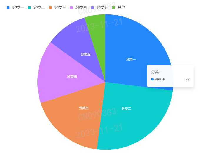
实现效果:
继续实现效果:
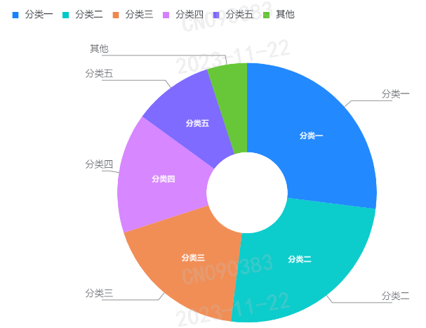
是如何实现的呢?代码里没有加,这里整理一下:
首先要加上innerRadius和outerRadius,可以理解成内圈大小和外圈大小
import { Chart } from '@antv/g2'
import React from 'react'


const data = [
    { type: '分类一', value: 27 },
    { type: '分类二', value: 25 },
    { type: '分类三', value: 18 },
    { type: '分类四', value: 15 },
    { type: '分类五', value: 10 },
    { type: '其他', value: 5 }
]
export default function Pie() {
    React.useEffect(() => {
        const chart = new Chart({
            container:'pie-container'
        })
        // 写在视图层级  chart.interval().coordinate()写在mark层级
        chart.coordinate({ type: 'theta' })
        chart.interval()
            .transform({type:'stackY'})
            .data(data)
            .encode('y', 'value')
            .encode('color', 'type')
            .label({
                // 指定绑定的字段
                text: (d, i, data) => { return d.value<10 ? '' : d.type },  // d当前项  i当前项的索引  data 数据
                radius: 0.5,
                fontSize: 10,
                fontWeight: 'bold'
            })
            .tooltip({
                title: 'type',
                items:['value']
            })
            .state('selected', { offset: 10 })  // 偏移
        chart.interaction('elementSelect',true)
        chart.render()
    },[])
    return (
        <div id="pie-container">
        </div>
    )
}

 浙公网安备 33010602011771号