CSS
字体属性
text-decoration
- none:无任何装饰线,可以去掉a标签默认的下划线
- underline:下划线
- overline:上划线
- line-through:中划线(删除线)
text-transform
- capitalize:首字母大写
- uppercase:将所有单词转为大写
- lowercase:将所有单词转为小写
- none:没有任何影响
text-indent
- 目前网站通过段落间隙可以分割段落,大部分不使用
text-indent:2em;
text-align
- left:居左
- right:居右
- center:居中
- justify:两端对齐
letter-spacing
word-spacing
font-size
font-family
font-weight
- 100~900
- normal
- bold
font-style
- normal
- italic(斜体):字体本身支持斜体,显示的斜体
- oblique(倾斜):让文本倾斜
font-variant
- normal
- small-caps:将英文转为小写,并且占据的高度不变
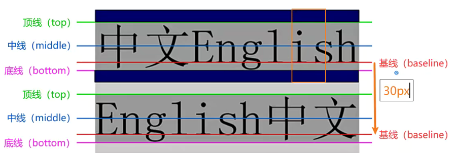
line-height
- 行高:两行文字基线之间的间距
- 基线:与小写字母x最底端对齐的线
font缩写属性
- font: font-style font-variant font-weight font-size/line-height font-family
- font-style font-variant font-weight可以随意调换顺序,也可省略
- line-height可以省略,如果不省略必须跟在font-size后
- font-size font-family不可以调换顺序,不可以省略
选择器
属性选择器
[title=div]{
    color:red;
}
/*
<div title='div'>asdfasf</div>
*/
后代选择器
- 空格分隔:后代
>符号:直接子代
兄弟选择器
- 相邻兄弟选择器:
+ - 普遍兄弟选择器:
~
选择器组
- 交集选择器:
div.box - 并集选择器:以逗号分隔
div.box{
    font:20px/1.5 ...
}

body,p,h1,h2{
    ...
}
伪类选择器
- pseudo-class:特定的某一状态
/**
动态伪类
:hover	a:hover鼠标悬浮
:link	a:link未访问的链接
:visited	a:visited已访问的链接
:active		a:active激活的链接
:focus
在与a连用时,:hover必须放在link和visited后才能生效,active必须放在hover后才能完全生效
顺序::link :visited :focus :hover :active


目标伪类
:target

语言伪类
:lang()


元素状态伪类
:enabled
:disabled
:checked


结构伪类
:nth-child()
:nth-last-child()
:nth-of-type()
:nth-last-of-type()
:first-child
:first-of-type
:last-child
:last-of-type
:root
:only-child
:only-of-type
:empty

否定伪类
:not()
*/
伪元素
- :first-line,first-line:首行文本
- :first-letter,::first-letter:首字符
- :before,::before
- :after,::after
css属性特性
选择器权重
- !import 10000
- 内联样式 1000
- id选择器 100
- 类选择器、属性选择器、伪类 10
- 元素选择器、伪元素 1
- 通配符 0
块级与行级元素
本质上元素没有区分,如div,span,只是浏览器默认设置了display
- block
- inline
- linline-block
- none
内存溢出
/*
overflow:hidden	auto scroll
*/
css盒子模型
盒子模型
- content
- padding
- border
- margin
- box-sizing:border-box
- 标准盒模型:content=width
- IE盒模型:content=width+padding+border
margin
- margin传递
- 传递:左右不会传递,上下传递是在子元素与父元素重叠
- 如何防止传递问题
- 给父元素设置padding-top\padding-bottom
- 给父元素设置border
- 触发BFC:设置overflow为auto
- margin折叠
- 垂直方向相邻的2个margin,合并为一个。
- 折叠后取最大那个margin
- 如何解决:
- 设置一个margin
- marign-top:50% 相对于父元素宽度
outline
不占据空间,默认显示在border外边
/*
应用场景:a标签focus效果
*/
box-shadow
/*
box-shadow:offset-x offset-y blur(模糊度) [延伸] color inset,...
*/
text-shadow
/*
text-shadow:offset-x offset-y blur(模糊度) color,...
*/
背景设置
- background-image
- background-repeat
- background-size
- auto
- cover: 以短边拉伸
- contain:以长边拉伸
- 百分比
- length:具体大小,如100px
- background-position
- background-attachment
- scroll
- local
- fiexed
- background
高级元素的使用
列表
- 有序列表:ol、li
- 无序列表:ul、li
- 定义列表:dl、dt、dd
表格
- 跨列合并:colspan
- 跨行合并:rowspan
<style>
    table{
        border-collapse: collapse; /*折叠*/
    }
</style>

<table>
    <caption>热门股票</caption>
    <thead>
    	<tr>
        	<th>标题1</th>
            <th>标题2</th>
            <th>标题3</th>
        </tr>
    </thead>
    <tbody>
    	<tr>
            <td>
                单元格1-1
            </td>
            <td>
                单元格1-2
            </td>
            <td>
                单元格1-3
            </td>
        </tr>
        <tr>
            <td>
                单元格2-1
            </td>
            <td>
                单元格2-2
            </td>
            <td>
                单元格2-3
            </td>
        </tr>
    </tbody>
    <tfoot>
    	<tr>
        	<td>
            	其他
            </td>
            <td>
            	其他
            </td>
            <td>
            	其他
            </td>
        </tr>
    </tfoot>
</table>
表单
- form
- action: URL
- method:get/post
- input
- type:
- text
- password
- radio
- checkbox
- button
- reset
- submit
- file
- date
- number
- color
- range
- search
- tel
- time
- readonly
- disabled
- checked
- autofocus
- name
- value
- placeholder:占位
- type:
- textarea
- rows
- cols
- resize
- none
- horizontal
- vertical
- both
- select、option
- multiple
- size
- selected
- button
- label
精灵图
- 减少http请求
- 减少图片大小
定位
- position
- static:默认,静态定位
- relative:相对定位
- absolute:绝对定位
- sticky:粘性定位
- fixed:固定定位
浮动
-
float
- left
- right
-
清除浮动
-
给父元素设置固定高度
-
clear属性:移动到浮动元素下面。
- left
- right
- both
- none
- 会增加很多无意义的空标签,维护麻烦
-
最终解决:
clear_fix::after{
    display:block;
    clear:both;
    content:''

    visibility:hidden; /*兼容性处理*/
    height:0 /*兼容性处理*/
}
/*兼容性处理*/
.clear_fix{
    *zoom:1 /*IE6/7兼容性*/
}
-
flex布局
flex:flex-grow | flex-shrink|flex-basic
<style>
    .fater{
        display:flex;
        flex-flow:wrap;
        width:500px;
        flex-direction:flex-between;
        overflow:hidden;
    }
    .child{
        width:100px;
        height:100px;
    }
    span{
        width:100px;
    }
</style>
<body>
    <div class='fater'>
        <div class="child">

        </div>

        <span></span>
        <span></span>
    </div>
</body>
Grid布局
二维布局系统,兼容性不强
-
Grid container
- display
- grid-template-columns
- grid-template-rows
- grid-template-areas
- grid-template
- grid-column-gap
- grid-row-gap
- grid-gap
- jsutify-items
- algin-items
- place-items
- jsutify-content
- align-content
- place-content
- grid-auto-columns
- grid-auto-rows
- grid-auto-flow
- grid
-
Grid Item--Grid cell
- grid-column-start
- grid-column-end
- grid-row-start
- grid-row-end
- grid-column
- grid-row
- grid-area
- jsutify-self
- align-self
- place-self
-
Grid Line
-
Grid Track:相邻网格线之间的空间
-
Grid Area: 四条线包裹的区域
.box{
    display:grid;
    grid
}
变形
-
transform
-
translate(x,y):百分比是参照自身
-
scale
-
rotate
-
角度:deg
-
百分度:gradians
-
弧度:radians
-
圈数:turns
90deg=100grad=1.5708rad=0.25turn
-
-
skew
-
-
transform-origin
动画
- transition
- 属性
- transition-property
- transition-duration
- transition-timing-function
- transition-delay
- 缺点:
- 只能定义开始和结束状态,不能定义中间状态
- 不能重复执行
- 需要在特定状态下才会触发
- 属性
- animation+@keyframes
- @keyframes
- from:0%
- to:100%
- animation
- animation-name
- animation-duration
- animation-timing-function
- animation-delay
- animation-iteration-count: 迭代次数
- infinite:无限
- animation-direction:方向
- reverse
- normal
- animation-fill-mode:元素停留在状态的哪一个位置
- forwards:最后那个位置
- backwards:最初那个位置
- none
- animation-play-state
- paused:暂停
- runing:播放
- @keyframes
行盒
- vertical-align
- baseline
- top
- buttom
- middle
CSS编写顺序
- 定位和布局
- 展示和可见
- 盒子模型
- 字体、文本
- 背景
- 其他

 浙公网安备 33010602011771号