Android Studio 之 用 Drawable resource file 美化 Button 样式
shape
•新建 Drawable resource file
点击 app/src/main/res 找到 drawable 文件夹,右击->New->Drawable Resource File。
•常用属性
<gradient> : 设置渐变色
- startColor : 起始颜色
- endColor : 结束颜色
- centerColor : 中间颜色
- angle : 方向角度,等于 0 时,从左到右,然后逆时针方向转,当 angle = 90 度时从下往上
- type : 设置渐变的类型
<solid android:color = "xxx"> : 设置背景颜色
<stroke android:width = "xdp" android:color="xxx"> : 设置边框的粗细,以及边框颜色
<corners android:radius="10dp"...> : 设置圆角
•gradient
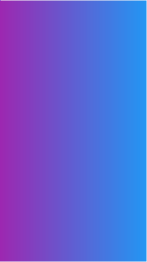
<?xml version="1.0" encoding="utf-8"?>
<shape xmlns:android="http://schemas.android.com/apk/res/android"
    android:shape="rectangle">

    <gradient
        android:endColor="#2196F3"
        android:startColor="#9C27B0" />

</shape>
•效果图
•solid
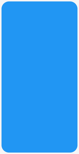
<?xml version="1.0" encoding="utf-8"?>
<shape xmlns:android="http://schemas.android.com/apk/res/android"
    android:shape="rectangle">

    <solid android:color="#2196F3" />

</shape>
•效果图

•stroke
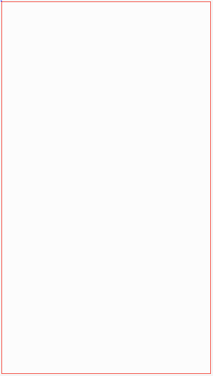
<?xml version="1.0" encoding="utf-8"?>
<shape xmlns:android="http://schemas.android.com/apk/res/android"
    android:shape="rectangle">

    <solid android:color="#FCFCFC" />

    <stroke
        android:width="1dp"
        android:color="#F44336" />

</shape>
•效果图
•corners
<?xml version="1.0" encoding="utf-8"?>
<shape xmlns:android="http://schemas.android.com/apk/res/android"
    android:shape="rectangle">

    <corners android:radius="10dp" />

    <size
        android:width="100dp"
        android:height="200dp" />

    <solid android:color="#2196F3" />

</shape>
•效果图
selector
•按下按钮时出现颜色变化
首先,新建一个 drawable resource file,根目录使用 selector ;
<?xml version="1.0" encoding="utf-8"?>
<selector xmlns:android="http://schemas.android.com/apk/res/android">

    <item android:state_pressed="false">
        <shape>
            <corners android:radius="10dp" />
            <solid android:color="#2196F3" />
        </shape>
    </item>

    <item android:state_pressed="true">
        <shape>
            <corners android:radius="10dp" />
            <solid android:color="#9C27B0" />
        </shape>
    </item>

</selector>
•效果图

•参考资料

 浙公网安备 33010602011771号