


matplotlib对双变量数据进行散点图分类显示
概述:海伦想找对象,收集了大量异性的数据,并进行了喜欢程度的判定。
数据集共有三个特征变量和一个标签变量
分别是每年获得的飞行常客里程数,玩视频游戏所耗时间百分比,每周消费的冰淇淋公升数
标签变量是喜欢程度:1,2,3 分别表示不喜欢的人、魅力一般的人、极具魅力的人
下面开始用散点图分析数据
1. 导入数据和相关库
import kNN#kNN是自定义的函数库
import numpy as np
import matplotlib
import matplotlib.pyplot as plt
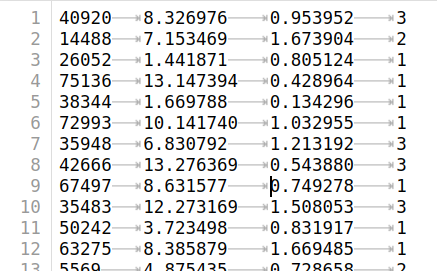
datingDataMat,datingLabels = kNN.file2matrix('./datas/datingTestSet2.txt')#调用函数将特征值转化为数组矩阵,标签值转换为列表
datingDataMat[:10]#查看数据
datingLabels[:10]
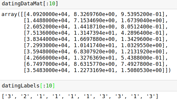
type(datingLabels[0])#因为datingLabels中的数据值是字符型,因此需要转化为数值型
datingLabels = list(map(int,datingLabels))
type(datingLabels[0])
plt.scatter(datingDataMat[:,1],datingDataMat[:,2])#散点图使用了特征变量的第二列和第三列数据
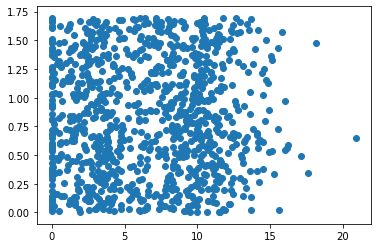
上图由于没有使用样本分类的特征值,很难看到任何有用的数据模式信息。为了更好理解数据信息,Matplotlib库提供的scatter函数支持个性化标记散点图上的点。调用scatter函数使用下列参数:
plt.scatter(datingDataMat[:,0],datingDataMat[:,1],15.0*np.array(datingLabels),15.0*np.array(datingLabels))
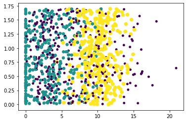
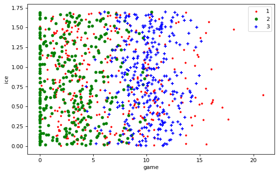
上图利用datingLabels存储的类标签属性,在散点图上绘制了色彩不等、尺寸不同的点。因而基本上可以从图中看到数据点所属三个样本分类的区域轮廓。为了得到更好的效果,采用datingDataMat矩阵的属性列1和2展示数据,并以红色的'*'表示类标签1、蓝色的'o'表示表示类标签2、绿色的'+'表示类标签3,修改参数如下:
datingLabels = np.array(datingLabels)
fig = plt.figure()
plt.figure(figsize=(8, 5), dpi=80)
ax = plt.subplot(111)
idx_1 = np.where(datingLabels==1)
p1 = ax.scatter(datingDataMat[idx_1,1],datingDataMat[idx_1,2],marker = '*',color = 'r',label='1',s=10)
idx_2 = np.where(datingLabels==2)
p2 = ax.scatter(datingDataMat[idx_2,1],datingDataMat[idx_2,2],marker = 'o',color ='g',label='2',s=20)
idx_3 = np.where(datingLabels==3)
p3 = ax.scatter(datingDataMat[idx_3,1],datingDataMat[idx_3,2],marker = '+',color ='b',label='3',s=30)
plt.xlabel("game")
plt.ylabel("ice")
ax.legend()
plt.show()
总结
1. np.where
numpy.where(条件[,x,y ] )
根据条件从x或y中选择返回元素
参数:
condition:array_like, bool
Where True, yield x, otherwise yield y.
x, y:array_like
Values from which to choose. x, y and condition need to be broadcastable to some shape.
返回值:
out: ndarray
An array with elements from x where condition is True, and elements from y elsewhere.
>>> a = np.arange(10)
>>> a
array([0, 1, 2, 3, 4, 5, 6, 7, 8, 9])
>>> np.where(a < 5, a, 10*a)
array([ 0,  1,  2,  3,  4, 50, 60, 70, 80, 90])
2. xlabels和ylabels
轴上的标签matplotlib默认是unicode码,具体转换成中文字体的方法有待学习。
同样,legend也是如此。

 浙公网安备 33010602011771号