

ConstraintLayout 用法
当前描述是基于constraint-layout:1.1.2。
一、前言
在以前,android是使用布局如LinearLayout 、RelativeLayout等来构建页面,但这些布局使用起来很麻烦,并且经常需要一层一层嵌套,写一个简单的页面就需要费很大的劲。所以在16年I/O大会上,google发布了全新的布局-ConstraintLayout,其他布局和ConstraintLayout比起来,根本就没有存在的必要了...
ConstraintLayout具有以下优势:
-
较高的性能优势。
布局嵌套层次越高,性能开销越大。而使用ConstraintLayout,经常就一层嵌套就搞定了,所以其性能要好很多。 -
完美的屏幕适配
ConstraintLayout的大小、距离都可以使用比例来设置,所以其适配性更好。 -
书写简单
-
可视化编辑。
ConstraintLayout也有十分方便完善的可视化编辑器,不用写xml也基本上能实现大部分功能。但个人还是比较喜欢写xml,所以本篇文章主要介绍如何使用代码控制。如果想看如何使用可视化编辑器,可以参考郭霖大神的这篇文章
1 引入:api 'com.android.support.constraint:constraint-layout:1.1.2'
二、ConstraintLayout
1. 定位位置
确定位置的属性提供了下面13个属性,其实本质上都是一样的,看名字应该基本上都知道怎么用了(就是哪一条边和哪一条边对齐)
- layout_constraintLeft_toLeftOf
- layout_constraintLeft_toRightOf
- layout_constraintRight_toLeftOf
- layout_constraintRight_toRightOf
- layout_constraintTop_toTopOf
- layout_constraintTop_toBottomOf
- layout_constraintBottom_toTopOf
- layout_constraintBottom_toBottomOf
- layout_constraintBaseline_toBaselineOf
- layout_constraintStart_toEndOf
- layout_constraintStart_toStartOf
- layout_constraintEnd_toStartOf
- layout_constraintEnd_toEndOf
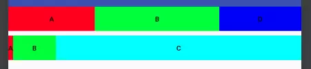
来看个例子:
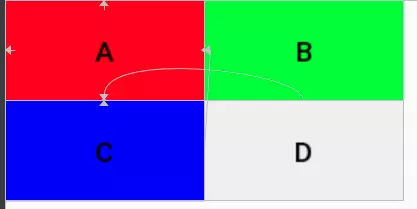 实现上述UI的相关代码如下:
 1 <android.support.constraint.ConstraintLayout
 2     ...>
 3
 4     <Button
 5         android:id="@+id/a"
 6          ....
 7         app:layout_constraintLeft_toLeftOf="parent"
 8         app:layout_constraintTop_toTopOf="parent"
 9         android:text="A" />
10
11     <Button
12         android:id="@+id/b"
13         ....
14         app:layout_constraintLeft_toRightOf="@id/a"
15         app:layout_constraintTop_toTopOf="@id/a"
16         android:text="B" />
17
18     <Button
19         android:id="@+id/c"
20          ....
21         app:layout_constraintLeft_toLeftOf="@id/a"
22         app:layout_constraintTop_toBottomOf="@id/a"
23         android:text="C" />
24
25     <Button
26         android:id="@+id/d"
27          ....
28         app:layout_constraintLeft_toRightOf="@id/a"
29         app:layout_constraintTop_toTopOf="@id/c"
30         android:text="D" />
31 </android.support.constraint.ConstraintLayout>
从中可以看到,
- layout_constraint*属性的值可以是某个id或者parent(父布局)
- B要位于A的右边,则使用
app:layout_constraintLeft_toRightOf="@id/a",C位于A的下边,则使用app:layout_constraintTop_toBottomOf="@id/a"
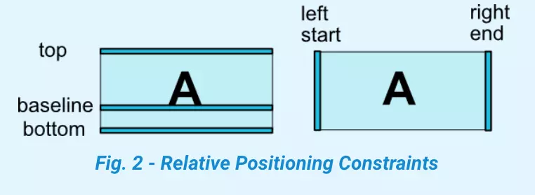
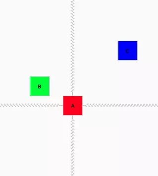
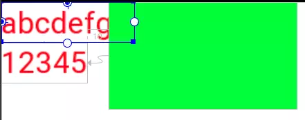
对于一个View的边界界定,官方给了下面这张图:
2. margin
设置margin还是继续用以前的属性layout_margin* 。
不过需要注意,要使margin生效,必须具有对应方向的layout_constraint*,否则margin不生效.
3. 关于view gone
假如现在有如下布局:

 1 <?xml version="1.0" encoding="utf-8"?>
 2 <android.support.constraint.ConstraintLayout
 3     ...>
 4
 5     <Button
 6         android:id="@+id/a"
 7         ...
 8         android:layout_marginLeft="100dp"
 9         android:layout_marginTop="20dp"
10         app:layout_constraintLeft_toLeftOf="parent"
11         app:layout_constraintTop_toTopOf="parent" />
12
13     <Button
14         android:id="@+id/b"
15         ...
16         android:layout_marginLeft="20dp"
17         android:layout_marginTop="20dp"
18         app:layout_constraintLeft_toRightOf="@id/a"
19         app:layout_constraintTop_toTopOf="@id/a"
20          />
21
22     <Button
23         android:id="@+id/c"
24        ....
25         android:layout_marginLeft="20dp"
26         android:layout_marginTop="20dp"
27         app:layout_constraintLeft_toRightOf="@id/b"
28         app:layout_constraintTop_toTopOf="@id/b" />
29 </android.support.constraint.ConstraintLayout>
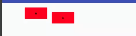
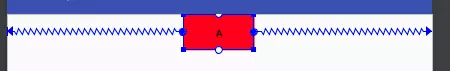
考虑一个问题,如果B动态设为gone了,C会怎么显示呢?
真实情况如下:
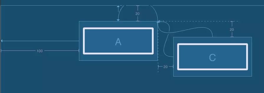
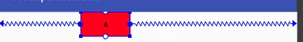
为什么会这样显示呢?看他的蓝图应该会好理解些:
那么如何解决关于View gone引起的非预期的布局变化呢?
- 如果可以,尽量使用invisible
- 尽量其他view的布局不依赖会gone的view
- google也提供了属性
layout_goneMargin*="xdp",意思是比如当constrainleft的锚点gone时,layout_goneMarginLeft将生效。但因为这个只能设置固定的距离,个人感觉灵活性不是很高。
4. 居中及bias
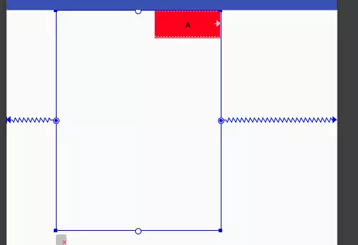
一个view如何设置为居中呢?如果查找属性,会发现并没有如RelativeLayout类似的layout_centerVertical属性,那如何设置居中呢?constraint的思想很巧妙。
根据第一节的知识,大家知道如果设置app:layout_constraintLeft_toLeftOf="parent",则view会贴着父view的左边,设置app:layout_constraintRight_toRightOf="parent" 则会贴着右边,那如果两个都设置,效果会怎样呢?
至此可以看出,对constraint的理解其实可以看成是像两个弹簧一样,如果只在左边加一个弹簧,右边没有,那左边的势必会把view拉到左边去,如果在右边也加一根弹簧,两个弹簧力相互平衡,则view就居中了。
上面是view居中,如果我想让view向左偏一些,或者位于1/3处该怎么处理?其实也是一样的,想象一下,如果左边的弹簧力大一些,view不是就自然往左偏了嘛。如何使力大一些呢?使用如下属性
- layout_constraintHorizontal_bias
- layout_constraintVertical_bias
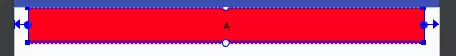
bias即偏移量,他们的取值范围从0~1,0即挨着左边,1是挨着右边,所以要使处于1/3处,可以设置如下属性app:layout_constraintHorizontal_bias="0.33",效果图如下:
5.view的尺寸
设置view的大小除了传统的wrap_content、指定尺寸、match_parent(虽然官方不推荐使用match_parent)外,还可以设置为0dp(官方取名叫MATCH_CONSTRAINT),0dp在constraint可不是指大小是0dp,而是有特殊含义的。他的作用会随着不同的设置有不同的含义:
- layout_constraintWidth_default
layout_constraintWidth_default有三个取值,作用如下:
-
spread,默认值,意思是占用所有的符合约束的空间
 1 <?xml version="1.0" encoding="utf-8"?>
 2 <android.support.constraint.ConstraintLayout
 3   ...>
 4
 5     <Button
 6         android:id="@+id/a"
 7         android:layout_width="0dp"
 8         ...
 9         android:layout_marginLeft="20dp"
10         android:layout_marginRight="20dp"
11         app:layout_constraintRight_toRightOf="parent"
12         app:layout_constraintLeft_toLeftOf="parent"/>
13
14 </android.support.constraint.ConstraintLayout>
可以看到layout_width为0dp,实际的效果则是宽度和约束一样,左右两边的留白是margin的效果。
percent,意思是按照父布局的百分比设置,需要layout_constraintWidth_percent设置百分比例
 1 <?xml version="1.0" encoding="utf-8"?>
 2 <android.support.constraint.ConstraintLayout >
 3
 4     <android.support.constraint.ConstraintLayout
 5         android:layout_width="300dp"
 6         android:layout_height="400dp"
 7         app:layout_constraintHorizontal_bias="0.3"
 8         >
 9
10         <Button
11             android:id="@+id/a"
12             android:layout_width="0dp"
13             ...
14             app:layout_constraintRight_toRightOf="parent"
15             app:layout_constraintWidth_default="percent"
16             app:layout_constraintWidth_percent="0.4" />
17     </android.support.constraint.ConstraintLayout>
18
19 </android.support.constraint.ConstraintLayout>
A的宽度设为0.4,则其宽度为父布局的0.4倍。另外,设置了layout_constraintWidth_percent属性,可以不用指定layout_constraintWidth_default,他会自动设置为percent
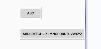
wrap,意思匹配内容大小但不超过约束限制,注意和直接指定宽度为wrap_content的区别就是不超过约束限制,如下:
 1 <?xml version="1.0" encoding="utf-8"?>
 2 <android.support.constraint.ConstraintLayout
 3     ...>
 4
 5
 6     <Button
 7         android:id="@+id/a"
 8         ...
 9         app:layout_constraintLeft_toLeftOf="parent" />
10     <Button
11         android:id="@+id/c"
12         ...
13         app:layout_constraintRight_toRightOf="parent" />
14
15     <Button
16         android:id="@+id/b"
17         android:layout_width="0dp"
18          ...
19         app:layout_constraintWidth_default="wrap"
20         app:layout_constraintLeft_toRightOf="@id/a"
21         app:layout_constraintRight_toLeftOf="@id/c"/>
22
23     <Button
24         android:id="@+id/d"
25         android:layout_width="wrap_content"
26         ...
27         app:layout_constraintTop_toBottomOf="@id/b"
28         app:layout_constraintLeft_toRightOf="@id/a"
29         app:layout_constraintRight_toLeftOf="@id/c"/>
30
31 </android.support.constraint.ConstraintLayout>
可以看到虽然文字很长,但第一行的绿色button宽度达到约束时,就不在增加,而第二行的button显示了完整的内容,超过约束的限制。
在1.1上 对于wrap_content会超过约束限制,谷歌又新增了如下属性
- app:layout_constrainedWidth=”true|false”
- app:layout_constrainedHeight=”true|false”
设置为true也可以限制内容不超过约束(这样感觉layout_constraintWidth_default这个属性已经没什么用了)
- ratio
layout_constraintDimensionRatio,即宽和高成一定的比例,其值可以是"width:height"的形式,也可以是width/height的值。该属性生效的前提:宽和高其中有一项为0dp,有constraint。下面按照有几个0dp来分别介绍下:
- 如果只有一项为0dp,则该项值按照比例计算出来。比如高为20dp,宽为0dp,radio为"2:1",则最终宽为40dp
- 如果两项都为0dp,则尺寸会设置为满足约束的最大值并保持比例。因为这是系统计算的,有的时候不是我们想要的,我们也可以通过在前面加H、W来指定是哪一个边需要计算。例如"H,2:1",则是指宽度匹配约束,高度是宽度的1/2
- max min
有如下属性可以设置其的最大最小值,含义如字面值一样:
- layout_constraintWidth_min
- layout_constraintWidth_max
- layout_constraintHeight_max
- layout_constraintHeight_min
- weight
该属性在下面讲解
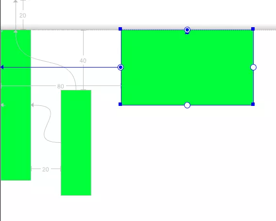
6. 链
如图,在一个水平或者竖直方向上,一排view两两互相约束,即为链
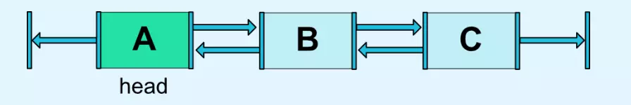
链的第一个元素称为链头,可以通过设置layout_constraintHorizontal_chainStyle来控制链的分布形式
-
spread
默认模式,分布样式如上图 -
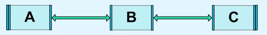
spread_inside
如图,和spread的区别是没算两端的约束
链的第一个元素称为链头,可以通过设置layout_constraintHorizontal_chainStyle来控制链的分布形式
-
spread
默认模式,分布样式如上图 -
spread_inside
如图,和spread的区别是没算两端的约束
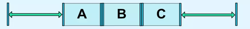
 packed
所有元素挤在中间,也可以配合使用bias来改变位置偏移
可以看出,链与LinearLayout效果大致一样。和LinearLayout一样,链也可以使用layout_constraintHorizontal_weight,来分割剩余空间。但又和 android:layout_weight不太一样,不一样的地方如下:
- layout_weight ,不管当前view的大小设的是多大,都会继续占据剩余空间
- layout_constraintHorizontal_weight,这个只对0dp并且layout_constraintWidth_default为spread的view生效,使其大小按比例分割剩余空间,对于已经设定大小的view不生效
如下面的示例:
 1 <?xml version="1.0" encoding="utf-8"?>
 2 <LinearLayout
 3     ...>
 4
 5     <LinearLayout
 6         ...
 7         android:orientation="horizontal">
 8         <Button
 9             android:layout_width="10dp"
10             android:layout_height="50dp"
11             android:layout_weight="1"
12             ... />
13         <Button
14             android:layout_width="wrap_content"
15             android:layout_height="50dp"
16             android:layout_weight="1"
17             ... />
18         <Button
19             android:layout_width="0dp"
20             android:layout_height="50dp"
21             android:layout_weight="1"
22             ... />
23     </LinearLayout>
24
25     <android.support.constraint.ConstraintLayout
26         ....>
27
28         <Button
29             android:id="@+id/a"
30             android:layout_width="10dp"
31             android:layout_height="50dp"
32             ....
33             app:layout_constraintHorizontal_weight="1"
34             app:layout_constraintLeft_toLeftOf="parent"
35             app:layout_constraintRight_toLeftOf="@id/b" />
36         <Button
37             android:id="@+id/b"
38             android:layout_width="wrap_content"
39             android:layout_height="50dp"
40             ....
41             app:layout_constraintHorizontal_weight="1"
42             app:layout_constraintLeft_toRightOf="@id/a"
43             app:layout_constraintRight_toLeftOf="@id/c" />
44
45         <Button
46             android:id="@+id/c"
47             android:layout_width="0dp"
48             android:layout_height="50dp"
49             ...
50             app:layout_constraintHorizontal_weight="1"
51             app:layout_constraintLeft_toRightOf="@id/b"
52             app:layout_constraintRight_toRightOf="parent" />
53
54         />
55     </android.support.constraint.ConstraintLayout>
56
57 </LinearLayout>
可以看出,LinearLayout和ConstraintLayout虽然三个子view的layout_width值是一样的,weight也都设置了1,但效果完全不一样
7. 圆形布局
ConstraintLayout还提供了一种比较炫酷的圆形布局,这是以往的布局所做不到的。涉及到的属性也很简单,就下面三个:
- layout_constraintCircle : 圆心,值是某个view的id
- layout_constraintCircleRadius : 半径
- layout_constraintCircleAngle :角度,值是从0-360,0是指整上方
示例如下:
 1 <?xml version="1.0" encoding="utf-8"?>
 2 <android.support.constraint.ConstraintLayout xmlns:android="http://schemas.android.com/apk/res/android"
 3    ...>
 4
 5    <Button
 6        android:id="@+id/a"
 7        ...
 8        />
 9
10    <Button
11        android:id="@+id/b"
12        ...
13        app:layout_constraintCircle="@id/a"
14        app:layout_constraintCircleAngle="300"
15        app:layout_constraintCircleRadius="100dp" />
16
17    <Button
18        android:id="@+id/c"
19        ...
20        app:layout_constraintCircle="@id/a"
21        app:layout_constraintCircleAngle="45"
22        app:layout_constraintCircleRadius="200dp" />
23    />
24 </android.support.constraint.ConstraintLayout>
三、辅助组件
除了
ConstraintLayout自身属性之外,谷歌还提供了很多辅助布局(只是在布局中起辅助作用,并不会在界面真正显示),来使ConstraintLayout的功能更加强大。下面,我们就一一来了解下这些布局
1. GuideLine
即参考线的意思,有水平参考线和竖直参考线两种。他的作用就像是一个虚拟的参考线,只是用来方便其他View以他为锚点来布局。
如上一篇所了解到的,ConstraintLayout 的定位原则就是一个View参考其他View的相对布局,如果有的时候当前布局没有合适的参考View,而建一个专门用于定位的View又会太重,这种情况正是GuideLine的用武之地。
例如:
 1 <?xml version="1.0" encoding="utf-8"?>
 2 <android.support.constraint.ConstraintLayout
 3     ...>
 4
 5     <android.support.constraint.Guideline
 6         android:id="@+id/guideline"
 7         ...
 8         android:orientation="vertical"
 9         app:layout_constraintGuide_percent="0.33" />
10
11     <android.support.constraint.Guideline
12         android:id="@+id/guideline2"
13         ...
14         android:orientation="horizontal"
15         app:layout_constraintGuide_begin="130dp" />
16
17     <Button
18         ...
19         app:layout_constraintLeft_toLeftOf="@id/guideline"
20         app:layout_constraintTop_toTopOf="@id/guideline2" />
21
22
23 </android.support.constraint.ConstraintLayout>
可以看到我分别添加了一个水平参考线和竖直参考线,之后的Button的布局就参考与这两个参考线,而在布局中并不会显示。
Guideline的大部分的属性如layout_width都是不会生效的,而他的位置的确定是由下面三个属性之一来确定的:
- layout_constraintGuide_begin:距离父布局的左边或者上边多大距离
- layout_constraintGuide_end:距离父布局的右边或者下边多大距离
- layout_constraintGuide_percent:百分比,0~1,距离父布局的左边或者上边占父布局的比例
2. Group
Group是一个可以同时控制多个view 可见性的虚拟View。
例如:
 1 <?xml version="1.0" encoding="utf-8"?>
 2 <android.support.constraint.ConstraintLayout
 3   ...>
 4
 5     <android.support.constraint.Group
 6        ...
 7         android:visibility="invisible"
 8         app:constraint_referenced_ids="a,c" />
 9
10     <android.support.constraint.Group
11         ...
12         android:visibility="visible"
13         app:constraint_referenced_ids="b,d" />
14
15     <Button
16         android:id="@+id/a"
17         ... />
18
19     <Button
20         android:id="@+id/b"
21         ... />
22
23     <Button
24         android:id="@+id/c"
25        ... />
26
27     <Button
28         android:id="@+id/d"
29         .../>
30 </android.support.constraint.ConstraintLayout>
可以看到,第一个Group通过app:constraint_referenced_ids指定了a、c两个控件,这样当该Group可见性为invisible时,a、c的可见性都会变为invisible,为gone则都为gone。所以Group很适合处理有网无网之类的场景,不再需要像之前那样一个一个view控制可见性,通过Group就可以统一处理了。
Group有一些注意事项:
- xml中,可见性配置的优先级:Group优先于View,下层Group优先于上层。
- Group只可以引用当前ConstraintLayout下的View,子Layout 下的View不可以。
-
app:constraint_referenced_ids里直接写的是id的字符串,初始化后会通过getIdentifier来反射查找叫该名字的id。所以如果你的项目用了类似AndResGuard的混淆id名字的功能,切记不要混淆app:constraint_referenced_ids里的id,否则在release版本就会因找不到该id而失效。或者也可以通过代码setReferencedIds来设置id。
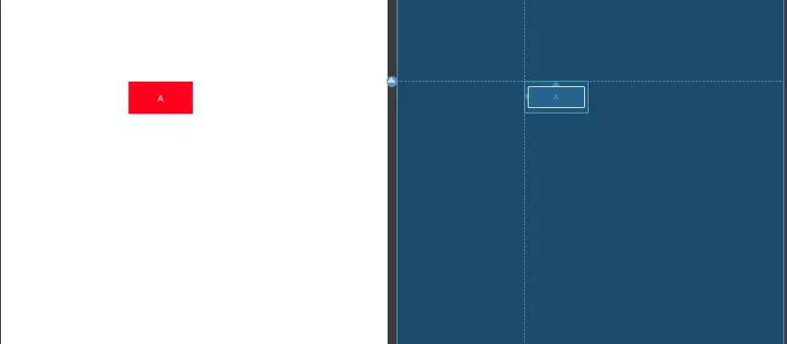
3. Placeholder
占位布局。他自己本身不会绘制任何内容,但他可以通过设置app:content="id",将id View的内容绘制到自己的位置上,而原id的 View就像gone了一样。
如下:
 1 <?xml version="1.0" encoding="utf-8"?>
 2 <android.support.constraint.ConstraintLayout
 3 ...>
 4     <Button
 5         android:id="@+id/a"
 6         android:layout_width="50dp"
 7         android:layout_height="50dp"
 8         android:layout_marginLeft="30dp"
 9        ...
10         app:layout_constraintLeft_toLeftOf="parent"
11         app:layout_constraintTop_toTopOf="parent" />
12
13     <Button
14         android:id="@+id/b"
15         android:layout_width="50dp"
16         android:layout_height="50dp"
17         android:layout_marginLeft="20dp"
18         ...
19         app:layout_constraintLeft_toRightOf="@+id/a"
20         app:layout_constraintTop_toTopOf="@+id/a" />
21
22     <android.support.constraint.Placeholder
23         android:id="@+id/place"
24         android:layout_width="200dp"
25         android:layout_height="200dp"
26         app:content="@+id/a"
27         app:layout_constraintBottom_toBottomOf="parent"
28         app:layout_constraintLeft_toLeftOf="parent"/>
29
30     <Button
31         ...
32         app:layout_constraintBottom_toBottomOf="@+id/place"
33         app:layout_constraintLeft_toRightOf="@+id/place" />
34 </android.support.constraint.ConstraintLayout>
效果如图:

可以看到,原本B是位于A的右边并且顶部对齐的,但因为A被Placeholder引用,使A 相当于Gone了。而Placeholder的位置则显示了A的内容,并且大小也和A相符,Placeholder的大小设置并没有生效。
大概总结可以认为,Placeholder引用A后的效果是,原本位置的A gone,原本位置的Placeholder变为Placeholder的约束属性+A的内容属性。另外,Placeholder也支持使用代码setContentId动态的修改设置内容。
关于Placeholder的应用场景,网上其他人也都列出了一些例子:比如可以作为位置模板,引入后只需要写内容view;使用代码动态改变内容,结合TransitionManager可以做一些有趣的过度动画等。
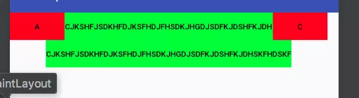
4. Barrier
屏障,一个虚拟View。他主要解决下面遇到的问题:
 上面的TextView和Button重叠了。这时该怎么解决这个问题呢?Button只能设置一个View作为锚点,设置了上面就顾不了下面了。。。
所以就诞生了Barrier,他可以设置N个View作为锚点,使用方式如下:
1 <android.support.constraint.Barrier
2               android:id="@+id/barrier"
3               android:layout_width="wrap_content"
4               android:layout_height="wrap_content"
5               app:barrierDirection="end"//end,left,right,top,bottom
6               app:constraint_referenced_ids="text1,text2" />
则Barrier始终位于text1,text2两个View最大宽度的右边,示意图如下:
这里基本的用法就讲完了。
下面再考虑一个情况,假如有如下的布局:
 1 <?xml version="1.0" encoding="utf-8"?>
 2 <android.support.constraint.ConstraintLayout
 3   ...>
 4
 5     <Button
 6         android:id="@+id/a"
 7         ...
 8         android:layout_marginTop="20dp"
 9          />
10
11     <Button
12         android:id="@+id/b"
13         ...
14         android:layout_marginTop="40dp"
15          />
16
17     <android.support.constraint.Barrier
18         android:id="@+id/barrier"
19         ...
20         app:barrierDirection="top"
21         app:constraint_referenced_ids="a,b" />
22
23     <Button
24         android:id="@+id/c"
25         ...
26         app:layout_constraintTop_toTopOf="@+id/barrier" />
27 </android.support.constraint.ConstraintLayout>
目前Button C和Button a、b的最上值对齐,没有问题。但如果a Gone了呢?效果如下:

barrierAllowsGoneWidgets,设为false后,就不在关注Gone的View了,效果如下: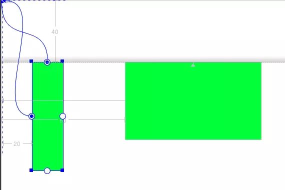
四、结束
本篇已基本上介绍完ConstraintLayout所有的属性了(除了代码写布局的ConstraintSet类)。相信ConstraintLayout之后会越来越强大。

 浙公网安备 33010602011771号