CSS 有一些新的属性,可以简化代码的书写,用简单的代码就可以实现复杂的变化。不用像 js 那样,需要写很多代码
这里主要介绍三个属性:transition ,transform,以及translate
1. transition: 允许属性在一定时间内进行过渡
规则: transition:property duration timing-function delay;
property--->属性值,例如width,height,background-color等,默认值为all
duration---->过渡时间,必须有单位,如5s,1000ms 等,默认值为0s
timing-function---->过渡效果,如 linear|ease|ease-in|ease-out|ease-in-out|cubic-bezier(n,n,n,n); 默认为ease;
delay--->过渡延迟时间,默认为0s
可以分开写:
 1 <!DOCTYPE html>
 2   <html lang="en">
 3   <head>
 4       <meta charset="UTF-8">
 5       <title>Document</title>
 6       <style lang="">
 7           .box{
 8              width:300px;
 9              height:300px;
10              background: #ccc;
11              margin:30px auto;
12              position:relative;
13          }
14          .child{
15              position:absolute;
16              width:100px;
17              height:100px;
18              top:50%;
19              left:50%;
20              background: #666;
21              margin-left:-50px;
22              margin-top: -50px;
23
24              transition-property: width;
25              transition-duration: 2s;
26              transition-timing-function: linear;
27              transition-delay: 200ms;
28
29             -moz-transition-property:width; /* Firefox 4 */
30             -webkit-transition-property:width; /* Safari and Chrome */
31             -o-transition-property:width; /* Opera */
32
33             -moz-transition-duration:2s; /* Firefox 4 */
34             -webkit-transition-duration:2s; /* Safari and Chrome */
35             -o-transition-duration:2s; /* Opera */
36
37             -moz-transition-timing-function:linear; /* Firefox 4 */
38             -webkit-transition-timing-function:linear; /* Safari and Chrome */
39             -o-transition-timing-function:linear; /* Opera */
40
41             -moz-transition-delay:200ms; /* Firefox 4 */
42             -webkit-transition-delay:200ms; /* Safari and Chrome */
43             -o-transition-delay:200ms; /* Opera */
44          }
45          .child:hover{
46             width:200px;
47             cursor:pointer;
48          }
49
50      </style>
51  </head>
52  <body>
53     <div class="box">
54       <div class="child"></div>
55     </div>
56  </body>
57  </html>
也可以合起来将4个属性写在一起
 1 <!DOCTYPE html>
 2   <html lang="en">
 3   <head>
 4       <meta charset="UTF-8">
 5       <title>Document</title>
 6       <style lang="">
 7           .box{
 8              width:300px;
 9              height:300px;
10              background: #ccc;
11              margin:30px auto;
12              position:relative;
13          }
14          .child{
15              position:absolute;
16              width:100px;
17              height:100px;
18              top:50%;
19              left:50%;
20              background: #666;
21              margin-left:-50px;
22              margin-top: -50px;
23
24              transition:width 2s linear 200ms;
25              -moz-transition:width 2s linear 200ms; /* Firefox 4 */
26              -webkit-transition:width 2s linear 200ms; /* Safari and Chrome */
27              -o-transition:width 2s linear 200ms; /* Opera */
28
29          }
30          .child:hover{
31             width:200px;
32             cursor:pointer;
33          }
34
35      </style>
36  </head>
37  <body>
38     <div class="box">
39       <div class="child"></div>
40     </div>
41  </body>
42  </html>
运行结果:

要改变多个属性时候,用逗号分开,如:
transition:witdth 2s linear 200ms,background 2s ease 200ms;
2.transform :就是变形,改变的意思。主要有几种效果:旋转rotate,扭曲skew,缩放scale,移动translate 以及矩阵变形matrix(还可以细分(2D)对应为X,Y)
规则:transform : none | transform-function
2.1 旋转rotate
 1 <!DOCTYPE html>
 2   <html lang="en">
 3   <head>
 4       <meta charset="UTF-8">
 5       <title>Document</title>
 6       <style lang="">
 7           .box{
 8              width:300px;
 9              height:300px;
10              background: #ccc;
11              margin:30px auto;
12              position:relative;
13          }
14          .child{
15              position:absolute;
16              width:100px;
17              height:100px;
18              top:50%;
19              left:50%;
20              background: #666;
21              margin-left:-50px;
22              margin-top: -50px;
23
24          }
25          .child:hover{
26             transform: rotate(20deg);
27             cursor:pointer;
28          }
29
30      </style>
31  </head>
32  <body>
33     <div class="box">
34       <div class="child"></div>
35     </div>
36  </body>
37  </html>
运行结果:
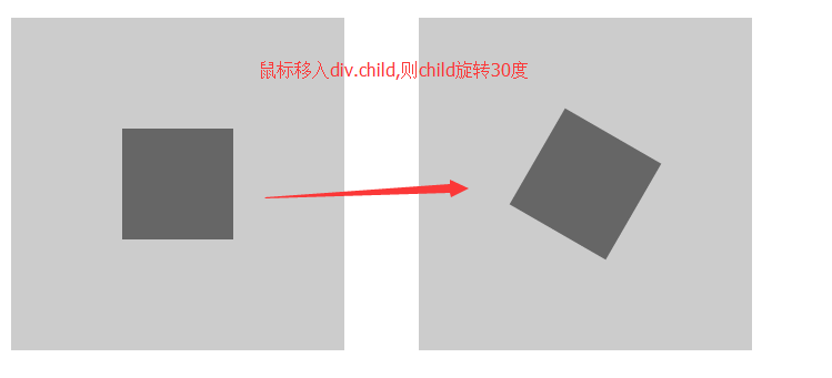
也可以单独旋转X轴或者Y轴,对应函数rotateX(),rotateY()
2.2 扭曲skew
 1 <!DOCTYPE html>
 2   <html lang="en">
 3   <head>
 4       <meta charset="UTF-8">
 5       <title>Document</title>
 6       <style lang="">
 7           .box{
 8              width:300px;
 9              height:300px;
10              background: #ccc;
11              margin:30px auto;
12              position:relative;
13          }
14          .child{
15              position:absolute;
16              width:100px;
17              height:100px;
18              top:50%;
19              left:50%;
20              background: #666;
21              margin-left:-50px;
22              margin-top: -50px;
23
24          }
25          .child:hover{
26             transform: skew(30deg);
27             cursor:pointer;
28          }
29
30      </style>
31  </head>
32  <body>
33     <div class="box">
34       <div class="child"></div>
35     </div>
36  </body>
37  </html>
运行结果:
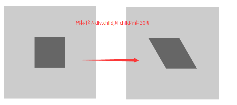
也可以单独扭曲X轴或者Y轴,对应函数skewX(),skewY()
2.3 缩放scale
 1 <!DOCTYPE html>
 2   <html lang="en">
 3   <head>
 4       <meta charset="UTF-8">
 5       <title>Document</title>
 6       <style lang="">
 7           .box{
 8              width:300px;
 9              height:300px;
10              background: #ccc;
11              margin:30px auto;
12              position:relative;
13          }
14          .child{
15              position:absolute;
16              width:100px;
17              height:100px;
18              top:50%;
19              left:50%;
20              background: #666;
21              margin-left:-50px;
22              margin-top: -50px;
23
24          }
25          .child:hover{
26             transform: scale(1.5);
27             cursor:pointer;
28          }
29
30      </style>
31  </head>
32  <body>
33     <div class="box">
34       <div class="child"></div>
35     </div>
36  </body>
37  </html>
运行效果:
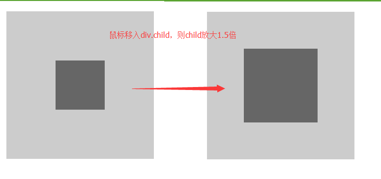
也可以单独缩放X轴或者Y轴,对应函数scaleX(),scaleY()
2.4 移动translate
 1 <!DOCTYPE html>
 2   <html lang="en">
 3   <head>
 4       <meta charset="UTF-8">
 5       <title>Document</title>
 6       <style lang="">
 7           .box{
 8              width:300px;
 9              height:300px;
10              background: #ccc;
11              margin:30px auto;
12              position:relative;
13          }
14          .child{
15              position:absolute;
16              width:100px;
17              height:100px;
18              top:50%;
19              left:50%;
20              background: #666;
21              margin-left:-50px;
22              margin-top: -50px;
23
24          }
25          .child:hover{
26             transform: translate(50%,50%);
27             cursor:pointer;
28          }
29
30      </style>
31  </head>
32  <body>
33     <div class="box">
34       <div class="child"></div>
35     </div>
36  </body>
37  </html>
translate的单位,可以是百分比(相对本身),也可以是px
运行结果:
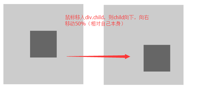
也可以单独移动X轴或者Y轴,对应函数translateX(),translateY()
2.5 矩阵变形matrix,这部分我自己现在也还没有搞懂,就不说了
不过以上四种一般情况下也够用了
2.6 当需要多个属性一起变化时,用空格隔起来就可以了
 1 <!DOCTYPE html>
 2   <html lang="en">
 3   <head>
 4       <meta charset="UTF-8">
 5       <title>Document</title>
 6       <style lang="">
 7           .box{
 8              width:300px;
 9              height:300px;
10              background: #ccc;
11              margin:30px auto;
12              position:relative;
13          }
14          .child{
15              position:absolute;
16              width:100px;
17              height:100px;
18              top:50%;
19              left:50%;
20              background: #666;
21              margin-left:-50px;
22              margin-top: -50px;
23
24          }
25          .child:hover{
26             transform: translate(50%,50%) scale(1.5) rotate(30deg);
27             cursor:pointer;
28          }
29
30      </style>
31  </head>
32  <body>
33     <div class="box">
34       <div class="child"></div>
35     </div>
36  </body>
37  </html>
运行结果:


 浙公网安备 33010602011771号