

css学习笔记
**响应式布局**
1.设置viewport/scale
2.使用流体宽度(也就是设置max/min-weidth 不使用固定宽度)
3.媒体查询(Media Queries)(不同的css样式对应不同的屏幕)
@media (max-width:900px){body{background:red}}
4.Rem单位转换
px、em、rem区别介绍:https://www.runoob.com/w3cnote/px-em-rem-different.html
vh和vw https://juejin.cn/post/6844903494386712589 100vh 熟不熟悉 面不面熟
弹性盒子布局 display:flex
5.移动优先
http://www.chengfeilong.com/mobile-layout
设置阴影 :box-shadows:5px 5px 20px red ;box-shadows:5px 5px 20px red ,-5px -5px 20px green
文字阴影 :text-shadows:
css变量 :两个- -- --light-color
<style>
body{
font-family: Arial, Helvetica, sans-serif;
color: white;
text-align: center;
padding-top: 100px;
--light-color:red;
background: var(--light-color);
}
</style>
一般用下面这种
<style>
:root{
--light-color:red;
}
body{
font-family: Arial, Helvetica, sans-serif;
color: white;
text-align: center;
padding-top: 100px;
background: var(--light-color);
}
</style>
动画
<style>
    body {
        --light-color: gray;
        background: var(--light-color);
    }
    #box {
        background: white;
        width: 200px;
        height: 200px;
        position: relative;
        /* animation: name duration timing-function delay iteration-count direction fill-mode; */
        animation: animation1 2s ease-in-out 2s infinite alternate-reverse forwards;
    }
    @keyframes animation1 {
/* from {
width: 200px;
top: 0;
}
to {
width: 600px;
background: red;
top: 300px;
} */
25%{
top: 0;
left: 300px;
background: red;
border-radius: 50% 0 0 0;
}
50%{
top: 300px;
left: 300px;
background: blue;
border-radius: 50% 50% 0 0;
}
75%{
top: 300px;
left: 0px;
background: green;
border-radius: 50% 50% 50% 0;
}
100%{
top: 0px;
left: 0px;
background: white;
border-radius: 50% 50% 50% 50%;
}
    }
</style>
<body>
    <div id="box"></div>
</body>

过渡 transition
旋转 缩放 倾斜或平移 transform
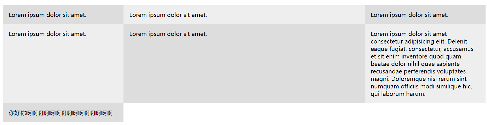
网格布局 css grid
 1 <style>
 2     .wrapper {
 3         display: grid;
 4         grid-template-columns: 1fr 2fr 1fr;
 5     }
 6     .wrapper>div {
 7         background: #eee;
 8         padding: 1rem;
 9     }
10     .wrapper>div:nth-child(odd) {
11         background: #ddd;
12     }
13 </style>
14 <body>
15     <div class="wrapper">
16         <div>Lorem ipsum dolor sit amet.</div>
17         <div>Lorem ipsum dolor sit amet.</div>
18         <div>Lorem ipsum dolor sit amet.</div>
19         <div>Lorem ipsum dolor sit amet.</div>
20         <div>Lorem ipsum dolor sit amet.</div>
21         <div>Lorem ipsum dolor sit amet consectetur adipisicing elit. Deleniti eaque fugiat, consectetur, accusamus et
22             sit enim inventore quod quam beatae dolor nihil quae sapiente recusandae perferendis voluptates magni.
23             Doloremque nisi rerum sint numquam officiis modi similique hic, qui laborum harum.</div>
24         <div>你好你啊啊啊啊啊啊啊啊啊啊啊啊啊啊啊</div>
25     </div>
26 </body>

全屏轮播

 浙公网安备 33010602011771号