
css镜像反光
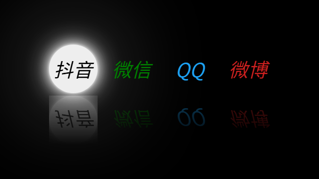
html:
<html>
<head>
<link rel="stylesheet" href="./index.css">
</head>
<body>
<div class="wapper">
<a href="#" style="--color: #eee">
<i class="fa-brand">抖音</i>
</a>
<a href="#" style="--color: green">
<i class="fa-brand">微信</i>
</a>
<a href="#" style="--color: #1da1f2">
<i class="fa-brand">QQ</i>
</a>
<a href="#" style="--color: #cd201f">
<i class="fa-brand">微博</i>
</a>
</div>
</body>
</html>
css:
css:
.wapper {
display: flex;
justify-content: center;
align-items: center;
width: 100%;
height: 100%;
background: #000;
}
a {
margin: 0 10px;
border-radius: 50%;
box-sizing: border-box;
width: 100px;
height: 100px;
display: flex;
align-items: center;
justify-content: center;
text-decoration: none;
transition: 0.5s;
background-color: #000;
color: var(--color);
font-size: 2.5em;
-webkit-box-reflect: below 5px linear-gradient(rgba(0,0,0,0), rgba(0,0,0,0.4));
}
a:hover {
background-color: var(--color);
color: #000;
box-shadow: 0 0 5px var(--color), 0 0 25px var(--color), 0 0 50px var(--color), 0 0 200px var(--color);
}

 浙公网安备 33010602011771号