通过border来实现各种三角符号
很长时间没有动笔了,最近学的东西很杂很乱!又有点丢了西瓜捡芝麻,走马观花,瞻前顾后的感觉!
因此,我决定一步步来,化繁为简,今天就从border入手。
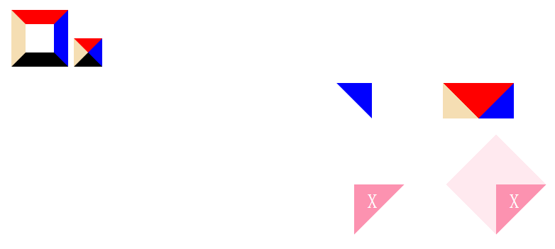
很多时候我们都会需要一个三角形或者三角小箭头。我们可以用border来做。当然还有其他很多中方法,比如直接图片,canvas等。
直接上代码吧!
<!doctype html>
<html lang="en">
<head>
	<meta charset="UTF-8">
	<title>Document</title>
	<style>
	*{
		padding:0;margin:0;
	}
	body{padding:100px;}


	.a0,.a1{
		display:inline-block;
		width:0;height:0;
		border-width:20px;
		border-style:solid;
		border-color:red blue black wheat;
	}
	.a0{width:40px;height:40px;}

	p{
		text-align:center;
		margin:20px;
	}
	.a2,.a2-2{
		display:inline-block;
		width:0;height:0;
		border-width:0 50px 50px 0;
		border-style:dashed solid solid dashed;
		border-color:red blue transparent wheat;
	}
	.a2-2{
		margin-left:100px;
		border-width:50px 50px 0px 50px;
		border-style:dashed solid solid dashed;
		border-color:red blue transparent wheat;
	}
	.a3,.a3-1{
		display:inline-block;
		width:0;height:0;
		border-width:50px;
		border-style:dashed dashed solid;
		border-color:transparent transparent rgb(252,146,176) !important;  /*rgba(252,146,176,.2)*/
		-webkit-transform:rotate(-45deg);
		transform:rotate(-45deg);

	}
	.a3-1{
		display:inline-block;
		width:0;height:0;
		margin-left:100px;
		border-width:50px;
		border-style:dashed dashed solid;
		border-color:rgba(252,146,176,.2) rgba(252,146,176,.2) rgb(252,146,176) !important;  /*rgba(252,146,176,.2)*/
		-webkit-transform:rotate(-45deg);
		transform:rotate(-45deg);
	}
	.a3 i,.a3-1 i{
		display:inline-block;
		-webkit-transform:rotate(45deg);
		transform:rotate(45deg);
		font-style:normal;
		margin-top:18px;
		margin-left:-5px;
		font-size:28px;
		color:white;
	}
	</style>
</head>
<body>
	<span class="a0"></span>
	<span class="a1"></span>
	<p><span class="a2"></span><span class="a2-2"></span></p>
	<p style="padding:20px;"><span class="a3"><i>X</i></span><span class="a3-1"><i>X</i></span></p>
</body>
</html>

 浙公网安备 33010602011771号