
爬虫疫情每日新增人数并进行数据分析与可视化
爬虫疫情每日新增人数并进行数据分析与可视化
一,选题的背景
虽然我国的疫情防控措施已经十分完善,但我们仍然要十分的警惕疫情,所以我选择了这个主题,对全国各地的疫情状况进行分析与可视化,获取各地总确诊、新增确诊、治愈人数,并进行合理分析,判断该地区的风险。
二,主题式网络爬虫设计方案
疫情每日新增人数并进行数据分析与可视化。
本主题网站爬虫主要是以字符串和数字为主,通过分析疫情每日新增人数,进行合理分析。判断什么地区为安全地区。

运用selenium、matplotlib、seaborn 包构建本网络爬虫主题网站。
运用selenium的模拟浏览器操作,获取页面标签以及对象,通过获取的对象去取得想要爬取的值。把爬取的值运用在matplotlib和seaborn包来构建统计图。
技术难点:在页面的标签获取中,获取的方式多样,选择最优的获取方式。
三,主题页面的结构特征分析
要爬取的数据都在页面的table标签中
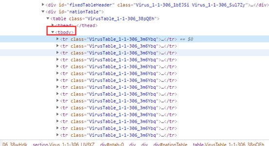
可通过for循环去获取所有标签中的数据
四,网络爬虫程序设计
1.导入的包

要爬取的网站

设置火狐浏览器驱动,并启动

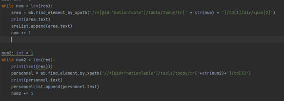
2.设立一个方法进行数据爬取,和数据清洗
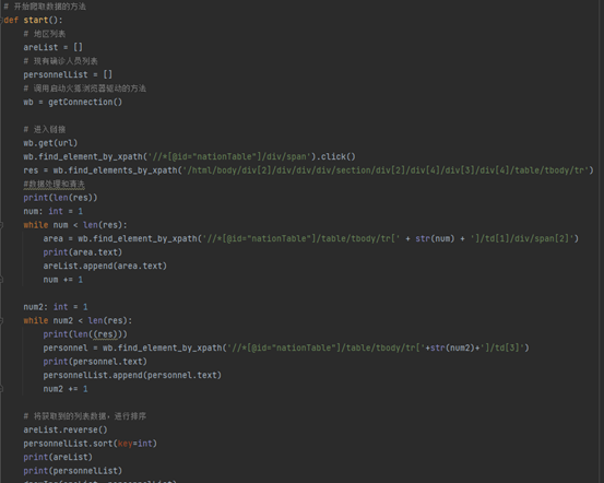
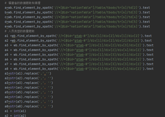
通过xpath获取webelement对象,通过获取对象的值,进行数据爬取

爬取数据后,对爬取到数据储存在列表中。
运行结果:

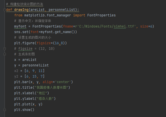
创建构造柱状图的方法,通过爬取到的数据生成柱状统计图。
运行结果:

数据爬取的代码
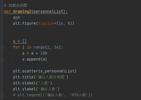
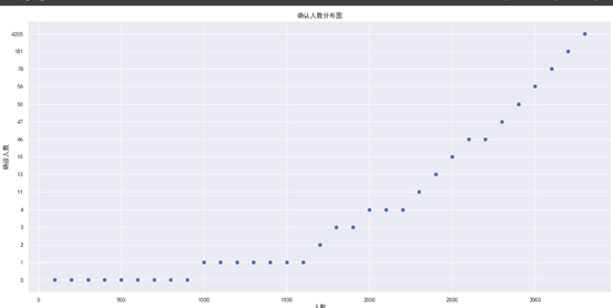
绘制点状图
运行效果:
绘制线形图

运行效果:

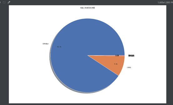
绘制饼图:

运行效果:
3.完成代码:
from selenium import webdriver
import numpy as np
import matplotlib.pyplot as plt
import seaborn as sns
import pandas as pd

# 设置要爬取的网站
url = 'https://voice.baidu.com/act/newpneumonia/newpneumonia/?from=osari_aladin_banner'


# 启动火狐浏览器驱动的方法
def getConnection():
    # 调用火狐浏览器的设置
    options = webdriver.FirefoxOptions()
    # 设置浏览器为无头浏览器
    options.add_argument("--headless")
    # 启动火狐浏览器驱动
    wb = webdriver.Firefox(options=options)
    # 将浏览器全屏显示
    wb.maximize_window()
    # 隐式等待10s
    wb.implicitly_wait(10)

    return wb


# 开始爬取数据的方法
def start():
    # 地区列表
    areList = []
    # 现有确诊人员列表
    personnelList = []
    # 福建省的疫情人员类型数量列表
    typeList=[]
    # 人员类型的数量列表
    typeSunList=[]
    # 调用启动火狐浏览器驱动的方法
    wb = getConnection()
    #
    # 进入链接
    wb.get(url)
    wb.find_element_by_xpath('//*[@id="nationTable"]/div/span').click()
    res = wb.find_elements_by_xpath('/html/body/div[2]/div/div/div/section/div[2]/div[4]/div[3]/div[4]/table/tbody/tr')

    # 数据获取和清洗
    print(len(res))
    num: int = 1
    while num < len(res):
        area = wb.find_element_by_xpath('//*[@id="nationTable"]/table/tbody/tr[' + str(num) + ']/td[1]/div/span[2]')
        print(area.text)
        areList.append(area.text)
        num += 1

    num2: int = 1
    while num2 < len(res):
        print(len((res)))
        personnel = wb.find_element_by_xpath('//*[@id="nationTable"]/table/tbody/tr[' + str(num2) + ']/td[3]')
        print(personnel.text)
        personnelList.append(personnel.text)
        num2 += 1
    # 福建省的数据爬取和清理
    a=wb.find_element_by_xpath('//*[@id="nationTable"]/table/tbody/tr[6]/td[2]').text
    b=wb.find_element_by_xpath('//*[@id="nationTable"]/table/tbody/tr[6]/td[3]').text
    c=wb.find_element_by_xpath('//*[@id="nationTable"]/table/tbody/tr[6]/td[4]').text
    d=wb.find_element_by_xpath('//*[@id="nationTable"]/table/tbody/tr[6]/td[5]').text
    e=wb.find_element_by_xpath('//*[@id="nationTable"]/table/tbody/tr[6]/td[6]').text
    # 人员类型的数量爬取
    a1 =wb.find_element_by_xpath('//*[@id="ptab-0"]/div[1]/div[2]/div[1]/div[2]').text
    a2 =wb.find_element_by_xpath('//*[@id="ptab-0"]/div[1]/div[2]/div[2]/div[2]').text
    a3 = wb.find_element_by_xpath('//*[@id="ptab-0"]/div[1]/div[2]/div[3]/div[2]').text
    a4 = wb.find_element_by_xpath('//*[@id="ptab-0"]/div[1]/div[2]/div[4]/div[2]').text
    a5 = wb.find_element_by_xpath('//*[@id="ptab-0"]/div[1]/div[3]/div[1]/div[2]').text
    a6 = wb.find_element_by_xpath('//*[@id="ptab-0"]/div[1]/div[3]/div[2]/div[2]').text
    a7 = wb.find_element_by_xpath('//*[@id="ptab-0"]/div[1]/div[3]/div[3]/div[2]').text
    a8 = wb.find_element_by_xpath('//*[@id="ptab-0"]/div[1]/div[3]/div[4]/div[2]').text
    a1=str(a1).replace(',','')
    a2=str(a2).replace(',', '')
    a3=str(a3).replace(',', '')
    a4=str(a4).replace(',', '')
    a5=str(a5).replace(',', '')
    a6=str(a6).replace(',', '')
    a7=str(a7).replace(',', '')
    a8=str(a8).replace(',', '')
    a1 = int(a1)
    a2 = int(a2)
    a3 = int(a3)
    a4 = int(a4)
    a5 = int(a5)
    a6 = int(a6)
    a7 = int(a7)
    a8 = int(a8)
    sum=a1+a2+a3+a4+a5+a6+a7+a8
    print(sum)
    a1 = a1 / sum
    a2 = a2 / sum
    a3 = a3 / sum
    a4 = a4 / sum
    a5 = a1 / sum
    a6 = a1 / sum
    a7 = a1 / sum
    a8 = a1 / sum
    typeSunList.append(a1)
    typeSunList.append(a2)
    typeSunList.append(a3)
    typeSunList.append(a4)
    typeSunList.append(a5)
    typeSunList.append(a6)
    typeSunList.append(a7)
    typeSunList.append(a8)


    if a=='待公布':
        a=0
    # 将获取到的列表数据,进行排序
    areList.reverse()
    personnelList.sort(key=int)
    print(areList)
    print(personnelList)
    drawIng(areList, personnelList)
    drawIng2(personnelList)

    drawIng3(a,b,c,d,e)
    drawIng4(typeSunList)

    plt.show()
    wb.quit()


# 构建柱状统计图的方法
def drawIng(areList, personnelList):
    from matplotlib.font_manager import FontProperties
    # 显示中文,并指定字体
    myfont = FontProperties(fname=r'C:/Windows/Fonts/simhei.ttf', size=6)
    sns.set(font=myfont.get_name())
    # 设置生成的图片的大小
    plt.figure(figsize=(16, 8))
    # figsize = (12, 10)
    # 生成条形图
    x = areList
    y = personnelList
    x2 = [6, 9, 11]
    y2 = [6, 15, 7]
    plt.bar(x, y, align='center')
    plt.title("我国疫情人数增长图")
    plt.xlabel("地区")
    plt.ylabel("感染人数")
    plt.plot(x, y)

# 绘制点状图
def drawIng2(personnelList):
    a=0
    plt.figure(figsize=(16, 8))


    y = []
    for i in range(1, 34):
        a = a + 100
        y.append(a)

    plt.scatter(y,personnelList)
    plt.title('确认人数分布图')
    plt.xlabel('人数')
    plt.ylabel('确诊人数')
    # plt.legend(('确诊人数', '平均人数'))

# 绘制线型图
def drawIng3(a,b,c,d,e):
    plt.figure(figsize=(16, 10))

    x = [0,200,400,600,800,1000]
    a=int(a)
    a=[a,a,a,a,a,a]
    b=int(b)
    b=[b,b,b,b,b,b]
    c=int(c)
    c=[c,c,c,c,c,c]
    d=int(d)
    d=[d,d,d,d,d,d]
    e=int(e)
    e=[e,e,e,e,e,e]

    plt.plot(x, a, label='新增人数')
    plt.plot(x, b, label='现有人数')
    plt.plot(x, c, label='累计人数')
    plt.plot(x, d, label='治愈人数')
    plt.plot(x, e, label='死亡人数')
    plt.title('福建省疫情感染类型对比图')
    plt.xlabel('人数')
    plt.ylabel('感染人数')
    plt.legend()

# 绘制饼图的方法
def drawIng4(typeSunList):

    plt.figure(figsize=(16, 10))
    # x=[]
    # y=[]
    # a=0
    # b=0
    # for i in range(1, 34):
    #     a = a + 200
    #     x.append(a)
    #
    # z=personnelList
    # plt.scatter(z,x,s=80,c='r',marker='o',alpha=0.5)
    label1=['现有确诊','无确诊','现有疑似','现有重症','累积确诊','境外输入','累积治愈','累计死亡']
    label2=typeSunList
    plt.pie(label2,labels=label1,normalize=True,autopct='%1.1f%%',pctdistance=0.8, shadow=True)
    plt.title('感染人数类型比例图')


    #


if __name__ == '__main__':
    start()
五.总结
经过对疫情数据的分析与可视化,获取到了全国各地区的疫情状况、感染人数。已达到预期的目标。学会了如何对网站内容进行爬取。

 浙公网安备 33010602011771号