数据分析与机器学习六:seaborn上
seaborn是在matplotlib上的进一步封装,提供了丰富的模板。
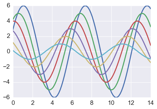
def sinplot(flip=1):
    x = np.linspace(0, 14, 100) #在0-14之间生成100个数
    for i in range(1, 7):
        plt.plot(x, np.sin(x + i * .5) * (7 - i) * flip) # 画7条线
sinplot()
一、sns风格和布局
seaborn提供了5种主题风格:
- darkgrid,深色背景,有网格线
- whitegrid,白色背景,有网格线
- dark,深色背景,没有网格线
- white,白色背景,没有网格线
- ticks,白色背景,有刻度条
定义主题风格:sns.set_stype(风格名称)
去掉某些轴:sns.despine(left=True,offset=距离),默认去掉上和右边的轴;offset,图形与轴线的距离; left=True,去掉左边的轴
with sns.axes_style(风格名称):指定with域内的风格;域外的风格与它不一样,此风格只作用于with域内
设置布置:sns.set_context(布置名称,font_scale=xy轴标签字体大小,rc={"lines.linwidth": 线条大小}),如paper, talk, poster,notebook
清除设置:sns.set()
二、sns调色板
- color_palette()能传入任何matplotlib所支持的颜色,不传参数则默认颜色
- set_palette()设置所有图的颜色
默认颜色:
current_palette = sns.color_palette()  # 默认有6种颜色,循环使用
sns.palplot(current_palette)  # 取出颜色
圆形画板之颜色空间hls:
x=sns.color_palette("htl", 颜色空间的颜色数量 )
sns.paplot(x)
大多数情况下,使用颜色空间hls即可。
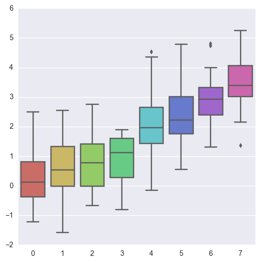
sns.boxplot(data, palette):data数据列表,palette颜色参数
data = np.random.normal(size=(20, 8)) + np.arange(8) / 2
sns.boxplot(data=data,palette=sns.color_palette("hls", 8))
设置hls颜色空间,除了使用sns.color_palette(),也可以使用sns.hls_palette()
sns.hls_palette(颜色空间的数量,l=亮度,s=饱和度):lightness,saturation
paired颜色空间:当需要用相近颜色来作区分时,使用paired颜色方式
使用xkcd颜色来命令颜色:sns.xkcd_rgb[xkcd颜色名称]:调rgb颜色
连续色板:
sns.palplot(sns.color_palette("Blues"))  # 默认由浅色到深色
sns.palplot(sns.color_palette("BuGn_r"))  #颜色名称加上_r,由深到浅
线性调色板:
sns.palplot(sns.color_palette("cubehelix"))
sns.palplot(sns.cubehelix_palette(8, start=.5, rot=-.75))
light_palette() 和dark_palette()调用定制连续调色板
sns.palplot(sns.light_palette("green"))
sns.palplot(sns.light_palette("navy", reverse=True))
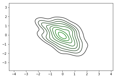
x, y = np.random.multivariate_normal([0, 0], [[1, -.5], [-.5, 1]], size=300).T
pal = sns.dark_palette("green", as_cmap=True)
sns.kdeplot(x, y, cmap=pal)
sns.palplot(sns.light_palette((210, 90, 60), input="husl"))
三、变量分析绘图
柱图:sns.distplot(data,kde=False)
x = np.random.normal(size=100)
sns.distplot(x,kde=False)
sns.distplot(x, bins=20, kde=False) #指定bins
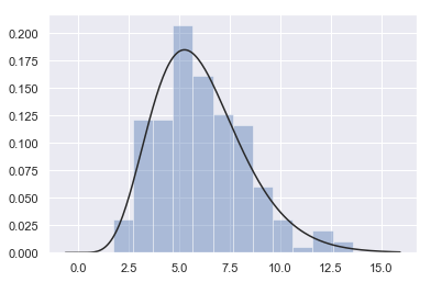
x = np.random.gamma(6, size=200)
sns.distplot(x, kde=False, fit=stats.gamma)  # fit=stats.gamma,数据分布
数据分布:
# 根据均值和协方差生成数据
mean, cov = [0, 1], [(1, .5), (.5, 1)]
data = np.random.multivariate_normal(mean, cov, 200)
df = pd.DataFrame(data, columns=["x", "y"])
df
    x    y
0    0.851944    0.356852
1    -0.429231    -0.190816
2    0.294405    0.286579
............
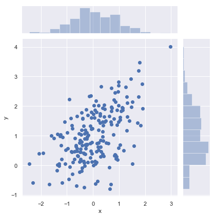
观测两个变量之间的分布关系最好用散点图:jointplot
sns.jointplot(x, y, data):绘制散点图,并画出x和y的柱图
sns.jointplot(x="x", y="y", data=df);
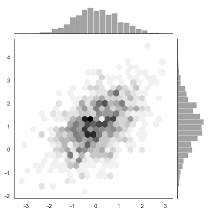
数据量大时, 查看哪个地方的点多:hex散点图,通过颜色的深浅来区分
x, y = np.random.multivariate_normal(mean, cov, 1000).T
with sns.axes_style("white"):
    sns.jointplot(x=x, y=y, kind="hex", color="k")
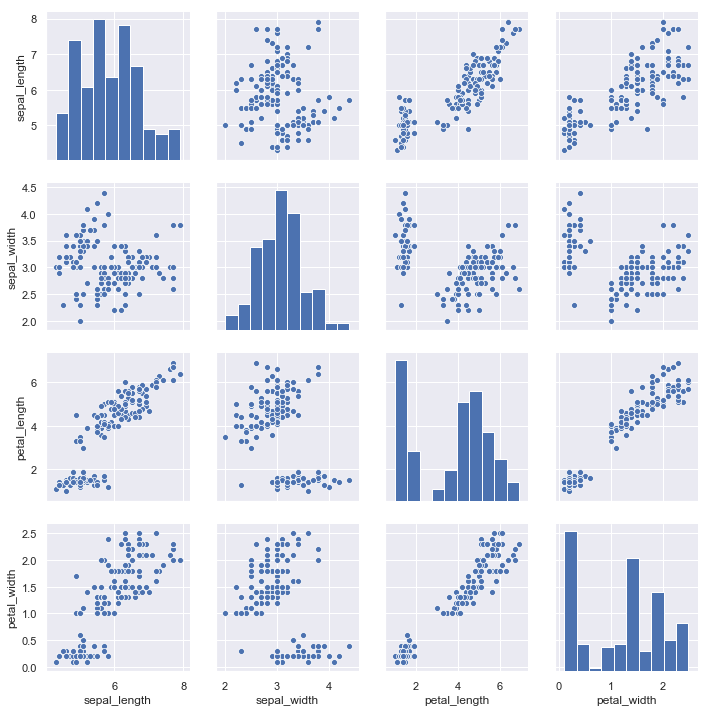
iris = sns.load_dataset("iris")  # iris是内置的数据集,实际中用pandas的数据集
sns.pairplot(iris)
对角线上是单变量图,其它的散点图是..
四、回归分析绘图
%matplotlib inline
import numpy as np
import pandas as pd
import matplotlib as mpl
import matplotlib.pyplot as plt

import seaborn as sns
sns.set(color_codes=True)

np.random.seed(sum(map(ord, "regression")))

tips = sns.load_dataset("tips")

tips.head()
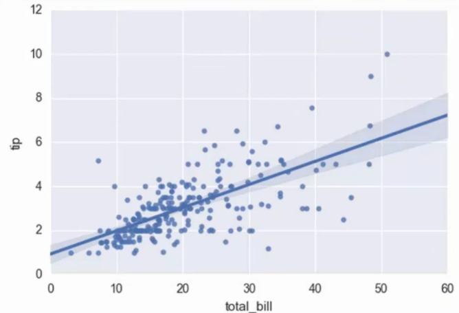
regplot()和lmplot()都可以绘制回归关系,推荐regplot()
餐费和小费之间的关系:
sns.regplot(x="total_bill", y="tip", data=tips)
posted on 2018-10-02 13:17 myworldworld 阅读(313) 评论(0) 收藏 举报


 浙公网安备 33010602011771号