十八:CSS 图片廊、图像透明/不透明、图像拼合技术
一、CSS 图片廊
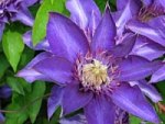
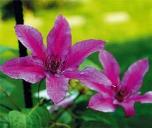
<html>
<head>
<style>
div.img
{
  margin: 2px;
  border: 1px solid #0000ff;
  height: auto;
  width: auto;
  float: left;
  text-align: center;
}
div.img img
{
  display: inline;
  margin: 3px;
  border: 1px solid #ffffff;
}
div.img a:hover img {border: 1px solid #0000ff;}
div.desc
{
  text-align: center;
  font-weight: normal;
  width: 120px;
  margin: 2px;
}
</style>
</head>
<body>
<div class="img">
<a target="_blank" href="/demo/klematis_big.htm"><img src="/static/images/klematis_small.jpg" alt="Klematis" width="110" height="90"></a>
<div class="desc">Add a description of the image here</div>
</div>
<div class="img">
<a target="_blank" href="/demo/klematis2_big.htm"><img src="/static/images/klematis2_small.jpg" alt="Klematis" width="110" height="90"></a>
<div class="desc">Add a description of the image here</div>
</div>
<div class="img">
<a target="_blank" href="/demo/klematis3_big.htm"><img src="/static/images/klematis3_small.jpg" alt="Klematis" width="110" height="90"></a>
<div class="desc">Add a description of the image here</div>
</div>
<div class="img">
<a target="_blank" href="/demo/klematis4_big.htm"><img src="/static/images/klematis4_small.jpg" alt="Klematis" width="110" height="90"></a>
<div class="desc">Add a description of the image here</div>
</div>
</body>
</html>
二、图像透明/不透明
使用CSS很容易创建透明的图像。
注意:CSS Opacity属性是W3C的CSS3建议的一部分。
实例1 - 创建一个透明图像
CSS3中属性的透明度是 opacity.
首先,我们将向您展示如何用CSS创建一个透明图像。
正常的图像
相同的图像带有透明度:
看看下面的CSS:
{
opacity:0.4;
filter:alpha(opacity=40); /* For IE8 and earlier */
}
IE9,Firefox,Chrome,Opera,和Safari浏览器使用透明度属性可以将图像变的不透明。 Opacity属性值从0.0 - 1.0。值越小,使得元素更加透明。
IE8和早期版本使用滤镜:alpha(opacity= x)。 x可以采取的值是从0 - 100。较低的值,使得元素更加透明。
实例2 - 图像的透明度 - 悬停效果
将鼠标移到图像上:
CSS样式:
{
opacity:0.4;
filter:alpha(opacity=40); /* For IE8 and earlier */
}
img:hover
{
opacity:1.0;
filter:alpha(opacity=100); /* For IE8 and earlier */
}
第一个CSS块是和例1中的代码类似。此外,我们还增加了当用户将鼠标悬停在其中一个图像上时发生什么。在这种情况下,当用户将鼠标悬停在图像上时,我们希望图片是清晰的。
此CSS是:opacity=1.
IE8和更早版本使用: filter:alpha(opacity=100).
当鼠标指针远离图像时,图像将重新具有透明度。
实例3 - 透明的盒子中的文字
这些文本在透明框里。这些文本在透明框里。这些文本在透明框里。这些文本在透明框里。这些文本在透明框里。这些文本在透明框里。这些文本在透明框里。这些文本在透明框里。这些文本在透明框里。这些文本在透明框里。这些文本在透明框里。这些文本在透明框里。这些文本在透明框里。
源代码如下:
<head>
<style>
div.background
{
width:500px;
height:250px;
background:url(klematis.jpg) repeat;
border:2px solid black;
}
div.transbox
{
width:400px;
height:180px;
margin:30px 50px;
border:1px solid black;
opacity:0.6;
filter:alpha(opacity=60); /* For IE8 and earlier */
}
div.transbox p
{
margin:30px 40px;
font-weight:bold;
color:#000000;
}
</style>
</head>
<body>
<div class="background">
<div class="transbox">
<p>This is some text that is placed in the transparent box.
This is some text that is placed in the transparent box.
This is some text that is placed in the transparent box.
This is some text that is placed in the transparent box.
This is some text that is placed in the transparent box.
</p>
</div>
</div>
</body>
</html>
首先,我们创建一个固定的高度和宽度的div元素,带有一个背景图片和边框。然后我们在第一个div内部创建一个较小的div元素。 这个div也有一个固定的宽度,背景颜色,边框 - 而且它是透明的。透明的div里面,我们在P元素内部添加一些文本。
三、CSS 图像拼合技术
图像拼合
图像拼合就是单个图像的集合。
有许多图像的网页可能需要很长的时间来加载和生成多个服务器的请求。
使用图像拼合会降低服务器的请求数量,并节省带宽。
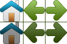
图像拼合 - 简单实例
与其使用三个独立的图像,不如我们使用这种单个图像("img_navsprites.gif"):
有了CSS,我们可以只显示我们需要的图像的一部分。
在下面的例子CSS指定显示 "img_navsprites.gif" 的图像的一部分:
<html>
<head>
<style>
img.home {
    width: 46px;
    height: 44px;
    background: url(/static/images/img_navsprites.gif) 0 0;
}

img.next {
    width: 43px;
    height: 44px;
    background: url(/static/images/img_navsprites.gif) -91px 0;
}
</style>
</head>
<body>
<img class="home" src="/static/images/img_trans.gif"><br><br>
<img class="next" src="/static/images/img_trans.gif">
</body>
实例解析:
- <img class="home" src="img_trans.gif" /> -因为不能为空,src属性只定义了一个小的透明图像。显示的图像将是我们在CSS中指定的背景图像
- 宽度:46px;高度:44px; - 定义我们使用的那部分图像
- background:url(img_navsprites.gif) 0 0; - 定义背景图像和它的位置(左0px,顶部0px)
这是使用图像拼合最简单的方法,现在我们使用链接和悬停效果。
图像拼合 - 创建一个导航列表
我们想使用拼合图像 ("img_navsprites.gif"),以创建一个导航列表。
我们将使用一个HTML列表,因为它可以链接,同时还支持背景图像:
<html>
<head>
<style>
#navlist{position:relative;}
#navlist li{margin:0;padding:0;list-style:none;position:absolute;top:0;}
#navlist li, #navlist a{height:44px;display:block;}

#home{left:0px;width:46px;}
#home{background:url('/static/images/img_navsprites.gif') 0 0;}

#prev{left:63px;width:43px;}
#prev{background:url('/static/images/img_navsprites.gif') -47px 0;}

#next{left:129px;width:43px;}
#next{background:url('/static/images/img_navsprites.gif') -91px 0;}
</style>
</head>
<body>
<ul id="navlist">
<li id="home"><a href="/"></a></li>
<li id="prev"><a href="/css/"></a></li>
<li id="next"><a href="/css/"></a></li>
</ul>
</body>
</html>
实例
<html>
<head>
<style>
#navlist{position:relative;}
#navlist li{margin:0;padding:0;list-style:none;position:absolute;top:0;}
#navlist li, #navlist a{height:44px;display:block;}

#home{left:0px;width:46px;}
#home{background:url('/static/images/img_navsprites.gif') 0 0;}

#prev{left:63px;width:43px;}
#prev{background:url('/static/images/img_navsprites.gif') -47px 0;}

#next{left:129px;width:43px;}
#next{background:url('/static/images/img_navsprites.gif') -91px 0;}
</style>
</head>
<body>
<ul id="navlist">
<li id="home"><a href="/"></a></li>
<li id="prev"><a href="/css/"></a></li>
<li id="next"><a href="/css/"></a></li>
</ul>
</body>
</html>
实例解析:
- #navlist{position:relative;} - 位置设置相对定位,让里面的绝对定位
- #navlist li{margin:0;padding:0;list-style:none;position:absolute;top:0;} - margin和padding设置为0,列表样式被删除,所有列表项是绝对定位
- #navlist li, #navlist a{height:44px;display:block;} - 所有图像的高度是44px
现在开始每个具体部分的定位和样式:
- #home{left:0px;width:46px;} - 定位到最左边的方式,以及图像的宽度是46px
- #home{background:url(img_navsprites.gif) 0 0;} - 定义背景图像和它的位置(左0px,顶部0px)
- #prev{left:63px;width:43px;} - 右侧定位63px(#home宽46px+项目之间的一些多余的空间),宽度为43px。
- #prev{background:url('img_navsprites.gif') -47px 0;} - 定义背景图像右侧47px(#home宽46px+分隔线的1px)
- #next{left:129px;width:43px;}- 右边定位129px(#prev 63px + #prev宽是43px + 剩余的空间), 宽度是43px.
- #next{background:url('img_navsprites.gif') no-repeat -91px 0;} - 定义背景图像右边91px(#home 46px+1px的分割线+#prev宽43px+1px的分隔线)
图像拼合s - 悬停效果
现在,我们希望我们的导航列表中添加一个悬停效果。
 |
:hover 选择器用于鼠标悬停在元素上的显示的效果 提示: :hover 选择器可以运用于是有元素。 |
|---|
我们的新图像 ("img_navsprites_hover.gif") 包含三个导航图像和三幅图像:
因为这是一个单一的图像,而不是6个单独的图像文件,当用户停留在图像上不会有延迟加载。
我们添加悬停效果只添加三行代码:
<html>
<head>
<style>
#navlist{position:relative;}
#navlist li{margin:0;padding:0;list-style:none;position:absolute;top:0;}
#navlist li, #navlist a{height:44px;display:block;}

#home{left:0px;width:46px;}
#home{background:url('img_navsprites_hover.gif') 0 0;}
#home a:hover{background: url('img_navsprites_hover.gif') 0 -45px;}

#prev{left:63px;width:43px;}
#prev{background:url('img_navsprites_hover.gif') -47px 0;}
#prev a:hover{background: url('img_navsprites_hover.gif') -47px -45px;}

#next{left:129px;width:43px;}
#next{background:url('img_navsprites_hover.gif') -91px 0;}
#next a:hover{background: url('img_navsprites_hover.gif') -91px -45px;}
</style>
</head>
<body>
<ul id="navlist">
<li id="home"><a href="/demo/default.asp"></a></li>
<li id="prev"><a href="/demo/css_intro.asp"></a></li>
<li id="next"><a href="/demo/css_syntax.asp"></a></li>
</ul>
</body>
</html>
实例解析:
- 由于该列表项包含一个链接,我们可以使用:hover伪类
- #home a:hover{background: transparent url(img_navsprites_hover.gif) 0 -45px;} - 对于所有三个悬停图像,我们指定相同的背景位置,只是每个再向下45px
posted on 2018-07-10 22:47 myworldworld 阅读(208) 评论(0) 收藏 举报


 浙公网安备 33010602011771号