css笔记:响应式、媒体查询
1 响应式
什么是响应式布局
响应式布局(respond layout)是Ethan Marcotte在2010年5月份提出的一个概念,简而言之,就是一个网站能够兼容多个终端(手机、平板、pc电脑、手表) ——而不是为每个终端做一个特定的版本。这个概念是为解决移动互联网浏览而诞生的。
为什么要有响应式布局?
- 在移动互联日益成熟的时候,在PC端开发的网页已经无法满足移动设备的要求。
- 通常的做法是针对移动端单独做一套特定的版本。
- 如果终端越来越多,那么需要开发的版本就会越来越多(大屏设备的普及)
- 响应式布局 :一个网站能够兼容多个终端(节约开发成本)
优点:
面对不同分辨率设备灵活性强
能够快捷解决多设备显示适应问题
缺点:
兼容各种设备工作量大,效率低下
代码累赘,会出现隐藏无用的元素,加载时间加长
其实这是一种折中性质的设计解决方案,多方面因素影响而达不到最佳效果
一定程度上改变了网站原有的布局结构,会出现用户混淆的情况
响应式开发现状:
- 如果已经存在PC的网站了,那么一般不会使用响应式开发,而是针对移动端再开发一套系统(比如京东、淘宝)
- 在新建站点 上采用响应式开发的越来越多。
- 在国内,响应式开发还不是特别的流行。但响应式开发是大势所趋,会越来越流行。
响应式开发与移动web开发的比较
| 开发方式 | 移动web开发+pc开发 | 响应式开发 |
|---|---|---|
| 引用场景 | 一般已经有了PC端网站,只需要端独开发移动端网站即可 | 针对一些新建网站,并且要求适配移动端 |
| 开发 | 针对性强,开发效率高 | 兼容各种终端,效率低 |
| 适配 | 只能适配移动端或者PC端,pad上体验比较差 | 可以适配各种终端 |
| 效率 | 代码简洁,加载快 | 代码相对复杂,加载慢 |
2 媒体查询
媒体查询(Media Query)是CSS提出来的一个新的属性,通过媒体查询可以查询到screen的宽度,从而指定某个宽度区间的网页布局。
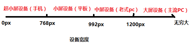
设备分类
| 分类 | 宽度范围 |
|---|---|
| 大屏设备 | >1200px |
| 中屏设备 | 992px~1200px |
| 小屏设备 | 768px~992px |
| 超小屏设备 | < 768px |
媒体查询的使用
需求:
<!--
需求:
    大屏设备(>1200px)   版心:1170px   背景色:红色
    中屏设备(992-1200)  版心:970px    背景色:蓝色
    小屏设备(768-992)   版心:750px    背景色:黄色
    超小屏设备(<768px)  版心:100%     背景色:绿色
-->
响应式开发的原理:使用媒体查询实现不同终端的布局和样式的切换。
媒体查询语法:
/*查询屏幕*/
@media screen and 条件 {
}

/*条件的写法*/
/*min-width:只要屏幕宽度超过这个值的设备样式就能生效*/
/*max-width:只要屏幕宽度小于这个值的设备样式就能生效*/
@media screen and (min-width: 1200px) {
  .container {
    width: 1170px;
    background-color: red;
  }
}

@media screen and (min-width: 992px) and (max-width: 1200px) {
  .container {
    width: 970px;
    background-color: blue;
  }
}

@media screen and (min-width: 768px) and (max-width: 992px) {
  .container {
    width: 750px;
    background-color: yellow;
  }
}

@media screen and (max-width: 768px) {
  .container {
    width: 100%;
    background-color: green;
  }
}
弊端:现在只有一个div,要做一套响应式布局,就需要如此多的代码,非常的麻烦,因此我们会更多的借助一些响应式的框架,比如bootstrap。
3 原生响应式的实现
第一步:通过媒体查询实现响应式的版心
第二步:再调整版心内的细节样式
【原生响应式实现demo】
html
<!DOCTYPE html>
<html lang="en">
<head>
    <meta charset="UTF-8">
    <meta name="viewport" content="width=device-width, initial-scale=1.0">
    <meta http-equiv="X-UA-Compatible" content="ie=edge">
    <title>原生响应式</title>
    <link rel="stylesheet" href="./index.css">
</head>
<body>
    <!-- 头部 导航 -->
    <div class="container">
        <div class="header">
            <ul class="left pull-left hide-xs">
                <li>导航</li>
                <li>导航</li>
                <li>导航</li>
                <li>导航</li>
                <li>导航</li>
                <li>导航</li>
            </ul>
            <ul class="right pull-right hide-xs">
                <li class="hide-sm">导航</li>
                <li class="hide-sm">导航</li>
                <li>导航</li>
            </ul>
            <span class="btn">三</span>
        </div>
    </div>

    <!-- 原生响应式 实现栅格布局-媒体查询 + 浮动+ 百分百  -->
    <div class="container product">
        <div class="column">
            <div class="in"></div>
        </div>
        <div class="column">
            <div class="in"></div>
        </div>
        <div class="column">
            <div class="in"></div>
        </div>
        <div class="column">
            <div class="in"></div>
        </div>
        <div class="column">
            <div class="in"></div>
        </div>
        <div class="column">
            <div class="in"></div>
        </div>
    </div>
    <script>
    	document.querySelector('.btn').onclick= function () {
            document.querySelector('.left').classList.toggle('hide-xs');
        };
    </script>
</body>
</html>
less
* {
    margin: 0;
    padding: 0;
    list-style: none;
    box-sizing: border-box;
}

// 版心
.container {
    width: 1200px;
    margin:0 auto;
}
.pull-left {
    float: left;
}

.pull-right {
    float: right;
}

.clearfix{
    overflow: hidden;
}
.header {
    position: relative;
    height: 70px;
    padding: 10px;
    background-color: #ccc;
    ul {
        li {
            float: left;
            height: 50px;
            width: 80px;
            background-color:green;
            color: #fff;
            text-align: center;
            line-height: 50px;
            margin: 0 10px;
        }
    }
    .btn {
        position: absolute;
        right: 10px;
        top: 10px;
        border-radius: 5px;
        width: 80px;
        height: 50px;
        background-color: yellow;
        color: red;
        text-align: center;
        line-height: 50px;
        font-size: 40px;
        display: none;
    }
}

.product {
    .column{
        float: left;
        width: 33.33%;
        height: 150px;
        // border: 1px solid #000;
        padding: 10px;
        .in {
            background-color: #f99;
            height:100%;
        }

    }
}

// 关键是 有一套响应式的版心
@media screen and (min-width: 1200px) {
    .container {
        width: 1170px;
    }
}
@media screen and (min-width: 992px) and (max-width: 1200px) {
    .container {
        width: 970px;
    }
}
@media screen and (min-width: 768px) and (max-width: 992px) {
    .container {
        width: 750px;
    }
    .hide-sm {
        display: none;
    }
    .product {
        .column{
            width: 50%;
        }
    }
}
@media screen and (max-width: 768px) {
    .container {
        width: 100%;
    }
    .hide-xs {
        display: none;
    }
    // 设置导航样式
    .header {
        ul {
            margin-top: 60px;
            width:100%;
            li {
                width: 100%;
                margin: 0;
                margin-bottom: 5px;
            }
        }
        .btn {
            display: block;
        }

    }

    .product {
        .column{
            width: 100%;
        }
    }
}

 浙公网安备 33010602011771号