

解析Qt自带的Style示例
在之前的QStyle类参考一文中我们介绍到实现自定义样式有两种方法:静态方法和动态方法。我们先介绍静态方法:也就是继承已经存在的类,不是QStyle,通常是QCommonStyle或者是QWindowsStyle等等。然后实现其中的虚函数,重写自己需要修改的部分代码。至于选择哪个基类来继承完全取决用户,通常选择和自己所期望的最相近的类来继承。这里贴一个图,主要是继承层次的图:

其中的QGtkStyle就是通常GNOME环境下的,而QPlastiqueStyle则是和KDE环境最为接近的。注意QMacStyle只有在Mac OS上才有效果,因为它的实现依赖相应的平台。
接下来解析一下Qt自带的Style示例,示例程序是Qt十分好的学习资源,不可不看哦!
首先上效果图:

图一:自定义样式效果图

图二:支持的样式
大家可以看到该程序在我的系统(Win7)上支持很多样式,这里就不一一截图了,大家可以自己编译示例程序体验一下。
接下来是源代码,首先看一下工程的目录结构:

大家可以看到,实现该自定义样式的类为:NorwegianWoodStyle,而类WidgetGallery主要是用代码实现整个界面布局,并没有什么好介绍的。主要介绍一下NorwegianWoodStyle类。
1、首先是头文件:
class NorwegianWoodStyle : public QMotifStyle
{
    Q_OBJECT

public:
    NorwegianWoodStyle() {}

    void polish(QPalette &palette);
    void polish(QWidget *widget);
    void unpolish(QWidget *widget);
    int pixelMetric(PixelMetric metric, const QStyleOption *option,
                    const QWidget *widget) const;
    int styleHint(StyleHint hint, const QStyleOption *option,
                  const QWidget *widget, QStyleHintReturn *returnData) const;
    void drawPrimitive(PrimitiveElement element, const QStyleOption *option,
                       QPainter *painter, const QWidget *widget) const;
    void drawControl(ControlElement control, const QStyleOption *option,
                     QPainter *painter, const QWidget *widget) const;

private:
    static void setTexture(QPalette &palette, QPalette::ColorRole role,
                           const QPixmap &pixmap);
    static QPainterPath roundRectPath(const QRect &rect);
}; 主要就是显示了QMotifStyle类中的虚函数,而这些函数最初是QStyle类中的虚函数。下面介绍这几个函数的功能:(1)void polish(QPalette &palette)
这是一个重载函数,功能就是改变调色板为样式指定的颜色调色板。
该处具体实现为:
//! [0]
void NorwegianWoodStyle::polish(QPalette &palette)
{
    QColor brown(212, 140, 95);
    QColor beige(236, 182, 120);
    QColor slightlyOpaqueBlack(0, 0, 0, 63);

    QPixmap backgroundImage(":/images/woodbackground.png");
    QPixmap buttonImage(":/images/woodbutton.png");
    QPixmap midImage = buttonImage;

    QPainter painter;
    painter.begin(&midImage);
    painter.setPen(Qt::NoPen);
    painter.fillRect(midImage.rect(), slightlyOpaqueBlack);
    painter.end();
//! [0]

//! [1]
    palette = QPalette(brown);

    palette.setBrush(QPalette::BrightText, Qt::white);
    palette.setBrush(QPalette::Base, beige);
    palette.setBrush(QPalette::Highlight, Qt::darkGreen);
    setTexture(palette, QPalette::Button, buttonImage);
    setTexture(palette, QPalette::Mid, midImage);
    setTexture(palette, QPalette::Window, backgroundImage);

    QBrush brush = palette.background();
    brush.setColor(brush.color().dark());

    palette.setBrush(QPalette::Disabled, QPalette::WindowText, brush);
    palette.setBrush(QPalette::Disabled, QPalette::Text, brush);
    palette.setBrush(QPalette::Disabled, QPalette::ButtonText, brush);
    palette.setBrush(QPalette::Disabled, QPalette::Base, brush);
    palette.setBrush(QPalette::Disabled, QPalette::Button, brush);
    palette.setBrush(QPalette::Disabled, QPalette::Mid, brush);
}
//! [1]
(2)void polish(QWidget *widget)
这是一个重载函数,功能是:初始化给定窗口部件的外观,该函数在每一个窗口完全创建之后的某个时刻并且是该窗口部件每一次创建后首次显示之前调用。注意,默认的实现是不做任何事情。该函数可能的动作就是调用QWidget::setBackgroundMode()。不要调用该函数来设置例如窗口部件显示位置之类的信息。重现实现这个函数使得我们获得课改变窗口部件显示方式的后门,但是Qt的样式引擎很少需要实现这个函数,而是重新实现 drawItemPixmap(), drawItemText(),drawPrimitive(),等等函数来代替。
此处的实现为:
//! [3]
void NorwegianWoodStyle::polish(QWidget *widget)
//! [3] //! [4]
{
    if (qobject_cast<QPushButton *>(widget)
            || qobject_cast<QComboBox *>(widget))
        widget->setAttribute(Qt::WA_Hover, true);
}
//! [4]
const QWidget *widget) const
功能:返回给定像素的公制值。指定的option和widget可以被用来计算公制值。一般情况下,widget参数都不会使用到。option参数可以通过qstyleoption_cast()函数转换为合适的类型。注意,option可能会为0,即使是PixelMetrics可以利用它。查看下面的表来获取合适的option转换:

一些像素公制是从widgets中调用的,而一些则仅仅是style在内部调用的。如果像素公制不是从widget调用的,那么样式的制作者就应该谨慎使用它。对于一些样式而言,这也许是不适用的。
看看该函数的具体实现:
//! [7]
int NorwegianWoodStyle::pixelMetric(PixelMetric metric,
//! [7] //! [8]
                                    const QStyleOption *option,
                                    const QWidget *widget) const
{
    switch (metric) {
    case PM_ComboBoxFrameWidth:
        return 8;
    case PM_ScrollBarExtent:
        return QMotifStyle::pixelMetric(metric, option, widget) + 4;
    default:
        return QMotifStyle::pixelMetric(metric, option, widget);
    }
}
//! [8]这里附带说一下PixelMetric,这是一个枚举类型,主要是描述了像素公制可取的一些值,一个像素公制值是单个像素在在样式中表现的尺寸。
在本例中我们对默认值做出了一些修改,然后就实现了自定义的样式,例如:
PM_ComboBoxFrameWidth默认值在Qt帮助文档中如下定义:
| QStyle::PM_ComboBoxFrameWidth | 7 | Frame width of a combo box, defaults to PM_DefaultFrameWidth. |
(3)int styleHint(StyleHint hint, const QStyleOption *option,
const QWidget *widget, QStyleHintReturn *returnData) const
功能:对指定的widget返回由option指定的样式的hint,返回值为整型。当查询的widget需要返回更多的信息,而不仅仅是由styleHint()返回的整型值时,我们就可以使用returnData来返回这些额外的信息。
这里的具体实现为:
//! [9]
int NorwegianWoodStyle::styleHint(StyleHint hint, const QStyleOption *option,
//! [9] //! [10]
const QWidget *widget,
QStyleHintReturn *returnData) const
{
switch (hint) {
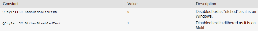
case SH_DitherDisabledText:
return int(false);
case SH_EtchDisabledText:
return int(true);
default:
return QMotifStyle::styleHint(hint, option, widget, returnData);
}
}
//! [10] 这里也附带介绍一下StyleHint的内容,这是一个枚举类型,指定了style hints可以选取的值,一种style hint是一般的外观和/或感到提示。
由上面的代码和这里的图片可以看到这里也做了一些修改。
(5)void drawPrimitive(PrimitiveElement element, const QStyleOption *option,
QPainter *painter, const QWidget *widget) const
功能:用给定的option核painter来绘制element。关于原始元素以及它们相关的option可以参见Qt帮组文档。
这里的实现为:
//! [11]
void NorwegianWoodStyle::drawPrimitive(PrimitiveElement element,
//! [11] //! [12]
                                       const QStyleOption *option,
                                       QPainter *painter,
                                       const QWidget *widget) const
{
    switch (element) {
    case PE_PanelButtonCommand:
        {
            int delta = (option->state & State_MouseOver) ? 64 : 0;
            QColor slightlyOpaqueBlack(0, 0, 0, 63);
            QColor semiTransparentWhite(255, 255, 255, 127 + delta);
            QColor semiTransparentBlack(0, 0, 0, 127 - delta);

            int x, y, width, height;
            option->rect.getRect(&x, &y, &width, &height);
//! [12]

//! [13]
            QPainterPath roundRect = roundRectPath(option->rect);
//! [13] //! [14]
            int radius = qMin(width, height) / 2;
//! [14]

//! [15]
            QBrush brush;
//! [15] //! [16]
            bool darker;

            const QStyleOptionButton *buttonOption =
                    qstyleoption_cast<const QStyleOptionButton *>(option);
            if (buttonOption
                    && (buttonOption->features & QStyleOptionButton::Flat)) {
                brush = option->palette.background();
                darker = (option->state & (State_Sunken | State_On));
            } else {
                if (option->state & (State_Sunken | State_On)) {
                    brush = option->palette.mid();
                    darker = !(option->state & State_Sunken);
                } else {
                    brush = option->palette.button();
                    darker = false;
//! [16] //! [17]
                }
//! [17] //! [18]
            }
//! [18]

//! [19]
            painter->save();
//! [19] //! [20]
            painter->setRenderHint(QPainter::Antialiasing, true);
//! [20] //! [21]
            painter->fillPath(roundRect, brush);
//! [21] //! [22]
            if (darker)
//! [22] //! [23]
                painter->fillPath(roundRect, slightlyOpaqueBlack);
//! [23]

//! [24]
            int penWidth;
//! [24] //! [25]
            if (radius < 10)
                penWidth = 3;
            else if (radius < 20)
                penWidth = 5;
            else
                penWidth = 7;

            QPen topPen(semiTransparentWhite, penWidth);
            QPen bottomPen(semiTransparentBlack, penWidth);

            if (option->state & (State_Sunken | State_On))
                qSwap(topPen, bottomPen);
//! [25]

//! [26]
            int x1 = x;
            int x2 = x + radius;
            int x3 = x + width - radius;
            int x4 = x + width;

            if (option->direction == Qt::RightToLeft) {
                qSwap(x1, x4);
                qSwap(x2, x3);
            }

            QPolygon topHalf;
            topHalf << QPoint(x1, y)
                    << QPoint(x4, y)
                    << QPoint(x3, y + radius)
                    << QPoint(x2, y + height - radius)
                    << QPoint(x1, y + height);

            painter->setClipPath(roundRect);
            painter->setClipRegion(topHalf, Qt::IntersectClip);
            painter->setPen(topPen);
            painter->drawPath(roundRect);
//! [26] //! [32]

            QPolygon bottomHalf = topHalf;
            bottomHalf[0] = QPoint(x4, y + height);

            painter->setClipPath(roundRect);
            painter->setClipRegion(bottomHalf, Qt::IntersectClip);
            painter->setPen(bottomPen);
            painter->drawPath(roundRect);

            painter->setPen(option->palette.foreground().color());
            painter->setClipping(false);
            painter->drawPath(roundRect);

            painter->restore();
        }
        break;
//! [32] //! [33]
    default:
//! [33] //! [34]
        QMotifStyle::drawPrimitive(element, option, painter, widget);
    }
}
//! [34]
(6)void drawControl(ControlElement control, const QStyleOption *option,
QPainter *painter, const QWidget *widget) const
功能:和上个函数类似。具体参见Qt帮组文档。
具体实现:
//! [35]
void NorwegianWoodStyle::drawControl(ControlElement element,
//! [35] //! [36]
                                     const QStyleOption *option,
                                     QPainter *painter,
                                     const QWidget *widget) const
{
    switch (element) {
    case CE_PushButtonLabel:
        {
            QStyleOptionButton myButtonOption;
            const QStyleOptionButton *buttonOption =
                    qstyleoption_cast<const QStyleOptionButton *>(option);
            if (buttonOption) {
                myButtonOption = *buttonOption;
                if (myButtonOption.palette.currentColorGroup()
                        != QPalette::Disabled) {
                    if (myButtonOption.state & (State_Sunken | State_On)) {
                        myButtonOption.palette.setBrush(QPalette::ButtonText,
                                myButtonOption.palette.brightText());
                    }
                }
            }
            QMotifStyle::drawControl(element, &myButtonOption, painter, widget);
        }
        break;
    default:
        QMotifStyle::drawControl(element, option, painter, widget);
    }
}
//! [36]
(7)两个辅助函数,这里代码比较好懂,直接贴代码了:
//! [37]
void NorwegianWoodStyle::setTexture(QPalette &palette, QPalette::ColorRole role,
//! [37] //! [38]
                                    const QPixmap &pixmap)
{
    for (int i = 0; i < QPalette::NColorGroups; ++i) {
        QColor color = palette.brush(QPalette::ColorGroup(i), role).color();
        palette.setBrush(QPalette::ColorGroup(i), role, QBrush(color, pixmap));
    }
}
//! [38]

//! [39]
QPainterPath NorwegianWoodStyle::roundRectPath(const QRect &rect)
//! [39] //! [40]
{
    int radius = qMin(rect.width(), rect.height()) / 2;
    int diam = 2 * radius;

    int x1, y1, x2, y2;
    rect.getCoords(&x1, &y1, &x2, &y2);

    QPainterPath path;
    path.moveTo(x2, y1 + radius);
    path.arcTo(QRect(x2 - diam, y1, diam, diam), 0.0, +90.0);
    path.lineTo(x1 + radius, y1);
    path.arcTo(QRect(x1, y1, diam, diam), 90.0, +90.0);
    path.lineTo(x1, y2 - radius);
    path.arcTo(QRect(x1, y2 - diam, diam, diam), 180.0, +90.0);
    path.lineTo(x1 + radius, y2);
    path.arcTo(QRect(x2 - diam, y2 - diam, diam, diam), 270.0, +90.0);
    path.closeSubpath();
    return path;
}
//! [40]


 浙公网安备 33010602011771号