前端三剑客快速入门(二)
前言
本文书接上回,继续css的知识,序号就重新开始了。上篇内容:前端三剑客快速入门(一)
CSS
-
盒子模型
盒子模型属性:- border外框
- margin外边距
- padding内边距
<!DOCTYPE html>
<html lang="en">
<head>
    <meta charset="UTF-8">
    <meta http-equiv="X-UA-Compatible" content="IE=edge">
    <meta name="viewport" content="width=device-width, initial-scale=1.0">
    <title>Document</title>
    <style>
        /* 元素边距初始化 */
        *{
            margin: 0px;
            padding: 0px;
        }
        .box{
            width: 100px;
            height: 100px;
            /* border-width: 10px;
            border-style: solid;
            border-color: red; */
            border: 1px solid green;
            margin: 0px;
            padding: 10px 20px;
            /* box-sizing: border-box; */
        }
    </style>
</head>
<body>
    <div class="box">
        <a href="">test</a>
    </div>
    <div class="box1">
        <h1>hhhh</h1>
    </div>
</body>
</html>
<!DOCTYPE html>
<html lang="en">
<head>
    <meta charset="UTF-8">
    <meta http-equiv="X-UA-Compatible" content="IE=edge">
    <meta name="viewport" content="width=device-width, initial-scale=1.0">
    <title>Document</title>
    <style>
       *{
        margin: 0px;
        padding: 0px;
       }
       .container{
        width: 500px;
        height: 300px;
        border: 1px solid red;
        margin: 0 auto;
       }
    </style>
</head>
<body>
   <div class="container"></div>
</body>
</html>
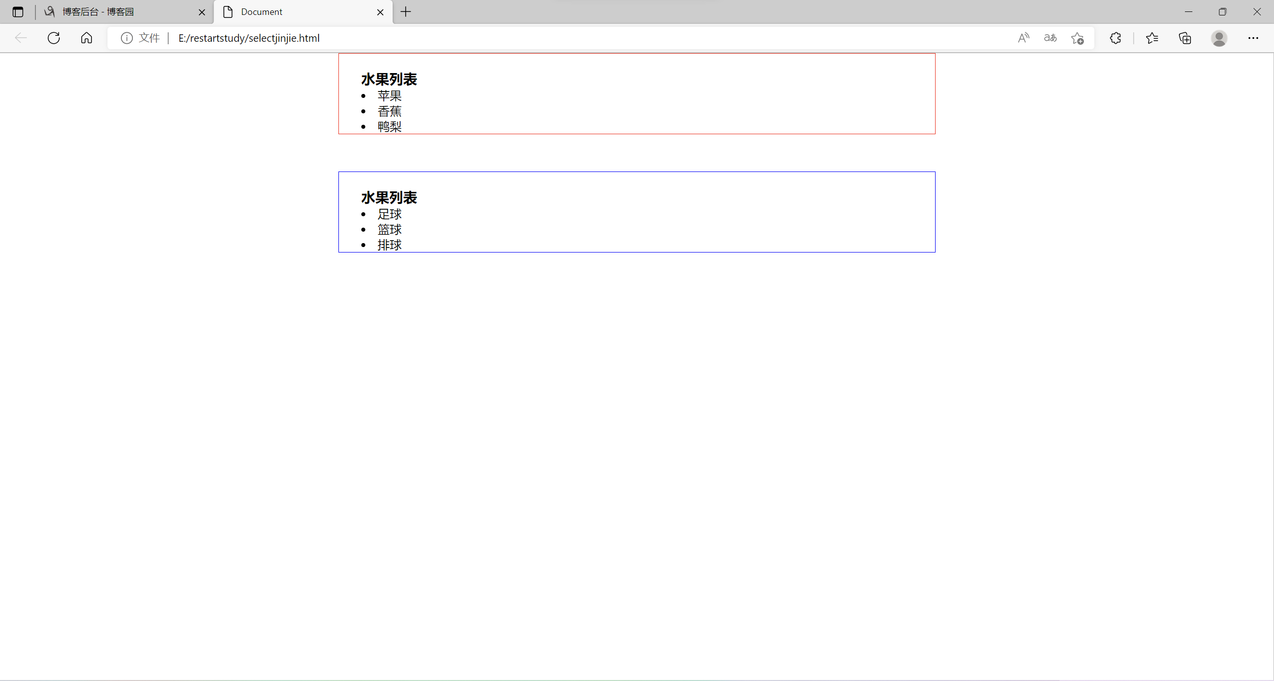
盒子模型实例:
<!DOCTYPE html>
<html lang="en">
<head>
    <meta charset="UTF-8">
    <meta http-equiv="X-UA-Compatible" content="IE=edge">
    <meta name="viewport" content="width=device-width, initial-scale=1.0">
    <title>Document</title>
    <style>
        *{
            margin: 0px;
            padding: 0px;
        }
        .fruits{
            border: 1px solid red;
            width: 800px;
            margin: 0 auto;
            padding-left: 30px;
            box-sizing: border-box;
            padding-top: 20px;
        }
        .sports{
            border: 1px solid blue;
            width: 800px;
            margin: 0 auto;
            margin-top: 50px;
            padding-left: 30px;
            box-sizing: border-box;
            padding-top: 20px;
        }
        .fruits ul,.sports ul{
            list-style: inside;
        }
    </style>
</head>
<body>
    <div class="fruits">
        <h3>水果列表</h3>
        <ul>
            <li>苹果</li>
            <li>香蕉</li>
            <li>鸭梨</li>
        </ul>
    </div>
    <div class="sports">
        <h3>水果列表</h3>
        <ul>
            <li>足球</li>
            <li>篮球</li>
            <li>排球</li>
        </ul>
    </div>
</body>
</html>
实例运行结果:
-
CSS浮动布局
- html元素分类:
- 块元素:可以设置宽度和高度,独立成行。如h1-6、p、div、ul、li
- 行内元素(内联元素、行级元素):不可以设置宽度和高度,不可以独立成行,如a、span
- 行内块元素:可以设置宽度和高度,不独立成行img、input、button
<!DOCTYPE html>
<html lang="en">
<head>
    <meta charset="UTF-8">
    <meta http-equiv="X-UA-Compatible" content="IE=edge">
    <meta name="viewport" content="width=device-width, initial-scale=1.0">
    <title>Document</title>
    <style>
        a{
            width: 300px;
            height: 100px;
            border: 1px solid red;
            /* 将a标签转换为块元素 */
            /* display: block; */
            display: none;
        }
    </style>
</head>
<body>
    <h1>hello world</h1>
    <a href="http://www.baidu.com">百度</a>
    <h2>hello world</h2>
</body>
</html>
设置元素浮动实例
<!DOCTYPE html>
<html lang="en">
<head>
    <meta charset="UTF-8">
    <meta http-equiv="X-UA-Compatible" content="IE=edge">
    <meta name="viewport" content="width=device-width, initial-scale=1.0">
    <title>Document</title>
    <style>
        .content{
            width: 300px;
            height: 100px;
            border: 1px solid red;
            /* 设置元素浮动 */
            float: left;
        }
        .aside{
            width: 200px;
            height: 100px;
            border: 1px solid red;
            float: left;
        }
        /* 浮动元素脱离文档流 */
        .box{
            width: 400px;
            height: 400px;
            background-color: yellow;
        }
        /* 清除浮动 */
        .clear{
            clear: both;
        }
    </style>
</head>
<body>
    <div class="content">内容</div>
    <div class="aside">边栏</div>
    <div class="clear"></div>
    <div class="box"></div>
</body>
</html>
伪元素清除浮动
<!DOCTYPE html>
<html lang="en">
<head>
    <meta charset="UTF-8">
    <meta http-equiv="X-UA-Compatible" content="IE=edge">
    <meta name="viewport" content="width=device-width, initial-scale=1.0">
    <title>Document</title>
    <style>
        .content{
            width: 300px;
            height: 100px;
            border: 1px solid red;
            /* 设置元素浮动 */
            float: left;
        }
        .aside{
            width: 200px;
            height: 100px;
            border: 1px solid red;
            float: left;
        }
        /* 浮动元素脱离文档流 */
        .box{
            width: 400px;
            height: 400px;
            background-color: yellow;
        }
        /* 伪元素清除浮动 */
        .clear::before,.clear::after{
            content: "111";
            display: block;
            clear: both;
            /* content: "";
            display: block;
            clear: both; */
        }
    </style>
</head>
<body>
    <div class="contoner clear">
        <div class="content">内容</div>
        <div class="aside">边栏</div>
    </div>
    <div class="box"></div>
</body>
</html>
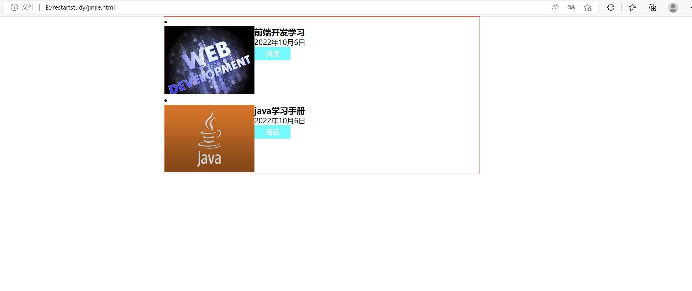
浮动布局练习:
html文件
<!DOCTYPE html>
<html lang="en">
<head>
    <meta charset="UTF-8">
    <meta http-equiv="X-UA-Compatible" content="IE=edge">
    <meta name="viewport" content="width=device-width, initial-scale=1.0">
    <title>Document</title>
    <link rel="stylesheet" href="css/jinjie.css">
</head>
<body>
    <ul class="list">
        <li class="box">
            <div class="pic">
                <img src="pic/th.jpg" alt="图片正在加载ing...">
            </div>
            <div class="content">
                <h3>前端开发学习</h3>
                <p>2022年10月6日</p>
                <a href="">阅读</a>
            </div>
        </li>
        <li class="box">
            <div class="pic">
                <img src="pic/java.jpg" alt="">
            </div>
            <div class="content">
                <h3>java学习手册</h3>
                <p>2022年10月6日</p>
                <a href="">阅读</a>
            </div>
        </li>
    </ul>
</body>
</html>
css文件
*{
    margin: 0px;
    padding: 0px;
}
.list .pic img{
    width: 200px;
    height: 150px;
}
.pic{
    width: 200px;
    float: left;
}
.content{
    width: 300px;
    float: left;
}
.box::before,.box::after{
    content: "";
    display: block;
    clear: both;
}
a{
    display: block;
    width: 80px;
    height: 30px;
    background-color: aqua;
    text-align: center;
    color: aliceblue;
    text-decoration: none;
    line-height: 30px;
}
.list{
    display: block;
    width: 700px;
    margin: auto;
    border: 1px solid red;
}
.list{
    list-style: inside;
}
浮动布局练习结果:
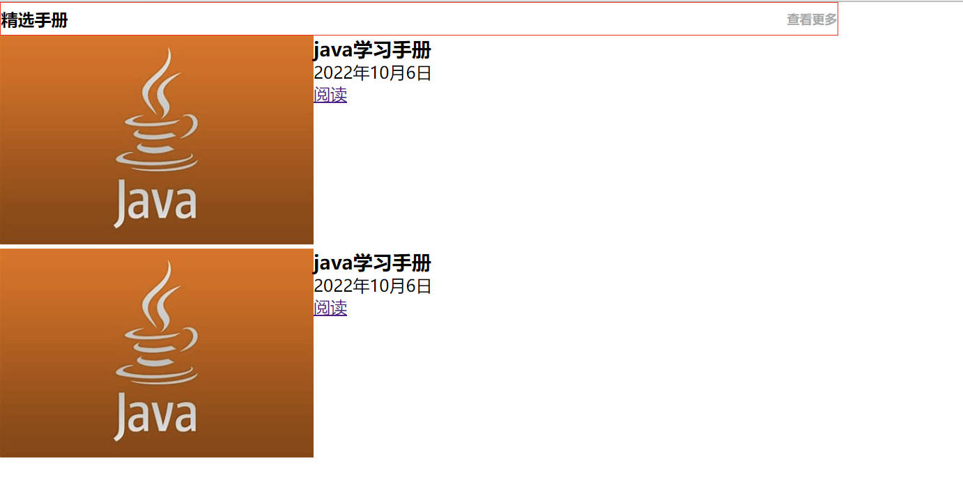
- 树状结构
树状结构练习
html代码:
<!DOCTYPE html>
<html lang="en">
<head>
    <meta charset="UTF-8">
    <meta http-equiv="X-UA-Compatible" content="IE=edge">
    <meta name="viewport" content="width=device-width, initial-scale=1.0">
    <title>树状结构</title>
    <link rel="stylesheet" href="css/treeStudy.css">
</head>
<body>
    <div class="title">
        <h2>
            精选手册
            <a href="">查看更多</a>
        </h2>
    </div>
    <div class="list">
        <ul>
            <li class="clear">
                <div class="pic">
                    <img src="pic/java.jpg" alt="图片正在加载ing...">
                </div>
                <div class="discribe">
                    <h3>java学习手册</h3>
                    <p>2022年10月6日</p>
                    <a href="">阅读</a>
                </div>
            </li>
        </ul>
    </div>
</body>
</html>
css代码:
*{
    margin: 0px;
    padding: 0px;
}
.title{
    width: 800px;
    height: 30px;
    border: 1px solid red;
}
.title h2{
    font-size: 16px;
    line-height: 30px;
}
.title h2 a{
    font-size: 12px;
    color: #aaa;
    float: right;
    text-decoration: none;
}
.pic{
    width: 300px;
    float: left;
}
.list img{
    width: 300px;
    height: 200px;
}
.discribe{
    width: 500px;
    float: left;
}
.clear::after,.clear::before{
    content: "";
    display: block;
    clear: both;
}
运行结果图:
后续
后面还有一个css定位,感觉今晚可能写不完了,就先发布吧,剩下的算到(三)里面,明天就能还原设计稿了。今天的浮动布局真是为难了好一阵,最终经验是浮动的是div块,清除浮动的话要在浮动的父元素处做手脚。web这两天一点也没学,要学的好多,好着急。

 浙公网安备 33010602011771号