深究table
匿名表格元素
有时候我们在编写table元素的时候,会少些一些元素。这些“丢失”的元素会被模拟出来,使得表格模型能够正常工作。所有的表格元素将会自动在自身周围生成所需的匿名table元素,从而使得其符合table/inline-table、table-row、table-cell三层嵌套关系。
也就是说,下面的代码是等价的:
<!--写法1-->
<div style="display: table-cell;">content</div>

<!--写法2-->
<div style="display: table; table-layout: auto;">
  <div style="display: table-row;">
    <div style="display: table-cell;">content</div>
  </div>
</div>
外层的table和table-row是由浏览器默认创建的,称为匿名元素。
另外,下面的代码也是等价的:
<!--写法1-->
<div style="display: table;">
  <p>paragraph1</p>
  <p>paragraph2</p>
</div>

<!--写法2-->
<div style="display: table;">
  <div style="display: table-row">
    <div style="display: table-cell">
      <p>paragraph1</p>
      <p>paragraph2</p>
    </div>
  </div>
</div>
table、table-row、table-cell之间的宽度关系
<style>
  #container {
    width: 1000px;
  }
  #table {
    display: table;
    table-layout: auto;
  }
  #table-row {
    display: table-row;
  }
  #table-cell {
    display: table-cell;
  }
</style>

<div id="container">
  <div id="table">
    <div id="table-row">
      <div id="table-cell">content</div>
    </div>
  </div>
</div>
1)table-layout: auto
-
若table不显式设置宽度
-
若table-cell不显式设置宽度,则三者的宽度等于内部content的宽度。
-
若table-cell显式设置宽度
-
若table的父容器宽度大于table-cell宽度,三者宽度等于table-cell宽度。
-
若table的父容器宽度小于table-cell宽度,table会约定最终宽度为父容器宽度。
-
-
若table显式设置宽度,无论内部table-cell如何设置宽度,三者的宽度都等于table的宽度。但有一种情况例外,即table宽度设置为小于table-cell中文本的最小宽度时,三者的宽度保持该最小的文本宽度。
2)table-layout: fixed
-
若table不显式设置宽度,与table-layout: auto的情况完全一致。
-
若table显式设置宽度
-
若table-cell不显式设置宽度,则table、table-row和table-cell三者的宽度相等。
-
若table-cell显式设置宽度
-
当table宽度大于table-cell宽度时,三者的宽度等于table宽度。
-
当table宽度小于table-cell宽度时,三者的跨度等于table-cell宽度。
-
-
table-row和table-cell之间的高度关系
位于同一table-row下的table-cell的高度会统一等于所有单元格中最高元素的高度。
vertical-align在table-cell上的作用
vertical-align一般用在内联元素上,主要用于内联元素间在垂直方向上的对齐。不过,vertical-align同样也可以作用于table-cell元素,目的是为了指定table-cell中的内容在垂直方向上相对table-cell的对齐关系。
由table产生的布局
自适应两栏布局
利用默认的table-layout: auto的特性,table-cell不会超过table父元素的宽度,从而实现自适应两栏布局。
<style>
  #left {
    float: left;
    width: 150px;
  }
  #right {
    display: table-cell;
    width: 9999px;
  }
  #container {
    overflow: auto;
  }
</style>

<div id="container">
  <div id="left">content goes here...</div>
  <div id="right">content goes here...</div>
</div>
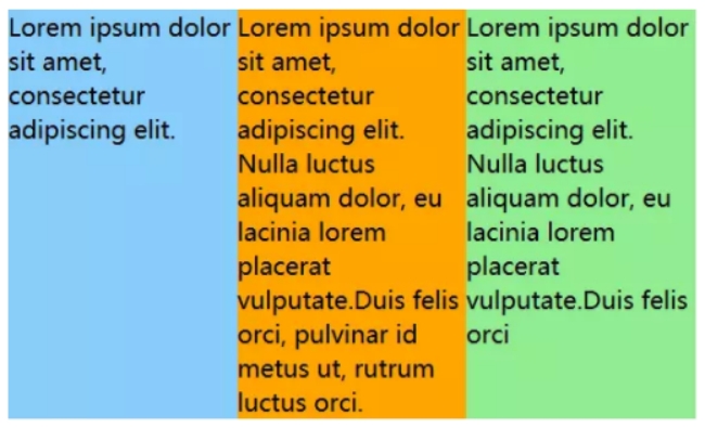
等宽布局
table-layout: fixed可令各table-cell宽度等分。
<style>
  #container {
    display: table;
    table-layout: fixed;
    width: 450px;
  }
  .cell {
    display: table-cell;
  }
</style>

<div id="container">
  <div class="cell">content goes here...</div>
  <div class="cell">content goes here...</div>
  <div class="cell">content goes here...</div>
</div>

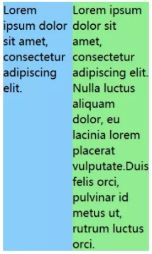
等高布局
利用了table-row下的table-cell高度相等的特性。
<style>
  #container {
    display: table-row;
  }
  #left,
  #right {
    display: table-cell;
    width: 100px;
  }
</style>

<div id=container>
  <div id="left">content goes here...</div>
  <div id="right">content goes here...</div>
</div>

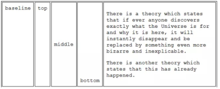
垂直居中
利用了vertical-align: middle使得table-cell的内容垂直居中的特性。
<style>
  #box {
    display: table-cell;
    width: 200px;
    height: 100px;
    vertical-align: middle;
  }
</style>

<div id="box">
  <div id="content">content goes here...</div>
</div>

其他细节
-
对于设置为display: table-cell或display: table-row的元素,对其设置margin将不会产生任何作用。
-
table-row作为table和table-cell的中间元素,对其设置width属性将不会产生任何作用。table-row元素的宽度由内部的table-cell或外部的table决定。

 浙公网安备 33010602011771号