


样式
设置Button元素的FontSize和Background属性,就可以定义WPF元素的外观和操作方式
如下所示:
        <StackPanel>
            <Button Name="button1" Width="150" FontSize="12" Background="AliceBlue">
                Click Me!
            </Button>
        </StackPanel>
除了定义每个元素的外观和操作方式之外,还可以定义用资源存储的样式。为了完全定义控件的外观,可以使用模版,再把它们存储到资源中。
样式
要定义样式,可以使用包含Setter元素的Style元素。使用Setter,可以指定样式的Property和Value,例如属性Button.Background和值AliceBlue
为了把样式赋予指定的元素,可以将样式赋予每一类型的所有元素,或者为该样式使用一个键。要把样式赋予某一类型的所有元素,可使用Style的TargetType属性,指定x:Type标记扩展(x:TypeButton),将样式赋予一个按钮。
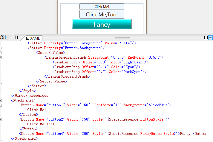
 <Window.Resources>
        <Style TargetType="{x:Type Button}">
            <Setter Property="Button.Background" Value="LemonChiffon"/>
            <Setter Property="Button.FontSize" Value="18"/>
        </Style>
        <Style x:Key="ButtonStyle">
            <Setter Property="Button.Background" Value="AliceBlue"/>
            <Setter Property="Button.FontSize" Value="18"/>
        </Style>
 </Window.Resources>
将button2的Style属性用StaticResource标记扩展设置为{StaticResource ButtonStyle},其中ButtonStyle指定了前面定义的样式资源的键值,所以button2的背景为AliceBlue。
除了把按钮的Background设置为单个值之外, 还可以将Background属性设置为定义了渐变色的LinearGradientBrush,如下所示:
  <Style x:Key="FancyButtonStyle">
            <Setter Property="Button.FontSize" Value="22"/>
            <Setter Property="Button.Foreground" Value="White"/>
            <Setter Property="Button.Background">
                <Setter.Value>
                    <LinearGradientBrush StartPoint="0.5,0" EndPoint="0.5,1">
                        <GradientStop Offset="0.0" Color="LightCyan"/>
                        <GradientStop Offset="0.14" Color="Cyan"/>
                        <GradientStop Offset="0.7" Color="DarkCyan"/>
                    </LinearGradientBrush>
                </Setter.Value>
            </Setter>
  </Style>
button3的样式采用情色线性渐变效果:
<Button Name="button4" Width="200" Style="{StaticResource FancyButtonStyle}">Fancy</Button>
效果如下:

 浙公网安备 33010602011771号