元素垂直居中
原代码
使用一个div+span,实现span元素垂直居中。span元素的display就分为三种情况:行内元素,行内块,块元素
	<div>
		<span >loading</span>
	</div>
行内元素与行内块、块元素最明显的区别就是它的margin只对水平方向有效
- 行内元素居中:水平使用:
text-align:center,垂直使用line-height等于它的高度使用line-height , 使用绝对定位+calc ,flex定位,使用margin垂直居中 - 行内块元素居中:transform对行内元素无效,所以行内元素要转换。使用relative+transform ,flex定位,使用margin垂直居中
- 块元素居中:使用relative+transform ,flex定位,使用margin垂直居中
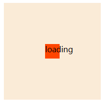
1. 使用line-height
利用元素的行高等于本身高度来实现垂直居中
	div {
		width: 400px;
		height: 400px;
		background-color: antiquewhite;
		line-height: 400px;
		text-align: center;
	}
	span {
		background-color: orangered;

	}
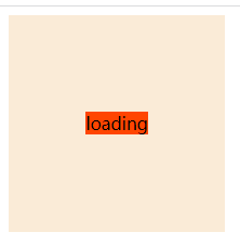
2. 子元素移动,使用计算属性
假设知道元素本身的高度和宽度,父开启relative定位,子元素开启绝对定位。子元素水平使用:left: calc(50% - 子元素宽度),垂直使用: top: calc(50% - 子元素高度)
  div {
  	width: 200px;
  	height: 200px;
  	background-color: antiquewhite;
  	position: relative;
  }
  span {
  	width: 30px;
  	height: 30px;
  	background-color: orangered;
  	position: absolute;
  	float: left;
  	top: calc(50% - 15px);
  	left: calc(50% - 15px);
  }
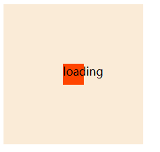
3. 子元素移动,利用relative定位来移动相应位置
使用transform+translate,子元素利用相对定位,来偏移相应位置。
div {
	width: 200px;
	height: 200px;
	background-color: antiquewhite;
}
span {
	background-color: orangered;
	position: relative;
	top: 50%;
	display: block;
	/* display: inline-block; */
	transform: translateY(-50%);
        left: 50%;
        transform: translateX(-50%);
        text-align: center;
}
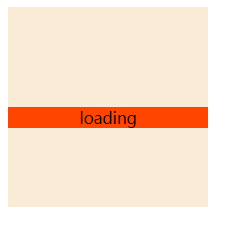
4. 使用flex定位
父元素使用justify-content: center;align-items: center;来对齐
div {
	width: 200px;
	height: 200px;
	background-color: antiquewhite;
	display: flex;
	justify-content: center;
	align-items: center;
}
span {
	width: 20px;
	height: 20px;
	background-color: orangered;
}
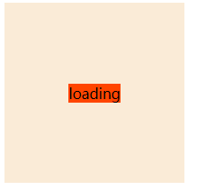
5. 使用margin居中
父相子绝,子元素一定要有宽度和高度才能使用margin居中,margin是为元素分配剩余空间的,内联元素只对左右外边距起作用。所以要垂直居中,只能该元素脱离正常文档流,重新分配空间,父相子绝,上下左右偏移量都为0,再margin:auto实现;
div {
	width: 200px;
	height: 200px;
	background-color: antiquewhite;
	position: relative

}
span {
	width: 30px;
	height: 30px;
	position: absolute;
	top: 0;
	right: 0;
	left: 0;
	bottom: 0;
	margin: auto;
	background-color: orangered;
}

 浙公网安备 33010602011771号