

WPF 自定义控件库
一、使用场景
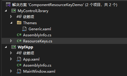
二 ,程序
1.静态的后台代码 资源键
// MyControlLibrary/ResourceKeys.cs
using System.Windows;

namespace MyControlLibrary;

public static class ResourceKeys
{
    // 按钮样式资源键
    public static ComponentResourceKey CustomButtonStyleKey =>
        new ComponentResourceKey(typeof(ResourceKeys), "CustomButtonStyle");

    // 文本框样式资源键
    public static ComponentResourceKey CustomTextBoxStyleKey =>
        new ComponentResourceKey(typeof(ResourceKeys), "CustomTextBoxStyle");

    // 主题色画笔资源键
    public static ComponentResourceKey ThemeBrushKey =>
        new ComponentResourceKey(typeof(ResourceKeys), "ThemeBrush");
}
2.前台代码
<!-- MyControlLibrary/Themes/Generic.xaml -->
<ResourceDictionary
    xmlns="http://schemas.microsoft.com/winfx/2006/xaml/presentation"
    xmlns:x="http://schemas.microsoft.com/winfx/2006/xaml"
    xmlns:local="clr-namespace:MyControlLibrary">
    <SolidColorBrush
        x:Key="{x:Static local:ResourceKeys.ThemeBrushKey}"
        Color="#FF2196F3"/>

    <Style
        x:Key="{x:Static local:ResourceKeys.CustomButtonStyleKey}"
        TargetType="Button">
        <Setter Property="Background" Value="{StaticResource {x:Static local:ResourceKeys.ThemeBrushKey}}"/>
        <Setter Property="Foreground" Value="White"/>
        <Setter Property="Padding" Value="12,6"/>
        <Setter Property="FontSize" Value="14"/>
        <Setter Property="Template">
            <Setter.Value>
                <ControlTemplate TargetType="Button">
                    <Border
                        Background="{TemplateBinding Background}"
                        CornerRadius="4"
                        Padding="{TemplateBinding Padding}"
                        SnapsToDevicePixels="True">
                        <ContentPresenter
                            HorizontalAlignment="Center"
                            VerticalAlignment="Center"/>
                    </Border>
                </ControlTemplate>
            </Setter.Value>
        </Setter>
    </Style>


    <Style
        x:Key="{x:Static local:ResourceKeys.CustomTextBoxStyleKey}"
        TargetType="TextBox">
        <Setter Property="BorderBrush" Value="{StaticResource {x:Static local:ResourceKeys.ThemeBrushKey}}"/>
        <Setter Property="BorderThickness" Value="2"/>
        <Setter Property="Padding" Value="8"/>
        <Setter Property="FontSize" Value="14"/>
    </Style>
</ResourceDictionary>
3.下面是引用上面的项目,在依赖项中引用一下
App.xaml
<Application x:Class="WpfApp.App"
             xmlns="http://schemas.microsoft.com/winfx/2006/xaml/presentation"
             xmlns:x="http://schemas.microsoft.com/winfx/2006/xaml"
             xmlns:local="clr-namespace:WpfApp"
             StartupUri="MainWindow.xaml">
    <Application.Resources>
        <ResourceDictionary>
            <ResourceDictionary.MergedDictionaries>
                <!-- 合并控件库的资源字典(Pack URI格式) -->
                <ResourceDictionary Source="/MyControlLibrary;component/Themes/Generic.xaml"/>
            </ResourceDictionary.MergedDictionaries>
        </ResourceDictionary>
    </Application.Resources>
</Application>
MainWindow.xaml
<!-- WpfApp/MainWindow.xaml -->
<Window x:Class="WpfApp.MainWindow"
        xmlns="http://schemas.microsoft.com/winfx/2006/xaml/presentation"
        xmlns:x="http://schemas.microsoft.com/winfx/2006/xaml"
        xmlns:d="http://schemas.microsoft.com/expression/blend/2008"
        xmlns:mc="http://schemas.openxmlformats.org/markup-compatibility/2006"
        xmlns:lib="clr-namespace:MyControlLibrary;assembly=MyControlLibrary"
        mc:Ignorable="d"
        Title=".NET 8 ComponentResourceKey 示例"
        Height="350" Width="500">

    <StackPanel Margin="20" >
        <TextBlock FontSize="16" FontWeight="Bold" Text="使用ComponentResourceKey的资源示例"/>

        <!-- 使用自定义按钮样式 -->
        <Button
            Content="自定义按钮"
            Style="{StaticResource {x:Static lib:ResourceKeys.CustomButtonStyleKey}}"/>

        <!-- 使用自定义文本框样式 -->
        <TextBox
            Text="自定义文本框"
            Style="{StaticResource {x:Static lib:ResourceKeys.CustomTextBoxStyleKey}}"/>

        <!-- 使用主题色画笔 -->
        <Border
            Height="60"
            Background="{StaticResource {x:Static lib:ResourceKeys.ThemeBrushKey}}">
            <TextBlock
                Text="主题色背景"
                Foreground="White"
                HorizontalAlignment="Center"
                VerticalAlignment="Center"/>
        </Border>
    </StackPanel>
</Window>

 浙公网安备 33010602011771号