
< > 7-2 CSS3选择器 :disabled选择器
CSS3选择器 :disabled选择器
“:disabled”选择器刚好与“:enabled”选择器相反,用来选择不可用表单元素。要正常使用“:disabled”选择器,需要在表单元素的HTML中设置“disabled”属性。
示例演示
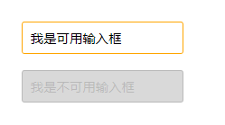
通过“:disabled”选择器,给不可用输入框设置明显的样式。
HTML代码:
<form action="#">
  <div>
    <input type="text" name="name" id="name" placeholder="我是可用输入框" />
  </div>
  <div>
    <input type="text" name="name" id="name" placeholder="我是不可用输入框" disabled />
  </div>
</form>
CSS代码
form {
  margin: 50px;
}
div {
  margin-bottom: 20px;
}
input {
  background: #fff;
  padding: 10px;
  border: 1px solid orange;
  border-radius: 3px;
}
input[type="text"]:disabled {
  background: rgba(0,0,0,.15);
  border: 1px solid rgba(0,0,0,.15);
  color: rgba(0,0,0,.15);
}
结果演示:
任务
在右边CSS编辑器的第21行输入正确的代码,让不可用按钮显示为灰色。
<!DOCTYPE html>
<html>
<head>
<meta charset="utf-8">
<title>属性选择器</title>
<link href="style.css" rel="stylesheet" type="text/css">
</head>
<body>
<form action="#">
  <div><input type="text" /></div>

  <div>
    <input type="submit" value="我要回到上一步" />
    <input type="submit" value="禁止点下一步" disabled />
  </div>
</form>
</body>
</html>
form {
  margin: 30px;
}

div {
  margin: 10px;
}

input {
  padding: 10px;
  border: 1px solid orange;
  background: #fff;
  border-radius: 5px;
}

input[type="submit"] {
  background: orange;
  color: #fff;
}

input[type="submit"]:disabled {
  background: #eee;
  border-color: #eee;
  color: #ccc;
}

 浙公网安备 33010602011771号