Flex 布局教程:语法篇
一、Flex 布局是什么?
Flex 是 Flexible Box 的缩写,意为"弹性布局",用来为盒状模型提供最大的灵活性。
注意,设为 Flex 布局以后,子元素的float、clear和vertical-align属性将失效。
总结图片
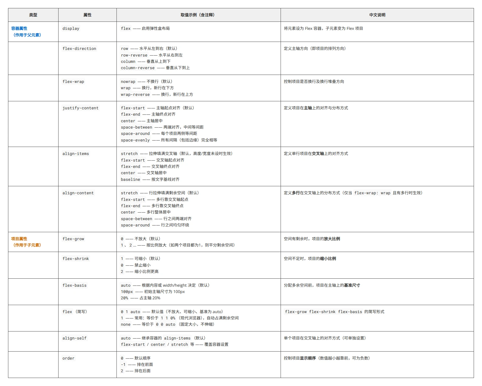
二、基本概念
-
容器
采用Flex布局的元素,称为Flex容器(flex container),简称"容器"。 -
项目
容器中的所有子元素自动成为容器的成员,称为Flex项目(flex item),简称"项目"。 -
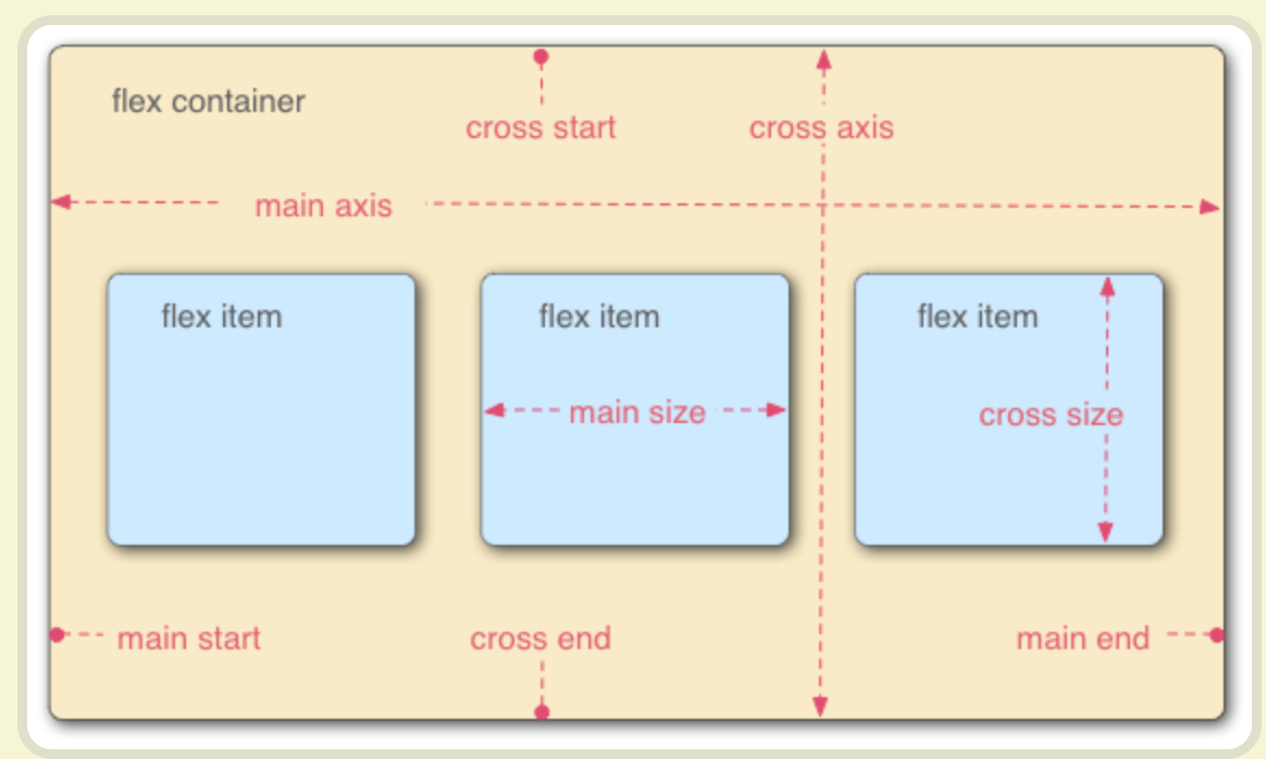
容器轴轴的概念
容器默认存在两根轴:-
水平的主轴
(main axis)
主轴的开始位置(与边框的交叉点)叫做main start,结束位置叫做main end; -
垂直的交叉轴
(cross axis)。
交叉轴的开始位置叫做cross start,结束位置叫做cross end。
-
项目默认沿主轴排列。单个项目占据的主轴空间叫做 main size,占据的交叉轴空间叫做 cross size。
三、容器的属性
以下6个属性设置在容器上。
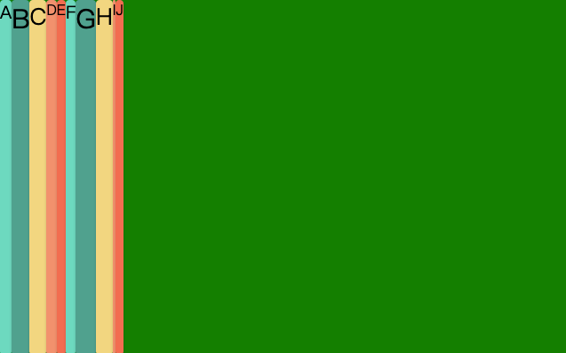
1. flex-direction  主轴的方向 项目横或者竖
2. flex-wrap  是否换行
3. flex-flow 属性是 flex-direction 属性和 flex-wrap 属性的简写形式,默认值为row nowrap
4. justify-content 项目在主轴上(水平对齐)的对齐方式 既行对齐 上 中 下等
5. align-items 项目在交叉轴上(垂直对齐)的对齐方式 既列 左 中 边等
6. align-content 多根轴线的对齐方式,既多行或者多列时项目对齐方式才生效,flex-wrap: wrap | wrap-reverse时生效
7. gap 属性用于在子元素之间创建统一的间距,它非常简洁高效,是设置 Flex 子元素间距的推荐方式。
1. flex-direction 属性
flex-direction 属性决定主轴的方向(即项目的排列方向)。
1. row(默认值):主轴为水平方向,起点在左端。
2. row-reverse:主轴为水平方向,起点在右端。
3. column:主轴为垂直方向,起点在上沿。
4. column-reverse:主轴为垂直方向,起点在下沿。

<!DOCTYPE html>
<html lang="en">
<head>
    <meta charset="UTF-8">
    <meta name="viewport" content="width=device-width, initial-scale=1.0">
    <title>Document</title>
</head>
<body>
	<div class="flex-container">
		<div class="box A">A</div>
		<div class="box B">B</div>
		<div class="box C">C</div>
		<div class="box D">D</div>
		<div class="box E">E</div>
	</div>

</body>
<style>
.flex-container{
	background-color: green;
	/* 设置为flex布局 */
	display: flex;
	flex-direction:row-reverse;
}
.box{
	width: 50px;
	height: 50px;
    background-color: #eee;
	text-align: center;
	line-height: 60px;
	border-radius: 4px;
	box-shadow: 0px 1px 3px rgb(0,0,0,.18);
	font-size: 1em;
}
/* 任何一个容器都可以指定为 Flex 布局。 */
.A {background-color: #6dd9bf;}
.B {background-color: #50A18E;}
.C {background-color: #F2D680;}
.D {background-color: #F2916D;}
.E {background-color: #F26E50;}
/* .box{
  display: flex;
  justify-content: center;
  align-items: center;
} */
</style>
</html>
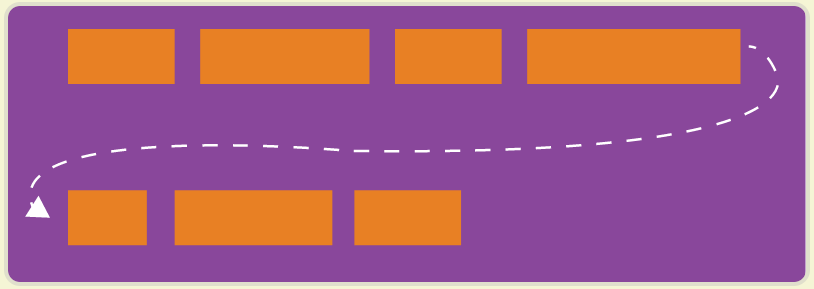
2. flex-wrap 属性
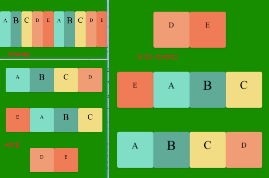
flex-wrap 默认情况下,项目都排在一条线(又称"轴线")上。flex-wrap属性定义,如果一条轴线排不下,如何换行。
.box{
flex-wrap: nowrap | wrap | wrap-reverse;
}
# 它可能取三个值。
nowrap (默认):不换行。
wrap :换行,第一行在上方。
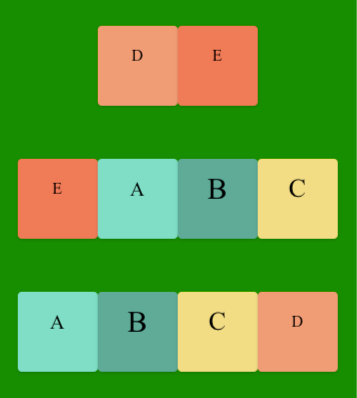
wrap-reverse:换行,第一行在下方。
- nowrap(默认):不换行。
- wrap:换行,第一行在上方。
- wrap-reverse:换行,第一行在下方。
示例:
代码如下:
<!DOCTYPE html>
<html lang="en">
<head>
    <meta charset="UTF-8">
    <meta name="viewport" content="width=device-width, initial-scale=1.0">
    <title>Document</title>
</head>
<body>
	<div class="flex-container">
		<div class="box A">A</div>
		<div class="box B">B</div>
		<div class="box C">C</div>
		<div class="box D">D</div>
		<div class="box E">E</div>
		<div class="box A">A</div>
		<div class="box B">B</div>
		<div class="box C">C</div>
		<div class="box D">D</div>
		<div class="box E">E</div>
	</div>

</body>
<style>
.flex-container{
	margin-top: 300px;
	background-color: green;
	height: 400px;
	display: flex;
	/* 设置为flex布局 */
	flex-direction:row;
	justify-content: center;
	align-items: center;
	flex-wrap: wrap;
}
.box{
	/* margin: 0 10px; */
	width: 80px;  /*父级设置了flex-wrap:nowrap后,项目里的宽高就没有用了 */
	height: 80px;
    background-color: #eee;
	text-align: center;
	line-height: 60px;
	border-radius: 4px;
	box-shadow: 0px 1px 3px rgb(0,0,0,.18);
	font-size: 1em;
}
/* 任何一个容器都可以指定为 Flex 布局。 */
.A {
	background-color: #6dd9bf;
	font-size:20px;
	}
.B {
	background-color: #50A18E;
	font-size:30px;
	}
.C {
	background-color: #F2D680;
	font-size:26px;
	}
.D {background-color: #F2916D;}
.E {background-color: #F26E50;}
/* .box{
  display: flex;
  justify-content: center;
  align-items: center;
} */
</style>
</html>
3. flex-flow属性
flex-flow属性 是flex-direction属性和flex-wrap属性的简写形式,默认值为row nowrap。
.box {
  flex-flow: <flex-direction> || <flex-wrap>;
}

.box {
/* 	flex-direction:row; //水平方向
	flex-wrap: wrap-reverse; //换行 */
	flex-flow: row wrap-reverse;
}
示例:
<!DOCTYPE html>
<html lang="en">
<head>
    <meta charset="UTF-8">
    <meta name="viewport" content="width=device-width, initial-scale=1.0">
    <title>Document</title>
</head>
<body>
	<div class="flex-container">
		<div class="box A">A</div>
		<div class="box B">B</div>
		<div class="box C">C</div>
		<div class="box D">D</div>
		<div class="box E">E</div>
		<div class="box A">A</div>
		<div class="box B">B</div>
		<div class="box C">C</div>
		<div class="box D">D</div>
		<div class="box E">E</div>
	</div>

</body>
<style>
.flex-container{
	margin-top: 300px;
	background-color: green;
	height: 400px;
	display: flex;
	/* 设置为flex布局 */
/* 	flex-direction:row; //水平方向
	flex-wrap: wrap-reverse; //换行 */
	flex-flow: row wrap-reverse;
	justify-content: center;
	align-items: center;
}
.box{
	/* margin: 0 10px; */
	width: 80px;
	height: 80px;
    background-color: #eee;
	text-align: center;
	line-height: 60px;
	border-radius: 4px;
	box-shadow: 0px 1px 3px rgb(0,0,0,.18);
	font-size: 1em;
}
/* 任何一个容器都可以指定为 Flex 布局。 */
.A {
	background-color: #6dd9bf;
	font-size:20px;
	}
.B {
	background-color: #50A18E;
	font-size:30px;
	}
.C {
	background-color: #F2D680;
	font-size:26px;
	}
.D {background-color: #F2916D;}
.E {background-color: #F26E50;}
/* .box{
  display: flex;
  justify-content: center;
  align-items: center;
} */
</style>
</html>
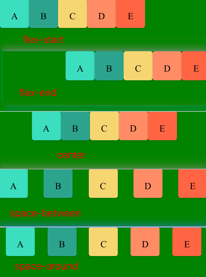
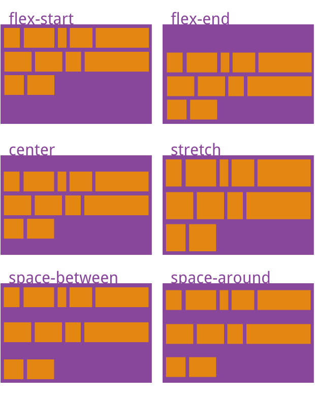
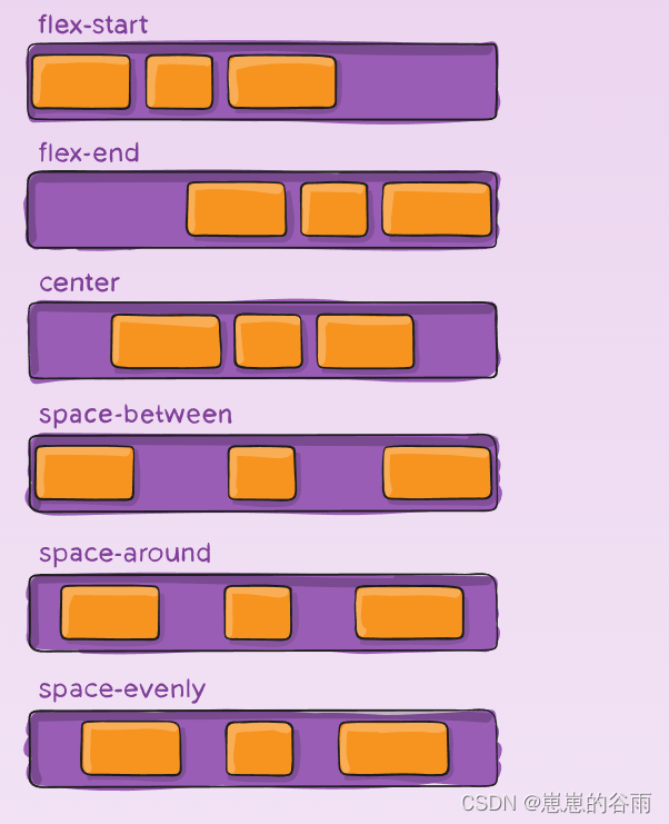
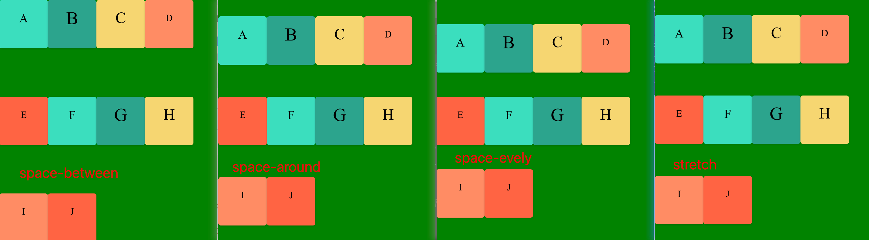
4. justify-content 属性
justify-content 定义了项目在主轴上(水平对齐)的对齐方式, 既行对齐 上 中 下等。
.box {
justify-content: flex-start | flex-end | center | space-between | space-around;
}
对齐类:
1. flex-start(默认值):左对齐
2. flex-end:右对齐
3. center: 居中
分布类:
4. space-between:两端对齐,项目之间的间隔都相等。
5. space-around:每个项目两侧的间隔相等。所以,项目之间的间隔比项目与边框的间隔大一倍。
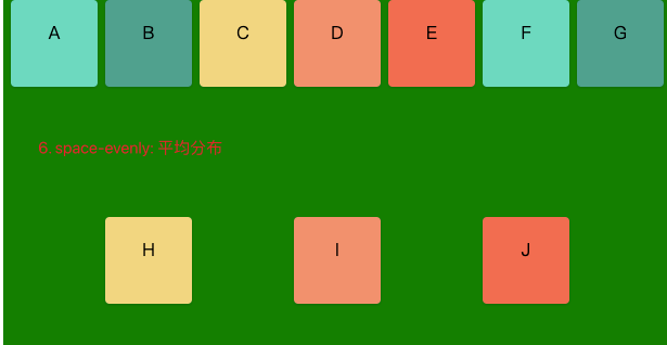
6. space-evenly: 平均分布,所有间距完全相等
示例:
<!DOCTYPE html>
<html lang="en">

<head>
	<meta charset="UTF-8">
	<meta name="viewport" content="width=device-width, initial-scale=1.0">
	<title>Document</title>
</head>

<body>
	<div class="flex-container">
		<div class="box A">A</div>
		<div class="box B">B</div>
		<div class="box C">C</div>
		<div class="box D">D</div>
		<div class="box E">E</div>
		<div class="box A">F</div>
		<div class="box B">G</div>
		<div class="box C">H</div>
		<div class="box D">I</div>
		<div class="box E">J</div>
	</div>

</body>


<!--
.box {
  justify-content: flex-start | flex-end | center | space-between | space-around;
}

1. flex-start(默认值):左对齐
2. flex-end:右对齐
3. center: 居中
4. space-between:两端对齐,项目之间的间隔都相等。
5. space-around:每个项目两侧的间隔相等。所以,项目之间的间隔比项目与边框的间隔大一倍。
6. space-evenly: 平均分布
}
 -->


<style>
	.flex-container {
		margin-top: 200px;
		background-color: green;
		height: 400px;
		display: flex;
		/* 设置为flex布局 */
		/* flex-direction: row;
		flex-wrap: wrap; */
		flex-flow: row wrap;
        justify-content:space-evenly

	}

	.box {
		/* margin:  10px; */
		width: 80px;
		height: 80px;
		background-color: #eee;
		text-align: center;
		line-height: 60px;
		border-radius: 4px;
		box-shadow: 0px 1px 3px rgb(0, 0, 0, .18);
		font-size: 1em;
	}

	/* 任何一个容器都可以指定为 Flex 布局。 */
	.A {
		background-color: #6dd9bf;
		/* font-size: 20px; */
	}

	.B {
		background-color: #50A18E;
		/* font-size: 30px; */
	}

	.C {
		background-color: #F2D680;
		/* font-size: 26px; */
	}

	.D {
		background-color: #F2916D;
	}

	.E {
		background-color: #F26E50;
	}

	/* .box{
  display: flex;
  justify-content: center;
  align-items: center;
} */
</style>

</html>
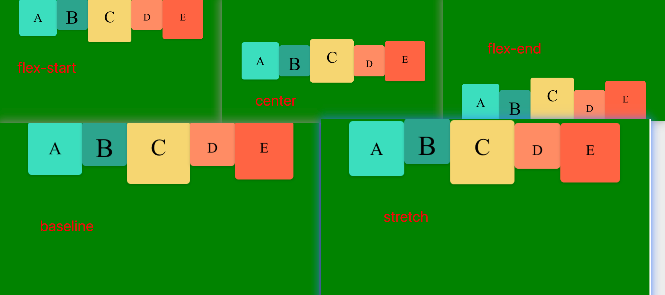
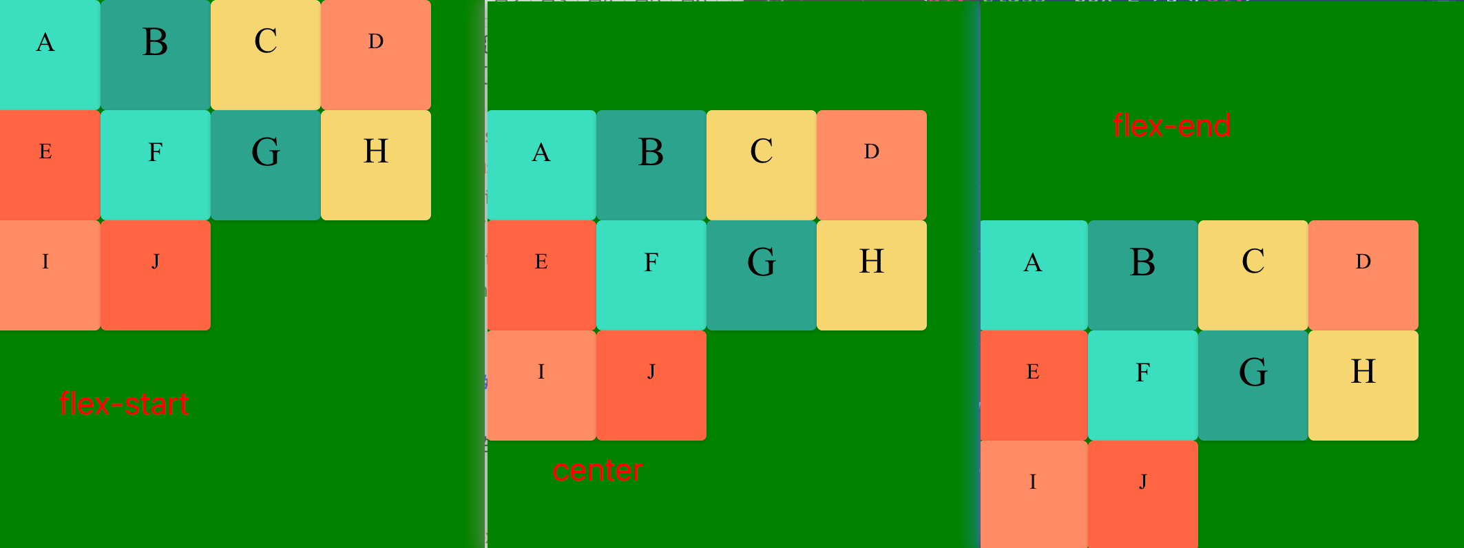
5. align-items 属性
align-items 定义项目在交叉轴上(垂直对齐)的对齐方式 既列 左 中 边等
.box {
  align-items: flex-start | flex-end | center | baseline | stretch;
}
1. flex-start:交叉轴的起点对齐。
2. flex-end:交叉轴的终点对齐。
3. center:交叉轴的中点对齐。
4. baseline: 项目的第一行文字的基线对齐。
5. stretch(默认值):如果项目未设置高度或设为auto,将占满整个容器的高度。
<!DOCTYPE html>
<html lang="en">

<head>
	<meta charset="UTF-8">
	<meta name="viewport" content="width=device-width, initial-scale=1.0">
	<title>Document</title>
</head>

<body>
	<div class="flex-container">
		<div class="box A">A</div>
		<div class="box B">B</div>
		<div class="box C">C</div>
		<div class="box D">D</div>
		<div class="box E">E</div>
		<div class="box A">F</div>
		<div class="box B">G</div>
		<div class="box C">H</div>
		<div class="box D">I</div>
		<div class="box E">J</div>
	</div>

</body>


<!--
.box {
  align-items: flex-start | flex-end | center | baseline | stretch;
}
1. flex-start:交叉轴的起点对齐。
2. flex-end:交叉轴的终点对齐。
3. center:交叉轴的中点对齐。
4. baseline: 项目的第一行文字的基线对齐。
5. stretch(默认值):如果项目未设置高度或设为auto,将占满整个容器的高度。
 -->


<style>
	.flex-container {
		margin-top: 200px;
		background-color: green;
		height: 400px;
		display: flex;
		/* 设置为flex布局 */
		/* flex-direction: row;
		flex-wrap: wrap; */
		flex-flow: row wrap;
        /* justify-content:space-evenly; */
		align-items:baseline;

	}

	.box {
		/* margin:  10px; */
		width: 80px;
		height: 80px;
		background-color: #eee;
		/* text-align: center;
		line-height: 60px; */
		border-radius: 4px;
		box-shadow: 0px 1px 3px rgb(0, 0, 0, .18);
		font-size: 1em;
	}

	/* 任何一个容器都可以指定为 Flex 布局。 */
	.A {background-color: #6dd9bf;font-size:20px;}
.B {background-color: #50A18E;font-size:30px;}
.C {background-color: #F2D680;font-size:26px;}
.D {background-color: #F2916D;}
.E {background-color: #F26E50;}

	/* .box{
  display: flex;
  justify-content: center;
  align-items: center;
} */
</style>

</html>
stretch(默认值):如果项目未设置高度或设为auto,将占满整个容器的高度。
代码如下
<!DOCTYPE html>
<html lang="en">

<head>
	<meta charset="UTF-8">
	<meta name="viewport" content="width=device-width, initial-scale=1.0">
	<title>Document</title>
</head>

<body>
	<div class="flex-container">
		<div class="box A">A</div>
		<div class="box B">B</div>
		<div class="box C">C</div>
		<div class="box D">D</div>
		<div class="box E">E</div>
		<div class="box A">F</div>
		<div class="box B">G</div>
		<div class="box C">H</div>
		<div class="box D">I</div>
		<div class="box E">J</div>
	</div>

</body>


<!--
.box {
  align-items: flex-start | flex-end | center | baseline | stretch;
}
1. flex-start:交叉轴的起点对齐。
2. flex-end:交叉轴的终点对齐。
3. center:交叉轴的中点对齐。
4. baseline: 项目的第一行文字的基线对齐。
5. stretch(默认值):如果项目未设置高度或设为auto,将占满整个容器的高度。
 -->


<style>
	.flex-container {
		margin-top: 200px;
		background-color: green;
		height: 400px;
		display: flex;
		/* 设置为flex布局 */
		/* flex-direction: row;
		flex-wrap: wrap; */
		flex-flow: row wrap;
		/* justify-content:space-evenly; */
		align-items: stretch;

	}

	.box {
		/* margin:  10px; */
		/* width: 80px;  */
		/* height: 80px; */
		background-color: #eee;
		/* text-align: center;
		line-height: 60px; */
		border-radius: 4px;
		box-shadow: 0px 1px 3px rgb(0, 0, 0, .18);
		font-size: 1em;
	}

	/* 任何一个容器都可以指定为 Flex 布局。 */
	.A {
		background-color: #6dd9bf;
		font-size: 20px;
	}

	.B {
		background-color: #50A18E;
		font-size: 30px;
	}

	.C {
		background-color: #F2D680;
		font-size: 26px;
	}

	.D {
		background-color: #F2916D;
	}

	.E {
		background-color: #F26E50;
	}

	/* .box{
  display: flex;
  justify-content: center;
  align-items: center;
} */
</style>

</html>
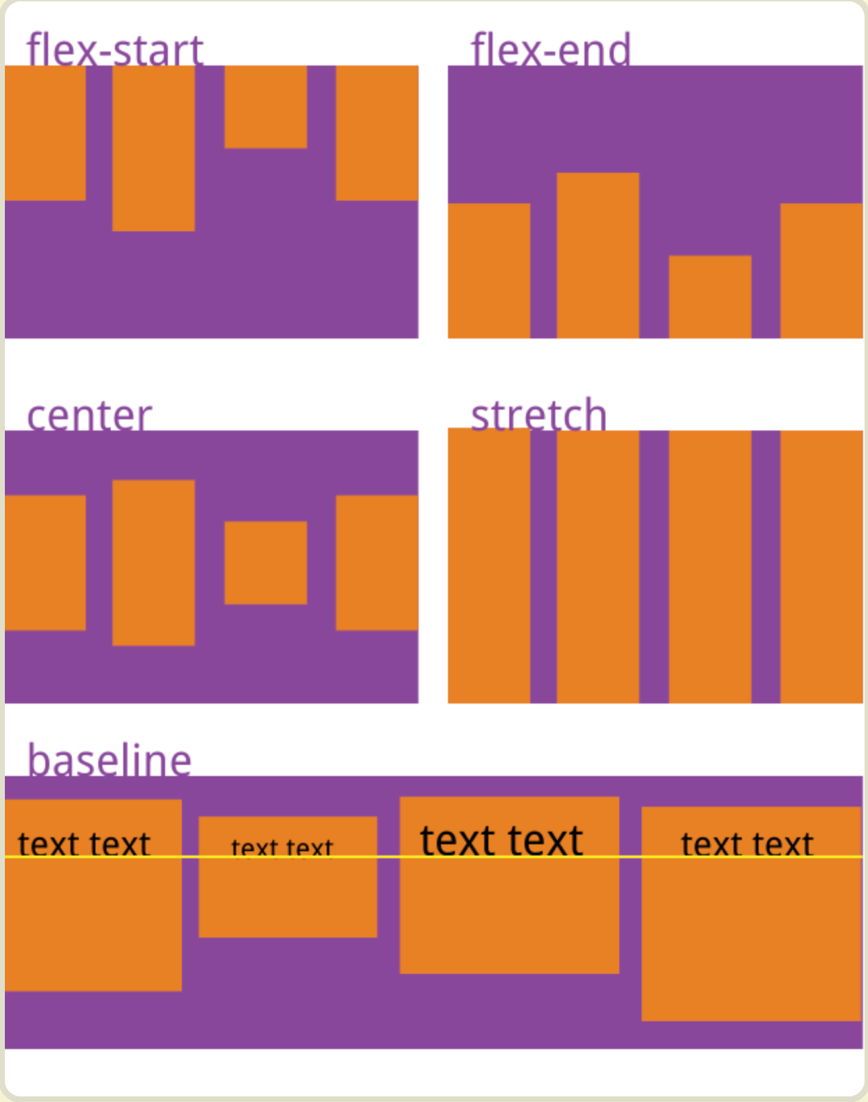
6. align-content 定义了多根轴线的对齐方式。如果项目只有一根轴线,该属性不起作用。
属性可能取6个值。
.box {
  align-content: flex-start | flex-end | center | space-between | space-around | space-evenly | stretch ;
}
1. flex-start:与交叉轴的起点对齐。
2. flex-end:与交叉轴的终点对齐。
3. center:与交叉轴的中点对齐。
4. space-between:与交叉轴两端对齐,第一项在起始行,最后一项在结束行,轴线之间的间隔平均分布,
5. space-around:每根轴线两侧的间隔都相等。所以,轴线之间的间隔比轴线与边框的间隔大一倍。
6. space-evenly:项目分布使得任何两个项目之间的间距(以及边缘的空间)相等。
7. stretch(默认值):(项目不设置高度时)轴线占满整个交叉轴。
<!DOCTYPE html>
<html lang="en">
<head>
    <meta charset="UTF-8">
    <meta name="viewport" content="width=device-width, initial-scale=1.0">
    <title>Document</title>
</head>
<body>
	<div class="flex-container">
		<div class="box A">A</div>
		<div class="box B">B</div>
		<div class="box C">C</div>
		<div class="box D">D</div>
		<div class="box E">E</div>
		<div class="box A">F</div>
		<div class="box B">G</div>
		<div class="box C">H</div>
		<div class="box D">I</div>
		<div class="box E">J</div>
	</div>

</body>
<style>
.flex-container{
	margin-top: 200px;
	background-color: green;
	height: 400px;
	display: flex;
	/* 设置为flex布局 */
/* 	flex-direction:row; //水平方向
	flex-wrap: wrap-reverse; //换行 */
	flex-flow: row wrap;
/* 	justify-content: flex-start;
    align-items: center; */
	align-content: space-between;
}
.box{
	/* margin:  10px; */
	width: 80px;
	height: 80px;
    background-color: #eee;
	text-align: center;
	line-height: 60px;
	border-radius: 4px;
	box-shadow: 0px 1px 3px rgb(0,0,0,.18);
	font-size: 1em;
}
/* 任何一个容器都可以指定为 Flex 布局。 */
.A {
	background-color: #6dd9bf;
	font-size:20px;
	}
.B {
	background-color: #50A18E;
	font-size:30px;
	}
.C {
	background-color: #F2D680;
	font-size:26px;
	}
.D {background-color: #F2916D;}
.E {background-color: #F26E50;}
/* .box{
  display: flex;
  justify-content: center;
  align-items: center;
} */
</style>
</html>
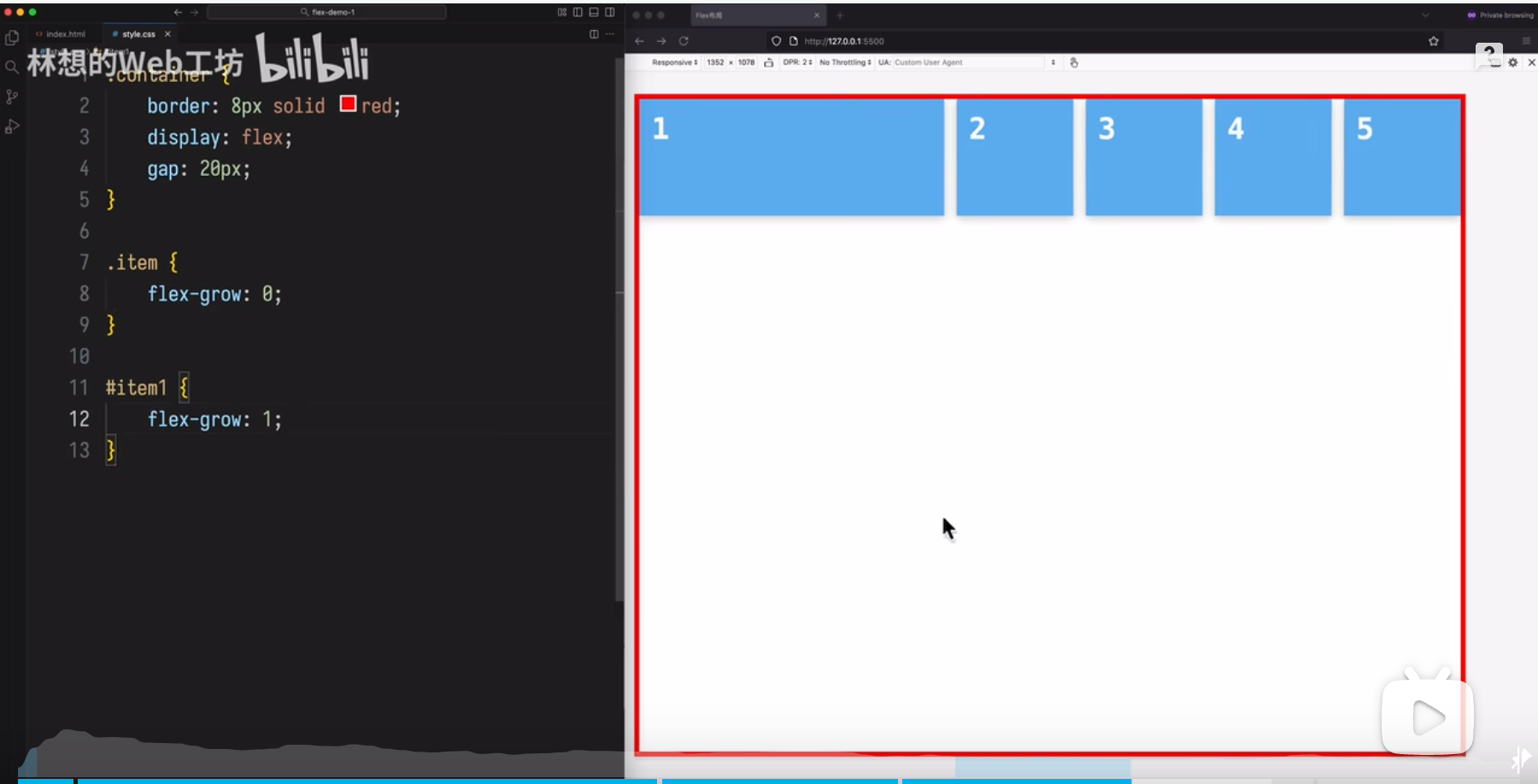
7.gap
在 Flex 布局中,gap 属性用于在子元素之间创建统一的间距,它非常简洁高效,是设置 Flex 子元素间距的推荐方式。
基本用:
启用 Flex 布:首先需要将容器设置为 display: flex。
设置 gap:在容器上直接设置 gap 属性,可以是单值或双值。
单值:gap: 10px; 会同时设置行间距和列间距为 10px。
双值:gap: 10px 15px; 第一个值设置行间距(交叉轴方向),第二个值设置列间距(主轴方向)。
关键特性:
自动间距:gap 会自动在所有子元素之间添加间距,无需为每个子元素单独设置 margin。
避免多余边距:与使用 margin 的方式不同,gap 不会在容器的边缘产生额外的间距,避免了首行/首列前或末行/末列后出现多余空白的问题。
换行处理:当使用 flex-wrap: wrap 时,gap 会自动应用在行与行、列与列之间。
方向控制:gap 的作用方向取决于主轴和交叉轴。主轴方向的间距由 column-gap 控制(即使主轴是垂直的,规范仍称其为“column”),交叉轴方向的间距由 row-gap 控制。
响应式:gap 支持响应式单位(如 rem、%、fr),便于创建灵活的布局。
示例
.flex-container {
  display: flex;
  flex-wrap: wrap; /* 允许换行 */
  gap: 10px 15px; /* 行间距 10px,列间距 15px */
}

.flex-item {
  flex: 1 1 200px; /* 示例:弹性增长,基础宽度 200px */
  /* 不需要额外的 margin */
}
与 margin 的对比:
使用 margin 设置间距时,需要考虑换行情况,并且容易在首尾元素产生多余边距。
gap 提供了更简洁、更可控的解决方案,避免了这些常见问题。
兼容性:
gap 属性在现代浏览器中得到了广泛支持。
对于旧版 Safari 等浏览器,可能需要使用 -webkit-gap 前缀。
总之,gap 是在 Flex 布局中设置子元素间距的高效、干净的方式,特别适用于需要统一控制项目间间距的场景。
四、项目的属性
以下6个属性设置在项目上。
1. order
2. flex-grow
3. flex-shrink
4. flex-basis
5. flex
6. align-self
4.1 order属性
order属性定义项目的排列顺序。数值越小,排列越靠前,默认为0。
.item {
  order: <integer>;
}
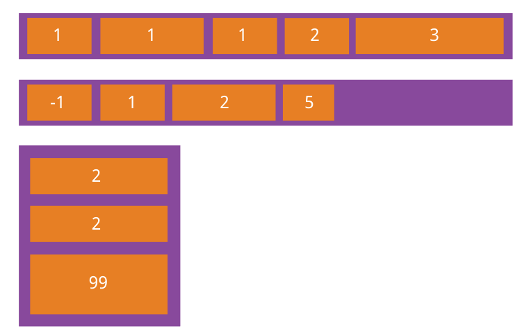
4.2 flex-grow属性
flex-grow属性定义项目的放大比例,默认为0,即如果存在剩余空间,也不放大。
flex-grown属性定义了父元素在空间分配方向上剩余空闲时,如何分配剩余空间。
.item {
  flex-grow: <number>; /* default 0 */
}
如果所有项目的flex-grow属性都为1,则它们将等分剩余空间(如果有的话)。如果一个项目的flex-grow属性为2,其他项目都为1,则前者占据的剩余空间将比其他项多一倍。
计算公式:


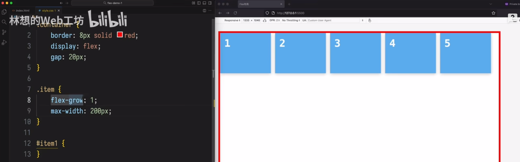
场景1:
第一个 item增长,其它 的都不增加
场景 2
item会增长,但第个项目不能超过 200px
场景 3
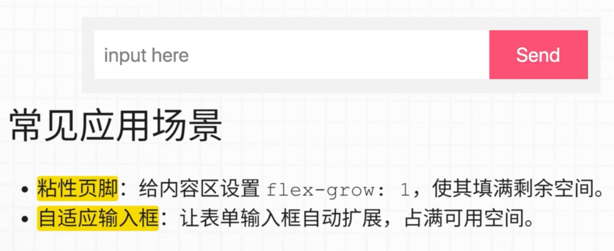
让 input框自动扩展占满剩余空间
场景 4
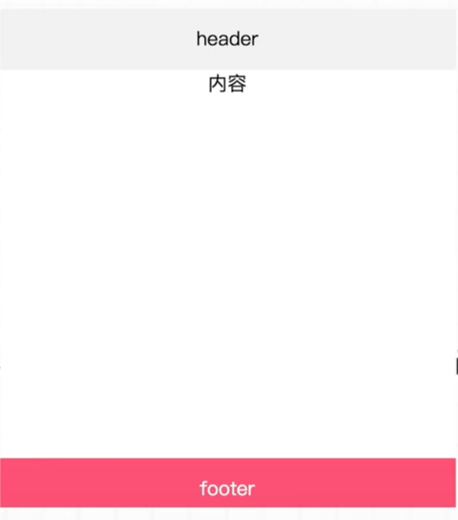
内容设置为flex-grow:1,就会把 footer 推送到最下面。
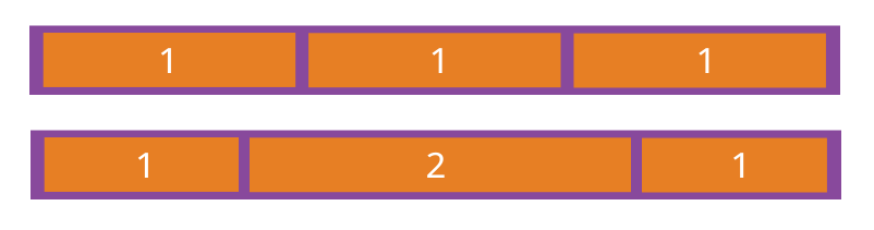
4.3 flex-shrink属性
flex-shrink属性定义了项目的缩小比例,默认为1,即如果空间不足,该项目将缩小。
.item {
  flex-shrink: <number>; /* default 1 */
}
如果所有项目的flex-shrink属性都为1,当空间不足时,都将等比例缩小。如果一个项目的flex-shrink属性为0,其他项目都为1,则空间不足时,前者不缩小。
负值对该属性无效。
如果不想让项目缩小,可以设置flex-shrink:0 或者 min-width:200px (这里给个最小值)
计算公式:

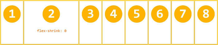
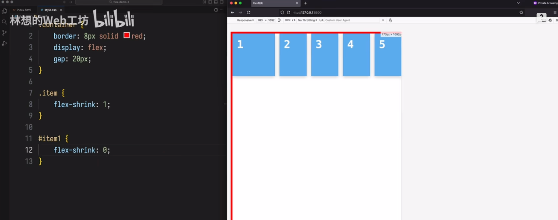
场景 1
第一个不收缩,其它的都收缩。
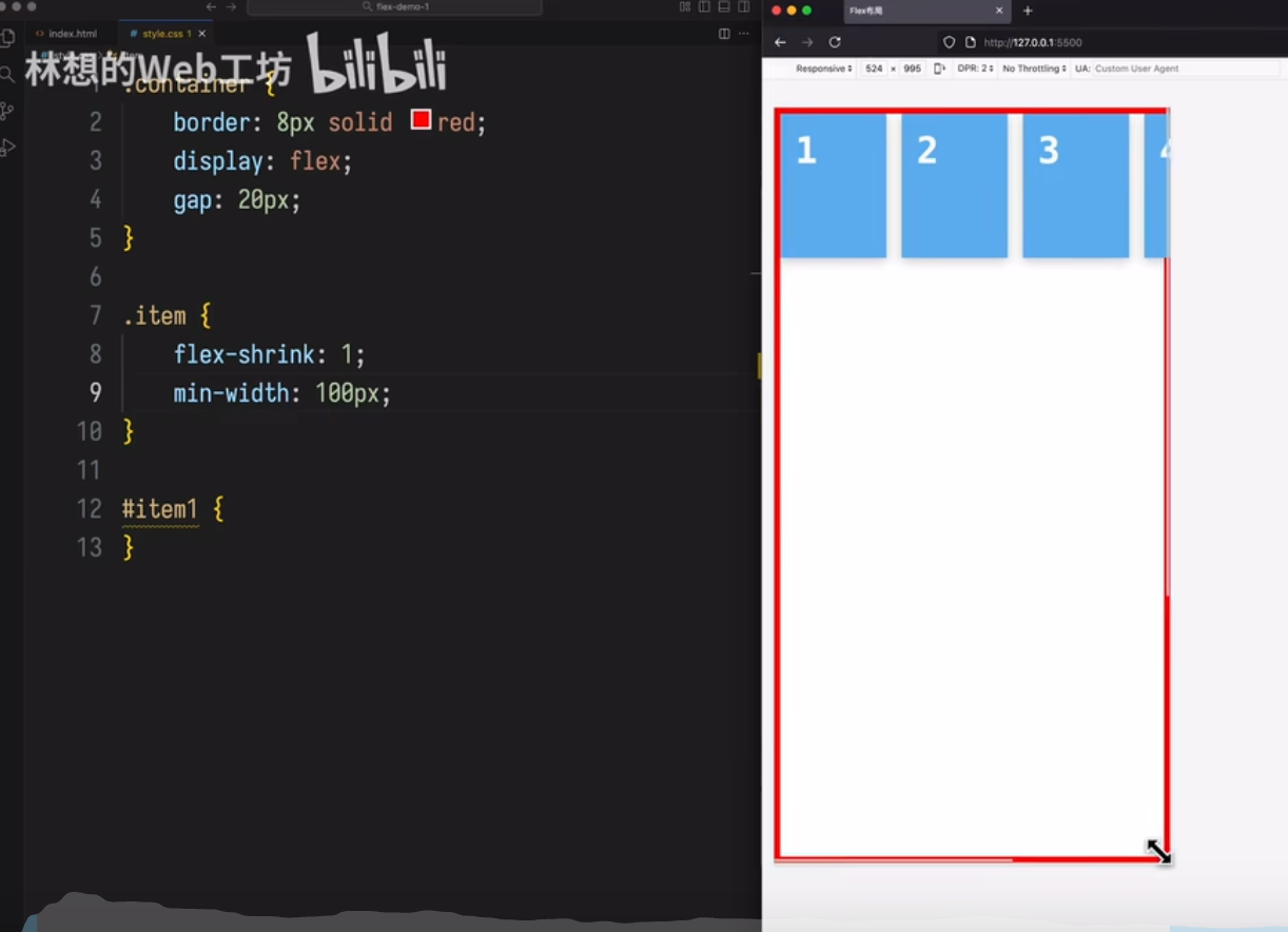
场景 2
item 宽度最小收缩不能小于 100px,
当容器宽度过小时,item会溢出
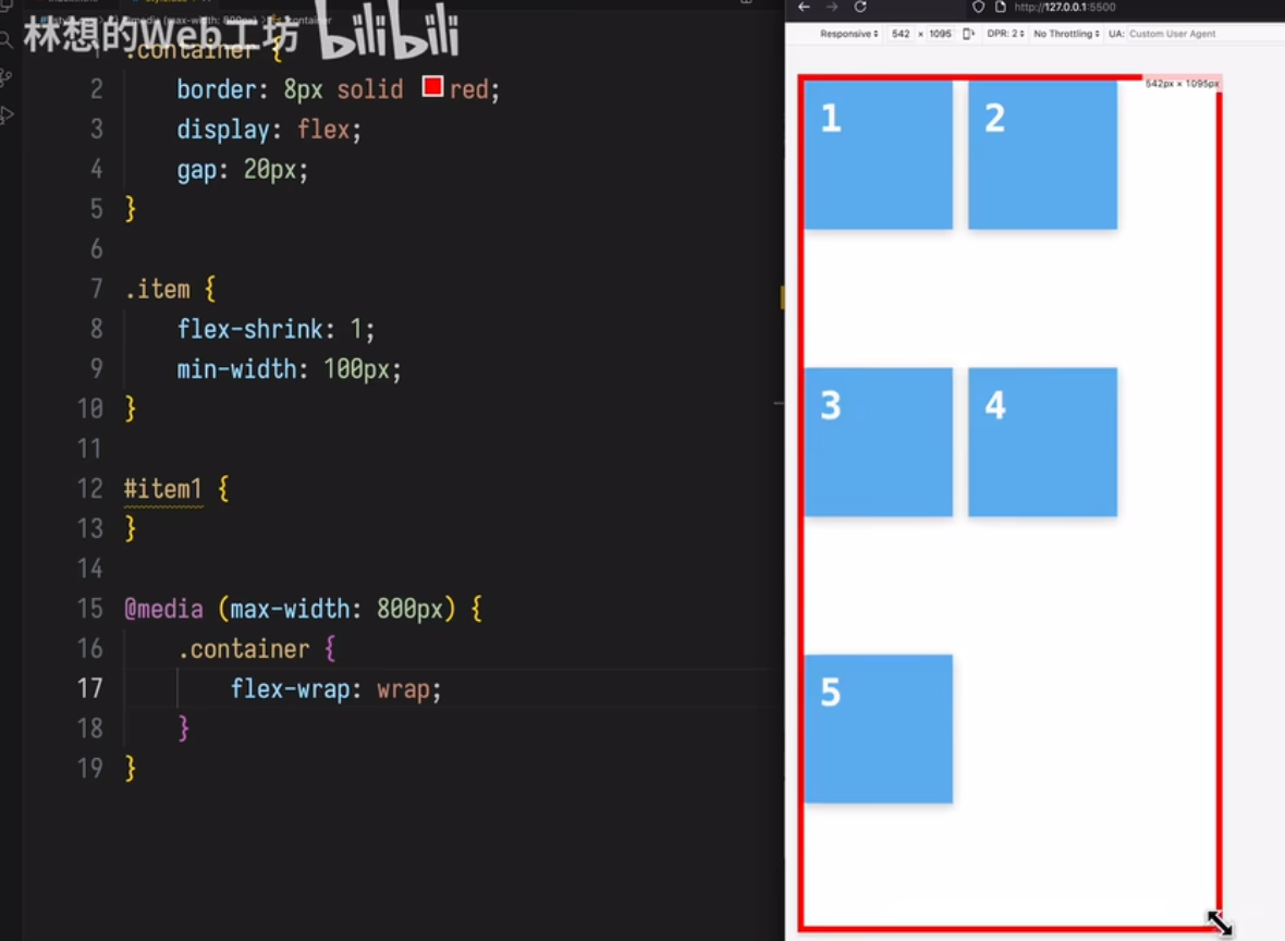
场景 3
item 宽度最小收缩不能小于 100px,
当容器宽度小于 800px时,item可以换行
4.4 flex-basis属性
flex-basis属性定义了在分配多余空间之前,项目占据的主轴空间(main size)。浏览器根据这个属性,计算主轴是否有多余空间。它的默认值为auto,即项目的本来大小。
flex-basis指定了 flex 元素在主轴方向上的初始大小,是所有增长和增长和收缩计算的起点。
.item {
  flex-basis: <length> | auto; /* default auto */
}
它可以设为跟width或height属性一样的值(比如350px),则项目将占据固定空间。
尺寸优先级顺序
- max-width/min-width
- flex-basis
- width
- box 内容尺寸
4.5 flex属性
flex属性是flex-grow, flex-shrink 和 flex-basis的简写,默认值为0 1 auto。后两个属性可选。
.item {
  flex: none | [ <'flex-grow'> <'flex-shrink'>? || <'flex-basis'> ]
}
该属性有两个快捷值:auto (1 1 auto) 和 none (0 0 auto)。
建议优先使用这个属性,而不是单独写三个分离的属性,因为浏览器会推算相关值。
flex: 1
/* 等价于 flex-grow: 1; flex-shrink: 1; flex-basis: 0%; */
当 flex: 1 时,如果窗口空间有剩余时,会等比例扩大,如果容器空间不足,这些项目会缩小。
flex: 1 实际上是 flex-grow: 1, flex-shrink: 1, flex-basis: 0% 的简写。其中 flex-shrink: 1 表示当容器空间不足时,该项目会按照默认的收缩比例进行缩小。
具体来说:
默认收缩:所有项目的 flex-shrink 属性默认为 1。如果容器空间不足,所有 flex-shrink 为 1 的项目会等比例地缩小。
收缩比例:如果一个项目的 flex-shrink 属性为 0,而其他项目为 1,那么空间不足时,flex-shrink 为 0 的项目不会缩小。
因此,当容器空间不足时,设置为 flex: 1 的项目会根据其 flex-shrink 属性(默认为 1)进行收缩。
**min-width & max-width **
限制元素增长收缩的程度
.flex-item {
	flex: 1 1 auto; /* 允许item收缩 */
	min-width: 0; /* 允许item的宽度收缩到小于其内容的固有宽度 */
	max-width:900px;/* 允许item的宽度放大到最大固有宽度 */
}
flex-basis: 0% 的意思
初始尺寸为:该项目在主轴方向上的初始基准尺寸被设置为0%。这意味着在分配多余空间(flex-grow)或收缩溢出空间(flex-shrink)之前,该项目不会占用任何额外的空间。
忽略内容尺:它会忽略元素内容的实际宽度或高度,不将其作为分配空间的依据。
空间分配:设置为 0% 后,该项目的尺寸完全由 flex-grow 和 flex-shrink 属性决定。所有剩余空间会根据 flex-grow 的值进行分配,或者在空间不足时根据 flex-shrink 的值进行收缩。
简单来说,flex-basis: 0% 会让该项目在布局时“放弃”自身的初始尺寸,把所有空间分配权交给 flex-grow 和 flex-shrink,常用于实现等分容器空间或让项目根据剩余空间自动调整大小的布局。
这与 flex-basis: 0(绝对值)类似,但 0% 是基于父容器尺寸的百分比计算。当容器空间不足时,该项目会根据 flex-shrink 属性进行收缩。
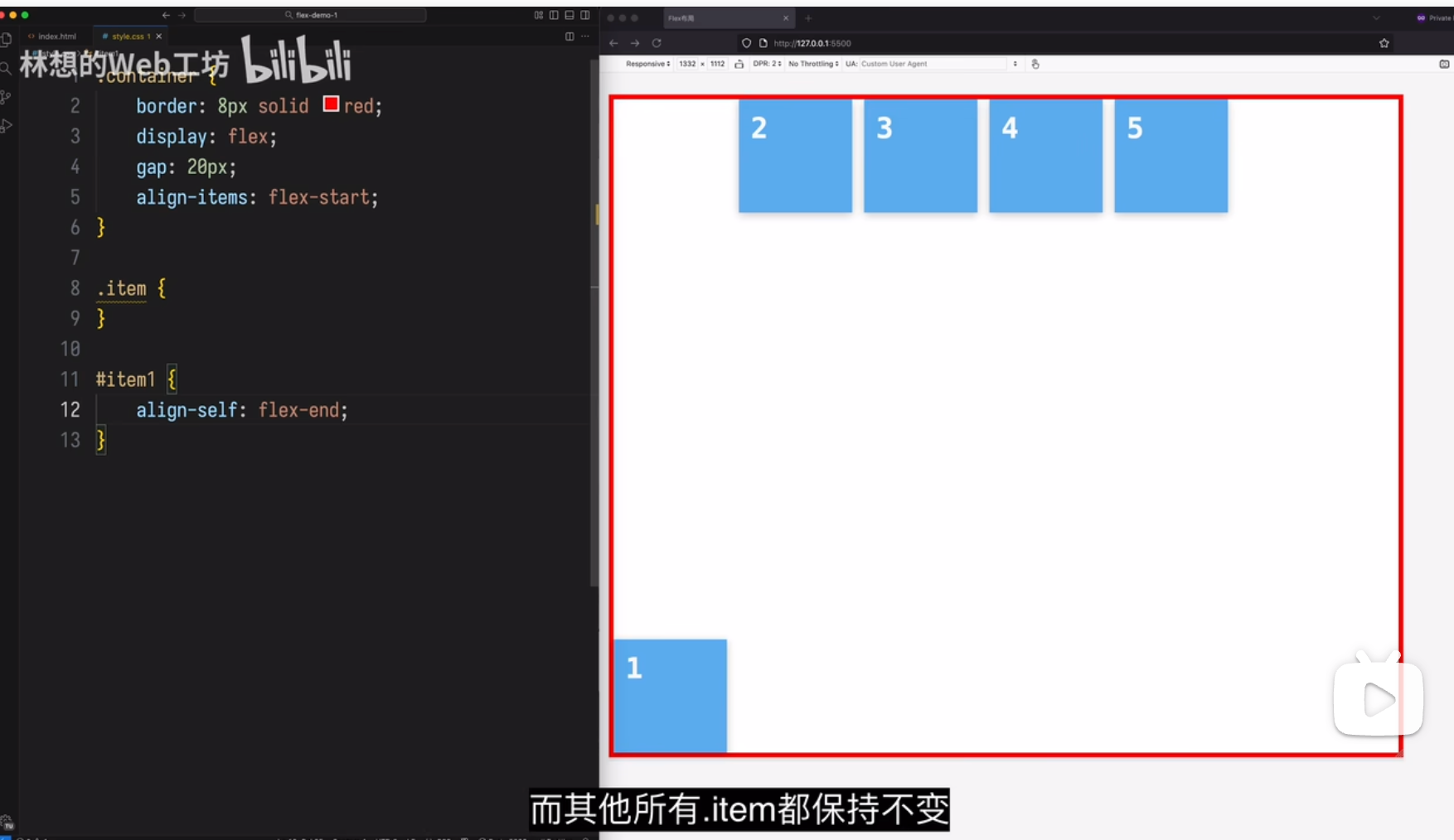
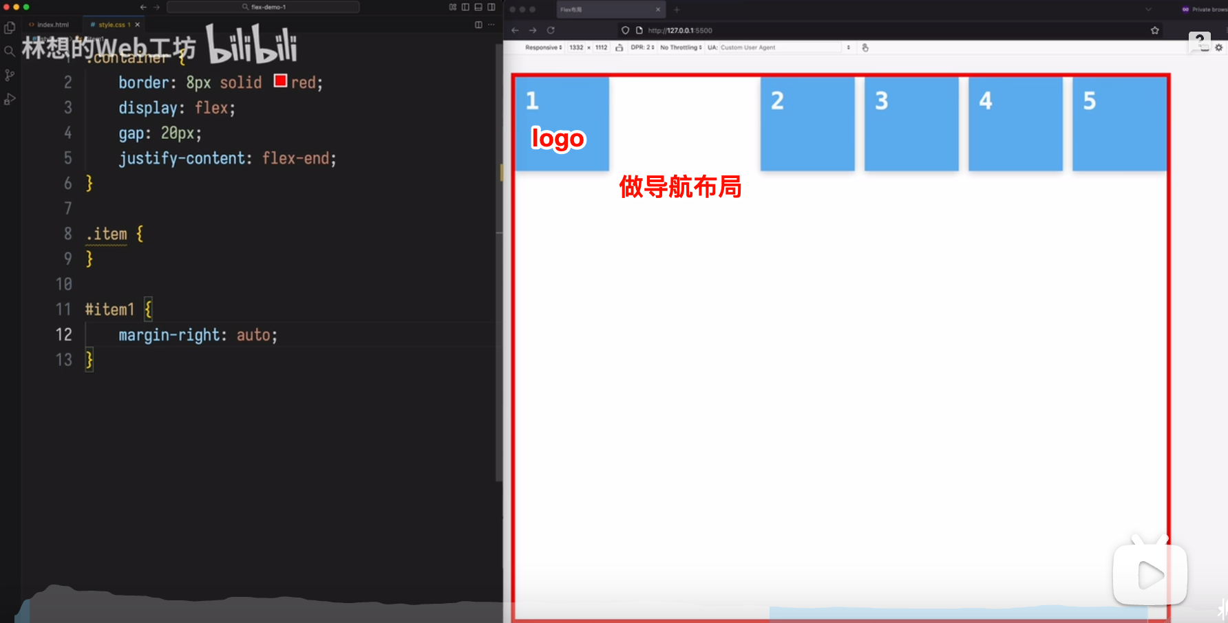
4.6 align-self属性
align-self属性允许单个项目有与其他项目不一样的对齐方式,可覆盖align-items属性。默认值为auto,表示继承父元素的align-items属性,如果没有父元素,则等同于stretch。
.item {
  align-self: auto | flex-start | flex-end | center | baseline | stretch;
}
该属性有两个快捷值:auto (1 1 auto) 和 none (0 0 auto)。
该属性可能取6个值,除了auto,其他都与align-items属性完全一致。
场景1
场景 2
做导航布局
(完)

 浙公网安备 33010602011771号