Python 学习可视化
Python 搭建几个简单app
简单介绍:
- 使用streamlit 来搭建浏览器app
- Streamlit 是一个专为数据科学和机器学习设计的开源 Python 框架,可快速将数据分析脚本转化为交互式 Web 应用
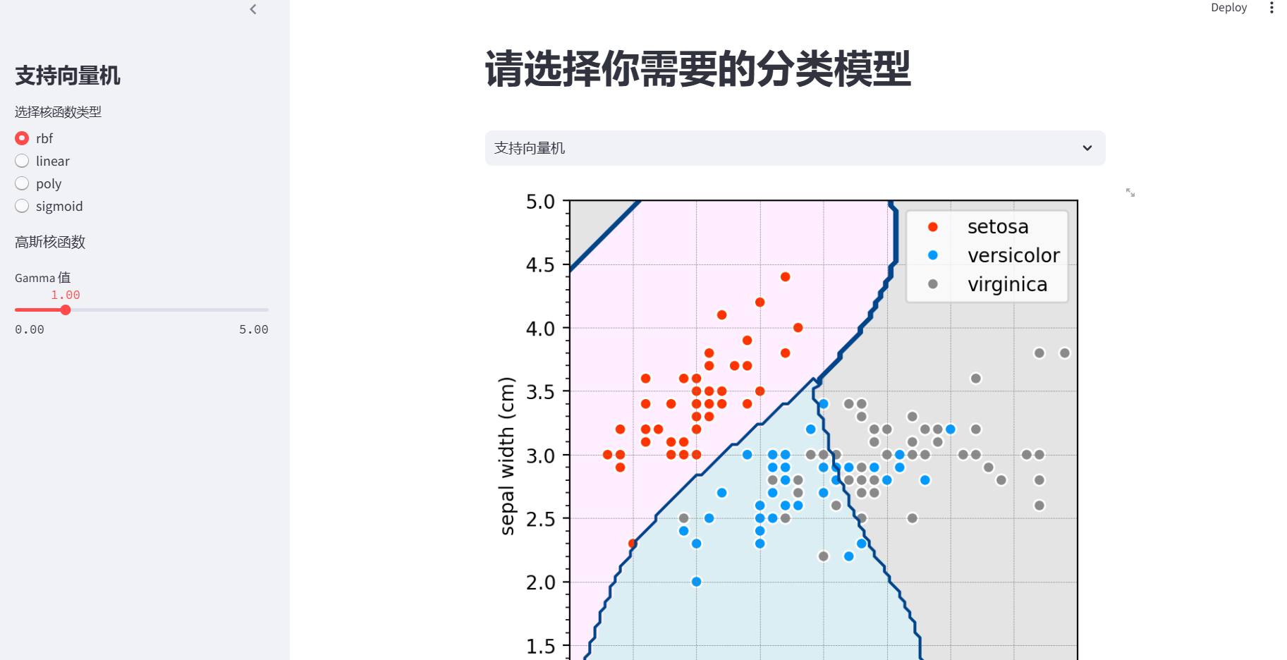
App one
简单介绍:
- 该应用主要包含了两个功能:可视化 支持向量机(SVM) 与 k 近邻(k - NN)两种分类算法在鸢尾花数据集上的分类效果。
- 首先在最开始处理好公共模块与设置对matplotlib.pyplot 的相关格式做出了相关的确定
- 接着提供一个选择控件来进入相应的功能模块,在支持向量机中提供交互界面接受用户提供参数接着开始处理,最后绘图展示;在k 近邻(k - NN)提供相应的参数选项与导入数据紧接着进行可视化处理与展示
import numpy as np
import matplotlib.pyplot as plt
import seaborn as sns
from matplotlib.colors import ListedColormap
from sklearn import neighbors, datasets, svm
import streamlit as st

p = plt.rcParams
#plt.rcParams 是 matplotlib 库中的一个字典对象,
#它包含了 matplotlib 绘图时所使用的各种默认参数设置。
#通过对它的相应键值设置能够统一图像的规格

#设置字体的字体与大小
p["font.sans-serif"] = ["Roboto"]
p["font.weight"] = "light"
# 显示坐标轴的次要刻度
p["ytick.minor.visible"] = True
p["xtick.minor.visible"] = True
# 显示坐标轴网格线
p["axes.grid"] = True
# 设置网格线颜色为灰色(0.5 表示灰色的深浅程度)
p["grid.color"] = "0.5"
# 设置网格线宽度为 0.5
p["grid.linewidth"] = 0.5

# 将两个应用合并故需要进行选择那个应用
# 选择应用程序,使用单选框让用户选择是支持向量机还是 k 近邻分类
#   st.selectbox();将会返回所选的字符串
'#    请选择你需要的分类模型     '#开头
app_choice = st.selectbox('',['支持向量机', 'k 近邻分类'])

if app_choice == '支持向量机':
    # 侧边栏设置,用于用户调整支持向量机的参数
    #   st.sidebar:表示对应用的布局开始
    with st.sidebar:
        st.title('支持向量机')
        # 向量机提供了多种核类型,用户可以从 rbf、linear、poly、sigmoid 中选择
        kernel_type = st.radio('选择核函数类型', ['rbf', 'linear', 'poly', 'sigmoid'])
        if kernel_type == 'rbf':
            # 若选择 rbf 核(高斯核),显示提示信息
            st.write('高斯核函数')
            # 提供滑块让用户调整 Gamma 参数,范围从 0.001 到 5.0,初始值为 1.0,步长为 0.05
            #   st.lider()返回用户选择的数值
            gamma = st.slider('Gamma 值',
                              min_value=0.001,
                              max_value=5.0,
                              value=1.0, step=0.05)
        elif kernel_type == 'poly':
            degree = st.slider('多项式核函数的次数',
                               min_value=1,
                               max_value=10,
                               value=3, step=1)
            gamma = st.slider('Gamma 值',
                              min_value=0.001,
                              max_value=5.0,
                              value=1.0, step=0.05)
        elif kernel_type == 'sigmoid':
            gamma = st.slider('Gamma 值',
                              min_value=0.001,
                              max_value=5.0,
                              value=1.0, step=0.05)
        else:
            # 若选择线性核函数,将 Gamma 值设为 1.0提供后选
            gamma = 1.0
            #gamma是一个重要参数,控制核函数的宽度即数据映射到高纬空间的影响范围
    # 加载鸢尾花数据集
    iris = datasets.load_iris()
    # 选取数据集的前两个特征作为输入特征
    X = iris.data[:, :2]
    # 选取数据集的标签作为目标变量
    y = iris.target
    # 生成网格化数据,用于后续绘制决策边界
    x1_array = np.linspace(4, 8, 101)
    x2_array = np.linspace(1, 5, 101)
    xx1, xx2 = np.meshgrid(x1_array, x2_array)

    # 创建色谱,用于绘制决策区域和数据点
    rgb = [[255, 238, 255],
           [219, 238, 244],
           [228, 228, 228]]
    rgb = np.array(rgb)/255.
    cmap_light = ListedColormap(rgb)
    cmap_bold = [[255, 51, 0],
                 [0, 153, 255],
                 [138,138,138]]
    cmap_bold = np.array(cmap_bold)/255.
    #matplotlib.colors 模块中的一个类,用于创建基于给定颜色列表的颜色映射,将三个小数映射到颜色中。

    # 将网格化数据转换为二维数组,方便用于模型预测
    q = np.c_[xx1.ravel(), xx2.ravel()]

    if kernel_type == 'poly':
        # 若选择多项式核函数,创建支持向量机分类器对象,并指定核类型、Gamma 值和多项式次数
        SVM = svm.SVC(kernel=kernel_type, gamma=gamma, degree=degree)
    else:
        # 若选择其他核函数,创建支持向量机分类器对象,并指定核类型和 Gamma 值
        SVM = svm.SVC(kernel=kernel_type, gamma=gamma)

    # 用训练数据训练支持向量机模型
    SVM.fit(X, y)
    # 用支持向量机分类器对一系列查询点进行预测
    y_predict = SVM.predict(q)
    # 将预测结果转换为与网格化数据相同的形状
    y_predict = y_predict.reshape(xx1.shape)

    # 可视化
    # 创建一个图形和坐标轴对象
    fig, ax = plt.subplots()
    # 绘制决策区域,使用浅色色谱
    plt.contourf(xx1, xx2, y_predict, cmap=cmap_light)
    # 绘制决策边界,使用特定颜色,levels表示绘制的等高线
    plt.contour(xx1, xx2, y_predict, levels=[0, 1, 2],
                colors=np.array([0, 68, 138])/255.)
    # 绘制数据点,根据标签进行颜色区分
    sns.scatterplot(x=X[:, 0], y=X[:, 1],
                    hue=iris.target_names[y],
                    ax=ax,
                    palette=dict(setosa=cmap_bold[0, :],
                                 versicolor=cmap_bold[1, :],
                                 virginica=cmap_bold[2, :]),
                    alpha=1.0,
                    linewidth=1, edgecolor=[1, 1, 1])
    # 设置 x 轴和 y 轴的范围
    plt.xlim(4, 8)
    plt.ylim(1, 5)
    # 设置 x 轴和 y 轴的标签
    plt.xlabel(iris.feature_names[0])
    plt.ylabel(iris.feature_names[1])
    # 设置网格线样式
    ax.grid(linestyle='--', linewidth=0.25,
            color=[0.5, 0.5, 0.5])
    # 设置坐标轴比例为相等
    ax.set_aspect('equal', adjustable='box')
    # 在 Streamlit 中显示图形
    st.pyplot(fig)

elif app_choice == 'k 近邻分类':
    # 侧边栏选项,用于用户调整 k 近邻分类的参数
    with st.sidebar:
        st.title('k 近邻分类')
        # 提供滑块让用户调整 k 值,范围从 2 到 20,初始值为 5,步长为 1
        k_neighbors = st.slider('近邻数量 k',
                                min_value=2,
                                max_value=20,
                                value=5, step=1)
        # 加载鸢尾花数据集
        iris = datasets.load_iris()
        # 获取数据集的特征名称
        feature_names = iris.feature_names
        # 让用户选择横轴使用的特征
        x_axis_feature = st.selectbox('选择横轴特征', feature_names)
        # 让用户选择纵轴使用的特征
        y_axis_feature = st.selectbox('选择纵轴特征', feature_names)

    # 获取所选特征的索引
    x_axis_index = feature_names.index(x_axis_feature)
    y_axis_index = feature_names.index(y_axis_feature)

    # 导入并整理数据,使用所选的两个特征
    X = iris.data[:, [x_axis_index, y_axis_index]]
    y = iris.target

    # 生成网格化数据,方便后续绘制决策边界
    x1_min, x1_max = X[:, 0].min() - 1, X[:, 0].max() + 1
    x2_min, x2_max = X[:, 1].min() - 1, X[:, 1].max() + 1
    x1_array = np.linspace(x1_min, x1_max, 101)
    x2_array = np.linspace(x2_min, x2_max, 101)
    xx1, xx2 = np.meshgrid(x1_array, x2_array)

    rgb = [[255, 238, 255],
           [219, 238, 244],
           [228, 228, 228]]
    rgb = np.array(rgb)/255.
    cmap_light = ListedColormap(rgb)
    cmap_bold = [[255, 51, 0],
                 [0, 153, 255],
                 [138,138,138]]
    cmap_bold = np.array(cmap_bold)/255.

    # 创建 k 近邻分类器对象,并指定 k 值
    kNN = neighbors.KNeighborsClassifier(k_neighbors)
    # 用训练数据训练 k 近邻分类器
    kNN.fit(X, y)
    # 将网格化数据转换为二维数组,用于模型预测
    q = np.c_[xx1.ravel(), xx2.ravel()]
    # 用 k 近邻分类器对一系列查询点进行预测
    y_predict = kNN.predict(q)
    # 将预测结果转换为与网格化数据相同的形状
    y_predict = y_predict.reshape(xx1.shape)

    # 可视化
    # 创建一个图形和坐标轴对象
    fig, ax = plt.subplots()
    # 绘制决策区域,使用浅色色谱
    plt.contourf(xx1, xx2, y_predict, cmap=cmap_light)
    # 绘制决策边界,使用特定颜色
    plt.contour(xx1, xx2, y_predict, levels=[0, 1, 2],
                colors=np.array([0, 68, 138])/255.)
    # 绘制数据点,根据标签进行颜色区分
    sns.scatterplot(x=X[:, 0], y=X[:, 1],
                    #通过hue的值进行分别
                    hue=iris.target_names[y],
                    ax=ax,
                    palette=dict(setosa=cmap_bold[0, :],
                                 versicolor=cmap_bold[1, :],
                                 virginica=cmap_bold[2, :]),
                    alpha=1.0,
                    linewidth=1, edgecolor=[1, 1, 1])
    # 设置 x 轴和 y 轴的范围
    plt.xlim(x1_min, x1_max)
    plt.ylim(x2_min, x2_max)
    # 设置 x 轴和 y 轴的标签
    plt.xlabel(x_axis_feature)
    plt.ylabel(y_axis_feature)
    # 设置网格线样式
    ax.grid(linestyle='--', linewidth=0.25,
            color=[0.5, 0.5, 0.5])
    # 设置坐标轴比例为相等
    ax.set_aspect('equal', adjustable='box')

    # 在 Streamlit 中显示图形
    st.pyplot(fig)
最后实现页面:
注意在本地浏览器查看时:
streamlit run app.py
App two
简单介绍
- 该应用也包含两个基本功能一个是多项式的回归增强线性模型的表达能力,但需警惕过拟合;另一个是对数据主成分分析的可视化,PCA无监督降维,保留数据核心信息,适用于高维数据简化。
- 最开始的情况基本同上,使用 st.selectbox 让用户从 “多项式回归” 和 “国债收益率主成分分析” 中选择一个功能。保持较为简洁的页面
- 在多项式回归中通过对项数以及正则强度来调节回归曲线,拟合又尽量防止过拟合;在主成分分析当中又提供了多个可视化包括时间序列分解、主成分散点图、荷载热力图。因为这三个可视化都用到相同数据所以建立一个相关函数对数据进行处理,使得代码整体更加规范。因本事又含有三个小功能需要对其进行简单封装,故建立一个主函数。
import numpy as np
import matplotlib.pyplot as plt
from sklearn.preprocessing import PolynomialFeatures
from sklearn.linear_model import Ridge
import streamlit as st
import pandas as pd
from pandas_datareader import data as pdr_data
import seaborn as sns
from statsmodels.multivariate.pca import PCA
# 设置 matplotlib 参数
p = plt.rcParams
p["font.sans-serif"] = ["Roboto"]
p["font.weight"] = "light"
p["ytick.minor.visible"] = True
p["xtick.minor.visible"] = True
p["axes.grid"] = True
p["grid.color"] = "0.5"
p["grid.linewidth"] = 0.5

'选择应用程序'
app_choice = st.selectbox('', ['多项式回归', '国债收益率主成分分析'])

if app_choice == '多项式回归':
    st.title("多项式回归")
    # 生成随机数据
    np.random.seed(0)
    num = 30
    #均匀分布产生随机数
    X = np.random.uniform(0, 4, num)
    y = np.sin(0.4 * np.pi * X) + 0.4 * np.random.randn(num)
    data = np.column_stack([X, y])
    x_array = np.linspace(0, 4, 101).reshape(-1, 1)

    with st.sidebar:
        st.title('多项式回归')
        degree = st.slider('多项式次数', 1, 9, 2, 1,
                           #创建提示
                           help='控制模型复杂度,值越大拟合能力越强')
        alpha = st.slider('正则化强度 (α)', 0.0, 10.0, 0.0, 0.1,
                          help='L2正则化系数,值越大抑制过拟合效果越强')

    fig, ax = plt.subplots(figsize=(5, 5))
    #生成多项式其中degree为其项数个数但不确定
    poly = PolynomialFeatures(degree=degree)
    #转换形式将其变为列且开始训练
    X_poly = poly.fit_transform(X.reshape(-1, 1))

    # 使用岭回归
    model = Ridge(alpha=alpha, random_state=0)
    model.fit(X_poly, y)
    y_poly_pred = model.predict(X_poly)
    data_ = np.column_stack([X, y_poly_pred])
    y_array_pred = model.predict(poly.transform(x_array))

    # 绘制图形
    ax.scatter(X, y, s=20, label='Real data')
    ax.scatter(X, y_poly_pred, marker='x', color='k', label='Predicted value')
    ax.plot(x_array, y_array_pred, color='r', label='fitted curve')

    # 添加残差线
    for (xi, yi), (_, yj) in zip(data, data_):
        ax.plot([xi, xi], [yi, yj], c='gray', alpha=0.3)

    # 显示回归方程先常数再次数增大
    equation = f'$y = {model.intercept_:.2f}'
    for j, coef in enumerate(model.coef_[1:], start=1):
        equation += f' + {coef:.2f}x^{j}'
    equation += f'$\n(α={alpha})'

    ax.text(0.05, -1.8, equation, fontsize=10)
    ax.legend(loc='upper right')
    ax.set(xlim=(0, 4), ylim=(-2, 2), aspect='equal')
    ax.grid(False)
    st.pyplot(fig)

elif app_choice == '国债收益率主成分分析':
    # 获取收益率数据
    #建立缓存
    @st.cache_data
    def load_data():
        try:
            df = pdr_data.DataReader(
                ['DGS6MO', 'DGS1', 'DGS2', 'DGS5',
                 'DGS7', 'DGS10', 'DGS20', 'DGS30'],
                data_source='fred',
                start='2022-01-01',
                end='2022-12-31'
            )
            df = df.rename(columns={
                'DGS6MO': '0.5 yr',
                'DGS1': '1 yr',
                'DGS2': '2 yr',
                'DGS5': '5 yr',
                'DGS7': '7 yr',
                'DGS10': '10 yr',
                'DGS20': '20 yr',
                'DGS30': '30 yr'
            })
            #先去空再计算再去空
            return df.dropna().pct_change().dropna()
        except Exception as e:
            st.error(f"数据加载失败: {str(e)}")
            return None

    # 主应用
    def main():
        st.title("国债收益率主成分分析")

        # 加载数据
        X_df = load_data()
        if X_df is None:
            return

        # 侧边栏控件
        with st.sidebar:
            st.title("分析设置")
            num_of_PCs = st.slider("主成分数量", 1, 8, 2, 1,
                                   help="选择要提取的主成分数量")
            plot_type = st.radio("可视化类型", [
                "时间序列分解",
                "主成分散点图",
                "载荷热力图"
            ], index=1)

        # 执行PCA
        pca_model = PCA(X_df, standardize=True, ncomp=num_of_PCs)
        explained_var = pca_model.eigenvals / pca_model.eigenvals.sum()
        # 可视化部分
        if plot_type == "时间序列分解":
            fig, axes = plt.subplots(2, 4, figsize=(10, 5))
            axes = axes.flatten()

            reconstruction = pca_model.project()
            #主成分分析后重建的数据
            for idx, col in enumerate(X_df.columns):
                ax = axes[idx]
                sns.lineplot(data=X_df[col], ax=ax, label='Original', alpha=0.7)
                sns.lineplot(data=reconstruction[col], ax=ax, label='Rebuild')
                ax.set(title=col, xticks=[], yticks=[])
                ax.axhline(0, color='k', linestyle='--', alpha=0.5)
            plt.tight_layout()

        elif plot_type == "主成分散点图":
            #提取主成分一和二
            scores = pca_model.factors.iloc[:, :2]
            fig = plt.figure(figsize=(8, 6))
            sns.scatterplot(
                x=scores.iloc[:, 0],
                y=scores.iloc[:, 1],
                hue=X_df.index.month,
                palette='viridis',
                s=80,
                edgecolor='w',
                linewidth=0.5
            )
            plt.axhline(0, c='0.8', ls='--')
            plt.axvline(0, c='0.8', ls='--')
            plt.xlabel(f"PC1 ({explained_var[0]:.1%})")
            plt.ylabel(f"PC2 ({explained_var[1]:.1%})")
            plt.title("Scatter plot of principal component scores (color represents month)")

        elif plot_type == "载荷热力图":
            #经过处理后的主成分载荷矩阵。
            #对主成分载荷矩阵进行转置操作,使得矩阵的每一行代表一个主成分,每一列代表一个原始变量。
            loadings = pca_model.loadings.T.iloc[:, :num_of_PCs]
            fig, ax = plt.subplots(figsize=(10, 6))
            sns.heatmap(
                loadings,
                annot=True,
                fmt=".2f",
                cmap='coolwarm',
                center=0,
                linewidths=0.5,
                ax=ax
            )
            ax.set_title("Principal component loading matrix")
            ax.set_xlabel("Principal component")
            ax.set_ylabel("Yield curve maturity")
        st.pyplot(fig)

        # 方差解释信息
        st.subheader("方差解释率")

        col1, col2 = st.columns([1, 2])

        with col1:
            #建立帧对象
            var_df = pd.DataFrame({
                '主成分': [f'PC{i + 1}' for i in range(len(explained_var))],
                '解释率': explained_var,
                '累计解释率': np.cumsum(explained_var)
            })
            st.dataframe(
                var_df.style.format({
                    '解释率': '{:.1%}',
                    '累计解释率': '{:.1%}'
                }),
                height=400
            )

        with col2:
            fig_var = plt.figure(figsize=(8, 4))
            plt.bar(var_df['主成分'], var_df['解释率'], label='Explained variance ratio of each component')
            plt.plot(var_df['累计解释率'], 'ro-', label='Cumulative explained variance ratio')
            plt.axhline(0.8, c='0.8', ls='--', label='80% threshold')
            plt.ylim(0, 1.1)
            plt.legend()
            plt.title("Scree plot of variance explanation")
            st.pyplot(fig_var)

    if __name__ == "__main__":
        main()
结果:

App three
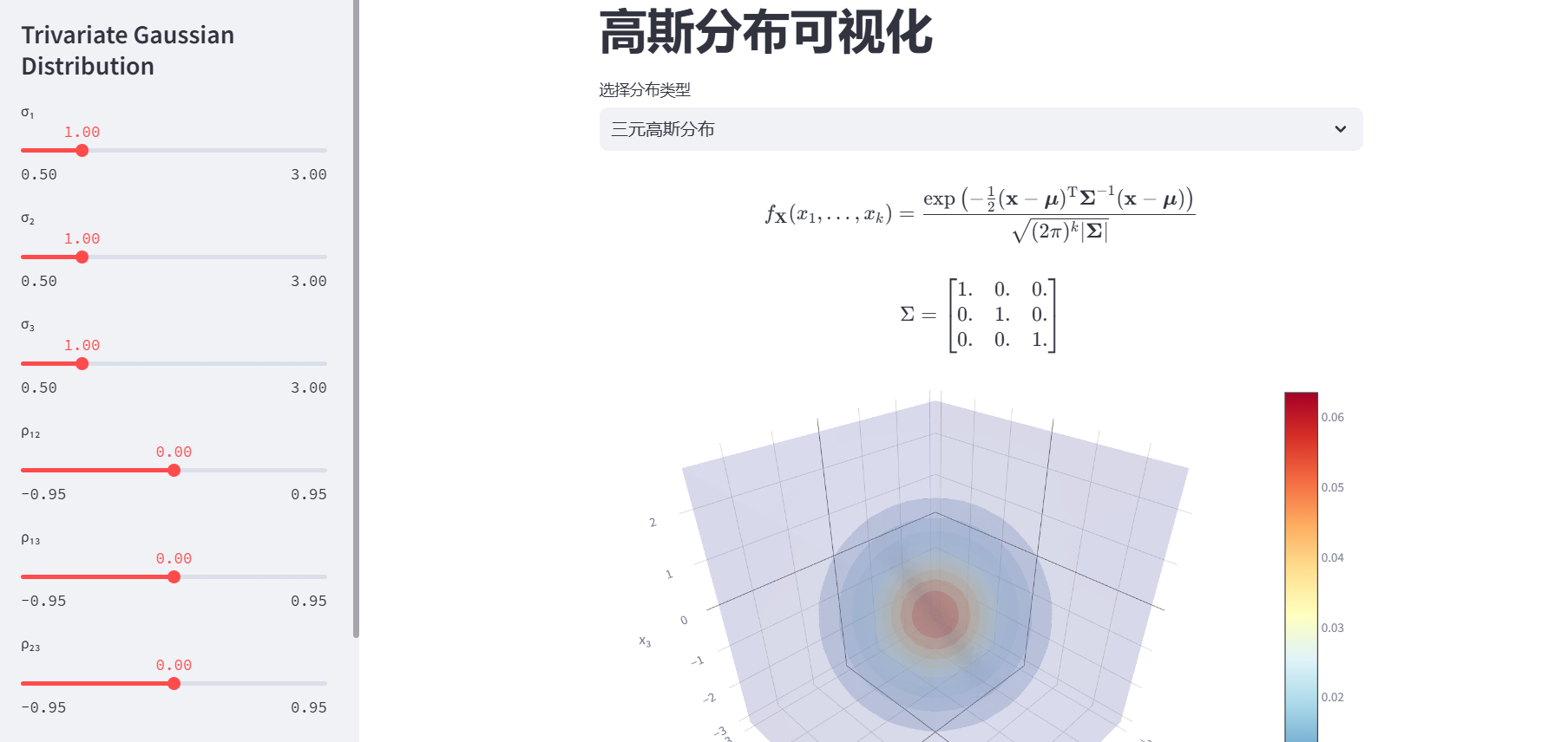
简单介绍:
- 该应用主要是对一、二、三元高斯分布可视化与分析情况的展示
- 一元高斯分布是最简单的正态分布形式,用于描述单个随机变量的概率分布。广泛应用于各种领域,如测量误差分析、学生考试成绩统计、人群身高体重分布等。
- 二元高斯分布用于描述两个随机变量X和Y的联合概率分布。在金融风险评估中,可用于分析两种资产收益率之间的关系;在图像处理中,用于对图像的灰度值分布进行建模等。
- 三元高斯分布用于描述三个随机变量X、Y、Z的联合概率分布。在气象学中,可用于分析温度、湿度、气压等气象要素的联合分布;在机器学习的多变量数据分析中,用于对多个特征之间的关系进行建模等。
import streamlit as st
import numpy as np
import matplotlib.pyplot as plt
from scipy.stats import norm, multivariate_normal
import seaborn as sns
import pandas as pd
import plotly.graph_objects as go
import plotly.express as px

# 设置Matplotlib样式
p = plt.rcParams
p["font.sans-serif"] = ["Roboto"]
p["font.weight"] = "light"
p["ytick.minor.visible"] = True
p["xtick.minor.visible"] = True
p["axes.grid"] = True
p["grid.color"] = "0.5"
p["grid.linewidth"] = 0.5

def bmatrix(a):
    #这个函数将传入的二维数组生成一个LaTex矩阵
    """Returns a LaTeX bmatrix"""
    if len(a.shape) > 2:
        raise ValueError('bmatrix can at most display two dimensions')
    lines = str(a).replace('[', '').replace(']', '').splitlines()
    rv = [r'\begin{bmatrix}']
    rv += ['  ' + ' & '.join(l.split()) + r'\\' for l in lines]
    rv += [r'\end{bmatrix}']
    #相应表示,用字符串来传递
    return '\n'.join(rv)

def univariate_gaussian():
    def uni_normal_pdf(x, mu, sigma):
        """计算一元高斯分布的概率密度函数"""
        coeff = 1 / (sigma * np.sqrt(2 * np.pi))
        z = (x - mu) / sigma
        f_x = coeff * np.exp(-0.5 * z**2)
        return f_x

    # 生成x轴数据
    x_array = np.linspace(-5, 5, 200)

    with st.sidebar:
        st.title('相关参数选择')
        # 参数输入
        mu_input = st.slider('μ (均值)', -5.0, 5.0, 0.0, 0.1)
        sigma_input = st.slider('σ (标准差)', 0.1, 4.0, 1.0, 0.1)
        num_samples = st.number_input('样本数量', 100, 10000, 1000)

    # 生成随机样本
    np.random.seed(0)  # 确保结果可复现
    samples = np.random.normal(mu_input, sigma_input, num_samples)

    # 计算PDF和CDF
    pdf_array = uni_normal_pdf(x_array, mu_input, sigma_input)
    cdf_array = norm.cdf(x_array, mu_input, sigma_input)

    # 绘制PDF和直方图
    fig_pdf, ax_pdf = plt.subplots(figsize=(8, 5))
    ax_pdf.plot(x_array, pdf_array, 'b', lw=2, label='PDF')
    ax_pdf.hist(samples, bins=30, density=True, alpha=0.5,
                color='g', label='random sample')

    # 标注统计量
    ax_pdf.axvline(mu_input, color='r', linestyle='--', label='mean')
    ax_pdf.axvline(mu_input + sigma_input, color='orange', linestyle=':', label='±1σ')
    ax_pdf.axvline(mu_input - sigma_input, color='orange', linestyle=':')

    # 设置图形属性
    ax_pdf.set_xlim(-5, 5)
    ax_pdf.set_ylim(0, 1)
    ax_pdf.set_xlabel('x')
    ax_pdf.set_ylabel('probability density')
    ax_pdf.legend()
    ax_pdf.set_title('Probability Density Function (PDF) and Distribution of Random Samples')

    # 绘制CDF
    fig_cdf, ax_cdf = plt.subplots(figsize=(8, 5))
    ax_cdf.plot(x_array, cdf_array, 'm', lw=2, label='CDF')

    # 设置图形属性
    ax_cdf.set_xlim(-5, 5)
    ax_cdf.set_ylim(0, 1)
    ax_cdf.set_xlabel('x')
    ax_cdf.set_ylabel('cumulative probability')
    ax_cdf.legend()
    ax_cdf.set_title('Cumulative Distribution Function (CDF)')

    # 在Streamlit中显示图形
    st.pyplot(fig_pdf)
    st.pyplot(fig_cdf)

    # 显示样本统计信息
    st.subheader('样本统计量')
    col1, col2 = st.columns(2)
    col1.metric("样本均值", f"{np.mean(samples):.2f}")
    col2.metric("样本标准差", f"{np.std(samples):.2f}")


def bivariate_gaussian():
    with st.sidebar:
        st.title('Bivariate Gaussian Distribution')

        # 参数设置
        mu_X1 = st.slider('μ X₁', -4.0, 4.0, 0.0, 0.1)
        mu_X2 = st.slider('μ X₂', -4.0, 4.0, 0.0, 0.1)
        sigma_X1 = st.slider('σ X₁', 0.5, 3.0, 1.0, 0.1)
        sigma_X2 = st.slider('σ X₂', 0.5, 3.0, 1.0, 0.1)
        rho = st.slider('ρ', -0.95, 0.95, 0.0, 0.05)
        n_samples = st.slider('样本数量', 100, 5000, 1000, 100)

    # 计算协方差矩阵
    cov = [
        [sigma_X1**2, sigma_X1 * sigma_X2 * rho],
        [sigma_X1 * sigma_X2 * rho, sigma_X2**2]
    ]

    # 显示协方差矩阵
    st.subheader("协方差矩阵 Σ")
    cov_df = pd.DataFrame(cov,
                          columns=['X₁', 'X₂'],
                          index=['X₁', 'X₂'])
    st.dataframe(cov_df.style.format("{:.2f}"), use_container_width=True)

    # 生成网格数据
    width = 4
    x1 = np.linspace(-width, width, 321)
    x2 = np.linspace(-width, width, 321)
    xx1, xx2 = np.meshgrid(x1, x2)
    xx12 = np.dstack((xx1, xx2))

    # 计算联合分布PDF
    bi_norm = multivariate_normal([mu_X1, mu_X2], cov)
    PDF_joint = bi_norm.pdf(xx12)

    # 绘制理论分布
    fig1, ax1 = plt.subplots(figsize=(5, 5))
    contour = ax1.contourf(xx1, xx2, PDF_joint, 20, cmap='RdYlBu_r')
    ax1.axvline(mu_X1, color='k', ls='--', lw=0.8)
    ax1.axhline(mu_X2, color='k', ls='--', lw=0.8)
    ax1.set(xlabel='X₁', ylabel='X₂', title='theoretical distribution')
    plt.colorbar(contour)

    # 生成随机样本
    samples = np.random.multivariate_normal(
        mean=[mu_X1, mu_X2],
        cov=cov,
        size=n_samples
    )

    # 绘制样本分布
    fig2 = plt.figure(figsize=(5, 5))
    g = sns.jointplot(x=samples[:, 0], y=samples[:, 1],
                      kind='scatter',
                      color='royalblue',
                      marginal_kws={'color': 'tomato'},
                      height=5)
    g.ax_joint.axvline(mu_X1, color='k', ls='--', lw=0.8)
    g.ax_joint.axhline(mu_X2, color='k', ls='--', lw=0.8)
    g.ax_joint.set(xlabel='X₁', ylabel='X₂', title='sample distribution')

    # 使用两列布局
    col1, col2 = st.columns(2)

    with col1:
        st.pyplot(fig1)

    with col2:
        st.pyplot(g.fig)

    # 显示样本数据,st。checkbox()返回的是布尔类型
    if st.checkbox('显示原始数据'):
        st.subheader(f"前100个样本(共{n_samples}个)")
        sample_df = pd.DataFrame(samples[:100], columns=['X₁', 'X₂'])
        st.dataframe(sample_df.style.format("{:.2f}"),
                     use_container_width=True)


def trivariate_gaussian():
    #展示LaTex函数
    st.latex(r'''{\displaystyle f_{\mathbf {X} }(x_{1},\ldots ,x_{k})=
             {\frac {\exp \left(-{\frac {1}{2}}
             ({\mathbf {x} }-{\boldsymbol {\mu }})
             ^{\mathrm {T} }{\boldsymbol {\Sigma }}^{-1}
             ({\mathbf {x} }-{\boldsymbol {\mu }})\right)}
             {\sqrt {(2\pi )^{k}|{\boldsymbol {\Sigma }}|}}}}''')

    # 生成三维网格
    xxx1, xxx2, xxx3 = np.mgrid[-3:3:0.2, -3:3:0.2, -3:3:0.2]

    with st.sidebar:
        st.title('Trivariate Gaussian Distribution')

        # 协方差参数
        sigma_1 = st.slider('σ₁', 0.5, 3.0, 1.0, 0.1)
        sigma_2 = st.slider('σ₂', 0.5, 3.0, 1.0, 0.1)
        sigma_3 = st.slider('σ₃', 0.5, 3.0, 1.0, 0.1)

        # 相关系数
        rho_1_2 = st.slider('ρ₁₂', -0.95, 0.95, 0.0, 0.05)
        rho_1_3 = st.slider('ρ₁₃', -0.95, 0.95, 0.0, 0.05)
        rho_2_3 = st.slider('ρ₂₃', -0.95, 0.95, 0.0, 0.05)

        # 样本数量
        num_samples = st.number_input('样本数量', 100, 10000, 1000)

    # 构建协方差矩阵
    SIGMA = np.array([
        [sigma_1**2, rho_1_2 * sigma_1 * sigma_2, rho_1_3 * sigma_1 * sigma_3],
        [rho_1_2 * sigma_1 * sigma_2, sigma_2**2, rho_2_3 * sigma_2 * sigma_3],
        [rho_1_3 * sigma_1 * sigma_3, rho_2_3 * sigma_2 * sigma_3, sigma_3**2]
    ])

    MU = np.array([0, 0, 0])

    # 显示协方差矩阵
    st.latex(r'\Sigma = ' + bmatrix(SIGMA))

    # 生成概率密度曲面
    pos = np.dstack((xxx1.ravel(), xxx2.ravel(), xxx3.ravel()))
    rv = multivariate_normal(MU, SIGMA)
    PDF = rv.pdf(pos)

    # 创建体积图
    fig_volume = go.Figure(data=go.Volume(
        #flatten()对矩阵进行降维
        x=xxx1.flatten(),
        y=xxx2.flatten(),
        z=xxx3.flatten(),
        value=PDF.flatten(),
        isomin=0,
        isomax=PDF.max(),
        colorscale='RdYlBu_r',
        opacity=0.1,
        surface_count=11,
    ))

    fig_volume.update_layout(
        scene=dict(
            xaxis_title='x₁',
            yaxis_title='x₂',
            zaxis_title='x₃'
        ),
        width=1000,
        margin=dict(r=20, b=10, l=10, t=10)
    )

    # 生成随机样本
    try:
        samples = np.random.multivariate_normal(MU, SIGMA, num_samples)
    except np.linalg.LinAlgError:
        st.error("非正定协方差矩阵,请调整相关系数组合!")
        st.stop()

    # 创建散点图
    fig_scatter = px.scatter_3d(
        x=samples[:, 0], y=samples[:, 1], z=samples[:, 2],
        opacity=0.3,
        color=np.linalg.norm(samples, axis=1),
        color_continuous_scale='RdYlBu_r',
        labels={'x': 'x₁', 'y': 'x₂', 'z': 'x₃'}
    )

    fig_scatter.update_traces(marker=dict(size=2))
    fig_scatter.update_layout(
        scene=dict(
            xaxis=dict(range=[-5, 5]),
            yaxis=dict(range=[-5, 5]),
            zaxis=dict(range=[-5, 5])
        ),
        coloraxis_colorbar=dict(title='范数'),
        title='三维随机样本分布'
    )

    # 显示图形
    st.plotly_chart(fig_volume, use_container_width=True)
    st.plotly_chart(fig_scatter, use_container_width=True)

    # 显示统计信息
    col1, col2, col3 = st.columns(3)
    col1.metric("样本均值 x₁", f"{samples[:, 0].mean():.2f}")
    col2.metric("样本均值 x₂", f"{samples[:, 1].mean():.2f}")
    col3.metric("样本均值 x₃", f"{samples[:, 2].mean():.2f}")

    st.write("样本协方差矩阵:")
    st.write(np.cov(samples, rowvar=False))


# 主程序
st.title('高斯分布可视化')
distribution_type = st.selectbox('选择分布类型', ['一元高斯分布', '二元高斯分布', '三元高斯分布'])

if distribution_type == '一元高斯分布':
    univariate_gaussian()
elif distribution_type == '二元高斯分布':
    bivariate_gaussian()
elif distribution_type == '三元高斯分布':
    trivariate_gaussian()
简单分析与观点
- 因为都是高斯分布其每个高斯分布的图有较大差距故使用三个函数分别表示各元高斯分布情况
- 但是因为都将其分别封装成函数,代码冗余较大,较前面的两个app缺少简洁。
- 代码使用已有的函数,故一些具体问题不同考虑专注与参数的传递与函数的相关情况。
最后结果展示:

结语
从最开始的 Numby、Pandas到后面的的 Matlablib、Plotly等通过使用Python对数据进行了可视化;了解到了对数据分析所要用的工具与其中的数学思想
提示:要在本地实现上述app,可以先下载好styreamlit

 浙公网安备 33010602011771号