

居中问题
未知高度宽度情况下水平垂直居中
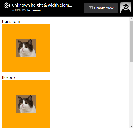
transform和定位
html如下:
<div class="box box1">
  <img src="a.jpg" alt="">
</div>
css如下:
.box{
  background:orange;
  width:200px;
  height:200px;
  position:relative;
}
.box1>img {
  position:absolute;
  left:50%;
  top:50%;
  transform:translate(-50%, -50%);
}
flexbox弹性盒
html如下:
<div class="box box2">
  <img src="a.jpg" alt="">
</div>
css如下:
.box{
  background:orange;
  width:200px;
  height:200px;
  margin-bottom:10px;
}
.box2{
  display:flex;
  justify-content:center;
  align-items:center;
}
绝对定位加margin:auto;
html如下:
<div class="box box3">
  <img src="a.jpg" alt="">
</div>
css如下:
.box{
  background:orange;
  width:200px;
  height:200px;
  margin-bottom:10px;
}
.box3{
  position:relative;
}
.box3>img{
  position:absolute;
  top:0;
  bottom:0;
  left:0;
  right:0;
  margin:auto;
}
table-cell
html如下:
<div class="box box4">
  <img src="a.jpg" alt="">
</div>
css如下:
.box{
  background:orange;
  width:200px;
  height:200px;
  margin-bottom:10px;
}
.box4{
  display:table-cell;
  vertical-align:middle;
  text-align:center;
}
.box4>img{
  display:inline-block;
}
:before伪元素
html如下:
<div class="box box5">
  <img src="a.jpg" alt="">
</div>
css如下:
.box5{
  background:orange;
  width:200px;
  height:200px;
  margin-bottom:10px;
  text-align:center;
}
.box5:before{
  content:'';
  display:inline-block;
  vertical-align:middle;
  height:100%;
}
.box5>img{
  display:inline-block;
  vertical-align:middle;
}
实际效果:

 浙公网安备 33010602011771号